Wappler Extensibility - Build Custom App Connect Extensions

The next level of Wappler extensibility - App Connect for our front-end framework is here!

Building custom App Connect custom components with their own dynamic attributes, events and data sources is now possible. You can write your own custom components and also provide a UI definition of your extensions so they integrate directly visually in Wappler!

Your extensions can be published on Github and NPM, so they can be easily installed in Wappler as versioned packages and also use their own dependencies.

Writing Extensions for App Connect

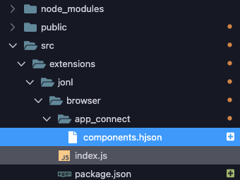
Extension Folder Structure

You can choose fully your own folder structure for the extensions, with just a few requirements:

  • it has to be a subfolder of your project, like for example /src/your-extension-name

  • it has to have package.json as any other node module, declaring the package general name, version and dependencies

  • for App Connect components, it has to have a folder with the UI definition file in it:
    /app_connect/components.hjson

Creating New Extension

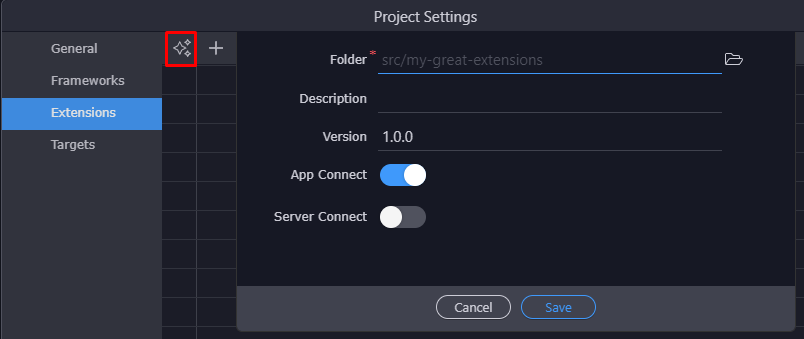
We have simplified greatly the initial setup of an extension folder, so just go to your project settings, choose Extensions and choose to Create New Extension. Then just pick a new folder to place your extension in and all the above requirements will be created automatically for you.

You can specify your own scope name (organization) if you will be creating multiple extensions. To do so create first a subfolder starting with @ and your organization name and then extension name as sub folder like src/@my_company/my_first_extension

Writing App Connect Components

The app connect component can easily be written in JavaScript. Check:

App Connect Components UI Definition

To define a UI for your App Connect components, you need to place a create special Hjson file in that describes your UI. Hjson is just a more readable json format that makes it easier to write. It describes the components, dynamic attributes and events and also which files to copy and link.

Note: If you created the extension folder as above and the App Connect was selected as option, the file was created for you.

You can place your Hjson file in /app_connect/components.hjson
An example is:

{
  components: [
    {
      type: 'dmx-example-component',
      selector : 'dmx-example-component, [is=dmx-example-component]',
      groupTitle : 'Components',
      groupIcon : 'fa fa-lg fa-cube',
      title : 'Example Component: @@id@@',
      icon : 'fa fa-lg fa-cubes',
      state : 'opened',
      anyParent: true,
      template: '<dmx-example-component id="@@id@@"></dmx-example-component>',
      baseName: 'comp',
      help: 'nice component',
      dataScheme: [
        {name: 'name', type: 'text'}
      ],
      outputType: 'object',
      dataPick: true,
      properties : [
        {
          group: 'Example Component Properties',
          variables: [
            { name: 'compId', attribute: 'id', title: 'ID', type: 'text', defaultValue: '', required: true },
            { name: 'compWidth', attribute: 'width', title: 'Width', type: 'text', defaultValue: '100%'},
            { name: 'compHeight', attribute: 'height', title: 'Height', type: 'text', defaultValue: '400'},
            { name: 'compValue', attribute: 'value', title: 'Initial Value', type: 'text', defaultValue: ''},
          ]
        },
      ],
      actionsScheme: [
        {
          addTitle: 'Set Value',
          title : 'Set Value',
          name : 'changeText',
          icon : 'fa fa-lg fa-play',
          state : 'opened',
          help: 'Set Value',
          properties : [
            {
              group: 'Set Value Properties',
              variables: [
                {
                  name: '1', optionName: '1', title: 'New Value', type: 'text',
                  dataBindings: true, defaultValue: '', required: true,
                  help: 'replace value with new one'
                }
              ]
            }
          ]
        },
      ],
      children: [],
      allowed_children: {},
      copyFiles: [
        {src: 'includes/dmx-example-component.js', dst: 'js/dmx-example-component.js'},
        {src: 'includes/dmx-example-component.css', dst: 'css/dmx-example-component.css'}
      ],
      linkFiles: [
        {src: 'js/dmx-example-component.js', type: 'js', defer: true},
        {src: 'css/dmx-example-component.css', type: 'css'}
      ],
      cssOrder: [],
      jsOrder: []
    }
  ],
  attributes: [
    { name: 'dmx-example-component-value', attributeStartsWith: 'dmx-bind', attribute: 'value', title: 'Value', type: 'boolean',
      display: 'fieldset', icon: 'fa fa-lg fa-chevron-right',
      groupTitle: 'Example Component', groupIcon: 'fa fa-lg fa-cubes',
      defaultValue: false, show: ['valueValue'], noChangeOnHide: true,
      groupEnabler: true, children: [
        { name: 'valueValue', attributeStartsWith: 'dmx-bind', attribute: 'value', isValue: true, dataBindings: true,
          title: 'Value:', type: 'text', help: 'Choose dynamic data binding.',
          defaultValue: '', initDisplay: 'none'
        }
      ], allowedOn: {
        'dmx-example-component' : true
      }
    }
  ],
  events: [
    { name: 'dmx-example-component-updated', attributeStartsWith: 'dmx-on', attribute: 'updated', title: 'updated', type: 'boolean',
      display: 'fieldset', icon: 'fa fa-lg fa-chevron-right',
      groupTitle: 'Example Component', groupIcon: 'fa fa-lg fa-cubes',
      defaultValue: false, show: ['updatedValue', 'updatedMods'], noChangeOnHide: true,
      groupEnabler: true, children: [
        { name: 'updatedValue', attributeStartsWith: 'dmx-on', attribute: 'updated', isValue: true, actionsPicker: true,
          title: 'Action:', type: 'text', help: 'Choose the action to execute.',
          defaultValue: '', initDisplay: 'none' //, required: true
        },
        { name: 'updatedMods', attributeStartsWith: 'dmx-on', attribute: 'updated', isModifiers: true, title: 'Modifiers:', type: 'enum',
          defaultValue: '', initDisplay: 'none', valuesType: 'event_modifiers' //values: EVENT_MODIFIERS
        }
      ], allowedOn: {
        'dmx-example-component' : true
      }
    }
  ],
  static_events: [
    { name: 'dmx-example-component-updated', attribute: 'onupdated', title: 'updated', type: 'boolean',
      display: 'fieldset', icon: 'fa fa-lg fa-play-circle-o',
      groupTitle: 'Example Component', groupIcon: 'fa fa-lg fa-cubes',
      defaultValue: false, show: ['updatedValue'], noChangeOnHide: true,
      groupEnabler: true, children: [
        { name: 'updatedValue', attribute: 'onupdated', isValue: true, behaviorsPicker: true,
          title: 'Action:', type: 'text', help: 'Choose the action to execute.',
          defaultValue: '', initDisplay: 'none' //, required: true
        }
      ], allowedOn: {
        'dmx-example-component' : true
      }
    }
  ]
}

The code is divided in four main structures:

  • components - a list of all components definitions
  • attributes - a list of all dynamic attributes
  • events - a list of all dynamic events
  • static_events - a list of all static events

Lets go through then one by one.

The components section

Key Type Description
type text, required a unique name for your component. Must start with dmx- for App Connect components. Use your own prefix after that to make it unique
selector text, optional a CSS selector to identify your component. If not specified this component definition will be used as template only.
priority text, optional if more component selectors match, sort by priority to display the match with lowest priority number
framework text, optional if this component is part of a framework, specify the name here. Possible names are bootstrap4, bootstrap5, framework7_7, app_connect. when component type starts with dmx- then app_connect is the default.
groupTitle text, required a group title to show all components with the same group name together
groupIcon text, required a font awesome icon for the group, use also color modifiers
title text, required a title that describes your component
icon text, required a font awesome icon for action, use also color modifiers
state text, optional can be ‘open’ or ‘closed’ to indicate if rendered in the App Structure tree if the node should be initially closed or open to show its children
anyParent boolean, optional if true it indicates that this component can be placed anywhere. So it is a kind of global component. If not specified the component can only be placed in a parent that has it as child
template text, required specify an html template that contains the initial code of the component when inserted. Use special variables as @@id@@ to add component ID
baseName text, optional specify initial component ID prefix
dataScheme array, optional an array of objects with name and type that define the output data for your action
dataPick boolean, optional is the main action name pickable as data
properties array, optional an array of groups with properties defining the input of the action. You can have multiple groups, see UI Control Reference
actionsScheme array, optional an array of actions for this component
children array, optional an array of children component names
allowed_children object, optional object with keys of allowed children and value how many are allowed or -1 for unlimitted
copyFiles array, optional an array of files or folders to be copied from the extension root folder (src) to the web root folder (dst)
linkFiles array, optional an array of files to be linked when this component is used. Can be also full cdn url. Specify type of file js/css, and additional attributes like defer, integrity, crossorigin, module. Also add detect='_regexp_' to enter a full regexp (escaped for string) to detect the different variations of the include and match them as found. Otherwise exact match is needed or the include will be added again
cssOrder array, optional an array of css file names to make sure reorder if needed so that the order is enforced
jsOrder array, optional an array of js file names to make sure reorder if needed so that the order is enforced

Component Actions Scheme

When specifying different component actions you can enter the properties passed on each action call.
Those are passed in exact order given. Example:

actionsScheme: [
    {
      addTitle: 'Go To',
      title : 'Go To',
      name : 'goto',
      icon : 'fa fa-lg fa-chevron-right',
      state : 'opened',
      help: 'Navigate to an URL',
      properties : [
        {
          group: 'Go To Properties',
          variables: [
            {
              name: '1', optionName: '1', title: 'URL', type: 'file',
              dataBindings: true, defaultValue: '', routePicker: true, required: true, expressionRequired: true,
              help: 'Enter the url'
            },
            {
              name: '2', optionName: '2', title: 'Internal', type: 'boolean',
              defaultValue: false, help: 'Use internal routing, for partial refresh', show: ['3'], hide: []
            },
            {
              name: '3', optionName: '3', title: 'Title', type: 'text',
              dataBindings: true, defaultValue: '', expressionRequired: true, initDisplay: 'none',
              help: 'Enter the title to be used when just partial refresh is done'
            }
          ]
        }
      ]
    },
....

You can however also pass is group parameters in single object parameter with optionsInObject, like this:

actionsScheme: [
    {
      addTitle: 'General Find Place',
      title : 'General Find Place',
      name : 'findPlaceFromQuery',
      icon : 'fa fa-lg fa-search',
      state : 'opened',
      help: 'General Find Place. The most generic and cheap query<br><span style="color: #d28445; padding-left: 90px; display: block; line-height: 1.6em;">Warning heavy pricing may apply.<br>See <a href="javascript:void(0)" style="color: indianred;" onclick="nw.Shell.openExternal(\'https://developers.google.com/maps/billing/gmp-billing#nearby-search\')"">Google Places Nearby Pricing</a></span>',
      properties : [
        {
          group: 'General Find Place Properties',
          optionsInObject: true,
          variables: [
            {
              name: 'query', optionName: 'query', title: 'Query', type: 'text',
              dataBindings: true, defaultValue: '',
              help: 'Enter the query for the place',
            },
            { name: 'bindBounds', optionName: 'bindBounds', title: 'Bind Bounds', type: 'boolean',
              defaultValue: false, help: 'Search inside current map boundaries only',
              show: [], hide: ['latitude', 'longitude', 'radius']
            },
            { name: 'latitude', optionName: 'latitude', title: 'Latitude', type: 'text',
              defaultValue: '', dataBindings: true
            },
            { name: 'longitude', optionName: 'longitude', title: 'Longitude', type: 'text',
              defaultValue: '', dataBindings: true
            },
            { name: 'radius', optionName: 'radius', title: 'Radius', type: 'text',
              defaultValue: 500, dataBindings: true, help: 'Search only within Radius in meters'
            },
          ]
        }
      ]
    },

The attributes section

The attributes section represents all dynamic attributes. Those are groups of one or more input fields that are toggled as single dynamic attribute. Usually those dynamic groups are identified with attributeStartsWith with value dmx-bind

You can also build your own generic custom attributes, see:

Key Type Description
name text, required a unique name for your dynamic attribute. Usually also prefixed with component type
groupTitle text, required a group title to show all attributes with the same group name together
groupIcon text, required a font awesome icon for the group, use also color modifiers
title text, required a title that describes your attribute. Make sure it is unique!
icon text, required a font awesome icon for attribute
display text, required must be value fielset for toggler group
groupEnabler text, required must be value true for toggler group
type text, required must be value boolean for toggler group
show text, required add the values of all children inputs, so they are shown when the group is on
children array, required an array with all the children inputs for this toggle group. Make sure they all have initDisplay: ‘none’ to be initially hidden. Further see the UI Control Reference
allowedOn object, optional specifies on which components this attribute can be used. Set component type there.
notAllowedOn object, optional specifies on general elements this attribute does not apply.
copyFiles array, optional an array of files or folders to be copied from the extension root folder (src) to the web root folder (dst)
linkFiles array, optional an array of files to be linked when this formatter is used. Can be also full cdn url. Specify type of file js/css, and additional attributes like defer, integrity, crossorigin, module. Also add detect='_regexp_' to enter a full regexp (escaped for string) to detect the different variations of the include and match them as found. Otherwise exact match is needed or the include will be added again

The events section

The events section represents all dynamic events. Those are groups of one or more input fields that are toggled as a single dynamic event. Usually those dynamic groups are identified with attributeStartsWith with value dmx-on

Key Type Description
name text, required a unique name for your dynamic event. Usually also prefixed with component type
groupTitle text, required a group title to show all events with the same group name together
groupIcon text, required a font awesome icon for the group, use also color modifiers
title text, required a title that describes your event. Make sure it is unique!
icon text, required a font awesome icon for event
display text, required must be value fielset for toggler group
groupEnabler text, required must be value true for toggler group
type text, required must be value boolean for toggler group
show text, required add the values of all children inputs, so they are shown when the group is on
children array, required an array with all the children inputs for this toggle group. Make sure they all have initDisplay: ‘none’ to be initially hidden. Further see the UI Control Reference
allowedOn object, optional specifies on which components this attribute can be used. Set component type there.
notAllowedOn object, optional specifies on general elements this eventdoes not apply.

The static events section

The static events section represents all static events. Those are groups of one or more input fields that are toggled as single static event. Usually those dynamic groups are identified with single onxxxx attribute

Key Type Description
name text, required a unique name for your static event. Usually also prefixed with component type
groupTitle text, required a group title to show all events with the same group name together
groupIcon text, required a font awesome icon for the group, use also color modifiers
title text, required a title that describes your event. Make sure it is unique!
icon text, required a font awesome icon for event
display text, required must be value fielset for toggler group
groupEnabler text, required must be value true for toggler group
type text, required must be value boolean for toggler group
show text, required add the values of all children inputs, so they are shown when the group is on
children array, required an array with all the children inputs for this toggle group. Make sure they all have initDisplay: ‘none’ to be initially hidden. Further see the UI Control Reference
allowedOn object, optional specifies on which components this attribute can be used. Set component type there.
notAllowedOn object, optional specifies on general elements this eventdoes not apply.

App Connect Formatters UI Definition

You can easily create a custom App Connect formatter by using a app_connect/formatters.hjson file.

To define the code for the formatter see: Writing Custom Formatters for App Connect

Note that the formatter type has to start with method_ followed by the type of the formatter, like text, number, boolean, array, collection and then followed by your function name.

Example:

{
  formatters: [
    {
      type: 'method_text_repeat2'
      groupTitle : 'General',
      groupIcon : 'fa fa-lg fa-cube',
      addTitle: 'Repeat Text',
      title : 'Repeat Text',
      name : 'repeat2',
      icon : 'fa fa-lg fa-retweet',
      state : 'opened',
      help: 'Repeat text num times.',
      allowedTypes: ['text'],
      properties : [
        {
          group: 'Repeat Properties',
          variables: [
            {
              name: '1', optionName: '1', title: 'Length', type: 'text',
              dataBindings: true, defaultValue: '', required: true,
              help: 'The number of times to repeat'
            }
          ]
        }
      ],
      copyFiles: [
        {src: 'includes/dmx-example-formatter.js', dst: 'js/dmx-example-formatter.js'},
      ],
      linkFiles: [
        {src: 'js/dmx-example-formatter.js', type: 'js', defer: true},
      ],            
    }
]
}

Publishing your extension to NPM

You can decide to publish your extension to NPM, so that other people can use it directly.
Make sure you check your package.json in the extension folder so that all correct name, info and dependencies are in there.

First make sure you visit NPM, register for account there and read the contribution rules

Then you can easily publish to NPM by:

  1. Open a terminal in Wappler

image

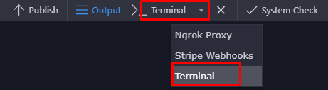
  1. Change to the folder where your extension is like:

cd src/your-extension-name

  1. Login to NPM by entering

npm login

  1. test your package publishing by running

npm publish ./ --access=public --dry-run

  1. if all ok, then publish the package

npm publish ./ --access=public

That is all! Your package is now officially available as Wappler extension!

Using a published extension in Wappler

Using an extension in your project that is already published to NPM is pretty easy.

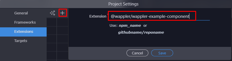
Just open the project settings, go to Extensions, click on the [ + ] to add extension and enter the NPM name for your extension.

You can try to install our example extension:

@wappler/wappler-example-component

After saving the project settings, the extension will be installed directly and ready for use.

8 Likes

@george do you have to publish to npm and install your own extensions to test them?

I’m saying this because the extension is looking for my js file in /node_modules as root so I get an error in the console.

file .../node_modules/browser/jonl/browser/index.js does not exists!

When going through the wizard I selected src/extensions/jonl/browser as folder to create the extension

This is my relevant part of the hjson

copyFiles: [
            {src: 'jonl/browser/index.js', dst: 'js/jonl_browser.js'}
        ],
linkFiles: [
            {src: 'js/jonl_browser.js', type: 'js', defer: true}
        ],

And my folder structure:

Wappler 10-03-2023 13.30.18 000264

It would seem that /node_modules/browser/is being prepended to the url added in src

As a workaround I added ../../ to skip the error and get the file copied.

{src: '../../src/extensions/jonl/browser/index.js', dst: 'js/jonl_browser.js'}

It’s unclear though what is the procedure to test locally.

No you don’t need to publish them when developing locally… That is the whole point when “creating new” extension in the src/my-extension for example it will create a new package.json and install the extension locally in node_modules and symlink it to the src

so actually it is pretty much running npm install ./src/my-extension

The paths in src in copyFiles are also relative to your extension root, so you shouldn’t add any ../src in there. And the dst are relative to your site root.

3 Likes

Ok. Got it.

How would this work? If I add a dependency in package.json how can my extension access it in the browser? AFAIK there is no bundler working with Wappler.

It’s undocumented.

It is just installed in node_modules outside of web root and in your hjson with copyFiles and linkFiles you can specify which from its files need to be copied to your web root and linked.

1 Like

All output is specified in the dataScheme and it defaults to array. With outputType you can make it object or other simple type of no dataScheme is specified

1 Like

We are actually brainstorming about integrating different bundlers in the same process as the extension installations and also in the publishing process, so you can contribute some ideas in a new topic if you want.

1 Like

@george what does dataPick do? I haven’t noticed any difference between true or false

dataPick means that even with no dataScheme, the user should be able to pick the component name as data. Otherwise it is not listed in the data picker at all.

1 Like

Well then there is a bug because I can’t pick it :smiley:
I mean, it’s available. But it doesn’t get added when clicking on it.

Well try adding also dataPickObject: true :slight_smile:

Something sketchy is going on here :smiley:

From App Connect:

Safari 13-03-2023 21.30.02 000298

From Server Connect:

Safari 13-03-2023 21.29.31 000296

From some random core component:

Code 13-03-2023 21.28.41 000294

I think we are going to require further help on what they do and how they combine :rofl:

dataPickObject does indeed allow to select the root. But I no idea what dataPick does. I see no difference at all when changing values.

Hi @george, what’s the workflow of an extension installation via UI? Asking to understand at what point in the UI installation npm lifecycle scripts will be called if I add them to package.json

Well it is explained in the last section of the above doc Wappler Extensibility - Build Custom App Connect Extensions

I meant what npm commands and arguments you are using when installing remotely and their order(if more than one). Also what files in the project are updated(like .wappler/project.json)

I might have the need to install from a private registry some stuff and run some lifecycle scripts. So I’m thinking on building a shell script to automate this and I want to make sure I follow the same steps so it registers correctly.