I voted too early. Now that I have tried it I would have voted differently. ![]()
Poll stations are closed.
See you in 4 years.
Lol And I thought that the blonde toupee had been the worst… 
It seems to me that the concept of selecting something to work on, should be unified across front-end files and back-end, and it should be bifurcated from the editing process.
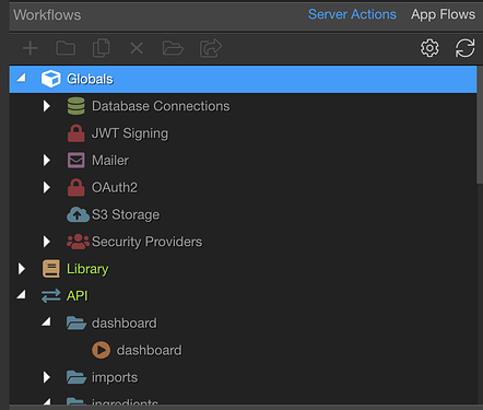
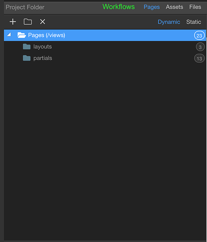
Essentially, this area:
could be moved into this:
and then you can remove an entire major section:
The developer flow is then, goto Site Manager, select something, edit it. Open up as many tabs as necessary, but once you select something, the real-estate of the selection area goes away – to allow for more tabs.
I’m very excited about the tabbed workflow editing, as it will be incredibly helpful when working on an API, and Globals, and Libraries that all impact the final task. Having to jump around on those is a constant annoyance today, especially given the validation done before leaving.
I think we need a Figma, Xd, Sketch designer here to show us a good prototype!! 

You got a point there Ken. In the end workflows, pages and assets are just special views of a folder and/or file.
Same! I have 27 inch mac and 2 x 32 inch monitors.
To an extent I would have to agree. Its a nightmare now when working on multiple tabs. If this is going to happen we need a better way to navigate between and find tabs.
Split tabs will help with this but a quick tab finder will help reduce the frustration.
Suggestion 5 from my wishlist would help for that.
Some excellent discussion and I love the fact we’re part of the process of how Wappler is designed.
After reading all the comments, my vote is to run with the new design but also keep the old as an option, including the double-width left column, as that will please everyone. My screen layout is different on my desktop (5k iMac) and my laptop because of the space available so I really like the current option of narrower or wider SC column depending on screen.
This is missing from mine, also.
If you guys are looking for App Flows, that is still an experimental feature in the Beta.
Thank you @mebeingken - I had this turned on for V3, just didn’t cross my mind to check to see if was auto-enabled in 4!.
Looking at the comments about the new design reducing productivity, it seems many are using the mouse too much, and resizing the panels as they work - something I have seen devs on my team do too. People are just not very open to learning & using shortcuts.
The biggest productivity gain I see is to be able to just have 2-3 SA open, along with 2-3 pages that I am working on and just switch between tabs (Ctrl+Tab) without having to keep opening and closing the SA panel on the left.
I don't see a situation where anyone needs to have all the pages of the project open in tabs and then also the SAs. I could be wrong, but a workflow like that is a nightmare for me.
Having an option in the Wappler settings to hide the properties panel would be great.
This is certainly something to think about in the tabbed design. Becuase working on maximised query builder UI is also something that is important too.
Don't have any ideas for the UI yet, but getting rid of the modal would definitely be a good move.
@George One more suggestion: please make Wappler remember the panel sizes! Its a huge productivity killer in the current version. Remembering the size universally would also work if per project is not an option.
Which panels do you mean exactly? Most already save their sizes.
I just want to clarify why I’m advocating so much. It’s not that I have an interest, but I have.
It’s just that minorities are usually very vocal and noisy so someone has to compensate on the other side.
All in all the poll results are clear and it’s not like the sample is small AND the results are tied.
Only 4% don’t want to change.
It’s clear that.
Even if we receive heavy fire from the losing guys.
Stay strong @George
Old panel.
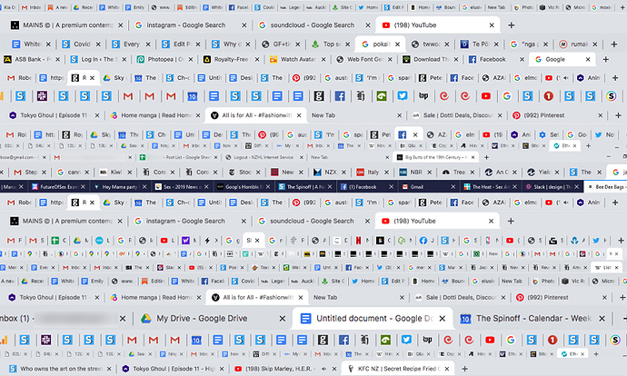
For those fearing a “tab hell”, a good solution might be, what Chrome have done with their tab groups.
We might consider a similar solution 
Grouping tabs per editor type.


