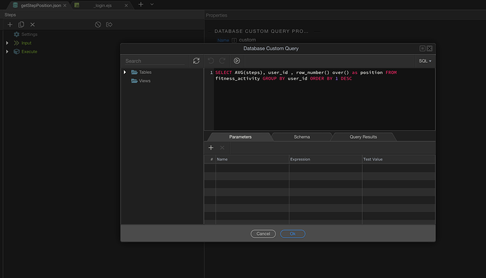
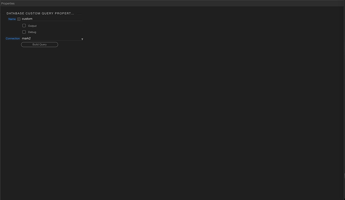
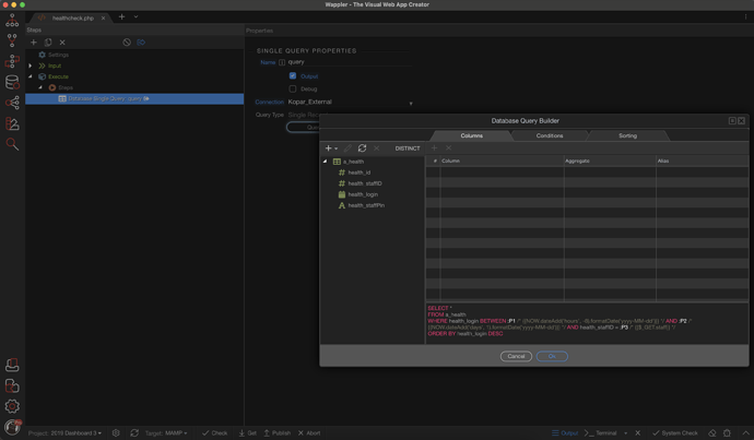
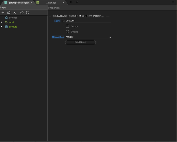
Maybe the idea of instant preview in a tab will solve this. So just as you were used to have the SC action preview on select, it can also preview in a special “preview” tab that is reused for different previews but once you edit something it becomes the editable tab for this SC action.
-
When working with several SC workflows at the same time you can move from one to another without having to confirm saving changes constantly.
-
No more modals!
-
Having two SC side-by-side(when split tabs are implemented). Useful when working with SC library.
-
Hopefully in the future being able to work side-by-side with a database tab open too. Seing database changes in realtime in the same screen.
I'm sure there are more. But those should be enough IMO to increase productivity.
Yes, this is an advantage. However, the question arises, how often does the developer have a need for the above actions? In my workflow, the above needs arise, but incomparably less often than small and frequent changes. Personally, I will definitely lose efficiency in working with the implementation of tabs in the form in which it is now.
Don't know. It may be convenient, but it may not be. It is necessary to try in practice.
Perhaps the easiest and most effective way is to simply add the tab functionality, but still leave all the functionality that is in Wappler 3? Thus, the user can choose what he needs and adjust the Wappler to his workflow.
Seems to me @JonL is the only one that gets it.  Now that I have had the chance to try it out in a real world situation I really don’t see any production benefits at all. If anything it’s just more opening and closing tabs.
I’m not against it but I certainly don’t see the purpose. Certainly lacks a wow factor for me. I could get used to it though. Hopefully the old way will remain as an option as well.
IMO that would be a UX mess and I'm advocating here to actually remove old functionality in favour of new but I get why some might be reluctant of this.
That's why Change Management is a thing. Change is always difficult.
I think the problem lays here that people tend to adopt new features very late. Say the library. People should be developing as many SC workflows in the library because that increases productivity.
If people used more the library they would definitively want SCs in tabs. And that would increase again productivity by another tenfold. But as people don't adopt SC library they don't get the plus of SC in a tab.
They do not get the compound efficiency of SC library and SC in tabs. So they are 100 times less productive overall.
Could there not be a two button solution for example left click is quick edit (the old Wappler 3 system or something a like) and then for example command or ctrl and left click for a advanced editor (Wappler 4s new addition)
Yes that is what we are doing now - so you can try it all and give us feedback.
That is the advantage of rapid prototyping ![]() - we build it, you try it and we tweak it based on the feedback.
- we build it, you try it and we tweak it based on the feedback.
I use the library very actively. But personally, I don't need tabs to actively use the library. I have had cases where it would be nice to open two server actions in parallel, but clearly, there were simply incomparably fewer such situations than situations with frequent changes or the need for quick viewing. So in my workflow, this will be a step backwards.
I respect and understand your issue.
Hopefully the bigger picture will end up making more sense when all the pieces fall together. Wappler never disappoints in that aspect 
Hi Jon, I understand your idea and vision of working in sc in full screen especially when we have to create a lot of complex actions and you spend hours without working on the front end. But in this way you force me to have to open a full screen to modify an action when before I could do it with a single click on the action and what is worse then I have to close the tab. I’m not interested in having split tabs just to see more things at the same time as I focus on one at a time. What interests me is that the action I am editing is fully displayed, but I already had that, I repeat, with a single click.
I know Teodor is not going to like what I am going to say, but if they really want to improve the way we work, they would let me work with an undocked window on another monitor (I use 3 at the same time) and there it would make more sense have the tabs divided, but as long as I have to work in a single window, my priority is to make as few clicks as possible and see the information displayed in its entirety, which is how we have been working very well.
I want to clarify that I always like to try new functionalities and I am not one of the developers who finds it difficult to adapt to new proposals, but in this case this new change is not very encouraging and I would not like to be forced to work in this way. I believe that the old way and the new “full screen” way can coexist.
Just getting this out of the way is enough for me to be honest.
You should also consider substracting the clicks you will not make when modals are off the menu and that is only possible with tabs.
Again, think in the bigger picture here. Do not tunnel vision with what’s available in a small preview. If not we will never push Wappler forward.
Hard audience! 
So where would that modal content go? There certainly isn't enough room for it in the tab view.
Where is all your server action steps? And not everyone is on a big screen. Wappler needs to work on laptops as well.
The modal content does not fit … and that is with the extra step of closing the SC panel.
This is from my laptop. It could go below if no space on the right. Wappler app can calculate this.
Or maybe even for small screens(wappler can identify this also) make a setting that make them open in modals instead and keep the modals for small screens.
Very valid concern Brad! And good that you brought it up so we can brainstorm UI ideas.
Sorry Jon, but I’m not having a tunnel vision, I’m trying to show that what was shown today is a step back from the way we have been working.
Personally I think Jon, that you are very excited about new features that were not even officially presented and you get a lot of guesswork and ideas from something that may not end up being the way you expect.
I honestly think that opening thousands of tabs is a very bad idea.
I hope my criticism is understood as something constructive and I think it is excellent that these debates exist after all we seek the same thing, to make Wappler even better. 
Yeah. I get your reluctancy believe me. It will all fall in place.
Just surveying people(95% of the sample we have think it’s a good idea ;)) is something that not many software companies do.
All in all. We are all very lucky to be a part of this.
77% of 22 votes 
5% of 22 votes want to keep the functionality as is.
This survey and the interpretations reminds me of politics in my country! 
We need your vote!!
We are campaigning here !! hahahah


