Another feature we are planning, and need your feedback on:
Edit the Server Connect actions in regular tabs, just as any other content.
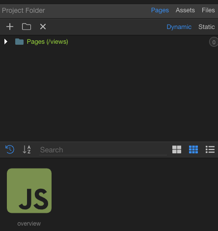
So that the Server Connect panel is just the files tree and when you click on a file it will get open in a tab for editing, instead of in the SC panel below.
This will give you much more space to edit actions, for their properties but maybe indeed also make some of the dialogs, like the database queries - come inline in the panel.
Also this will allow you to work on multiple server actions as tabs, so you don’t have to always save the action first to get to other one.
So give us feedback and vote to help us prioritize:
I would LOVE to see Server Connect editor in tabs
It’s nice to have but not high priority
Leave the editing of Server Connect actions as it is now
Oh yes. Huge leap in productivity. But not to implement before you allow splitting tabs in the UI.
Because if not the SC will get in the middle of frontend code/design view.
Right now you can open a SC window on the left and have a frontend code/design tab open so you can have eyes on both. If implemented as a tab but not before tab splitting you either work on backend or frontend.
So yes, but implement split tabs first if possible.
Just to clarify - the SC editor in the tab will consist of 3 panels as well.
See them like 3 columns
one - with the steps tree, probably on the left, then one with the properties per step in the middle.
And one with extended editors on the left, like the database queries.
So actually you will be picking a step and then the properties will show and maybe inline queries - but all this per action, so if you choose another action - those will be refreshed. So you are actually editing one action at the time.
Thats interesting.
I haven’t had a workflow requirement where having the SA and page available side by side was needed.
Mostly because when SA panel is open, page tab becomes too narrow to work on.
But it sounds like tab split could be good for productivity.
In my case, even if split tabs thing is implemented, the workable area will be very narrow. So I won’t be using it on my 14" laptop screen.
Even on my 16" MacBook, not sure how much screen real estate that would save. Unless I understand incorrectly, with both right and left panels open it still wouldn’t leave much room even in a tab?
These panels would open/show when needed right? So if I’m just browsing the server action there would be only one panel open. And the advance panel would open only if I click on a property that requires a modal today.
Would be nice to have a swift animation when these panels show. Like a slide from the right side. I am think about those UI designs where those two panels would be collapsed initially in two vertical thin bars and they just slide when needed. Once you change a focus on a property/step or double click the bar it would slide back to the right. Something of the sorts.
This setup would be compatible with tab splitting and available real estate. Because if all 3 panels are open always you wouldn’t be able to split a tab and stay productive as suggested above.
I will add to this, that when working with novices I often see them going to the server connect action within the front end page to find which server connect api they need to work on and then hop over to find that api for modification.
With the proposed tab solution, it opens the door to be able to open a server connect api directly from the server connect action on a page.
This would be crucial in my view. The idea of clicking on a server action, editing it and then having to click to close it again would really add time to workflow. If they close automatically then they get my vote. A larger area to work on the actions would be very welcome.
As for animations, will see when we get there. We had experiments with sliding panels in the past but usually those animations slowed the whole display down.
Well not exactly. The initial proposal is to have the server action file in a whole tab. So you will have one tab with the SC action and another tab with your page.
But if we also can implement indeed Split tabs, as John suggests, then you will have like two panes with tabs next to each other (like two column design) and have for example SC action editors on one side in tabs and pages on other side.
That is indeed very important - and solved well in code editors like Sublime Text.
It works as follows: as long as you are browsing all the SC actions open in the same “preview” tab. But if you go and change something in the SC action - it suddenly becomes a pinned tab on its own that you can save later or close
One thing I would say, though, is I’m very happy with the UI of Wappler and have grown extremely familiar with it. So my preference would be more features for sites/apps we develop rather than fundamental changes to the UI.
Things like drag and drop, PouchDB, other map integrations than Google Maps, Select Dropdowns with more functionality like colours of options and filtering, etc. Things which give more functionality to our apps would be top priority for me.
The change of nwjs to electron is a good chance to improve UI though as they have everything very recent and are extremely focused on the internal library they use for the UI. So it’s probably like now or in a long time
Yep, I get that and am sure the changes will be for the better. But I miss the Thursday updates revealing new features we can put into our apps rather than under-the-hood changes which do improve things but don’t expand on what we can build. Hope that makes sense.
Yeah I get your point. I miss that too, but I think this is just necessary.
They can’t keep adding things to the UI without reevaluating it. Shiny new things that we like tend to have more UI stuff which clutters even more the view.
If they don’t take a step back and rethink it from time to time it just adds up to the UI debt they have.
They need to make space for shiny new things
If not, eventually they will had to add an epilepsy warning
I would rather not have a fixed space as that could eventually need UI reevaluation again if something is added or UI gets cluttered. I.E. People working exclusively or focused on backend don't want to have their right space cluttered with frontend stuff.
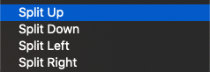
So just let us splìt right or left(or even up and down). And then be able to move/pin the tab as we want inside their tab group. Plus leaving file open if changes are made as you commented.
VSC allows all that.
People with ultrawide will prefer to split left and right. People with 4:3 monitors will prefer to split up and down. And people with 49" monitors will split up, down, left, right and in other dimensions
Things that come to mind:
I see an SC file similar to a web page file. It could have two type of views: Design/Functional and Code.
When a SC file is open do not show right AC menu as this is exclusive to web pages.
Database manager would also qualify for this approach. Browse database on the left, when opening a table/view open in tab and show two possible views as with SC and web pages (structure and data for tables). Again don't show AC panel.
Some people would be happy if you found a way to open files from another project in the same workspace. I.E. working on a mobile project but wan't to open SC files from their backend project. This could be quite tricky so as an alternative being able to open additional workspaces would also work.
In the end I would see in the main/content window a mix of tabs with a nice coloured icon depending on the type: Page, Layout, Partial, SC, Table and in the future even more like settings, deployment content, etc
Any tab can be split( up, down, left and right). For each split a tab group is created where more tabs can be there. Any of them can be pinned per group so people could work with a UI that suits their needs.
Some may want to have all their SC files split on the left, and AC on the right. Others might be working on a focused way when creating their API. So they might be working on an SC API file on the left side but they split to the right a SC library file they need to call from the API file.
I am guessing @mebeingken will appreciate that everything goes in a tab in the content area as he won't have to change his courses so often to accomodate changes in the UI. As everything or nearly everything is a tab now
More things that come to mind. Sorry but when I turn on the engine I find it hard to stop.
Don’t forget about App flows. Those can also go into a tab.
I think we can finally nail the UI and everything starts to make a lot of sense in terms of where you expect things to be.
So we have from left to right.
Module bar(or whatever)
This is fine as is in terms of UI. Every main feature goes there.
Browse Panel
If it can be browsed it goes here.
Content Panel
Content goes here and tabbed. Tabs can be split, pinned ,moved, etc
SC actions
App Flows
Front End Files
Assets (folder content)
Database Tables
Git Views(working vs changed, commit info, etc)
Routes(properties should be content) to make space for additional and future fields routes need to show. Also to keep consistency.
For each content tab
Depending on what type of content from above it will have 1, 2 or 3 panels as you mentioned for the new SC file approach(Steps, Properties, Query or others). Pages would have 2 the page and AC panel, etc
Project/Extensions/Options
Should probably go to the system menu bar. But guess what…they also open in a tab if you want to see their content.
Could do with some tweaks but it can wait. Except for project settings that should also open as a content tab. Just because…no modals please There can be some honorable exceptions like the account modal(with the subscription details) and similar. But not anything related to the project work.
Sorry for mixing SC with general UI but I think the move of SC to a tab is the first step towards a great UI so I just reimagined how it would all look like with a harmonized UI.