Thanks for promising changes done with SC - they will be of help to many.
Requests for better use of the massive space now made available in the SC tabs.
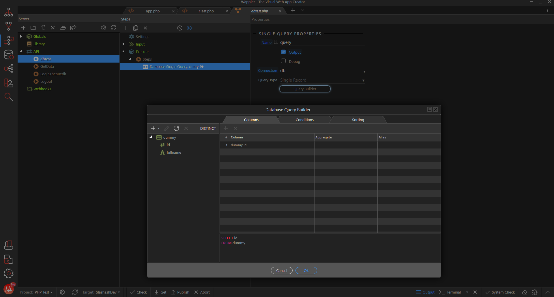
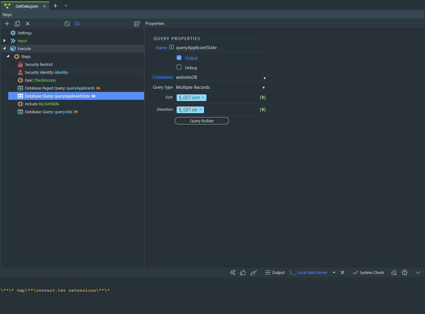
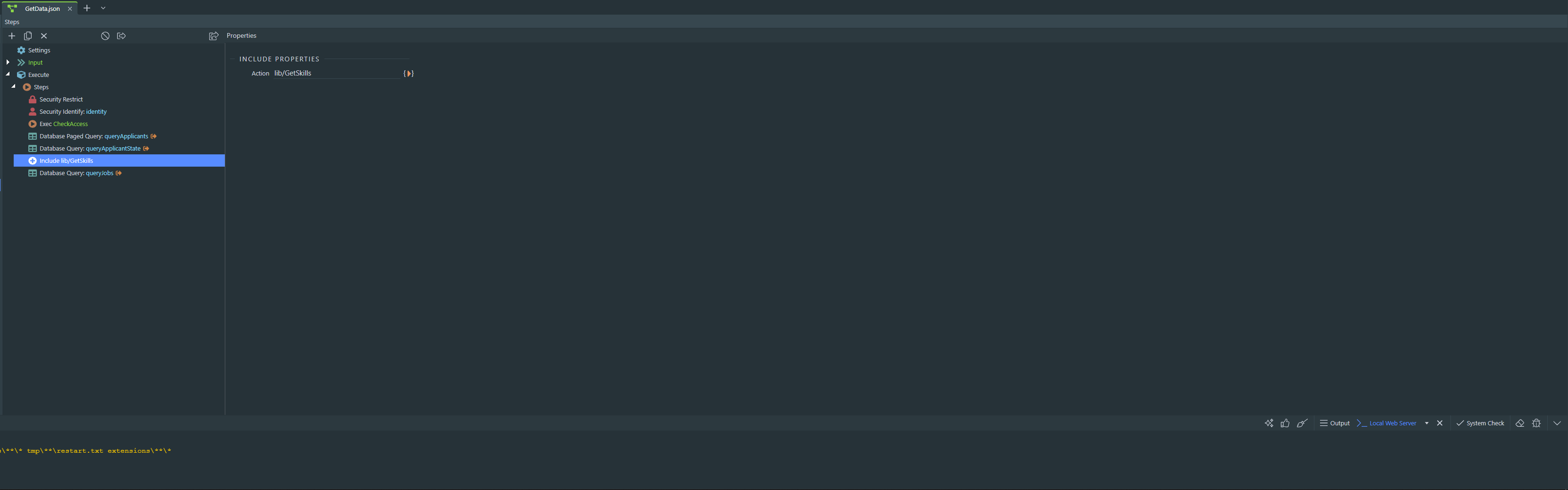
ONE (DB Actions)
we have so much space now. showing the DB actions of insert/update/delete/select on the tab itself is so much more better than having to open them in a modal. width of 400px-600px should be sufficient - will have to be fixed in px i suppose coz with % based width, handling wrapping will be difficult (my thinking process revolves around web - it maybe different for desktop apps - pls factor this to consider my feedback)
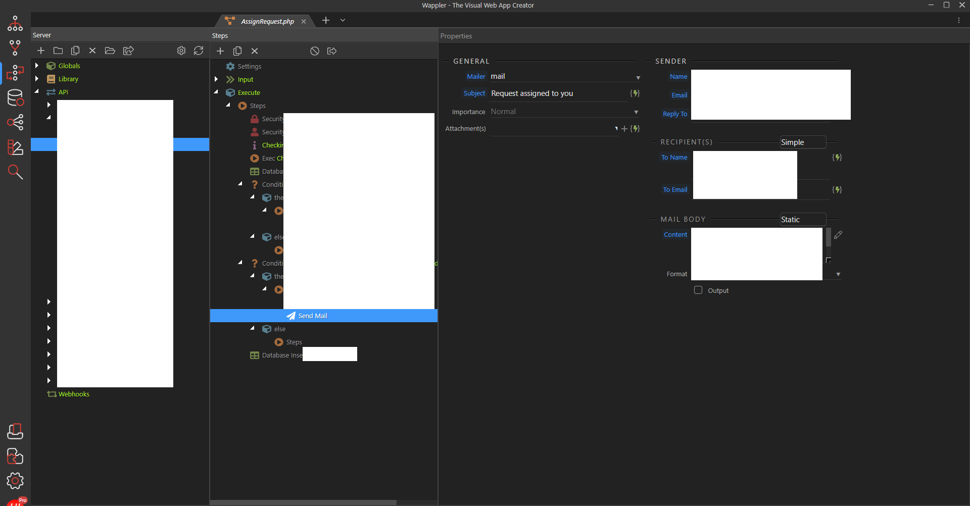
TWO (Send Mail)
the GENERAL part of the send mail action can be in a single row and wrapped to continue on second line depending on the width of the screen. the width can vary depending on content - maybe will have to keep it in multiple for 400 for more ‘linear’ visibility. most displays these days are 1920x1080p or higher.400px will give a comfortable space for 3 inputs in a single line i suppose.
the SENDER part can be stacked right below the GENERAL part and with a similar horizontal layout that wraps onto the second line with the mail body given a very nice full width for better use of space.
vertical scrolling on this 3rd pane should be widely acceptable.
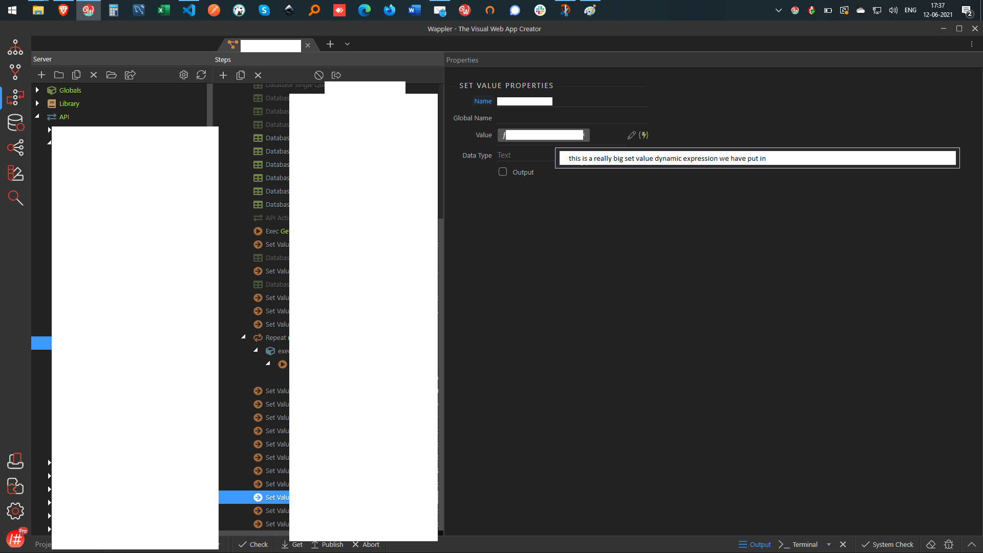
THREE (Set Value)
continuing on the previous idea itself, with a separate example coz stopping at 2 did not seem right.
we have a really big set value dynamic expression - if this were a full width box (while keeping the vertical layout for better use of space) then it becomes much easier to read.
for smaller expressions, having a big input box with a smaller colour blob isn’t too bad either.
(sorry for the all the redaction - these are from client projects - cannot expose anything)
IMO, 2 well done features are better than 5 mildly ok ones. Please consider prioritising quality over quantity.
Just a plain repositioning of SC in tabs is not good enough - using that space to allow for better experience is important too. I hope the more people agree with me on this than not! its better like this than having a tiny single pane - but if the team are taking so much efforts to improve things - go all the way - don’t leave us high and dry so much.
thank you for the recent updates to make the modals more flexible to work with.
would like to see this as well - use of better space on server actions - avoiding modals all together for steps like query by showing data on the tab itself - given that there is so much space there now.
also, for steps like email, better use of space would be to setup the elements to use the available spaces more generously - it still feels quite crammed.
Well that is the dilemma currently if you embed the query dialogs inline… then they will use the space but on actions that have just few properties you will have much empty space….
I would also love to see them inline, but I do love what you have done with the native windows.
From a UI/UX perspective the option of inline is a great way to know how you can reach something quickly. i.e. I know that if I want to change a query I can go to that tab and it’s there. While the window allows for flexibility to move to a different screen and have it as reference it comes with the caveat that it can get lost with all those other windows floating around.
If you manage to find a way to view them inline and add an option to move to window when needed that would give us huge flexibility. It could even be considered “break-away panels” making a lot of people very happy.
Next to buttons that open windows you can add an icon(square with a arrow pointing to the upper left) to open in window mode.
In the actual window you can add the close and the move to inline icons(square with arrow pointing to lower left to return it to the inline view.
If you nail this you open Wappler UI to all sorts productivity levels for its users. You could even move a whole tab to a window or move it back to the main app.
All in all it seems you made the best of the choices when migrating from nwjs to electron. Big applause
keep in mind the context that I and team here interface with Wappler (and i hope there are 100s of other such extensive Wappler users out there if not in 1000s) a good 4-5 hrs a day on average. if we do not have to open, resize, move modals, it is really good for productivity. while for others it is not worse off either - so it's win-win.
i do not mind breakaway panes - but while a modal is open, cannot do anything in the background - so not very sure about its value addition here.
Indeed. There would only be added value if they figure out how to allow the native window to run in background. If it has to be in foreground always there is no point.