I’m on a 27" iMac so have plenty of screen space. Having the wider API column would still work well and have plenty of space for the tabs. I suspect most people have large monitors these days.
Adding these suggestions here.
1 Like
I guess this goes without asking. Fields in steps will take the whole width of the tab in next iterations, right?
Yes we will be getting to that too.
1 Like
Yes we were thinking about that, but if the code view is editable- a whole new design / code synchronization challenge appear.
And actually we discourage a direct json editing, so there won’t be much use for code view and it will cause only confusion.
1 Like
I understand and makes sense.
When I do copy and paste actions I usually do it in VSC @sid because I’ve seen that kind of sync issues when doing it in wappler. So maybe you want to try it out there.
A valid point.
But can we at least have an option separately to open the JSON file?
Ever since Monaco was added, I have grown more confident in using Wappler for such things. Also saves me from keeping another app open.
1 Like
instead of direct editing to copy and paste would there be no way you could do something like command click etc to highlight any steps you want to copy then command c to copy go into the other action command v on the step before where you want to paste im not sure if this would even be possible
edit I imagine ir would get pretty confusing thinking about it because this wouldn’t really work unless you was copying everything inside a condition for example where it has nested items
@george LIbrary items open in code editor in case you missed them.
And custom modules need to be checked with this new feature.
Do you want a bug report for both?
My feedback on the new functionality.
-
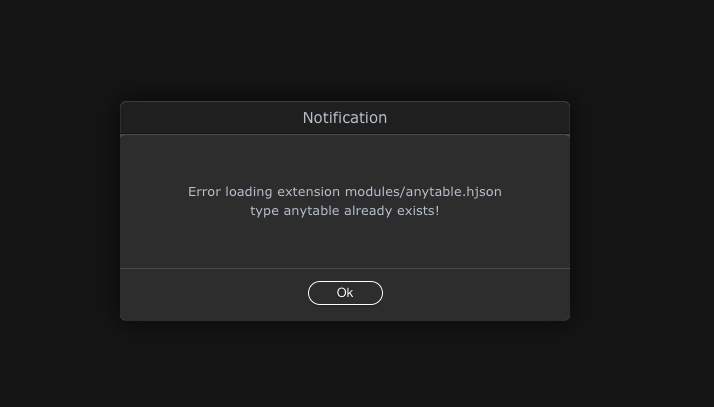
There is a problem with custom extensions when the tab opens. The message always occurs, even if the server action does not use the extension. The extension itself works stably (thanks John for the useful extension):
-
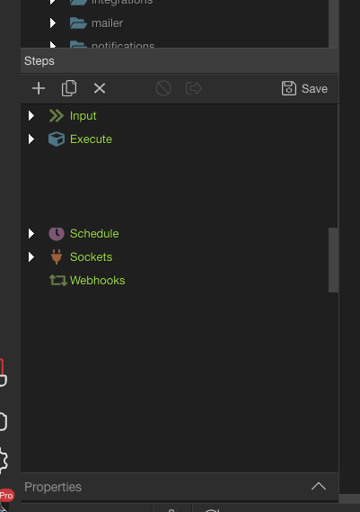
This is what my SC area looks like in the latest stable version of Wappler:
As you can see, the largest space is occupied by the area of steps, because with complex logic, the steps are very cumbersome. The current implementation suits me and its advantage is that there is no step of double-clicking and opening an additional tab. It is enough to select the server action and immediately get access to its editing, it is very convenient.
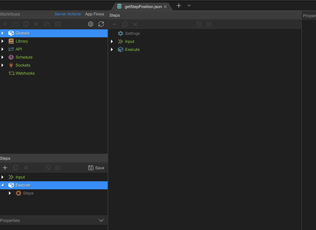
This is what the new SC tab looks like in the new Wappler 4:

Large “+”: A lot of space is convenient.
“-” (at the moment):
- you have to do an additional action to open the edit-friendly mode. It is not yet clear how significant this point is, we need to try it in the workflow.
- the size that the user sets for the area with steps is not saved, it is constantly reset when moving to another step and becomes small and the area with properties is large, although it should be the opposite.
- when you close a tab, all changes are instantly lost without any warning.
When opening a tab in the app workflow actions, the tab has only a code representation, not a visual one:
Currently we have implemented just the Server connect API actions to be opened in the tab editor .
Will get shortly to all other server connect types as well App Flows.
1 Like
I would try to think of a way of streamlining the UI so it looks more like the two top toolbars in webpages.
There is some space there in the two top toolbars to reimagine the utilities.
Also:
![]()
Maybe change the tab icon to this?
Yellowish book for Library
![]()
Blueish arrows for API
![]()
Blueish graph for Flow(maybe change color as it’s very similar to API if not the same)
![]()
And leave the current one for DB tabs(if they come at some point).

3 Likes
Another idea.
I’m not going back to the old panel(that’s for sure). I do understand some people might still want it for quick edits. So I won’t get in the middle of that.
However the old panel is now annoying me a lot because I still have to scroll a lot in the browser.
Suggestion: Make the steps panel collapsible to the bottom as the properties one and make it remember the position of both. This should satisfy everybody.
This way I can have a better view on the SC browser and not have to scroll so much.
Also there are two small UI bugs I’ve noticed.
- A few pixels in between the properties collapsed bar and the bottom.
- When properties is collapsed it seems the steps panel doesn’t resize and you can see the browser behind it.
1 Like
Good idea. We are toggling between full tree, if an action is open in tab editor, or with inline steps and properties if it isn’t.
I was thinking of making the default view inline steps or directly in tab editor, an option, but having them collapsed might also do well.
Both options work for me. I just want to browse SC in all it's glory ![]()
I just thought that collapsing and remembering would be less traumatic por people but I'm all for making it disappear as an option or altogether.
The problem I see keeping the old panel is that you will have to keep the modals so you won't be able to stick to one design pattern moving forward. And I think consistency is something important for a good UX, for new users and for learning materials.
Anyway, that's just my opinion. All in all, I'm just happy I will be able to browse through the whole height.
1 Like
On second thought. I would scrap the old panel altogether and for a very good reason @George
Check this image. A SC open in a tab and a SC open in the old panel.
What are you saving when you click on the save button? It’s rhetorical. I know what I’m saving but it’s going to create a UX havok and impact specially new users.
Am I saving the tab? Am I saving the old panel? What if I made a stupid small change to the old panel SC I forgot about but I click it thinking I’m saving the tab. Bad things can end up in production. What about the modals that pop when you have unsaved work? How would I know which is it affecting.
From the bottom of my heart. Be done with the old panel altogether.
Hi @George , like many of us in this community I have been closely following the Wappler 4.0 development
Even though I’m still working on the latest stable version, I try to test the new betas and see how it evolves.
Getting to the point, the new functionality of opening an api action in a new tab and removing the possibility of making it wider, is a great loss of speed and therefore productivity in my opinion.
I think this is about who works on small and low res screens vs those who work with high resolution screens.
I work on a 4k screen and as you can see now it limits me to working with my action steps in a smaller area or having to open a new tab and then have to navigate between many tabs that we all know what it means in the end, chaos of open tabs that take up space and have to close tab after tab, consuming valuable time and computer resources.
I like the expression “less is more” and in this case I think that it is not necessary to have a full screen action api unless you are working on a low resolution notebook, in which case and for everyone to be happy I would leave both possibilities.
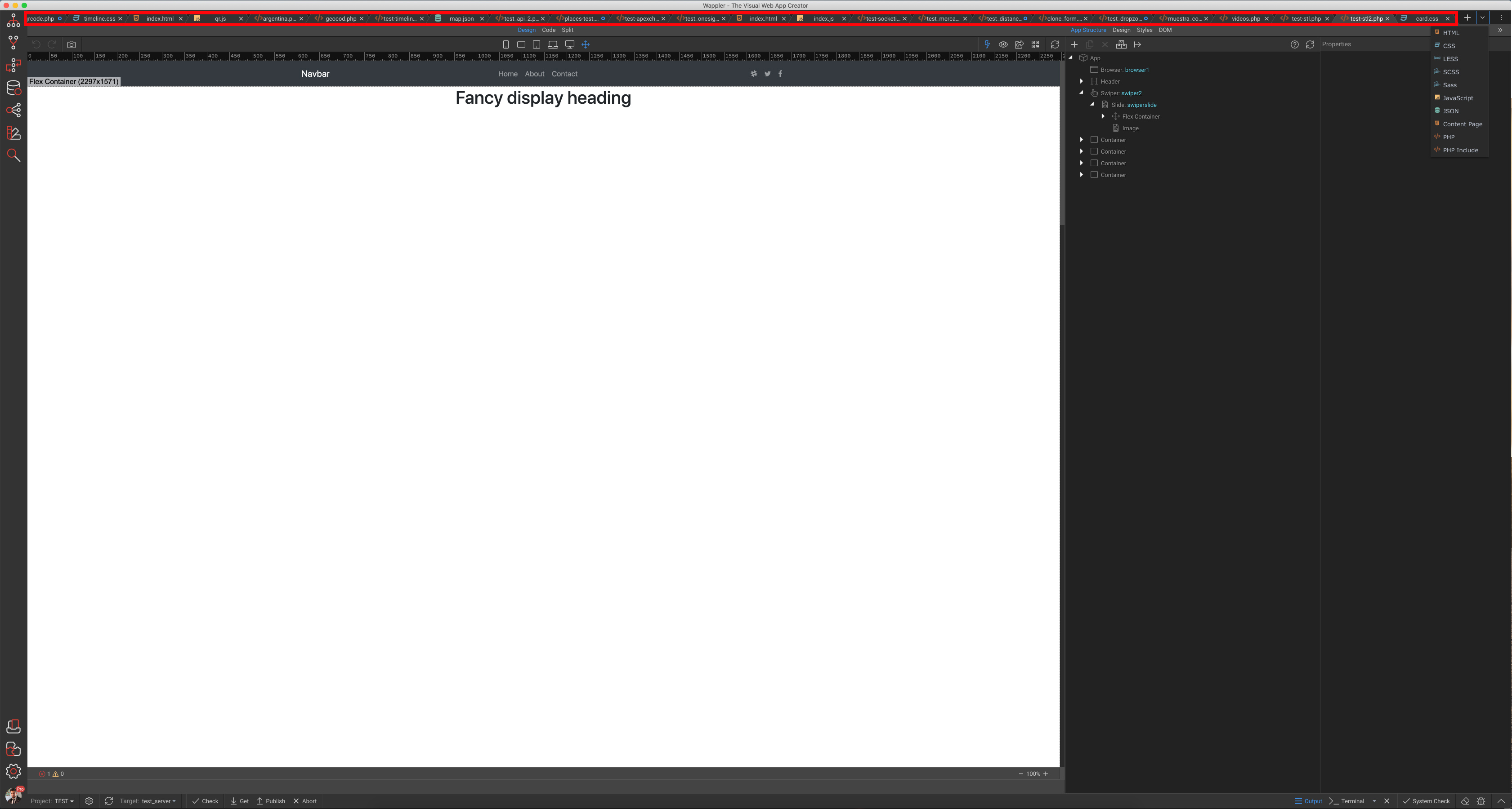
On the other hand, I don’t know how many of you have ever opened more than 20 tabs, but it is a problem since they start to run to the left until they disappear and the last tab is read in half.
Grabación de pantalla 2021-06-03 a la(s) 14.32.49
I haven’t tried the tab view yet. I will this afternoon. But from seeing Max’s video above I am not sure this is a good approach. I’m a bit skeptical.
Wouldn’t splitted tabs into groups ease your problem?
You would be able to work on a group just for SC workflows and on the other side you could have web pages for instance or database tabs(in the future). This configuration is specially useful for big monitors or with high resolutions and not the contrary.
Then if you want to close all SCs you could ‘Close All’, ‘Close to the right’, ‘Close all except this one’, etc. Or pin the most important ones and close all except pinned.
Also don’t think about tabs as a chrome tab. Even if chromium :D. These tabs are just a UI element of the library they use and not a chromium tab.
This is a well tested and battle proven UI. Millions of developers use Visual Studio Code like that on a daily basis.
I ran a test. I worked for about an hour with the new tabs. I can say that for me personally, this is a step back compared to the implementation of Wapper 3. The need to open a tab every time to have a good overview and a convenient editing ability significantly slows down the work if small but frequent changes are needed. It really gets uncomfortable.
As for the larger area, it becomes not much larger, in comparison with what is in Wappler 3. Moreover, if in Wappler 3, when increasing the size of the SC window, it would be possible to move the area with the properties to the right side in the vertical view (as it is now implemented in the tab in Wappler 4), then there would be no difference with the tab at all.:
But instant access to the content of the server action in Wappler 3 is a huge plus compared to the Wappler 4 tab. What are the advantages of the tab, then?