Wappler 4 RFC: Editor Tabs for Server Connect actions

I think we had a long discussion about the existing two column setup of the server action panel, where you could not make it remember the size of the left column when left panel is open to a certain width.
The solution you proposed was to expand the left panel more, but that ate into the open page, so I am living with adjusting the left column since then.

I am hoping that will no longer be an issue since it will be all the more important since the tab that opens up will also have a left column of steps and a right column of properties, and probably more column/areas for the builders.

Very true. But now I've seen it in action, I would vote differently.

I like the new concept but I also miss the old ways so I continue to request we get both options.

1 Like

For me it’s the combination of not being able to see the API steps AND the HTML page at the same time (@JonL has promised there’s a solution coming for that :wink: ) and also the need to close tabs each time (I believe there’s a solution to that coming, too).

I spend most of my time with SC open on the left and one page open on the right and working between the two so ultimately would like that to still be possible.

I’ve got into the habit of only having one page open at a time because of the long-running bug where you type and it appears in another tab. I know that’s fixed now but I got into the habit way too much!

Is there any reason the entire left panel couldn’t be tab control my idea is let’s use actions as a example one click it opens without the tabs showing at the top, when you edit the action a blue dot appears in the left navigation area when saving this is back to normal this would be for everything git databases pages everything if possible. Then have some save and close options on actions pages etc etc save and close, save, close without saving

Also for easy access to the open tabs a new active tabs area where you can also choose to split section the open tabs

1 Like

Not only this quote, but the whole post is a great opinion manipulation. Jon, have you considered going into politics? :wink:

I'm not a fan of minorities, and I'm not someone who defends them. I mean something else. It seems to me that categorical statements in complex issues are obviously a mistake.

If you go back to the quote. It seems to me that the minorities who voted against it are not that loud, they did not say anything at all on this topic. So we don't even know their point of view on this issue.All those who unsubscribed here, voted for, but before the new functionality was clearly demonstrated. After the demonstration, apparently, opinions were divided. So your hypothesis of a united front is not correct.

You wrote about the tunnel vision of some of us. But isn't the denial of third-party approaches part of the tunnel vision? I think you're a little confused about this.

Returning to the facts and objective things. For me, there are only two objective criteria for UI/UX quality:

  1. Intuitive clarity. The better the interface is implemented in this regard, the less time it takes to start using it for a new user.
  2. Efficiency. Very easily measured in time saved on routine work.

Nothing else matters. The more time the interface saves, the better it is designed.

You suggest removing the old functionality. What efficiency does this give?

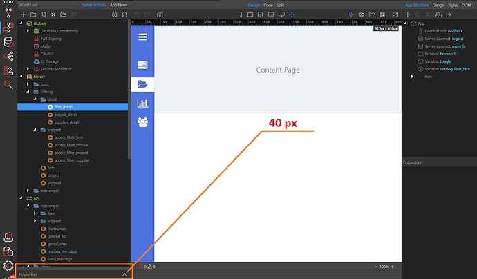
Look, I collapsed the old functionality, and it became a small panel with a height of 40px:

What objective value is there in the fact that it will disappear for you?

For my part, I can clearly formulate the loss and it is objective: - in some routine processes (I emphasize not in all) I'll spend a lot more time without the old functionality. This is objective and it can be measured.

I voted for tabs. And my vote was still in favor. They will definitely make the work more efficient and I am always in favor of the Wappler expanding its functionality. But I just don't see the point of giving up the old functionality, because this giving up is objectively harmful, but does not give any profit from my point of view.

Not to me as I already explained in some posts above. I don't care if it stays collapsed. It's still bad UX to mix design patterns. And it will be a nightmare for new users and for learning materials as also explained above.

You are thinking in your workflow. I'm thinking in mine and new users' one.

How will you explain this to a new user?

It seems to me extremely rare that duplication of functionality in the interface leads to a nightmare. In such cases, users chose what suits them best. What usually leads to a nightmare is what is missing, but what is very necessary.

To answer your question, the explanation is extremely simple. To description and explanation of the functionality that already exists, add descriptions of the new functionality that will be based on the tab. The user will choose the most suitable option for their purposes.

I find having the Server Side stuff on the left and Client Side stuff on the right. It makes sense. So mixing the tabs where they contain both might make it harder for new users.

For this reason, I still think App Flows should be on the right next to App Structure… but that’s probably another conversation :wink:

That's a workaround and still bad UX because you are mixing design patterns. You are forcing new users to read documentation because you have a bad UX(unintuitive in this case).

The user will choose the most suitable option for their purposes.

This is not always good. And in this case I believe it's not. Sometimes things are done by design.

The new user will have to read the documentation anyway, otherwise they won’t be able to start working. It doesn’t matter how the functionality is implemented. So reading the documentation is not a consequence of poor UX.

Also I don’t agree that mixing the design in this particular case is a bad UX. My opinion is based on the fact that in this particular case, the two design patterns do not duplicate each other completely, but expand the functionality.

I don’t see an option for a more efficient implementation of quick access to view the content of a server action and edit it than the way it is implemented now in Wappler 3. Tabs in Wappler 4 give extreme efficiency when working meticulously on specific server actions. Therefore, my opinion is that the combination of the Wappler 3 and Wappler 4 approach is an extension of the functionality, but not its mixing.

1 Like

We will have to settle down on agreeing to disagree.

1 Like

So be it. :slightly_smiling_face: Cheers! :beers:

1 Like

Sorry Jon to disagree but the only one who doesn’t stop making noise is you. If you look at the number of responses you are ahead of the curve, you might have to realize that underestimating what the other says by saying things like “tunnel vision” “noisy minorities” only makes you look like someone who lacks self-confidence. If I were you and fortunately I am not, I would try to speak with more respect to those of us who have a different opinion on this subject. This is not about win or lose. It cristal clear u want this like a baby want a candy! Just stop crying about it hahah. If wappler is going to be more efficient good for all of us and not only for 20 votes who litterally are less than the 5% of the actual wappler users.

I personally tried that feature in chrome only once, but on a day-to-day basis I don’t use it, because it would create more work, having to organize the tabs into groups. I sincerely believe that something that has been working very well until now is getting complicated. As some have already said, I think it would be best to leave both options, since in small monitors, it is better to have a full tab open but in large monitors productivity and efficiency are lost. I think that one of the points in favor of Wappler is to be able to carry out programs more quickly and efficiently, opening, grouping and closing tabs only slows down the workflow.

1 Like

I couldn’t have laughed more at this reply :joy:

If you had actually read all my posts in this thread you would realize how wrong you are about me in your comments. But you do you.

Unless something major happens I am already getting tabs. I proposed this feature weeks ago and it seems it was already planned as to how quickly it was implemented.

I also proposed a few days ago privately to george to open these topics requesting for comments from the community before developing major changes because a lot of good ideas and concerns could come out of these discussions(you’re welcome).

If you read all my replies thoroughly you will understand that I was proposing at first how to handle effectively both options as you are requesting. Because I personally don’t mind if you would like to keep the old functionality even if it’s a UX aberration. People like pineapples in pizzas after all.

It wasn’t until later that I changed my mind because I realized that this change will not just affect us current users but also future ones that don’t know anything about the UI and already find it difficult to navigate.

Having both options as you propose is bad UX and will just confuse new users. It won’t confuse us because we already know the UI as the palm of our hand. But it will be a nightmare for them.

Maybe you don’t care about new users but I personally do as I am pretty regular in this community and provide help to people. And because of that I would rather avoid seeing and having to reply in the forum to dozens of posts regarding how confusing the new UI for SC is.

Your post was pretty petty, didn’t add much value and it just seems to me that you were just projecting. Furthermore I had to write this post that doesn’t add value either to this thread to clarify how wrong you are. Something I could have skipped if you paid good attention to my posts.

Again you’re welcome for having this post to reply to although I would appreciate that if you have anything related to me you took it via PM so we can keep this thread for what’s it meant for.

I think George already came up with a good solution as a preview tab which would provide a good middle solution for those who want immediate access to an SC with compromising UX and new user’s experience.

Sorry @JonL too large to read and i have so much to do :slightly_smiling_face: may be same day i will read it. Peace out :v:

Out of interest why would the Wappler 3 menu be needed if split tabs are implemented at some point I don’t see it doing any harm to have both at least for now though unless any big changes in the future mean its needed in tabs only

1 Like

What do you refer to with Wappler 3 menu?

The doubling up server actions area this would be solved by the split sections if implemented in to Wappler 4

1 Like

That would be one possible solution indeed. There are probably dozens of alternative solutions to the problem some users see.

It’s just a matter of brainstorming them between all of us as you are doing.

I believe a combination of split tabs, command palette to change quickly between tabs, tab preview and removing additional clicks from modals should be more than enough to make people equally or more productive than having to maintain the old panel. A few disagree.