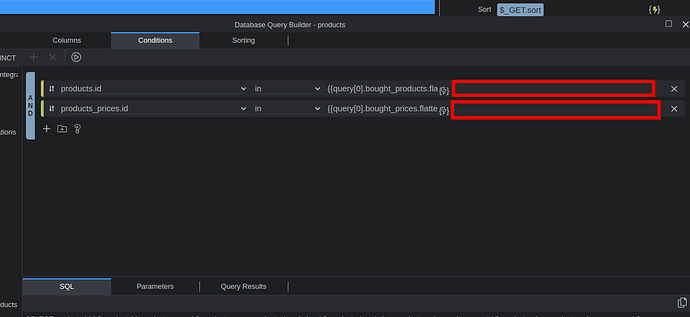
Can we have this input field be responsive and take the width it has available?
Fully agree that short input for expressions in Conditions sometimes become a problem.
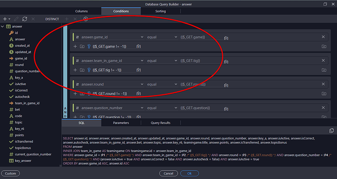
And the same applies for “condition input”.

Making it max width is an obvious solution.
But it brings a new problem.
The binding button is one of the core elements that the user interacts with here.
So for quick and comfortable work it has to be as close as possible to the main working areas of the screen: center and left side.
If we extend the input to the max, this design rule will be violated.
And also, it places a binding button near the buttons for deleting nodes/groups, which surely gonna bring some misclicks from time to time. 
So the best decision in my opinion is to extend the input, but at the same time move the binding button to the left side of input.
But of course this will break the consistency of all Wappler UI, which is not good. (but still worth it, in my opition)
.
In general, I think that moving the binding button from the right side of input to the left side all over the Wappler UI would be the right thing to do and will drastically increase the speed of development, because there will be less eyes and mouse movement.
But I never even dreamed of convincing anyone of the advantage of this measure, so I never proposed this. 
As always, you think the UX solutions through really well. I really hope the team takes your advice seriously.
I would love to see these changes.
HUGE bump - this is likely a small change that can make a big difference 


I agree that this would make a big difference to the UI, throughout Wappler. However, I imagine it can’t be a small change. While it’s been requested - and tweaked - several times, it’s never really been resolved.
Requests for this have been made more or less since Wappler was released, eg:
Expandable input fields in the elements properties (2018)
UI issue: difficulty using Actions panel (2018)
Increase properties field width (2019)
Server Connect properties width (2019)
etc…
Some of these requests were closed (prematurely), which I suppose made it less likely for the issue to be revisited. It may be that the issue has not been understood/appreciated, but perhaps it’s more likely that it’s very difficult to resolve in a satisfactory way.
I really do appreciate that there could be a broader task to improve the overall layout, which may need careful consideration but, in the short term, addressing the width (filling the available space) will, IMHO, be far more beneficial than leaving it how it is. Having the binding lightning bolt slightly further to the right is well worth being able to see more of an expression.
Longer term, I agree with your previous comment that the binding lightning bolt should be to the left of the input so it is in a fixed, easily-accessible position.

