Paths to specific elements can quite easily become very long. Eg you might want to set the value of
a form element inside
a server connect form inside
a modal inside
a data detail component
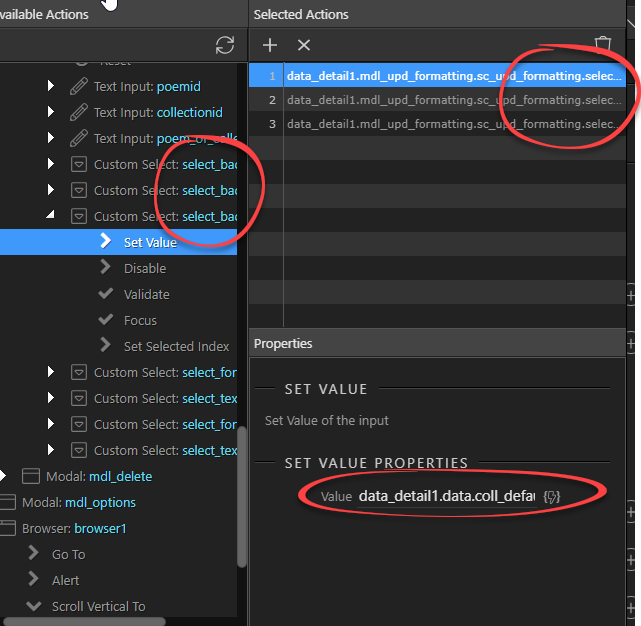
… so one action might be: dmx-on:click="data_detail1.mdl_upd_formatting.sc_upd_formatting.select_back_colour.setValue(data_detail1.data.coll_default_bgcol)"
In this case, I need to set a series of these. The task is made difficult due to the fact that I cannot see any of the relevant parts properly, without scrolling or hovering over text for each one:
… which makes this aspect of the UI very frustrating. I’ve started to rename various elements - eg changing ‘update’ to ‘upd’ - and shall probably do some more, but even with more concise naming, the actions panel in its current form will frequently be frustrating to use.
Would it be possible to have an option to widen the action panels, or perhaps even have a button to maximise this section to full screen, like some similar panel (eg in server connect), with wider fields etc.?
I shall use code view to continue working on this, but it could be quicker, and more reliable, to use the UI if it were made more flexible.
There are quite a few similar issues, some of which have been mentioned before. Eg it’s frequently not possible to see all the class names applied to an element. As the power and potential of Wappler becomes more apparent, issues like these become more serious.
True! I thought about the same and maybe there are already solutions for long pathnames. Maybe exact matching path names could be shortened to smth like […]
As you say, I think it could be useful to be able to shorten long path names - creating aliases to them - but it might add a layer of complexity which might be best avoided. Also, in this case, I want to see the full names, without any hovering etc…
What I would ideally like is an option to reorganise the Actions panels - eg perhaps to keep it as it for most purposes and make it expandable for more advanced use.
Apart from the difficultly of selecting actions, it’s difficult to confirm or review the selected actions and to see what value is assigned to each action. In the example I gave, if I want to debug the events assigned to clicking a button, I have to do a lot of scrolling and resizing, and there is no way to view the whole full values which have been assigned - short of copy/pasting them into a text editor. What would make this so much easier is if the assigned values could be displayed next to actions - so at a glance, everything would be displayed with no fiddling around with the mouse or keyboard to see every action or value:
i have said this before but the team don’t think its important i guess
my request was for the input for the value is too small and its really frustrating to deal with
The issue has been marked as ‘investigating, tofix’, so hopefully the problem will be fixed soon.
I’ve mentioned it before too, in relation to the width of various (most) fields. I can see it’s a problem making the UI work on different screen resolutions etc., but if this is the case, the bar is set very low. (Of course it might be nothing to do with this.)
Great - thanks for clarifying that. I looked at one of my existing list of actions and couldn’t see any difference - because there weren’t any. The change only applies to new actions (reasonably enough).
Now that the path is reduced to such an extent, is there any possibility that objects with the same names could be mixed up (ie objects which wouldn’t necessarly have unique IDs)? Do we need to take any more care in naming objects? Also, will it matter if the old and new styles of action paths both exist on the same page?
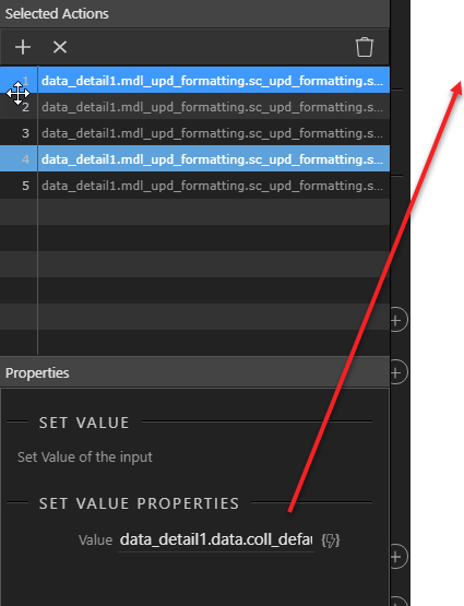
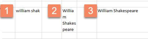
The shorter paths certainly make things much clearer when selecting actions. The code generated is also much more concise. However, assigning values is still a problem - here and in many other cases throughout Wappler.
The great improvement in action path length is apparent in the screenshot below. I’ve added the same action twice - old then new versions. The problem in assigning values is also apparent.
The value I’ve selected is not fully visible without using the mouse and/or keyboard - there isn’t even the ‘hover’ option which is available with the actions. This is a minor inconvenience if you’re assigning a value to a single option, but if you’re assigning many, it’s quite difficult, prone to error and difficult to check. If I need to check something, I usually copy/paste the value into a text editor where I can see it clearly. It would be great if there were no need to do this.
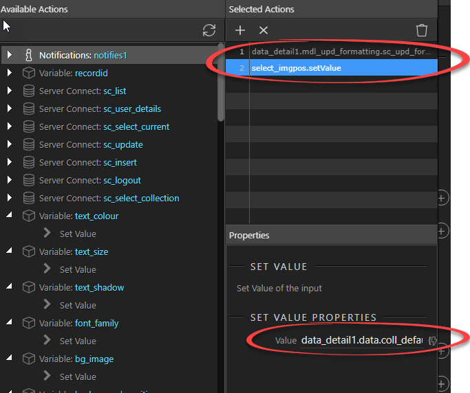
I appreciate the improvement, but at some point perhaps you could consider more changes - eg widening the whole panel, fields and ideally, displaying the actions and values next to each other, with a full screen option.
The left side of the panel would also be much easier to use if there were more space. Typically it opens as in the screenshot with a long list of options which I probably don’t need (I don’t know why the variables are usually expanded), requiring a lot of scrolling and tree-navigation to get to the relevant object. Working in the actions panel feels quite claustrophobic - and I would love to be able to escape.
Double-clicking actions to select them is very helpful - thanks. However, one would expect double-clicking an action on the right-hand panel to remove it, but it doesn’t. It would be helpful if it did. I often duplicate buttons etc. and then need to remove items as well as add them.
@mrbdrm how big should this field become? Should it be multi line,or what?
What if field big enough for your workflow is not enough for other people with huuuge expressions?
So what if your expressions need 2 lines and there comes that guy whose expressions need 15 lines.
Should we change that every time someone creates a strange, large expression that is usually not needed?
From what i see 90%+ of the users here do not even need 2 lines for the expressions they use…
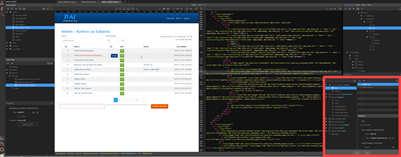
I would have thought the issue is that the area for the action panel is simply too small. Obviously there is variation in screen resolution, but I expect in any case, the action panel will take a small proportion of the screen. For me, it looks like this (action panel shown with red border):
If this panel were several times wider (optionally) - or could be made full screen - then the problem would largely be solved. Is there some technical reason that makes this difficult/impossible? If not, I don’t understand why you’re discussing the number of lines there could be in a field etc… It would be very awkward to see long paths to an object on multiple lines anyway (though perhaps better than not seeing the whole path at all).
Hi Tom,
I get your point, we can make the UI 1920px wide, then comes the user who is using a 1200x800 screen resolution - and that is a problem then… The action picker dialog is currently the optimal size which fits well ALL screen sizes, and you will be amazed how many people are using some strange screen resolutions.
As i explained - we are going to see how could this be improved.
As I said, I appreciate the issue with screen sizes, but where you have provided options to use full screen - server connect, query builder, file manager - presumably screen size is not a big issue. I would have thought the action panel would deserve this treatment too, as long as the lines will be correspondingly wider.