The Swiper component in Wappler is a modern, touch-friendly slider which can be used with any content. It includes different options like 2D and 3D transitions, parallax effects, touch interactions, different color themes etc. In this tutorial we will cover the basic options of Swiper.
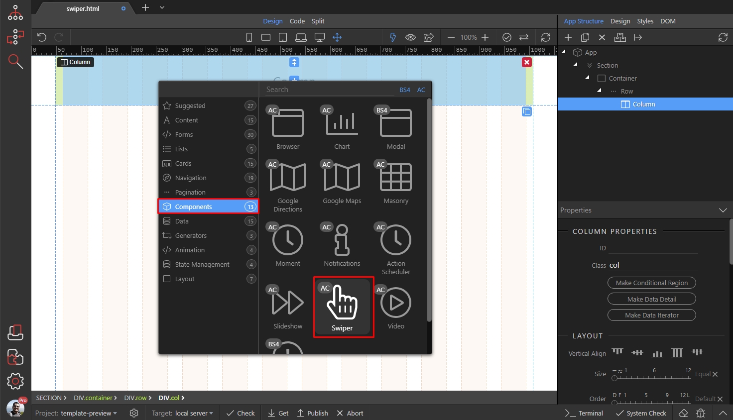
We started by adding App Connect and Bootstrap 4 on the page. Then we create a simple layout containing a bootstrap container with row and column. We will insert the swiper in the column so click the add inside button:
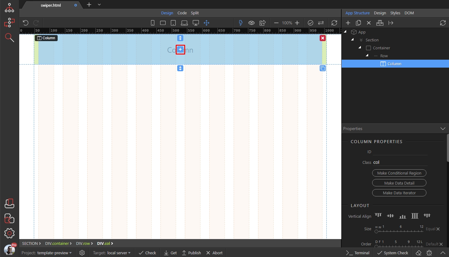
Then open the components category and select swiper:
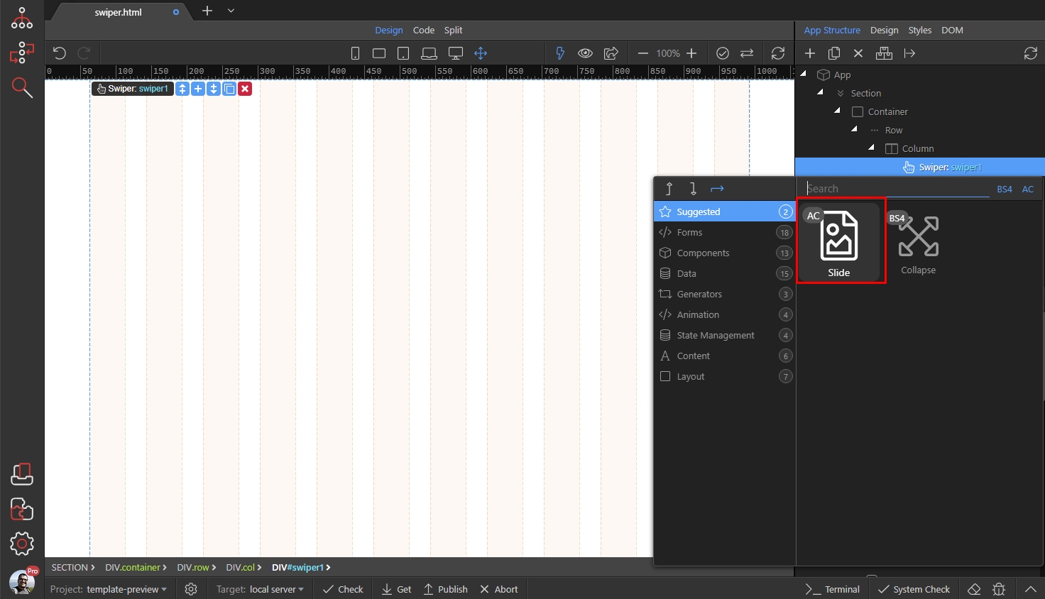
The swiper is now added on the page. Let's add a slide inside it first, and then we will setup its options. Right click the swiper component in app tree, and select Slide:
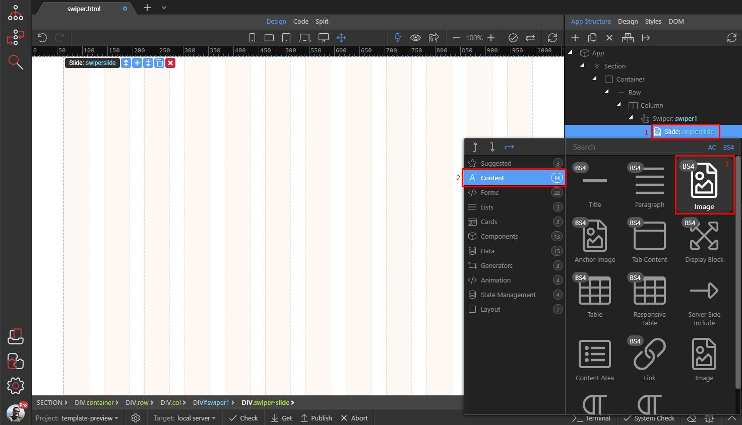
We will show you how to create an image slide - i.e. slide containing a responsive image. Right click the slide(1) then open the content category(2) and add image(3):
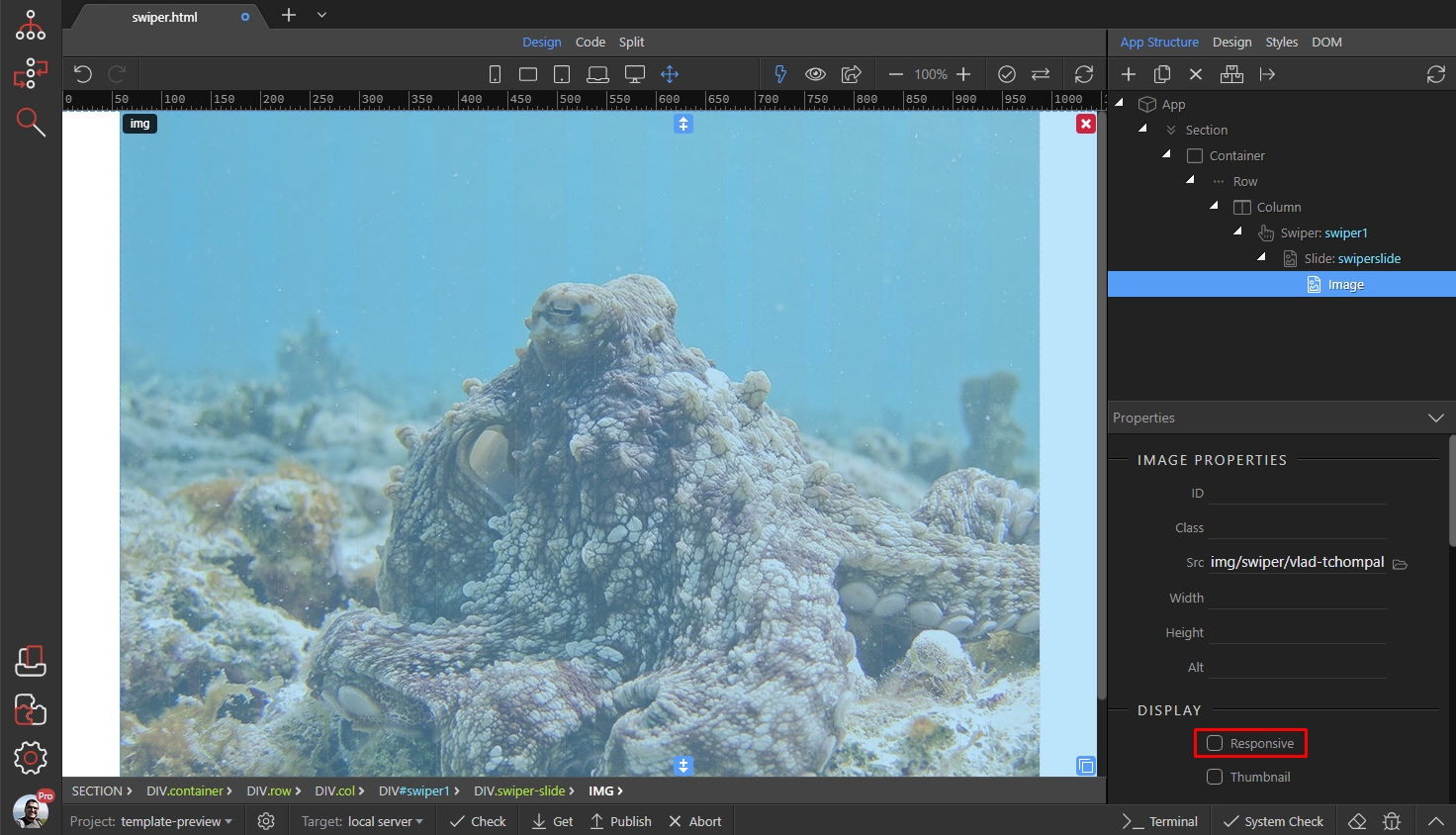
Select your image source:

Then make sure to turn on the responsive option:
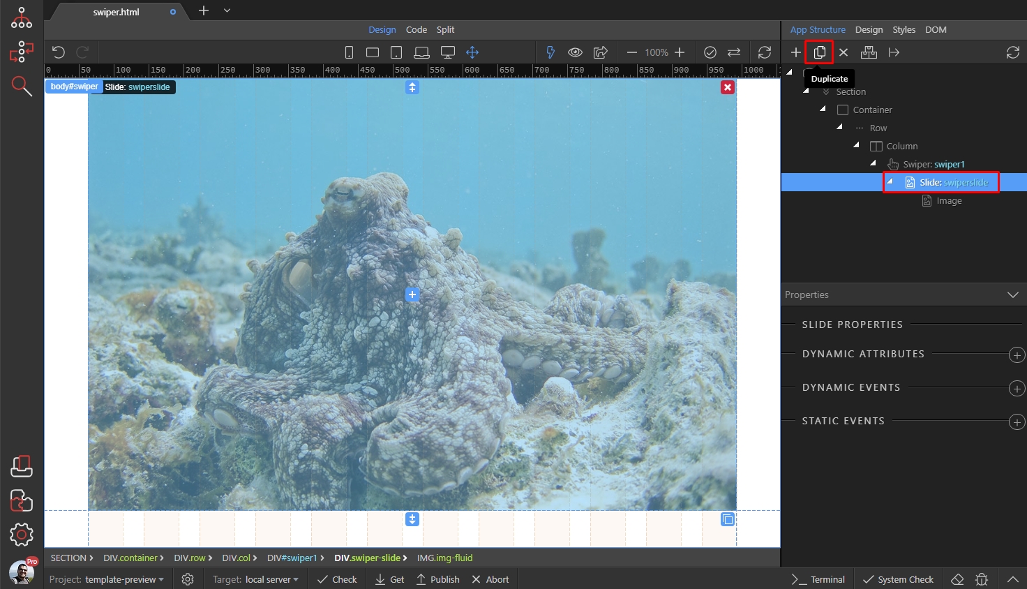
Your image slide is done. You can add as many slides like this as you wish. You can also use the duplicate button, to duplicate a slide and then just change the image source:
Now, as we are done setting up our slides, let's take a look a the options. Select the Swiper in the App Structure and you will find its options in the Properties inspector:
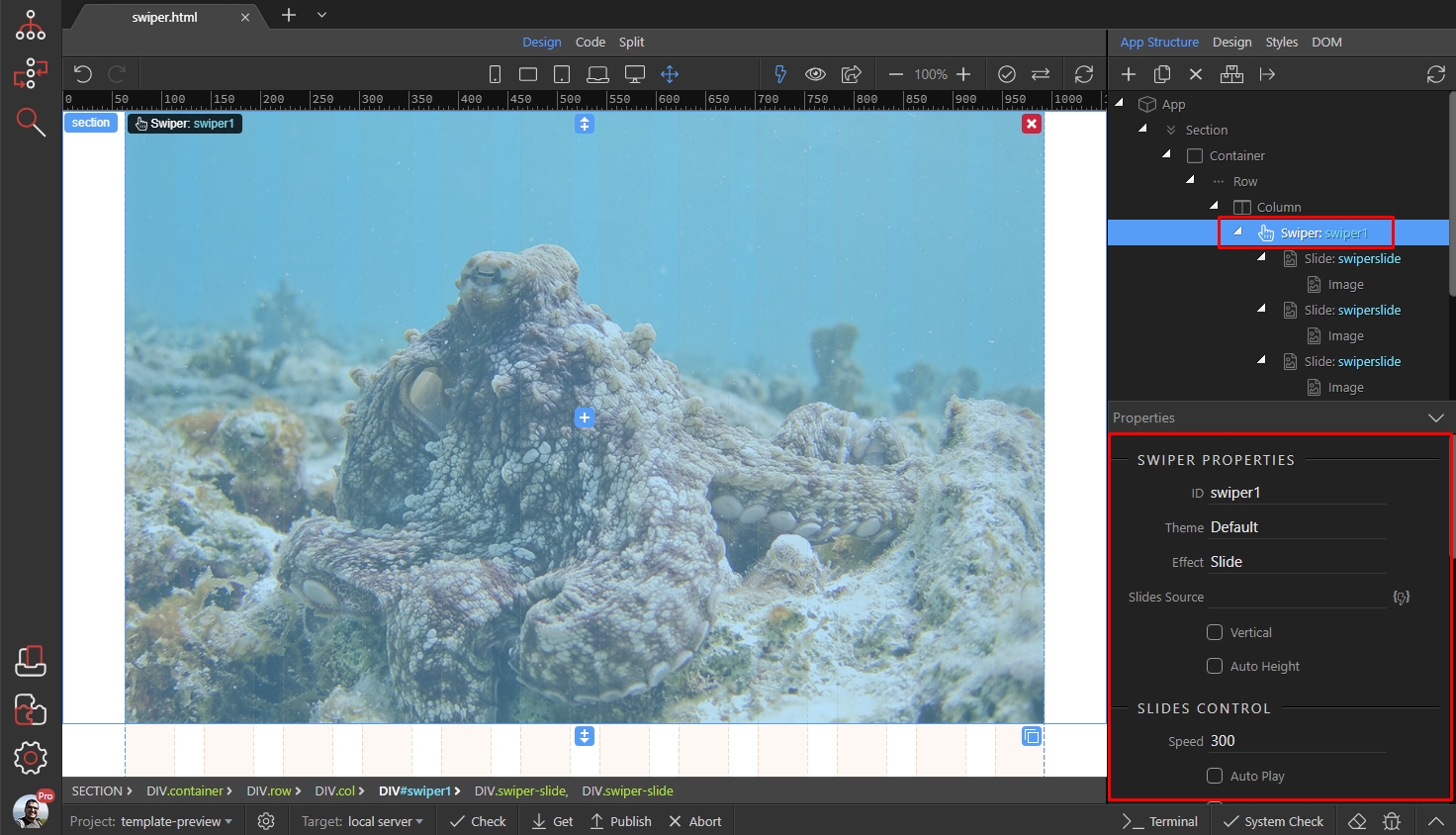
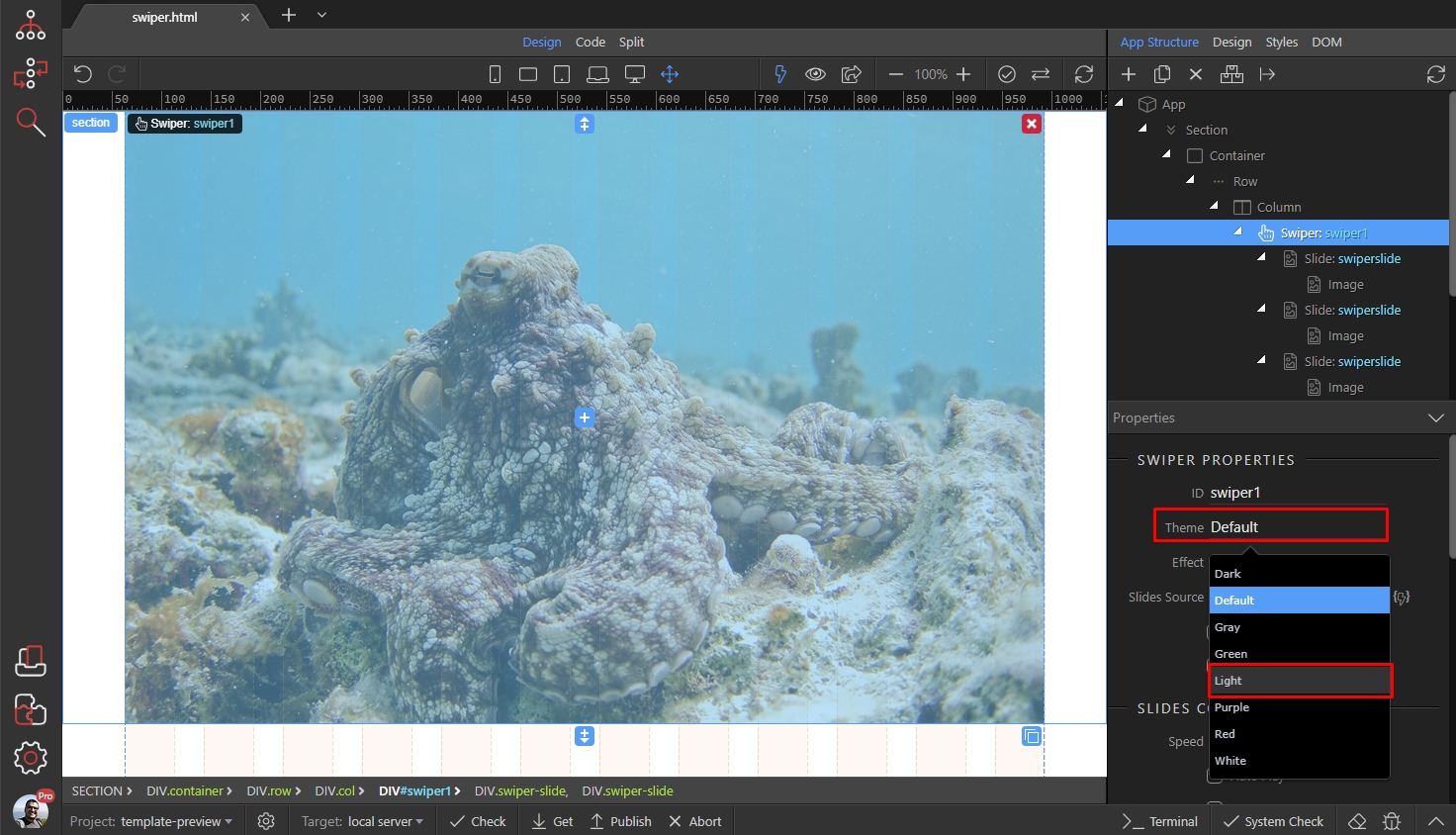
First, choose a color theme from the theme dropdown. There are 8 different themes available and we select the Light one. The themes style the navigation arrows and paging (if enabled) and they don't affect the slides content:
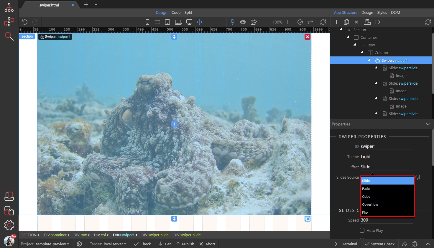
There are 5 transition effects available. Two of them are 2D transitions (fade and slide) and three of them are 3D transitions (cube, coverflow, flip). You can experiment with them in design view. We select the "Coverflow" effect as we like it the most 
There are two more options here - Vertical and Auto Height. Enable vertical if you want your slider to scroll vertically instead of the default horizontal scroll. Enable auto height, if you are planning to use slides with different height or in this example if you are using images with different height in the slides:
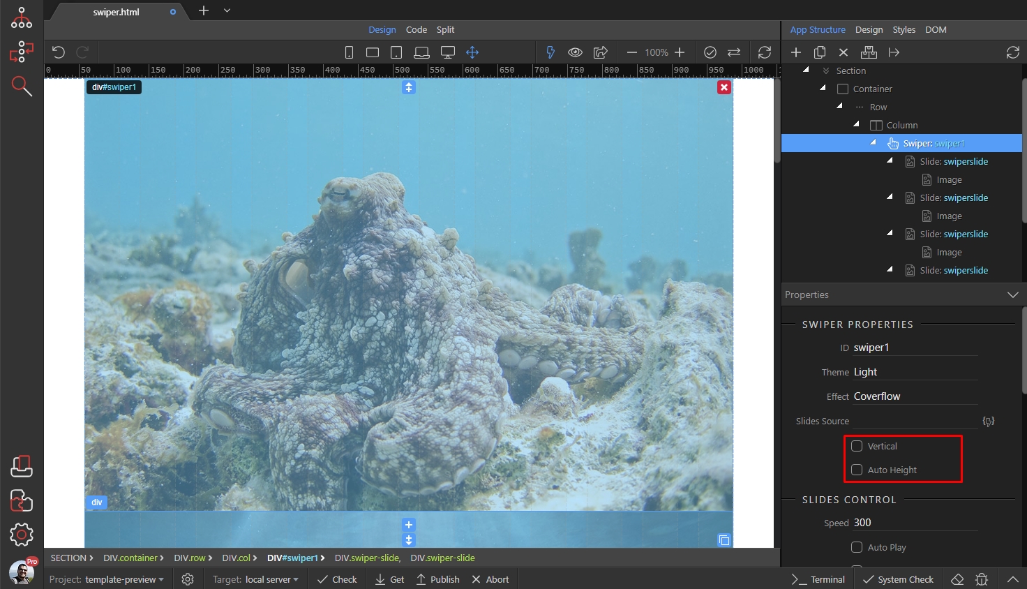
We leave them as they are, as we want horizontal scroll and our images are all the same size.
Scroll further down to the slides control. Here you will find options related to your slides and transitions between them:
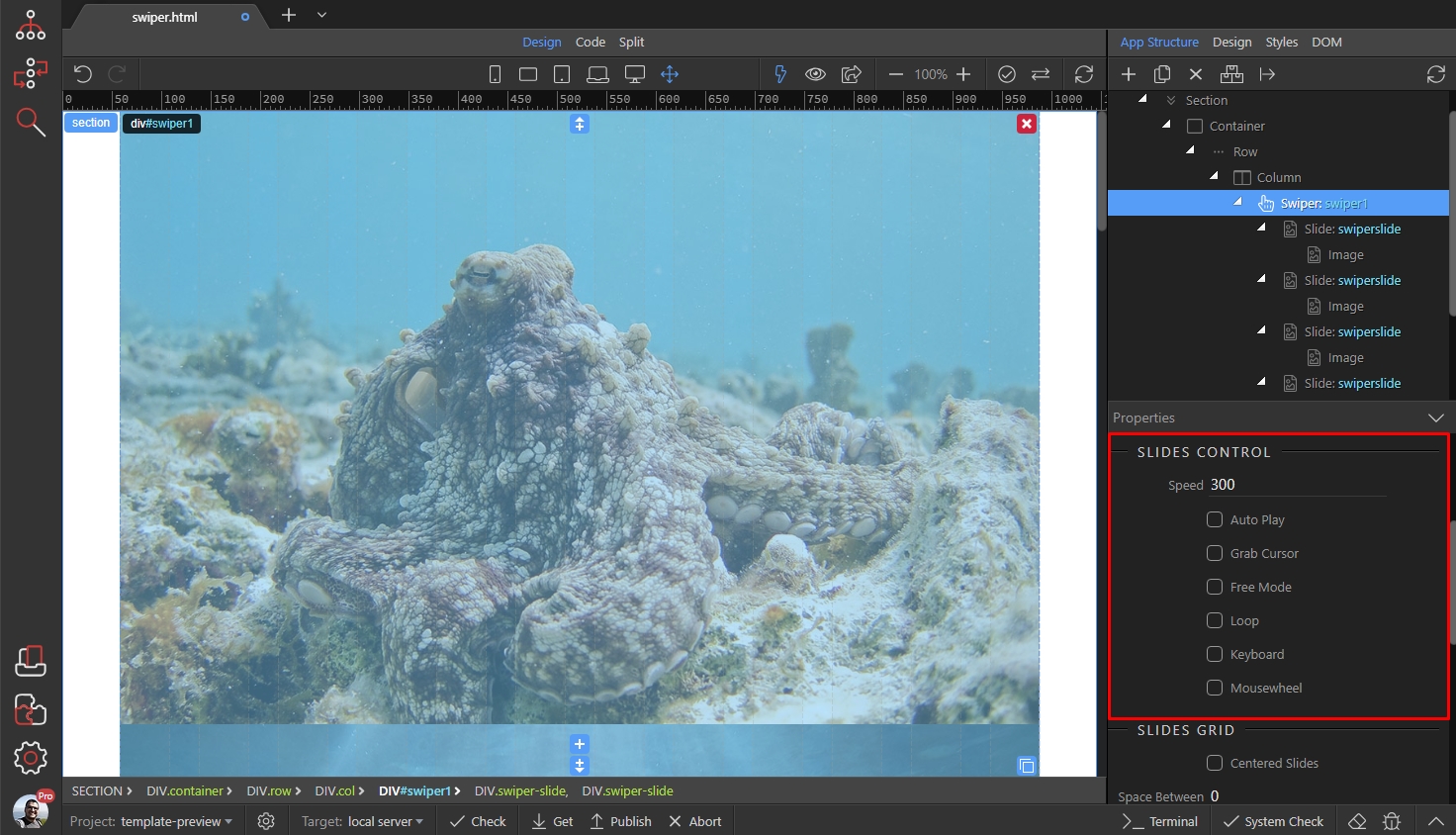
- Speed - this is the speed of transition between the slides in milliseconds. The default is 300
- Auto Play - when enabled the swiper will auto play on page load
- Grab cursor - on desktop it shows a "grab" cursor when you hover the Swiper
- Free Mode - enables free swiping through the slides, so the slides won't snap to the Swiper view. This way you can have half of the slide visible, half hidden.
- Free Mode Sticky - only available when Free Mode is enabled. This option allows freely swiping through the slides but will snap the slide to the swiper view.
- Loop - enables continuously loop mode, so when on last slide you click/swipe to the next slide it will show the first slide.
- Loop Fill - only available when Loop is enabled. It fill groups with insufficient number of slides with blank slides.
- Keyboard - enables navigation through slides using the keyboard
- Mouse - enables navigation through slides using the mouse wheel
We enable the Loop and Grab Cursor options. We also set the transition speed to 600:

Scroll further down the properties inspector and you will see the Slides Grid options:
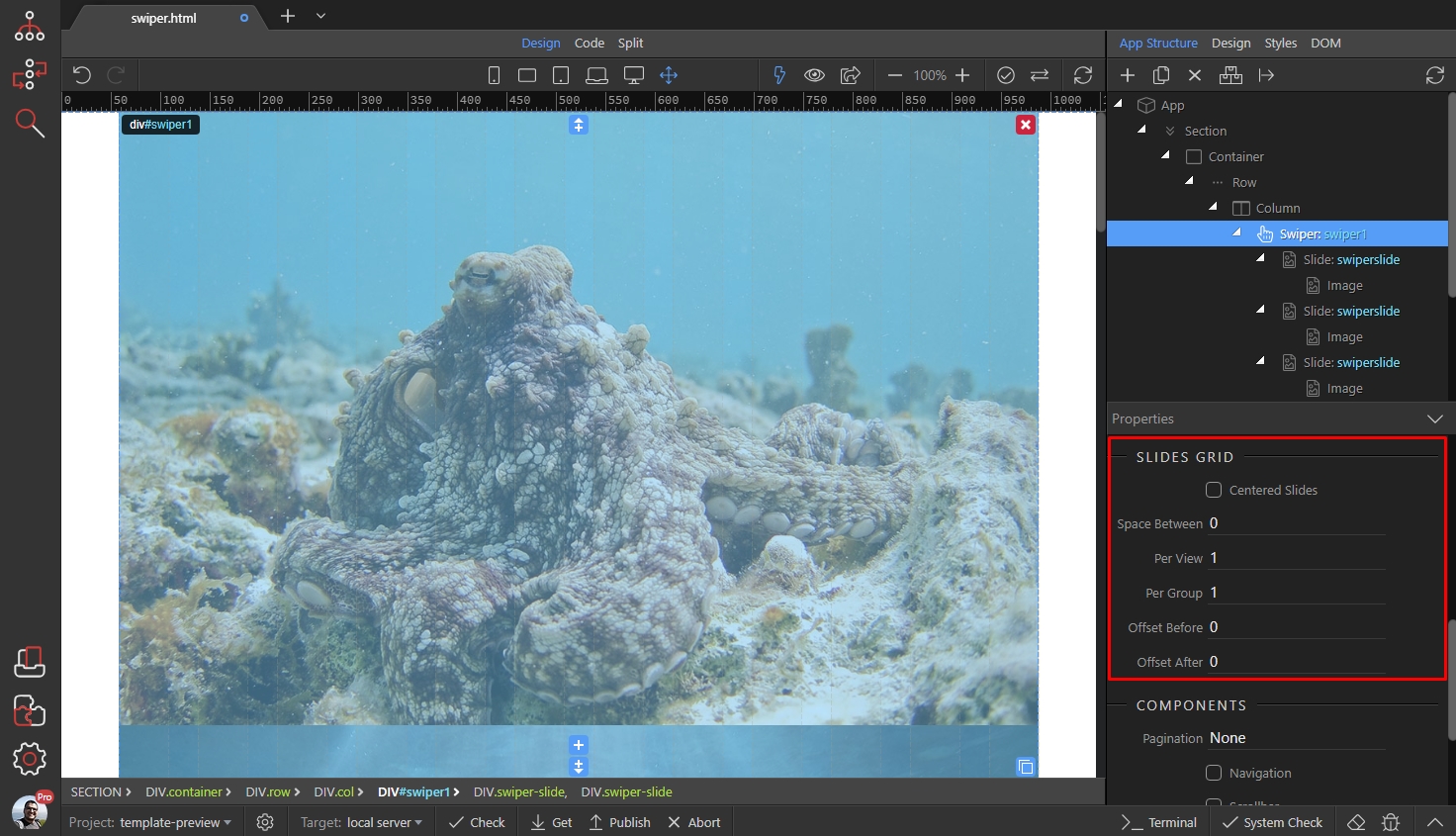
These options allow you to arrange your slides into a grid i.e. show more than one slide in the Swiper view.
- Centered Slides - allow this option if you want to have your active slide in the center, instead of snapped to the left side of Swiper view. This works when you show more than one slide per view.
- Space Between - the space between slides, in pixels
- Per View - how many slides should be entered in the Swiper. Use auto or a numeric value here.
- Per Group - you can group your slides, so that when you swipe through them, they will slide per group. Example: if you have 3 slides per group, when you click next it will scroll by 3 slides
- Offset Before / Offset After - this is the offset before and after all the slides, in pixels
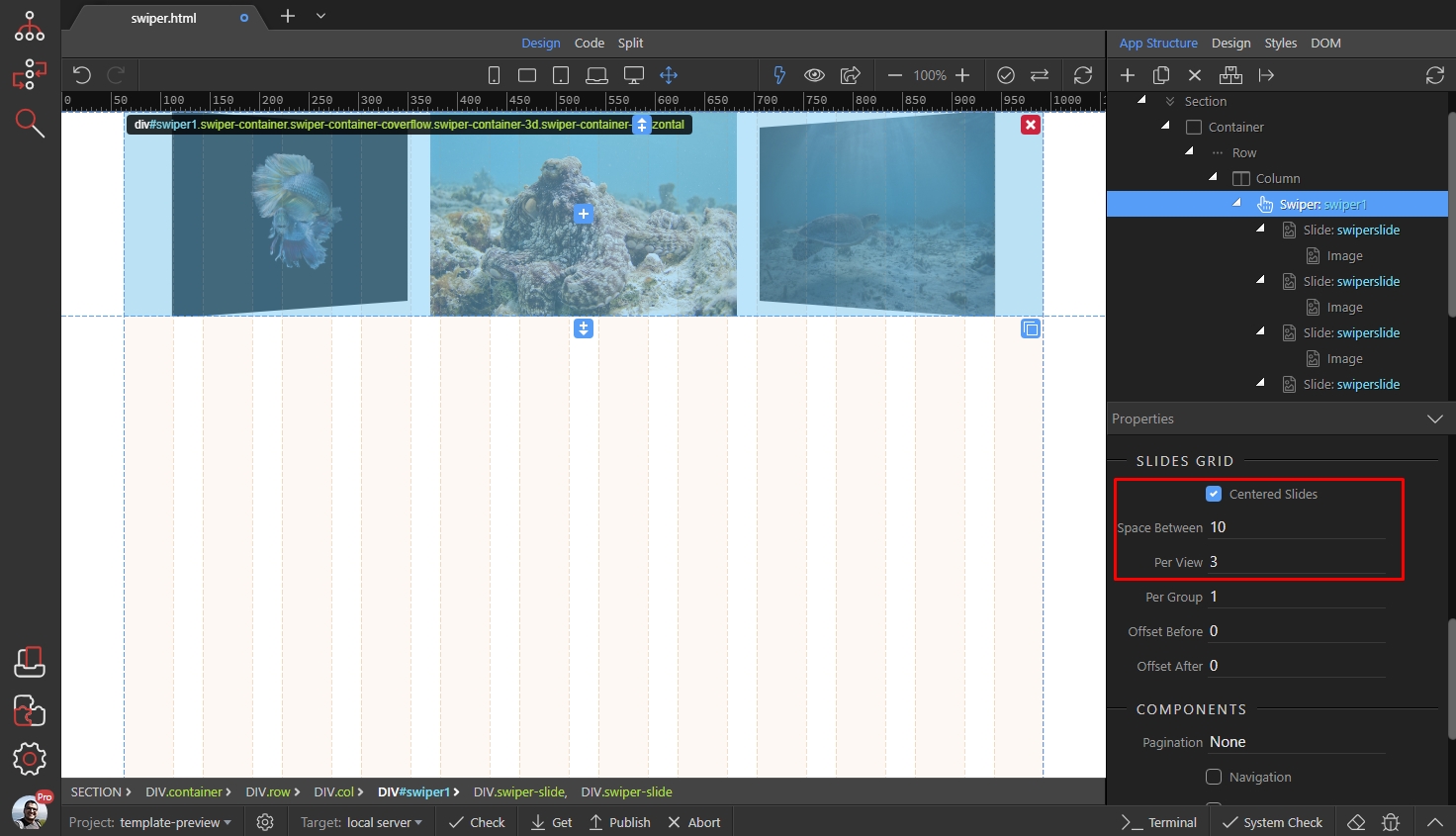
We enable Centered Option, set the space between slides to 10px and set 3 slides per view:
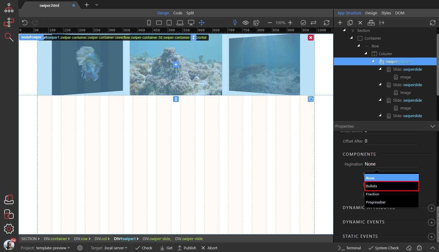
We enable pagination and set it to bullets:
And lastly, we enable the navigation arrows:

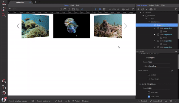
That's all about the basic options. Here's a preview of the results: