I don't find a lot of attention in docs so far to the Bootstrap Slider template in Wappler.
I'm hoping some experts can point me in the right direction between Bootstrap Slider Template and Wappler SWIPE to get my desired output.
Ideally it would resemble this layout when done --

I want to adapt a friend's page to use a Carousel-type Slider and DUPLICATE what they like already but with more sophistication from Wappler.
Their html page is a bare-bones half page width (six out of 12 column width) slider on the right hand of a text column.
What they specifically like in their current page is that there are thumbnails below which can also be clicked to bring the larger image immediately into the Slider.
The Slider shows 1 slide with the Next and Previous translucent Arrows PLUS
the thumbnails mini-slider to pick navigate to that matching large image.
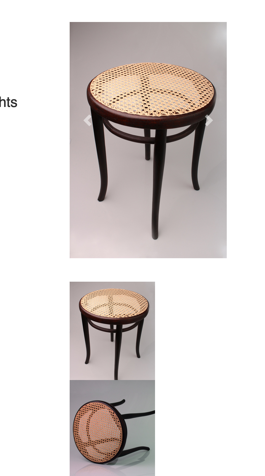
And if a Slide is not as high as another slide it will be displayed at the shorter height in the Slider or Carousel.
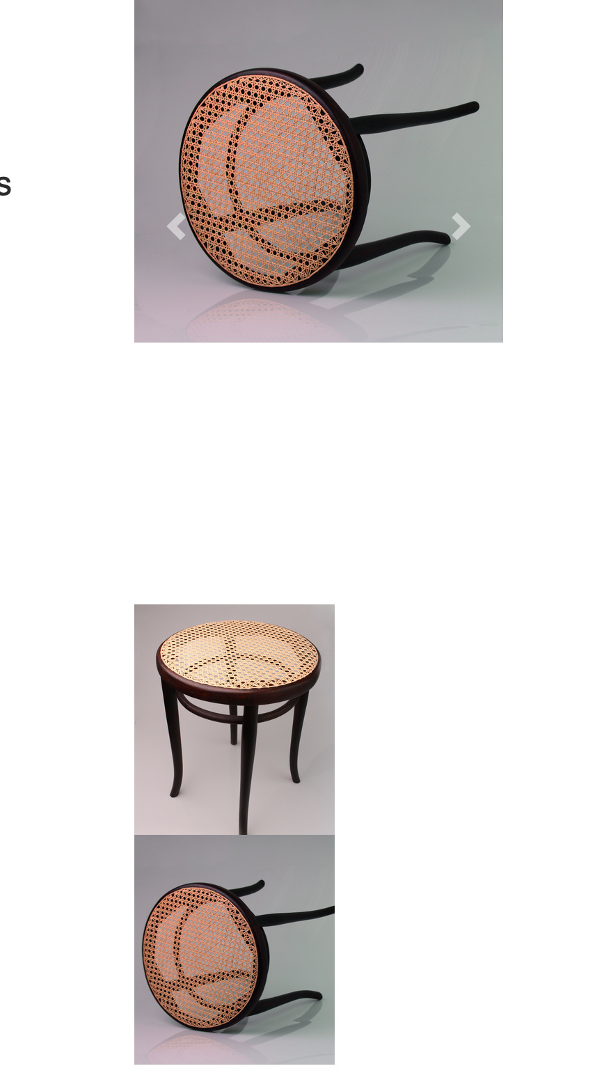
So the height for each slide is what varies, not the width, as is usual. I've cropped each large slide to 800 px width with 1 slide higher than wide.
I have experimented with the Slider component in Wappler & created a slider which is "responsive"
But to create 2 sliders -- the full-size image & a mini-slider of the clickable thumbnails -- I'm looking at the SWIPER, too, if it has more options --
Which direction -- Bootstrap 4 Slider or SWIPER, is more likely to allow me to create the slider effect I'm trying to duplicate?
With an image that is higher in pixels to show its full height while a shorter image displays perfectly, too.
Thank you for suggestions or a relevant tutorial!