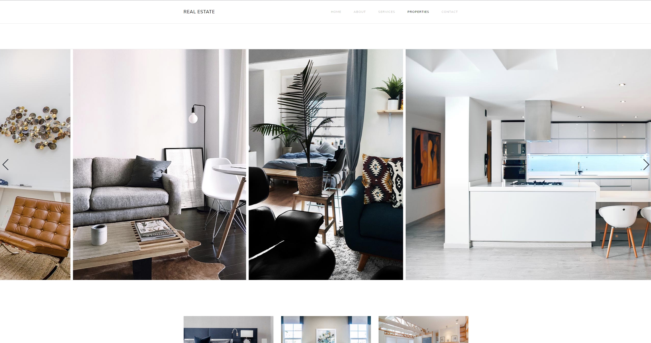
For this showcase we used App Connect Swiper in order to create a full-width image slider for a real estate page. The transitions are set to slide and we use images grid, set to ‘auto’ so that it looks great on all screen sizes. Navigation arrows and paging dots are enabled.
Nice Demo @Teodor, is this a preview of you apartment?
Haha, that’s just my vacation house, Paul 

1 Like

Great, this is what I have been looking for for a long time. Compared to this, the former slideshow is rather boring and primitive. I will have to work it all out.
In the DMX Zone info I have also learned that a wonderful parallax transition for titles and paragraphs is possible. I am already eager to get started with this.
Thank you Wappler. 
1 Like
I like the new Swiper component very much, but there is a particular feature I’m confused about.
Typically, quite a number of images might be displayed on desktop and perhaps only 1 or 2 on a mobile device. Ideally, I would like the SLIDES GRID properties section to have responsive options - allowing for different values depending on the breakpoint (eg to control number of slides, space between etc.). As it is, is there anyway I can use a variable for this attribute for example:
slides-per-view={{variable}}
?
I was thinking I could use the browser component to determine how many slides shoud appear.
I notice the Real Estate demo works similarly to the above by using some extra CSS rules - eg by adding a media query to specify the height on smaller devices. It also uses “auto” for the number of images. I tried adding “auto” but it didn’t seem to work.
Is there a correct way to make the swiper responsive in this way - ie where Per View can be set to ‘auto’ or made dynamic?
1 Like
Hi Tom,
‘auto’ will work(dynamically) if your slides are not as wide as the swiper view. I.e. if the slides are 600px wide, and on desktop the swiper is 1440px wide then you will see more than one slide, and on mobile it will fit only one.
Maybe in the next update we can add responsive options similar to what is currently set in the masonry component. Will this work for you?
Hi Teodor,
I’ve just reminded myself what the masonry component responsive are - and I think having these options for the swiper would be perfect. From my point of view, it would it make it a lot more useful.
(In the meantime, am I correct in thinking there isn’t a way to add a dynamic value (eg using a variable) to the ‘slides-per-view’ attribute?)
No, but you can use auto as a value.
We currently do not have the dynamic pickers in the UI, but try dmx-bind:slides-per-view="browser1.viewport.width < 768 ? 1 : 3". You need of course a browser control with the name browser1 on your page to make it work, it will show 1 slide for mobile and 3 slides for desktop.
3 Likes
That’s great. That works perfectly. It seems it’s possible to control all the attributes like this so I can get it exactly as I want. Thanks!
1 Like
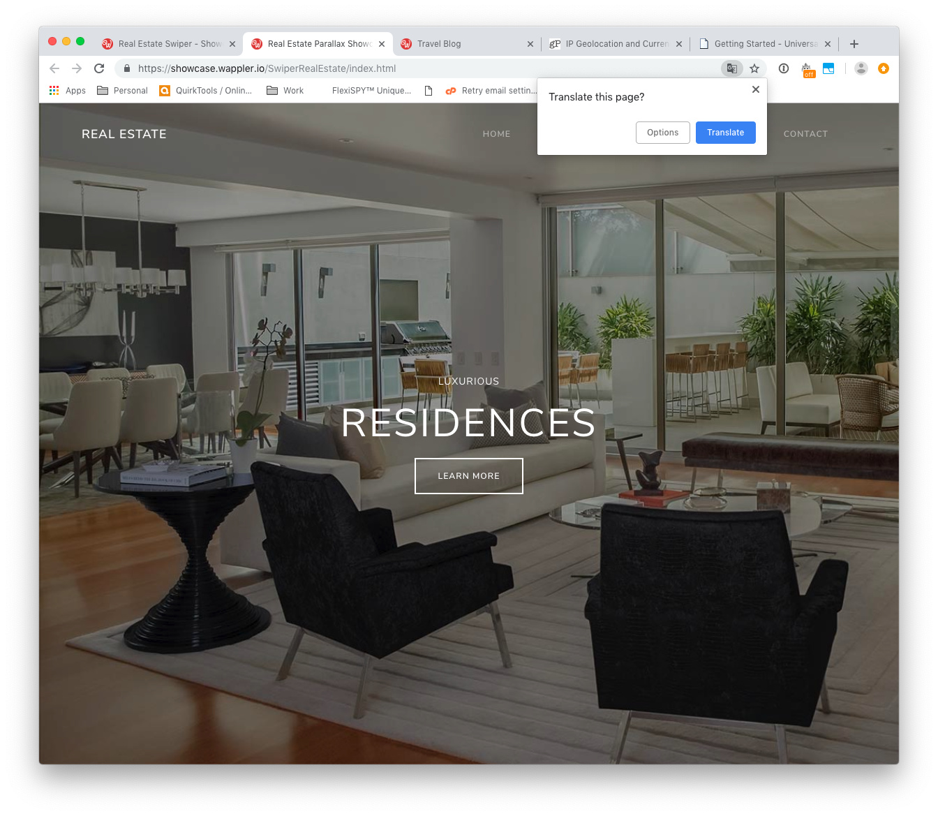
Hi @Teodor how do you get the navbar to be transparent on the picture yet white on everything else. Is there a tutorial for this?
Please check the following tutorial, it’s the same in Wappler: https://www.dmxzone.com/go/33281/styling-elements-on-scroll
Just an observation @Teodor, that will not really make any functional difference.
Due to all the “Lorem Ipsum…” placeholder text my browser throws up a translate from Latin to English, maybe you could set the language to english manually so it does not happen.
What browser are you using?
Never seen such a behavior - all my browsers are set to English and never ask me to translate any of the showcases.
This is in Google Chrome 70.0.3538.77 (Official Build) (64-bit) on Mac OS Mojave 10.14.1
EDIT: Also tried in Google Chrome Incognito Window and it also did that.
Strange, not happening here (win 10). And I’ve seen translation suggestions on German sites for example
But actually changing this to English will cause issues for people using browsers in their native languages, so probably we will never have 100% satisfaction.
I see google understands a metal tag for disabling translation, maybe it will help for the showcases:
<meta name="google" content="notranslate" />
When we recognize that the contents of a page are not in the language that the user is likely to want to read, we often provide a link to a translation in the search results. In general, this gives you the chance to provide your unique and compelling content to a much larger group of users. However, there may be situations where this is not desired. This meta tag tells Google that you don't want us to provide a translation for this page.
1 Like
Very true, probably fix it for one and break it for the rest, as I said it is really not a big deal anyway, just wanted you to know, by the way it does not happen on the Travel Blog Showcase so I am pretty sure it is just due to the amount of Latin text on the Real Estate showcase.
1 Like
Hmm that is an interesting meta tag, if you decide to try it let me know so I can test it on my side for you.