1.8.2 Design Panel - working strategy

Hi,
Continuing the discussion from Wappler 1.8.2 Released:

Properties set by design panel are now added as a style tag in HEAD section. Hence, the existing styles are not showing up in the Design panel, as @Webjack357 has reported.
Is this a good code design in terms of page load times/speed?
Also, this is creating overlapping CSS - one in in-line style via Styles Panel and one in page-level style via Design Panel.

Here’s what I suggest: Instead of making style tag in HEAD, user could be prompted to create/attach a new CSS file, if not already present in the styles panel. And all changes in design panel will then affect that file.
This will remove the overlapping, and Styles Panel will show all properties - in-line, added directly to CSS file or changes made in Design Panel.

Also, in my brief period of use, I see that some sections are missing various properties.
EG: Background section is missing background position, size, repeat etc…
All properties can be found here: https://www.w3schools.com/css/css_background.asp

image

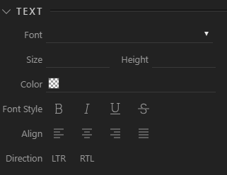
Similarly, Text section is missing options like spacing, line height, transformation etc.
https://www.w3schools.com/css/css_text.asp
image

I don’t know what process is Wappler following for inclusion of properties, but I hope to see many more added. :slight_smile:

I think if there's one thing you can be sure of with a feature like this is that there isn't a perfect solution - certainly not one everyone will agree on. I haven't used the Design panel very much, but after a little experimenting with it, I think the current solution will usually be what I would prefer.

Given the CSS which is created can't possibly be what I want, at least not always, I would rather see it generated in the section where I can easily tweak it, before finally moving it to an existing external style sheet. For example:

I select an <h1> tag and add a margin above it. Wappler will give it an id (unless it already has one), assuming this style will only apply to this specific <h1> occurence. I may be happy with the result, but more likely:

I wanted to assign an id, but I wanted to choose the name
I wanted to create a new class, not an id
I wanted this style to apply to all <h1> headings - I don't want a new id or class
I just wanted to experiment to see the effect of applying a style
etc. Wappler can't possibly know which option I want (I may not know myself)

As it is, on one screen, I can see:
the Design Panel to make the changes
the CSS generated in the <head> (which I can easily tweak)
the ids added to the tags (which, probably in most cases, I'll remove)
the effect of the style choice on the actual page - in real time
!!

As you say, it's lacking a few features, but it's pretty impressive.

2 Likes

I used very few time the design panel because for the application I develop I Just applied Bootstrap lux theme, but reading your post made me willing to explore this part of Wappler!

I forgot about the classes. That's another thing missing.

The reason why in-body styles tag design is not good is that it has zero re-usability. With the external CSS file option, the code becomes re-usable. And if auto-IDs can be changed to classes, even better.

The very purpose of design panel is to not having to go in the CSS to change it. Almost everything should be done visually. But, for those rare cases, you can just open the CSS file in second tab.

This is not how it would work in real-world. Designing is done in Design View, where HEAD is not visible. And adding classing/IDs would mean switching between views and panels, and the whole experience is not as visual as it could be.

Classes remind me of how it works in Webflow (no longer use webflow :grin:). You write the class name at the top of design panel, select it, and all changes made afterwords are stored as that class.
Need multiple classes? Write another class name, and all changes then made are applied to elements with both the classes.

This leads to amazing code re-usability and flexibility.

1 Like

OK seems I have to clear up some of our design choices :slight_smile:

Why we used ID selector instead of Class for the design panel?

Well there is actually a very special reason for this. We evaluated many use cases of the design panel, how would our users use it. Also evaluated many of the competitors use cases.

After long discussion we came to the conclusion that the design panel is used for "exceptions" design.

So things that aren't covered by already used CSS framework.
With the design panel you won't be styling global reusable elements, like H1, P tags or Card elements, you will be just adding small tweaks/exceptions to the already global styling.

With the design panel, you are actually styling just the selected elements, no global classes, no other rules - just THAT element.

We saw other tools - offering a class based styling to enforce reuse, but eventually after a while, you end up of creating so many classes that all the reuse has gone away because you were making a new class for every new minor css styling.

So to make sure that our idea of single element styling is enforced and to avoid creation of thousands dummy CSS classes - just for sinle minor change, we decided to bind it to the element ID

Don't get me wrong - you can have global CSS styles, and you already do when you use Bootstrap for example. You can also create your custom ones with the Styles panel.

But the idea of the design panel is just not CSS Classes creation but - styling the currently selected element.

We believe that structural, global styling should be done at a global level. So its place is in the Bootstrap classes/theming for example.

You can do global styling currently with the Styles panel and later on we will be adding a whole new Theme / Design System builder - that we allows you to customize global styling for all components and elements. So that uniformity can be achieved.

So I hope you understand now our design decision :slight_smile:

This would certainly take care of the code reusability point. But, please make it responsive from day one. :pray: :grin:

And the issue with too many minor CSS classes is correct, it does happen.

Going back to this point, I think this approach is limiting the promise of Wappler being a visual builder.

  1. The styling options in App structure properties panel are very few.
  2. Not everyone knows how to write CSS.
  3. The global theme/design builder would be another learning curve when its released.
    Instead of adding another panel, and having to keep switching to it, design options could be added to the app structure properties panel itself. This would make for a better visual tool in my opinion. And properties panel is expected to work only on selected element, so no confusion there.

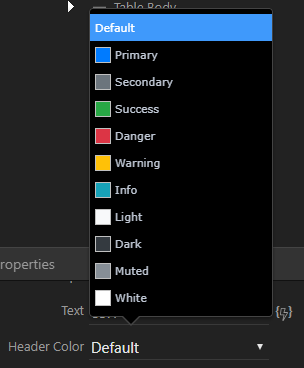
I understand that currently properties panel just adds bootstrap classes and not actual CSS. So, other properties headers can be marked/colored to indicate CSS.
I suggest this because as a beginner of Wappler, I faced numerous design challenges which only got more complicated with the additional experimental design tab (so I never used it) and I think new users in the future would too.

Lastly, the ID vs Classes post raises another good issue of how styles are handled during element duplication in absence of classes. I cannot think of a solution for this except classes. :thinking:

1 Like

As an addition - more and more controls will be coming shortly to the design panel :slight_smile:

So you will have control of multiple background (with all its properties), gradients, shadows, custom fonts (google font picker maybe)

and more.

2 Likes

Well, I must be an "exceptional" designer because I use lot of "exceptions design" :joy:
More seriously, for designers there must be some way to allow space for creativity or personal touch so the new Theme / Design System builder will helpful and very welcome.

1 Like

Obviously I don't know how the new feature will work, but I hope/expect it might solve many of the current issues. I hope it will offer an easy way to customise Bootstrap variables and create a custom bootstrap.css file.

This is of course possible now - and is the best approach IMO - but it's not possible from within Wappler. As it is, if someone wants to change the default Bootstrap colours, the default fonts and use gradients for example, they could do this in Wappler, but it could involve adding hundreds of CSS classes. If these changes were made using the Design Panel, and individual ids were created, it might involve thousands of ids, depending on the size of the site. The same result could be achieved by ceating a custom.scss file with about 20 lines.

I hope the new theme builder will mean this is the first step in customisation, and the other, existing, features will only be required relatively infrequently. I mentioned before that I thought one of the useful features of the Design Panel was for experimenting; I think this will be even more the case - as an aid to choosing options to incorporate into the theme builder. This will be another reason why the ids are best added to the <head> section - because this location will only be temporary.

I think this is similar to most people not knowing how (or not choosing) to use styles in Microsoft Word, and using direct formatting instead. The results can look exactly the same either way and that may be sufficient for the user - although, for anything but a short document, it's unlikely to be a good solution. To use styles, people have to have some understanding of how they work. To create good CSS - and pages which are more efficient and maintainable - I think you have to have some understanding of CSS. I doubt if anyone has come up with a fully visual solution which produces good CSS, just as Microsoft hasn't up with an alternative to users having to understand styles in Word, after three or four decades.

1 Like

By creating classes in Wappler, we can change the default colors shown in the UI? Or have I misunderstood your point?
image

The visual building tools of Webflow is as close to complete as I have seen and used.
My point with not knowing to write CSS also meant that Wappler being a visual tool should not rely on writing CSS for a well designed front-end. New users would expect front-end tools that get the work done.

The comparison of Office Styles and the new Design Panel is true to some level. But applications have a much different use-case than a Word doc. The head-level CSS can affect the performance and page load of a web application - but direct formatting does not affect a doc as much.

In the current state, the design panel seems like an overlap with the properties panel. And with theme builder in future, it would just add to the confusion.
The design panel is great to use as an experiment, as you have mentioned, but if this is released to be permanent with the current strategy, it will probably cause issues. One of which is listed here - duplicating elements does not duplicate the styles.

Sadly, I could not come up with any other solution for this other than the one I have mentioned before. But its not without drawbacks either. :man_facepalming:

1 Like

This wasn't quite my point. If you wanted to choose different colours - ie a different primary colour, different secondary colour etc. - this could involve changing 100s of CSS classes. Eg there are over 50 references to 'primary' in bootstrap.css. If you define a new variable for the primary colour in a custom.scss file and recompile, this change will affect options for text, buttons, hover states, backgrounds and borders etc.. If you wanted to change the whole colour pallette, these changes will of course be multiplied accordingly. All these changes can be achieved essentially by about 10 lines of code; or by changing a few hundred classes manually (although of course in practice, you won't need every possible class where each colour is used).

I appreciate that performance is not a significant factor when it comes to Word and styles, but this wasn't my point. My point was that Microsoft hadn't come up with a solution for people to use styles without having some understanding of how they work (I'm assuming that they tried to come up with a solution during the 30 or so years Word's been around, but of course don't know).

I don't have much experience with Webflow but I'm sure it can't decide what should be a class and what should be an id, and always know where the CSS should go.

I certainly can't imagine what the solution might be. Perhaps it's something which will always require a degree of human intervention and understanding - which may not be a bad thing.

1 Like

It just uses classes. No IDs. All classes are stored in a separate file. This is how it works:

Although, as George had mentioned, this method leads to too many unused classes. In current working of Design panel, it leads to creation of multiple IDs. But classes option does not put performance burden and is re-usable. So better in my opinion.

True. But to make Wappler the ultimate visual tool, I just hope the community comes up with some cool solution. :sweat_smile:

1 Like

This sounds like a good idea.. but if you're writing class names, it's not entirely visual and suggests some understanding of CSS is required.

Dreamweaver has a useful feature where you can select some inline CSS, choose the required selector and choose where to put the rule:

image

Althought it will usually be too specific, it's a nice feature to have the full selector displayed.

That's correct. But way it is presented, the tool itself.. makes it very natural. Does not feel like writing CSS class, but just another title on the webpage.

This is cool. Based on the nature of action selectors and server actions and all the wizards, this could be turned into similar UI.

Hi TomD! Reading your post it remind me of the way “Flexilayout” (Visual design toll for DW) manage the styles: Let say you have a text and you decide to changer the default color, size et. when you do so FL will pop up a question "Do you want to apply this change to that element only or create a NEW CSS CLASS?
And of you decide to create a new class then FL give it a default name that you can change easily in the css panel and apply that class on other text if needed.
Very simple to use and very easy to understand even for beginners.

Just want to say great discussion guys! I’m keeping very close eye on it - to see indeed what will be the optimal way to setup the new design panel.

So keep it up - I love the feedback and we hear you all!

2 Likes

Hi @Webjack357. This sounds like what @nshkrsh was describing with Webflow too. (I imagine you were referring to the feature in Dreamweaver I mentioned.)

As far as customising Bootstrap itself is concerned, Pinegrow has a good video about this. I think something like this for Wappler’s upcoming Theme Editor would be great - or something which produced the same result anyway.

Perhaps the Design Panel could be used to select styles/options, which could then be turned into variables for compiling a customer bootstrap.css. Or perhaps a predefined list of styles could be made available for this purpose (to stop things getting out of hand): eg the main colour palette, fonts, gradients on/off, default button radius settings etc…

3 Likes

Btw as I said in the future we would like to have our own Theme / Design Systems builder in Wappler.
That will allow you to fully customize your core framework, like Bootstrap for example.

So something like:

https://bootstrap.build/app
https://pikock.github.io/bootstrap-magic/app/index.html#!/editor

4 Likes

Both these customizers have a good UX.
The Pinegrow video share by @TomD looked good until I saw these. :sweat_smile: This is much better in terms that its more visual. Just see the type of component you want to customize and update the values in left/right column.

3 Likes

These customizers do look good. However, the Pinegrow approach is in one way rather more visual, IMO.

You can open any page of the site you're working on and see the effect of the style/theme changes on that page as you save the changes. This has obvious advantages. There are also some less obvious advantages. Eg you can select an element on the page and discover which Bootstrap variables affect that element - and then modify them if you want. I imagine Wappler could offer similar features.