Wappler could (and should imo) be so simple that basically all non-techies understand it almost at first glance. It currently isn’t by a long shot. And since the main UI layout will not change a lot I assume, it won’t become extremely user friendly any time soon.
Documentation and explainer video’s are too weak, even though I do see a lot of new articles being added all the time.
I do however encourage you to be prepared to be frustrated a little bit, get through all the nooks and crannies of the software, and once you get to know the program and it’s intricacies, you will be relieved that a tool like this exists.
But I’m also just as non-loyal to Wappler if something better comes up. There currently isn’t anything better, so it’s what we have to work with. And it’s pretty much unlimited in terms of what can be built with it, it’s just not user friendly. (still keeping in mind that it’s probably 100x more user friendly then raw coding)
Noted should be that the team probably work their asses off, and they really do listen to user feedback and quickly implement improvements.
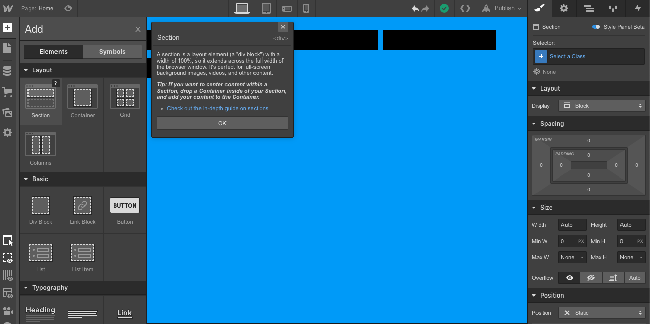
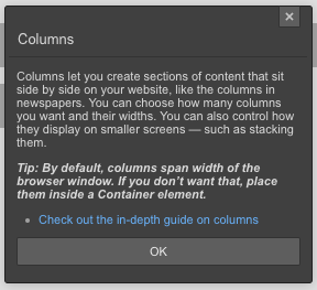
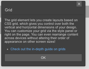
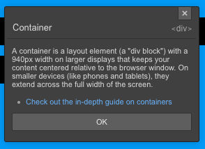
Here’s webflows right-hand side ‘new’ interface - is pretty sharp and intuitive. Also, some pop-up info dialogue windows and help tips (see attached) - sorry about formatting.
Hi @pachamama
Yes, i’ve explored Webflow’s panels and UI and I find most of them overwhelmed, complicated and just displaying all the options available (not selection sensitive).
I can’t imagine how could this be an easy to use UI especially for new, inexperienced users it just does not seem logical to me, but that’s just my personal opinion.
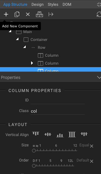
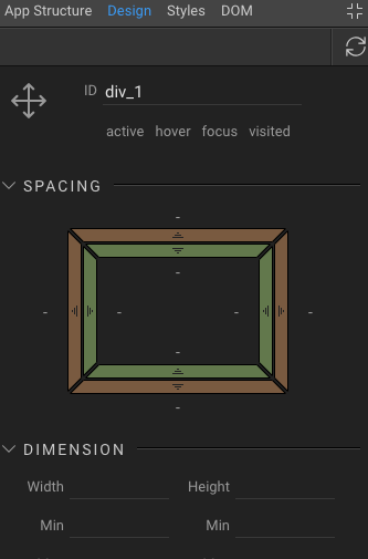
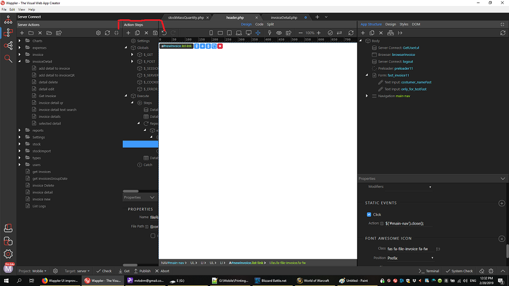
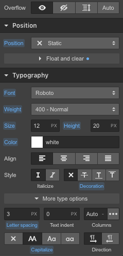
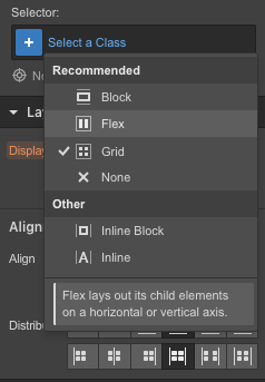
In Wappler - the interface looks a little less ‘tight’ and efficient. Also I can quite work out the css class naming, using repeat global classes. ID seems odd also, in ‘App Structure’ there is no ID, but I click the on ‘Design’ there is an ID. Please see attached.
Fair enough but respectfully disagree. Just an idea, maybe farm out opinion and feedback, good and bad. COmparisons, pros and cons.
Please bear in mind I took multiple screen shots of the same right-hand interface, it is not fragmented like shown.
What about the help dialogue/tool tips. Surely they are beneficial and more concise?
But both with a field called ID. Not intuitive IMO. Plus DOM has an ID field too.
And then further fields relative to CSS under DOM too? BTW, haven’t even got round to what DOM is lol!
Don't get me wrong, of course we are happy to hear feedback from users like you (coming from other software products) and believe me we've explored and evaluated pros and cons of many products out there.
Yes I cannot disagree with that
We are constantly improving the UI based on users feedback. That's one of the best things with Wappler - it's community driven.
Yes and what an amazing piece of software you have created so far. Just giving feedback as requested. Please don’t feel that Webflow is the panacea, there was a learning curve for me there too, more about best practices though; the interface I ‘just got’.
I also use most Adobe products too and is also quite intuitive although they can miss the mark (gave up on DW years ago), but I can really give PS, Illustrator, InDesign, Premiere, Dimensions, XD a good work out.
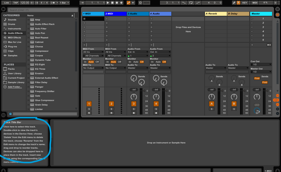
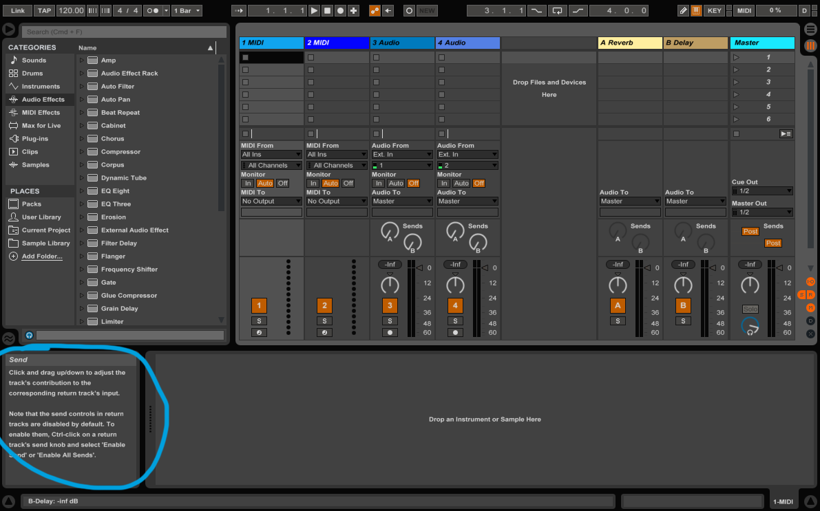
Ableton Live (audio software) has a great tooltip box positioned bot right of screen which changes dynmically on rollover - see screenshot.
I think the main drawback of wappler is the lack of documentation, videos and other learning tools. The UI is a matter of getting used to, once you understand it you’re good to go. But you really need proper learning tools otherwise it’s just not intuitive enough.
Videos are key in this by the way, for most people it’s the preferred way of learning i suppose.
Hi again Teodor! I was reading Pachamama impressions about Wappler and I do understand how he feel using Wappler from a “Webflow” or similar visual builder perspective.
Many of them don’t know that Wappler is a compilation of dynamics php extensions put together in one tool and that at is base, is a tool for building dynamic sites (databases and queries etc.)
Now many new comers to Wappler are attracted by the “ALL VISUAL’ DESIGN” promise, but in fact what is the first goal of Wappler is that you can build “dynamic” sites" the visual way instead of coding.
The reality is that Wappler is not yet as visual builder as are Webflow, Wix, FlexiLayout etc.
Wappler is very powerful and that comes with some complexity level and need some time to understand as for the terminologies (needing some explanations in the UI). As Pachamama mentioned, visual tools like Weblow do offer some explanations right in the UI so users don’t always have to search and look for videos. One good example is the difference between Wappler APP panel and the DESIGN panel, for a new comer that itself need some explanation, and that goes for many other things in the Wappler UI.
But Wappler has already improved a lot in very short period of time and the dev team is awesome and listening to users feedback and suggestions.
So if you are new to Wappler and and come from Webflow or similar, just be patient and explore the possibilities of Wappler and I thank you will do like me: Love and stay with Wappler!
Thanks to all of you for the comments and suggestions
Just wanted to clarify this a bit:
It is true that with Wappler you have advanced back-end framework (Server Connect) which allows you to build server-side/dynamic workflows visually BUT it's not true Wappler does not offer visual tools for designing your page.
That's why the world’s most popular front-end component library Bootstrap 4 is included in Wappler. And as you mentioned the App Structure panel offers you all the customization options available for all the Bootstrap 4 components, but visually with options, sliders and buttons!
Maybe the problem is with people who have zero or minimal experience with web design/development as our docs are referring to terms like framework, class, ID, repeat region, component which such users might not be familiar with.
You can check some great examples in our showcase section showing what the design tools in Wappler are capable of:
Yes that is exactly what I mean! From there perspective it is asking for some efforts and they do expect some level of explanation in order to know what to do.
The question here is then - should we start documenting then general HTML/CSS/Bootstrap 4 topics?
I believe there are great resources like https://www.w3schools.com/ which exlplain really nice what class or ID is, what’s the difference between them etc.
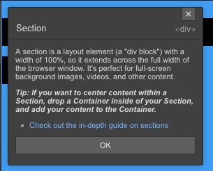
And discussing the help texts in Webflow (screenshots provided above) look at their explanation about <section>:
The only right thing in this text is that the section is a block element.
The <section> is actually a semantic element used to define sections in a document, such as chapters, headers, footers, or any other sections of the document.
It is not related to usage of background images or videos … you can apply background image to any element, it doesn’t have to be a section
So people have to be careful what sources they use to learn about HTML/CSS/Semantics.
for me the issue with the UI is that its not great when you want to focus on one side (interface- server side actions)
for example i find myself wanting to compare two server actions but i cant do it since i have to keep switching between them and if i click on any element in the server action then try to switch i get the “do you want to save the changes” message.
i know that wappler want to have everything on one screen. but in practice the screen is not enough to jam everything. you get left with too much scrolling to reach what you want.
and pull to expand panel is not useful at all. check the screenshot of my project.

 it just does not seem logical to me, but that’s just my personal opinion.