Finally updated my workspace to make better use of my Ultra-Wide and Wappler. This may take some getting used to, but I think it will be better.

4 Likes
I have to say that overall, I really like the new graphical interface of Wappler version 7—from the new theme to the design of the inputs and other visual enhancements that improve the user experience.
One of the best improvements I’ve noticed is the ability to search for an ID in the structure panel. It might seem simple, but it’s a feature that significantly enhances performance when developing an application.

Regarding the structure panel always being full-size, I think it’s a good choice. Even on my 13-inch Mac with a 2K resolution that I use when I’m neither at the office nor at home, I always utilize the panel in full size.

However, there’s a downside. I think it’s a poor decision to have it fixed on the left side. It doesn’t add much value to Wappler to change the layout just because others are doing so. If I wanted an app similar to Webflow, I wouldn’t pay for Wappler; I’d choose Webflow instead.

Honestly, George, I think you should let us users who spend long hours with the mouse and keyboard—trying to minimize wrist strain—choose whether we want to move the mouse across the screen just to, for example, select a column and change its border color. It’s really unnecessary to have to move the mouse so much in an application that also lacks shortcuts for simple tasks like switching from component edit mode to preview mode. So I only ask that we can have the structure panel on the right so that when selecting a component we can edit it more comfortably, quickly, and efficiently in a properties panel that is not on the other side of the screen.

I believe the only outcome will be that we’ll all start using the code view to select each component since it’s much quicker. And believe me, if I end up using the code view for that, I might as well switch to using Visual Studio Code full-time.
I’ve been using Wappler for 60% of my programming work since April 2019, so I’m very familiar with how it works. I believe there’s still a lot to improve in version 7. For instance, the tree in the app structure used to be a headache when we wanted to add something because it would close automatically, but I see that you’ve now fixed this issue.

Aside from the left panel, I really like how Wappler 7 is shaping up and I’m excited to see the new improvements you have in the pipeline.
6 Likes
Couple of days in to the new layout now and beginning to like it...
2 Likes
![]() I for one like it
I for one like it ![]()
2 Likes
Thank you all for the feedback!
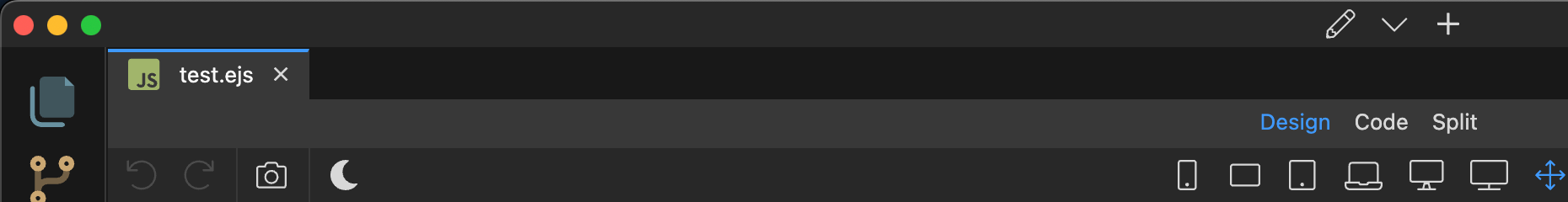
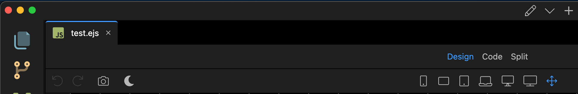
In Beta 3 we've added an option in the General Settings where you can select the panels layout:
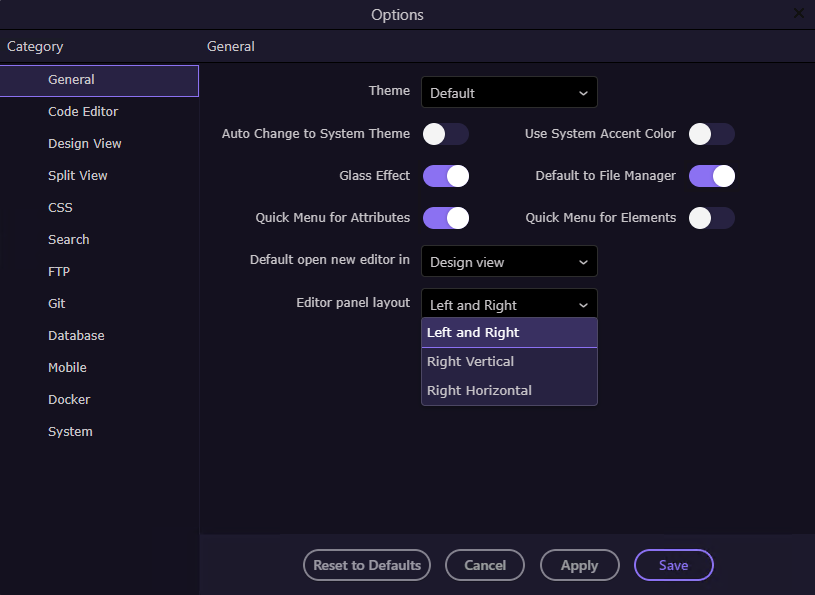
Left and Right:

Right Vertical:

Right Horizontal:

21 Likes
This change is awesome! I can now work comfortably on my Ultra Wide Monitor as well as my 1st 6" MacBook Pro! ![]()
5 Likes
The UI of Wappler 7 is bigger, is there a way to make it like Wappler 6? I felt something different
Wappler 6:
Wappler 7 beta 4:
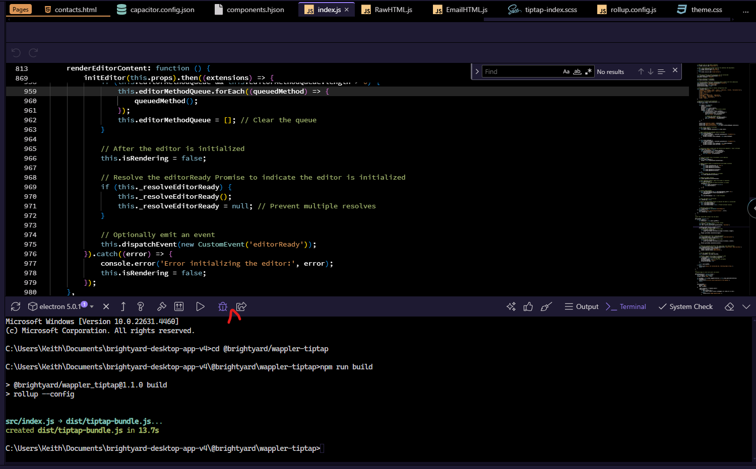
You can look at the Git Manager icon, the first screenshot the space is more compact, so it cuts the icon slightly. The second screenshot the space is less compact, so it covers the full icon. You can also see the vertical bar is bigger on Wappler 7
2 Likes
@Apple, I agree, the spacing in Wappler 7 is larger than Wappler 6. A compact UI works better in fitting more content in the same screen height, especially when working with APIs that can contain 20-30 or more steps.
1 Like
I've only just had a chance to download and install W7 b4 and it looks really slick! I'm very glad that the option was added to have the page element structure on the right. In my mind 'server-side left', 'client-side right'
It also feels a lot faster to reload previews, search components and switching between tabs, especially on more-complex pages and sites where there may be lots of elements.
All in all, great work and thank you @George , @Teodor , @patrick
![]()
4 Likes
full height properties panel is something i would start fully appreciating when i get a wider display for my workstation. but i am missing a lot the quick navigation we had in wappler 6. It took us a click to get to events or attributes section. right now, i have to scroll few times to get to dynamic events. and more scrolls to get to top again. full height panel will unlikely fit all properties where it matters for most users. it is possible i am missing something here.
All the hassle about UI and Layout changes makes me wonder if it is here because it is important to deal with it now due to stuff in pipeline for Wappler 7. Otherwise, what matters most to me is stuff that is fixed remains fixed between updates that fix other broken stuff or adds more functionalities to Wappler.
We will be working on restructuring the properties panel by itself, so dynamic attributes and events will be available in separate panels as well, making them clearly visible and easy to access
3 Likes
How can I hide this toolbar? Without compromising Cmd+P to quick open
With every update you guys like to push the design area lower and lower ![]()
1 Like
You can just go to full screen mode with F11 on Windows/linux or ctrl+cmd+F on Mac
... ![]()
I frequently switch between browsers, VSCode and so on, I'm not going to use Wappler in full screen, I don't need that kind of mental processing overhead in my life...
I rarely use any application full screen on my main monitor (43"), but I always use Wappler full screen - it's great to see code and page views, and the umpteen options and settings as it's laid out in the Wappler UI. I use a text editor and other applications a lot too, usually on different monitors. If I didn't have other monitors, I would use other desktops.
It's all a matter of preference of course, and it's great that Wappler increasingly accommodates a range of choices.
1 Like
If you undock the editor you don't have the extra toolbars. More UI changes will be coming in next Beta updates, when we finalized the UI I will see if I can add a compact version where everything is a bit more compact and smaller.
5 Likes
The UI changes in Wappler 7 are incredible. Job well done. I can't imagine how much more you guys have planned. It's looks and feels so fresh.
2 Likes
Yes, I really like the new UI too; everything looks much more modern and refined. About the new version 9-10, I’m not entirely convinced about having all these buttons so close together. I would move the Wapple logo back to the bottom left where it was before, so that area feels a bit cleaner. But it’s not something super important.

2 Likes
I spend most of my time at the bottom of the app building and updating the files for custom app connect components. Because of this, I preferred having the Project Updater near the other actions for building/packing the app.
Moving it to the top left causes extra mouse movement from 1 to 2 to 3.

2 Likes
If I'm actively working on an app, it means i'll typically be working with the DB, Server Connects as well as the front end (aka using Wappler's visual builder selling point)
With this in mind, a few clicks and I have a very small work page work area due to an open left panel, elements panel and properties panel.
I now find myself forever closing down panels just to see the visual aspect of the app which didn't use to be the case.
If the 'Structure' panel was merged as a tab into the right Properties/Design/Styles panel this would not be an issue.
That and all these new horizontal toolbars/bars minimising vertical height.
1 Like