Yes, of course I can. I can close all the panels. But then I am forever opening and closing panels. It's not very user friendly but I am getting used to it.
Well we have being thinking of some auto close or open on hover panels, pinnacle panels but haven’t found the best solution yet.
Ideas are welcome.
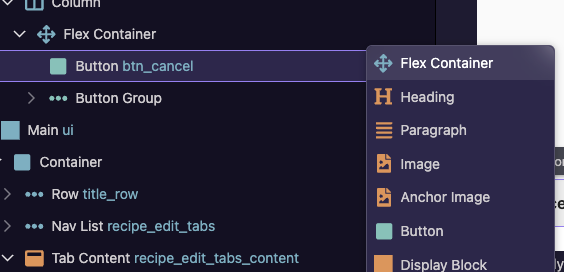
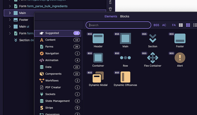
The quick Insert after icon directly on an element is a step backward for those of us that prefer not to go hunting for an icon with the mouse, but rather we use the keyboard to quickly go to an element. Yes I can get there with More... but that's another click each time.
The option click, followed by Insert after is better.
I'd vote to have them behave the same....straight to all elements with keyboard search activated on open. If that was done, it would be an improvement over v6 as the first click identifies the location. So it can be a single click, type, and click the element.
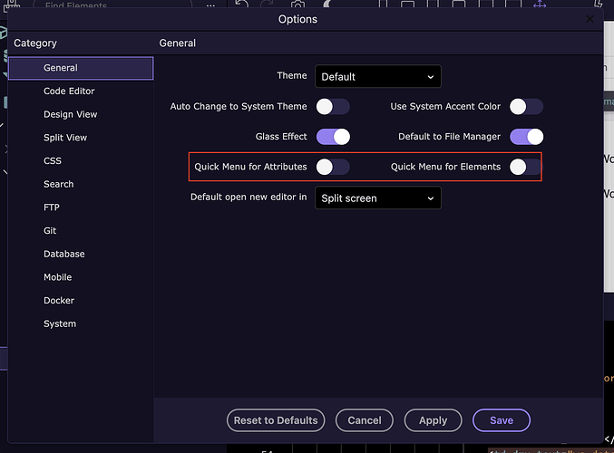
You can do that now if I understand you correctly. In the Wappler settings just toggle off the quick menus. Hope I understand you correctly.
I want the quick menu, but I want it to behave like the Option click method.
I guess I don't understand? Isn't this what you are trying to do?
You're right. I thought the settings toggle was to show the icons or not...I get it now. Thx.
That option/setting was actually available back in Wappler 5 (last major UI update) I believe. ![]()
Did not know that this existed

Thank you @brad
Moral: Never too old to learn
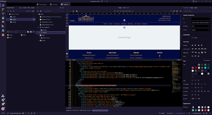
This is what mine looks like and (except for the placement of the App Structure) I love it.
As previously stated, the App Structure panel would be better placed on the right.
I don't have the luxury of a large monitor. I work on a 16 inch Macbook Pro. Even without the extra panel the design view is still pretty small so I have gotten used to using it mainly for selecting elements quickly and not relying on it for design.
The small design area is likely more of an issue for new users that are just trying out Wappler for the first time. I am used to it after 7 years. ![]()
But yes, I agree, the structure panel should be on the right with the properties panel.
Yes, I too don't understand the Structure panel on the right ![]()
I wish the panel on the left also has the Structure button like in Wappler v6
Over the years, we've had many requests, especially from new users, asking why Wappler doesn't have a separate structure panel on the left side of the window.
This design choice is considered standard by many, particularly for users familiar with other design tools. Many popular web and app builders, like Webflow, Framer, Wix Studio, and Bubble, follow this UI pattern—structure panel on the left and properties on the right.
Based on the feedback we decided to make this change to follow a familiar design that makes Wappler easier to use.
Also i don't think you are losing too much space with a layout like that. On my ~9 years old 1440p monitor it looks great and you have plenty of space (1650px) in design view with the structure and properties panel open
Why don't you make it a selectable option? Keep everyone happy? Pinegrow and Photoshop still use on the right...
On the left I keep my file explorer, on the right I keep my Structure tree... And that's all I use, I don't want my Design view to be shifted to the right to make space for the left Structure tree... Otherwise I'd have to work with a non-centered Design view ![]()
People use smaller screens, increase scaling percentage... It's not so linear...
I'll keep using my v6 until you guys figure out the design so I don't have to drain brain energy
That's why the discussion here ![]() We're collecting feedback so we can make more people happy.
We're collecting feedback so we can make more people happy.
As I noted in my previous post, the app structure is already available as a separate panel on the right. Perhaps, the new app structure design/UI can be applied to this current app structure panel. If users want to display both app structure and properties panels, then they can already expand the view.
In my 5 years of using Wappler, I have always worked with app structure and properties in a single panel, as I find this placement more logical (select an element and apply its properties) and efficient (moving mouse a short distance, focus stays in one area).
I see a lot of people complaining about too many panels to open/close, but no one talking about adding keyboard shortcuts to manage the UI.
I use shortcuts (alt+s/f/r/d) all the time to manage the left panel.
The right panel and tabs have never had any shortcuts from what I know. Maybe a good time to add those everywhere and make everyone a little bit more productive by using shortcuts.
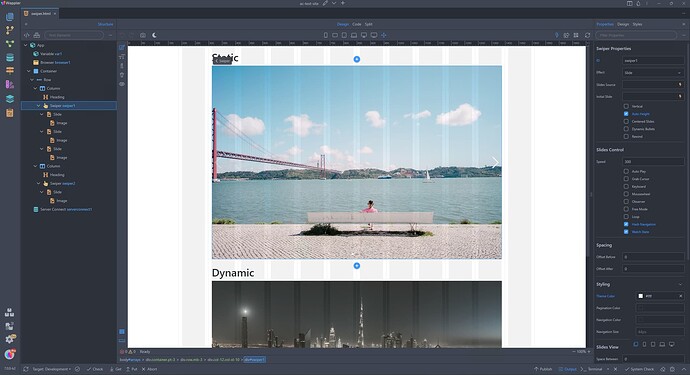
I’m kind of warming up to the structure on the left. Keeps my Split View in the centre. I tried expanding the panels in 6.8.0 and that pushed my working space all the way to the left and that was awkward to work with.
Some tough choices for the team but for me I’m enjoying 7.0.0. Very clean.
My system is running using two monitors. I have several complex applications that have multiple panels that are highly customizable because I can undock a panel from the main application window and move the panel over to the other monitor where I can locate it a position where it's most comfortable for the particular workflow for the task I am working in.
Why not make Wappler's panels undockable so they can be moved wherever they work best for the tasks your end users are performing?
I feel like I am watching tennis... Look left, look right, look left, look right...

Aside from that all looks and functions nice on Ubuntu (although have found a bug which seems to be Ubuntu 24.04.1 LTS specific). Will post details shortly. Also can't switch to Tree View while editing Server Connect Actions (not sure if that has been reported?).
