Wappler 7 Beta - UI and Layout Changes

Intro

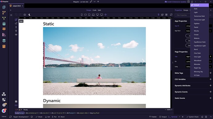
Welcome to the first beta of Wappler 7 – The Ultimate Refinement! We're excited to unveil a truly groundbreaking update that brings major enhancements to the Wappler UI. With a complete overhaul of the interface, we’ve introduced sleek new designs for panels, toolbars, and dialogs, following the latest design trends and accessibility standards. You’ll notice a refreshing new theme with bold purple hues and improved layouts, all designed to elevate your experience!

For those eager to explore the future of Wappler, the most significant layout changes and higher-risk experimental features are available under the experimental flag in Wappler 7 beta. These changes are just the start of what's to come as we continue to fine-tune the platform and roll out powerful new features.

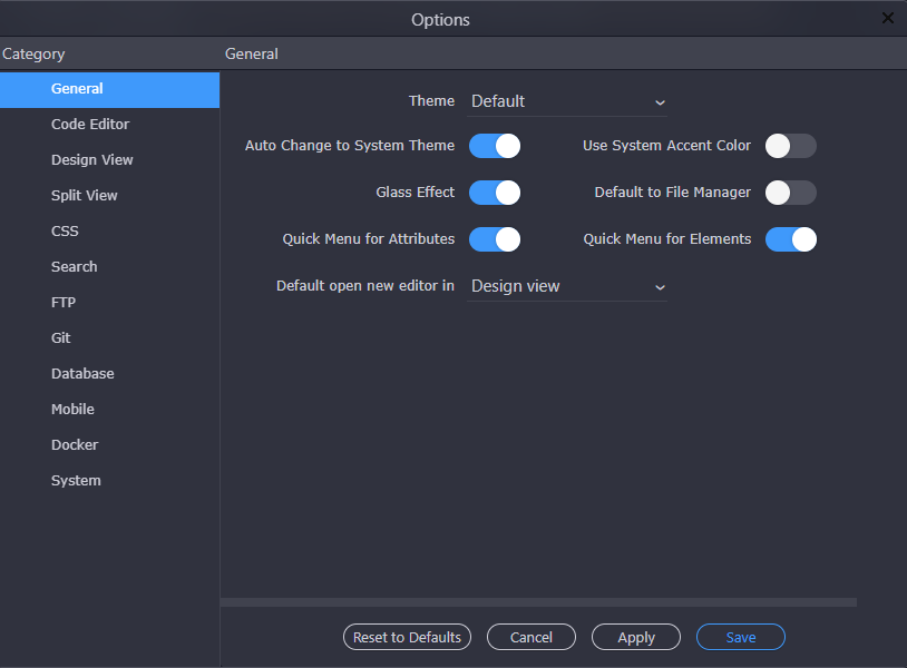
NOTE: To test the new UI Panels you need to turn on the Experimental Features in Wappler settings.

Wappler UI

Updated Styling: All panels, toolbars, and dialogs have been redesigned with a streamlined look, following the latest design trends and accessibility guidelines.

New Default Theme: A purple color scheme is now available as the new default theme.

Wappler Editor

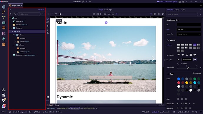
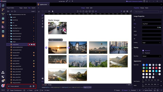
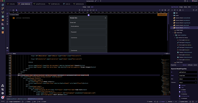
New Left Structure Panel: We have moved the Structure panel to the left side of the Wappler window. It displays the structure of the current page.

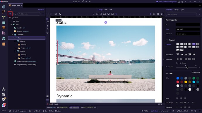
The Structure Panel allows toggling between components and full HTML elements view. This way, you can access and edit any custom HTML elements that you have added.

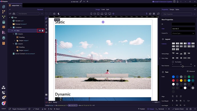
Quick Actions: We added quick actions within the editor for improved functionality.

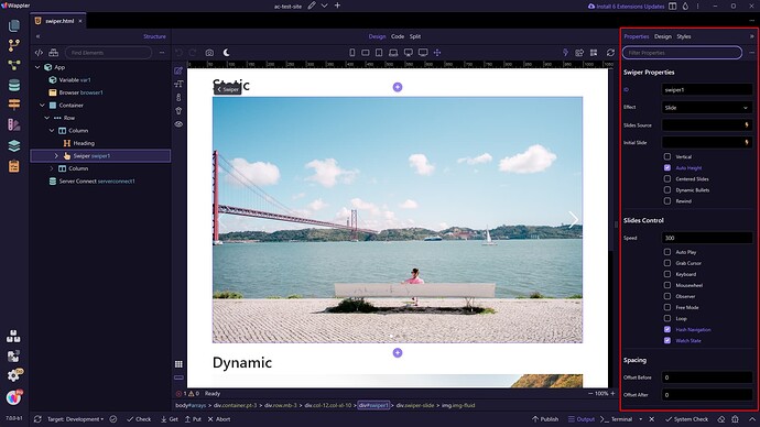
Properties Panel: The Properties Panel on the right, now taking the full height of the Wappler window, shows properties of the selected component in the editor, with easy filtering options.

File Manager

New Quick Actions: We have improved the overall styling and layout of the file manager and added new quick actions for more efficient file management.

Server Connect Workflows

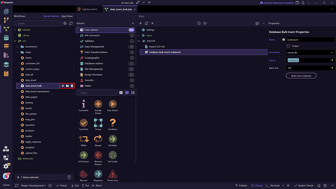
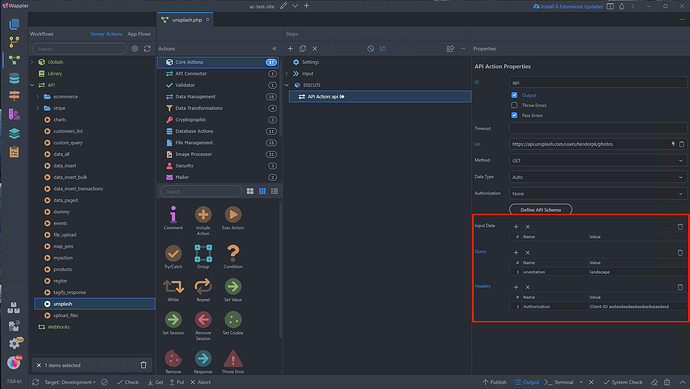
Direct Actions: New direct actions are now available on the workflow tree, displayed as shortcut icons on hover.

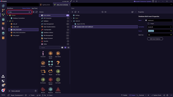
Toolbar Cleanup: The toolbar has been refined, and we have added a quick search feature.

This is just the beginning—more exciting features and enhancements are on the way as we continue to develop and refine Wappler 7.
14 Likes

I haven't tried v7 yet but why was the structure panel moved to the left? Now it looks like there is even less screen space left for design view than there already was. Not sure what problem this solves.

Good luck with the new Beta. I look forward to folowing it's progress. :beers:

7 Likes

Some solid usability improvements. We got updates we did not even know we needed. Well done!

3 Likes

I agree. It would be nice if this was an option in the Options panel. Real estate on smaller screens is already challenging.

3 Likes

Maybe think of adding the duplicate option as a quick option as well? You probably need some intelligence where it should be available and where not....

5 Likes

Yes, we will be adding more options there in the next betas :slight_smile:

5 Likes

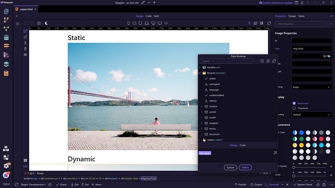
I hope to see this Flow arguments table size and this Bindings input sizable to available size be implemented in next Betas.

6 Likes

In the new Beta most of the property inputs use the full width of the panel and are no longer capped.

3 Likes

These tables have already been improved for Server Connect and other places:

If we missed to fix this somewhere, please let us know.

3 Likes

How do I turn on the structure panel on the left? It is still on the right where it always was for me?

Love the new look/theme. Very clean.

1 Like

You need to turn the experimental features on.

Yikes. Not sure I want to do that. Is it only UI stuff in experimental mode?

Well yes and only in the beta :grinning: you still have your Wappler 6 installed.

Loving the extra room in properties panel for my extensions

2 Likes

@patrick @Teodor but what about Flow options?
Sorry, I don't have an option to upgrade ATM.

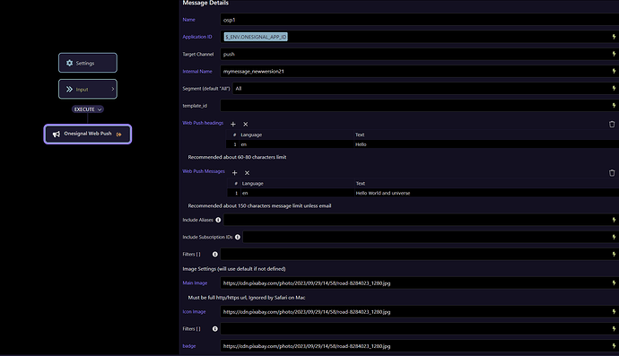
Flow action properties UI is also updated.

3 Likes

Hello I test the Beta 7 but in my case, I dont see app structure to de left or any of the other layout changes. Still the same I try reseting layout to default. Any Suggestion??

You need to turn on the Experimental Features in Wappler settings.

Done like the way it looks but I have a 27 inch iMac I dont know if in a small monitor the viewport for HTML is reduced. I will begin testing.

Thank is for this, Wappler team… it all feels very excited from a Wappler GUI perspective.

As you know, I tend to stick with a version of Wappler where the AC and SC functions are super stable for a while, and I’ve been thinking this will now be 6.8.0, followed by a late and stable version of v7.

I like the sound of your GUI plans for v7… but am I right in saying that there will be some major AC and SC innovations that may take a while to settle down?