Wappler 7 will not have major AC and SC updates and the updates it gets will also become available for Wappler 6. The major changes will be within the Wappler GUI improving user experience.
Looks very nice, well done team!
Congrats Wappler team. I've been very impressed seeing the UI mature, not just in the short-term, but in posts dating back to when it was at version 4.
The first thing that caught my eye was the coloring of selected windows/tabs/items. It uses the new theme's dark/bold purple to identify the item in focus whereas the items/selections next to it are a seemingly brighter off-white. This feels backwards from design trends, where the selection in focus stands out in a brighter color and other items/selections are more dim in color.
That's my $0.02. I'm sure I will get used to it.
Apply dynamic value in “Authorization” name.
Congrats to the Wappler Team. I only started using Wappler recently for a personal project, but I already get a new look & feel. Really excited ![]() and I love the purple.
and I love the purple.
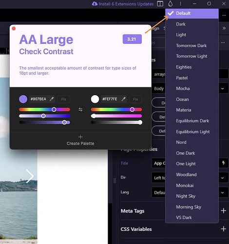
As a UX-Designer by day and Accessibility aficionado, I agree with @GraybeardCoder above: the hover states/selects are too bright in the background to be WCAG-compliant ![]()
Working together with people using screenreaders all day, I know for a fact that having an accessible content creator like Wappler is well sought after! So keep it up. If I can be of any assistance (UX-wise/Accessibility-wise) I am ready to help in any way I can. Just let me know.
Thanks for the feedback!
can you share which part of the UI are you referring to please, so we can take a look and fine tune it?
Sure thing:
Just looking at your screenshots for now: The white text on light purple would only be ok for larger text. You might go for a darker hover and – as you do elsewhere – with an outline maybe?
Btw: you use similar colors on your website now.
Since it is a very exciting GUI centric update…
![]()
… I don’t suppose…
![]()
… that maybe…
![]()
… possibly…
![]()
… perhaps…
![]()
It will include things like
![]() Making a library action from a server action
Making a library action from a server action
… or …
![]()
… even better …
![]() Cut and paste in server actions?
Cut and paste in server actions?
![]()
… or perhaps …
![]() An “output everything for debugging” switch in a server action?
An “output everything for debugging” switch in a server action?
![]()
= = = = = = = = = = = = = = = = = = = = = = = = = = = = = = = =
You can always bump the feature requests you mean to put them more on the spotlight. We will have more betas to come more focused on different parts.
Good catch! Seems we have missed this one, should be indeed a similar highlight as in the file manager or page structure trees
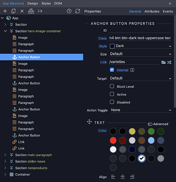
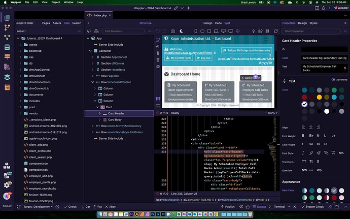
I have been playing around with the new UI for a few hours now, and although I really like the subtle color changes and icon changes, I find the Structure Panel on the left a little challenging. Most of the time your workflow will be changing or adding something in the structure panel, then mouse all the way over to the right to the properties panel to change the properties of the items in the structure panel. Seems to be a lot more mouse moving than before, plus now you are shifting focus from all the way right to all the way left and back and forth. Wished we had as others have suggested of giving us the option of moving it to the right or the left. I closed out the Beta and went back to 6.8.0 and it felt like putting on an old broken in pair of jeans. Just felt right.
I created a feature request, so we don't lose this topic in here. Please vote.
I thought you folks have been a little quiet lately. Turns out, you were busy! These look like great improvements.
It would be wonderful if all of the panels were un-dockable. I remember back when DW allowed you to move the panels anywhere you want, including over to another monitor. That was a big improvement and I would love to see that in my favorite dev tool.
Anyway, your pace of updates and improvements is appreciated. I get a little dopamine hit when that "update" notice lights up in the upper right.

Count me as a big fan of this.
Like some others, I'm not understanding the benefit of this move...was there something we are all missing that drove this choice?
When selecting items in code view, it feels like the structure panel stays in sync better...thanks for that.
Overall appearance has a more professional polish.
It does make design view unusable. Having used it for a few days I find I am forever opening and closing panels. Not really a step forward for me. But I am getting used to it.
The main idea about this move was that there was more space needed for both structure as well property panels.
So by having the structure separately on the left - you enjoy its full height as it can get pretty lengthy on large pages.
Having structure on left and property panel on right is pretty common on most design programs.
As for the property panel - it can have a lot of properties and you will be scrolling too much to find the right one. So having a full height is also desirable there.
and eventually because the general left panel with file manager and other managers, can be collapsed - you have the same editor width @brad
Thanks for the explanation. All good thoughts. I think the key feature to nail this is to make those columns moveable so we could have them as before, one above the other, or have them full height side by side but both on the right of the code/design window. I agree that it's a lot of mouse moving clicking on elements and then editing the properties.
Some screen sizes and preferences will prefer that, some won't. So having the option is crucial.
The new UI has an overall cleaner appearance. Well done!
The app structure and properties panel on the right can already be expanded to display the two panels side-by-side (v6.8.0).
I agree with previous posters that having the two panels on opposite end of the screen will be moving the mouse a lot for no gain in time and productivity. The time factor alone will be a lot noticeable on ultra-wide or large sized monitors.
This is what my design view has come to ...... lol ![]()
Luckily I just use it for quick selecting of elements and don't rely on it for design. I constantly need to check design in browser.
You can just collapse the file manager as you don’t need it all the time.


