@mgaussie You can do that in the Wappler settings ... select 'Right Vertical' in the settings and it will stack them both in the same column like it used to be. ![]()
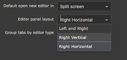
@mgaussie You can do that in the Wappler settings ... select 'Right Vertical' in the settings and it will stack them both in the same column like it used to be. ![]()

Personally I love the layout in 7.0.0-beta.12 (have not updated to .13 yet), feels seamless switching back and fourth between VSC and Wappler... Makes total sense if you're a VSC User as well as a Wappler User.
By the way, how do I access DOM properties in beta 7? I can't seem to find it the latest version.
Currently they only show for unknown components in the properties panel, we are working on it to combine them with the other properties.
Merging it is a great idea. One more less click.
Hope to see similar approach in general UI design to make things look organized and aesthetic BUT EASIER TO USE. At the moment, some of the actions that are closely related scattered all around the UI making it less user-friendly.
UI design that only focuses on form and not function can be impractical. I find myself kept going back to Wappler 6 as I find it much efficient for my workflow.
could you explain that more in detail? And how would you like to see that improved.
workflows haven't changed much between Wappler 6 and 7 - could you explain more which workflow exactly are you referring to?
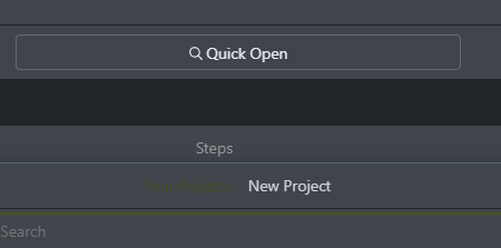
Your Project tab is not visible. Using "Night Sky" theme.
Give the option to move that bar where's the Publish button to the bottom
To be honest I'm not a fan of having that bar at all. I did notice you took away the Publish button from the old bottom bar, so... I still need that ![]()
I agree.. having the whole thing merged with the server/version bottom bar would be nice.
Having two bars on the top is an eyesore.
I think they are trying to replicate other systems with the huge Publish button. I don't use it at all, so I would even be happy with a setting to hide it.. but for those who use it, maybe move the publish button to the left sidebar, below Resource Manager, or just move the whole thing at the bottom?
Additionally, the server online green dot and green dot to the left of target seem redundant.
Another suggestion: get rid of the Steps bar in the server action tab.
Thanks.
Any thoughts on this Teodor?
Can you give an option to move that top bar with the blue Publish button to the bottom? I don't want the design area pushed down
P.S.: I haven't tried the latest Beta releases
Its the same in B16.
I see the appeal of this bar, but I think an implementation like VSCode would be needed to reduce the space it takes.
A lot of options shoved in the single bar - not very ideal, but can be made usable with setting in Wappler to let users show/hide icons in the top bar.
Again, this all is advanced stuff. For majority users, it does not matter. That said, I think its important to at least have such options so that when the regular users become pro, they already have a ton of customization options - similar to VSCode. Its extremely overwhelming the kind of customization it supports, and at the same time I didn't bother with any of it when I started using it.
If Wappler team can come up with a better UX than VSCode, that would be even better. ![]()
Can I propose a change that might confuse some for a bit but I believe would be better in the long run...
At the moment the icons for the Project folder is blue, the items inside are green. Yet when you open the file up, the tab colours are orange - I suggest changing all to a common colour
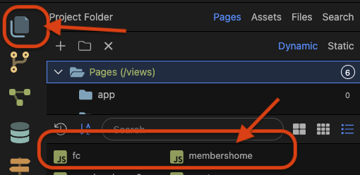

Likewise, the server connect section icon is green, the items inside are orange and the tabs are orange, the section icon should match the colour of the others
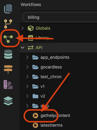

If you use file manager like this, blue is ok. I don't use the Pages view, but File view. Which was the original default.

And if you look at the SA panel like this, green looks ok.
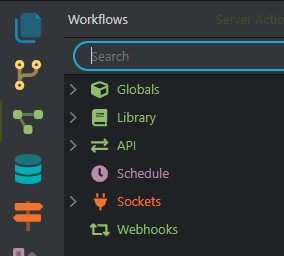
DB and route icons are already blue.. so that could be a reasoning behind the colour scheme as well.
That said, I don't think changing colours would affect anyone - not me at least.
This has been now improved ![]()
The two top bars are now merged into one. More vertical space is now available for Design view.
So I updated from Beta 8 to Beta 17, the design view is still pushed a line down. I don't want to change the UI size option because that makes things smaller, when in Beta 8 things were fine at the same size.
Give the option to just make this top bar "compact" to match the old (regular MacOS) height:
I also did some comparisons to VSCode, and it seems like the heights are matched so you did a nice job, but because Wappler has two additional bars the design area is pushed down, and therefore the top bar has to be compact to compensate...
It is true that everything will become smaller but the current default Medium setting is a bit larger than it was in Wappler 6. Setting it to Small will have same font-size and toolbar sizes as Wappler 6.