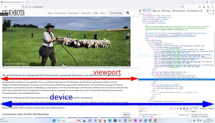
I just spent over an hour fighting with this, so if anybody else needs to be able to find the browser viewport width and then swap out various sized images to reduce load times on various devices this is how I did it.
Required Frameworks / Components / Libraries
- App Connect Framework
- Bootstrap 4 Framework
- Browser Component
- dmxFormatter.js
I have 1 Image with 4 size variations
- image-small.jpg @ 768px wide 1:1
- image-medium.jpg @ 992px wide 4:3
- image-large.jpg @ 1200px wide 16:9
- image-huge.jpg @ 2000px wide 16:9
Each image is in the same folder called pictures which is in the root of my site
Here is the code that would work well if you just had a small number of images on your page.
- Go to your page in design view and add an image component, in the image properties panel leave Src empty, scroll down the properties list to find Dynamic Attributes > Images > Image Source > then in the value field add the code below. NOTE: adjust code to suit your image names and folder paths.
'pictures/image-'.concat((browser1.viewport.width <= 767).then('small.jpg') || (browser1.viewport.width.inRange(768, 991)).then('medium.jpg') || (browser1.viewport.width.inRange(992, 1199)).then('large.jpg') || (browser1.viewport.width >= 1200).then('huge.jpg'))
Here is the code when you have a page fairly full of images, not much more complicated but certainly easier to read the code when you need to. This is used INSTEAD of the code above.
- Right Click App > Data > Variable
- I change the variable ID to var_pic_size then paste the following code into your Variable Properties > Value
(browser1.viewport.width <= 767).then('small') || (browser1.viewport.width.inRange(768, 991)).then('medium') || (browser1.viewport.width.inRange(992, 1199)).then('large') || (browser1.viewport.width >= 1200).then('huge')
- Right Click Variable > Insert After > Data > Conditional Region
- In the Conditional Properties click the Condition Dynamic Data Picker (Lightening Bolt) and select Variable > value NOTE: Ensure all your page content is in this conditional region or the Developer Tools > Network tab will report all your images as missing and then a second later all the real image names will propagate, but if the condition only fires once the value is set then that problem is solved.
- Go to your page in design view and add an image component as a child of the conditional region, in the image properties panel leave Src empty, scroll down the properties list to find Dynamic Attributes > Images > Image Source > then in the value field add YOUR image name and path such as pictures/image-{{var_pic_size.value}}.jpg
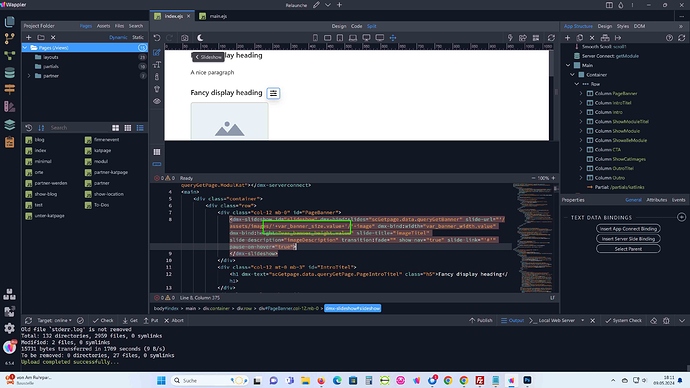
- This second option also allows you to add the same functionality into slides however we will first need to add a second App Connect Variable, which will this time hold an array of all the full image paths. Thank you @patrick for your amazing brain. So right click after the first variable in the app structure and select Data > Variable
- I change the ID to var_pic_array and in the value area paste the following code, this code needs to be altered to suit your folder structure and image names.
- In this example I have 3 different images in 4 different size variations
[{url:'pictures/image1-' + var_pic_size.value + '.jpg'},{url:'pictures/image2-' + var_pic_size.value + '.jpg'},{url:'pictures/image3-' + var_pic_size.value + '.jpg'}]
- In Design View, make sure you are inserting as a child of the conditional region and insert Slideshow > Slideshow
- In the slideshow properties add your required options, and under slides click Dynamic Slides on, then set your Slides Source to var_pic_array.value
- NOTE: Do not try add Image or Thumb or Title or Description or Link to this as you have only targeted a single dimensional array so it will not work, if you have a need to use the other options you will need to alter the Variable into a Multidimensional array.
Please keep in mind this was the easiest way I found to do this, there might very well be much better ways, if anyone already knows of one that ONLY uses the built in Wappler libraries and components please feel free to post to this thread.
I initially tried the built in srcset attributes however when looking through what images were loading in the developer tools network pane i could see that once the browser had the largest version of my image then it no longer felt the need to load the same image in smaller sizes, which I suppose would under normal circumstances be very clever indeed, however in my circumstances my various image sizes all have different aspect ratios so a mobile device would almost receive a 1:1 image while a tablet would get a 4:3 a desktop or larger gets a 16:9.


