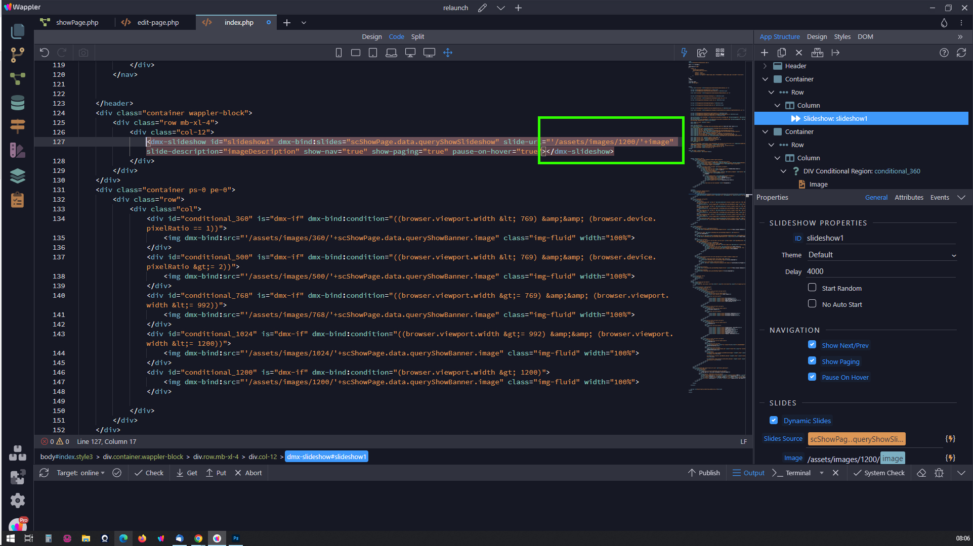
I just spent over an hour fighting with this, so if anybody else needs to be able to find the browser viewport width and then swap out various sized images to reduce load times on various devices this is how I did it.
Required Frameworks / Components / Libraries
App Connect Framework
Bootstrap 4 Framework
Browser Component
dmxFormatter.js
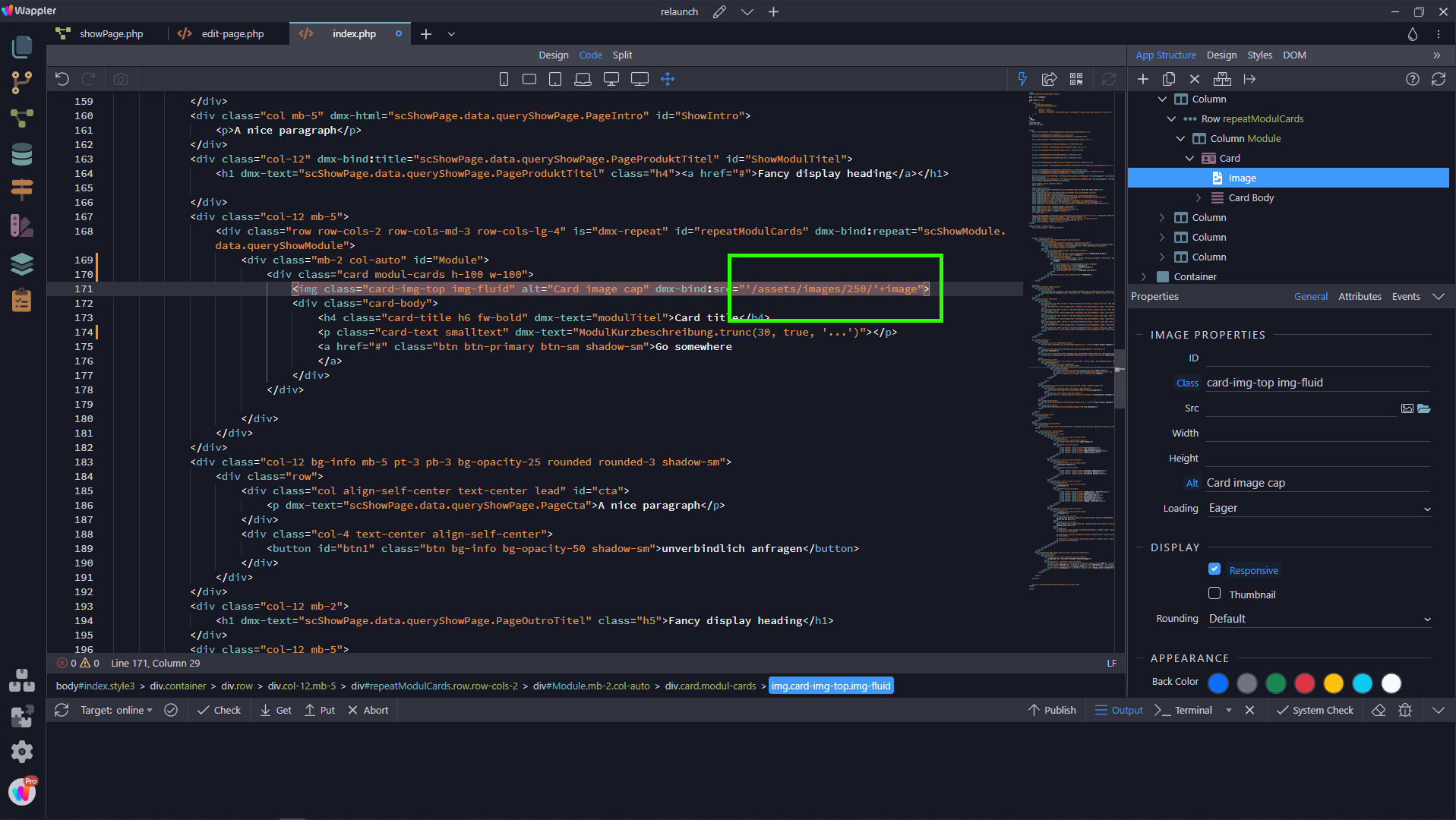
I have 1 Image with 4 size variations
image-small.jpg @ 768px wide 1:1
image-medium.jpg @ 992px wide 4:3
image-large.jpg @ 1200px wide 16:9
image-huge.jp…
The method from psweb works quite well.But I still have questions:
Is there a way to make this a script that creates a variable $device size so it can be applied to all photos?
/assets/images/$device-size/image
I would also like to apply this to the logo, dynamic slider and product photos(dynamic card).
TMR
May 24, 2023, 8:36am
2
We use Cloudimage for this - its brilliant:
All you need to do is set the image size in the URL (different URL for each screen size) then let Cloudimage do the rest - its very good for optimising images. The set up we use converts the image to Webp, in the size we select (crops is required) if Webp isn’t supported by the users browser its automatically rendered in jpg format.
That’s exactly what it’s all about, how can I generate a URL based on the device.
The optimization of the images is very easy via a query.