isn't it correct that dmxRouting.js has to be included twice and dmxAppConnect.js once as <link and once as <script?
<link href="/dmxAppConnect/dmxRouting/dmxRouting.js" defer>
<script src="/dmxAppConnect/dmxRouting/dmxRouting.js" defer>
isn't it correct that dmxRouting.js has to be included twice and dmxAppConnect.js once as <link and once as <script?
<link href="/dmxAppConnect/dmxRouting/dmxRouting.js" defer>
<script src="/dmxAppConnect/dmxRouting/dmxRouting.js" defer>
I think I have adjusted everything as you described, but unfortunately that doesn't change anything
I only have routing once, the script version and dmxAppConnect once, also a script version.
I changed that, unfortunately it doesn't change my problem
Have you tried clearing your browser cache? I have tried your site in Chrome, Safari and Firefox and it all seems to work perfectly.
I just checked your site again now, mainly checking your head section
Please move dmxFormatter under dmxAppConect
Please move dmxBrowser under dmxRouting
It may not make a difference but considering you need the the browser properties, and most of them have formatting on, before it loads the slideshow scripts, i think it would be better.
Last thing is consider adding a noload on your getKatalog, and rather add an onsuccess load getKatalog on your getPage script, so the getKatalog only loads when its filter parameter is already available.
Would an app connect formatter that could do this help?
Image name above and size group of image shown in blue block images
Although I have used the Browser component in one of my How-To videos, it is not entirely the best way to go.
HTML allows one to specify multiple image resources for different browser conditions. As an exaple:
<picture>
    <source srcset="image-large.jpg" media="(min-width: 800px)">
    <source srcset="image-medium.jpg" media="(min-width: 500px)">
    <img src="image-small.jpg" alt="Art-directed image">
</picture>
Here, different images are provided based on media queries (screen width). The
For higher pixel density screens, a descriptor can be added in the form of 1.5x or similar as in
<picture>
    <source srcset="image-medium.jpg" media="(min-width: 500px)">
    <source srcset="image-medium-hires.jpg" media="(min-width: 500px)" 2x>
    <img src="image-small.jpg" alt="Art-directed image">
</picture>
For more...
EDITED
Ok, this has inspired me into releasing my first App Connect formatter extension/video as my next video (probably tomorrow)
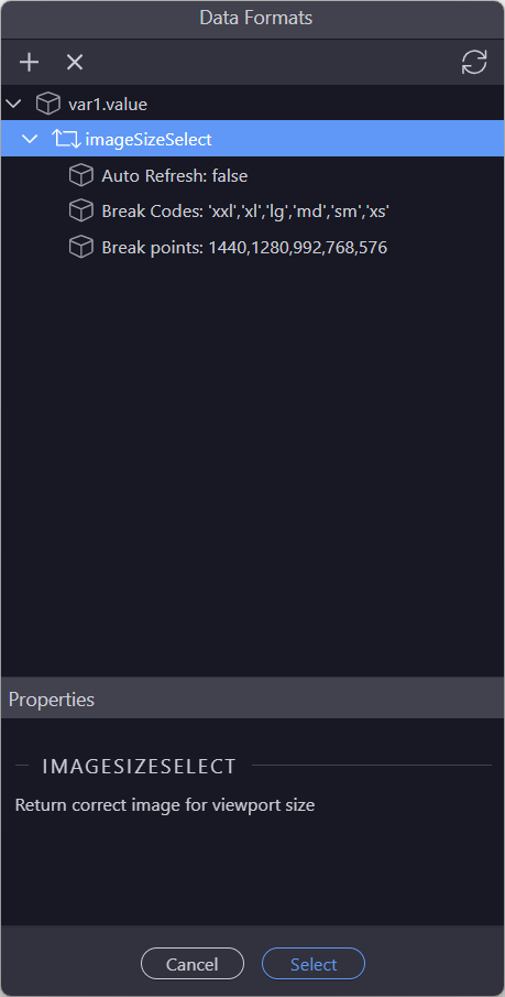
This formatter takes an image file name, for example 'myimage.png'
and returns:
'myimage-xxl.png', 'myimage-xl.png', 'myimage-lg.png', 'myimage-md.png', 'myimage-sm.png' or 'myimage-xs.png' depending on the viewport size
Simply apply the formatter to the image name and the extension does all the work for you automatically switching images as viewport size changes.
Can be set to auto refresh when screen changes or not and where needed, standard bootstrap defaults can be overridden as can break codes so they can be reduced in number if needed
to use, simply create the six variants of your image with the appropriate breakpoint codes and the formatter will do all the work.
Easy to automate image generation with a simple API action using "Resize Image" and "Save Image"
Hi Ben, the reason i initially did not use srcset was because of the way it seemed to work.
So i know most people would be using adaptive over responsive browser resizing, but me personally I resize browser windows all day long.
in general at XXS bootrap breakpoint I would be using my smallest most optimised image, which may have 3 or even more images side by side in a row.
Example at 1400px browser width, lets say 4 images in a row, i land up with each inage at 16x9 having a width of about 300px wide after margins and gaps etc.
While at XS size that same image needs to be about 576px wide, which is almost twice the width.
When i tried using srcset it seemed to work well when resizing a browser window responsively from 576px up to 1400px, but in reverse I kept getting really pixelated images.
Paul, that changes things. This discussion seems to be about Paulsifying  the project rather than having a responsive site where the user opens the browser in a predefined device.
In other words, when a site is viewed in a mobile device, there is not much real estate left to resize the browser.
Basically, resizing of the browser can only occur in desktops that have large screens with higher pixel densities. If the image is pixelated, it means that the wrong image size has been chosen. This is where the descriptor plays a part in using the correct image (e.g. 2dpi-Retina-Screen).
Have a look at this video for more info on images.

Thanks Ben, that video actually helped a lot, i never realised the picture element with srcset would actually do what i wanted, I have only ever used it on an img element.
Will test this out, but in theory it should work well