Just wanna sum up things a little bit.
Overall, we have those options.
-
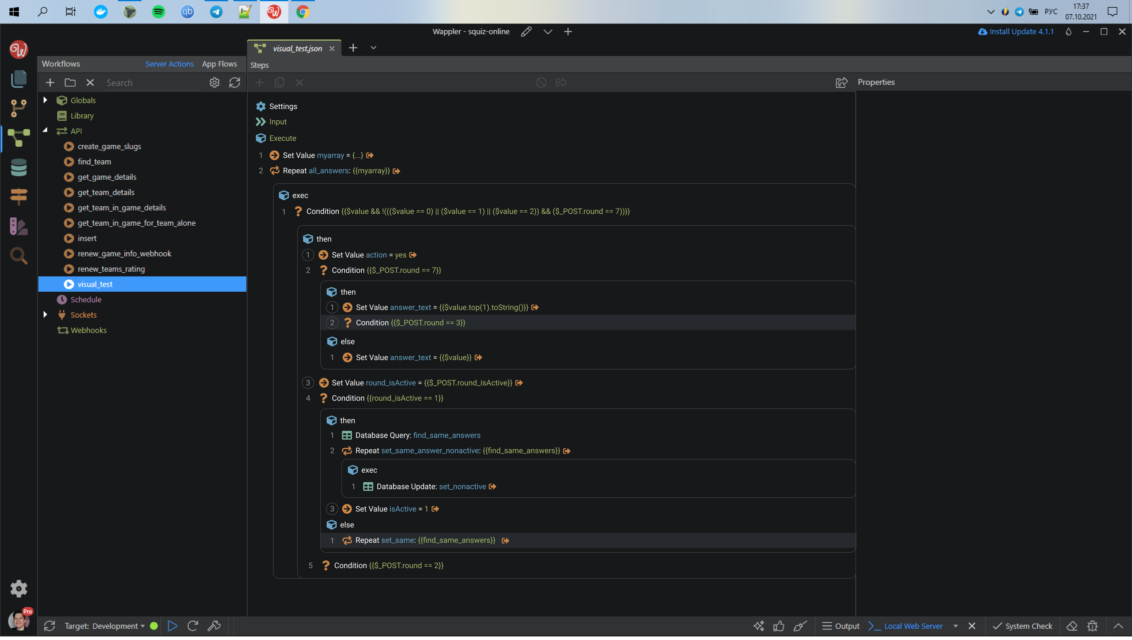
With arrows and without numbers and without individual comment toggling.
Users can click on arrows to expand or collapse inner nodes. So, this version is closest to actual Wappler view and behavior. Though, I changed the arrow’s design a little. Also I on purpose placed dots on the empty spaces between arrows. Few posts earlier I explained why I think this is necessary.
To see the comments, users have to toggle the “Show/hide all commentary”.
-
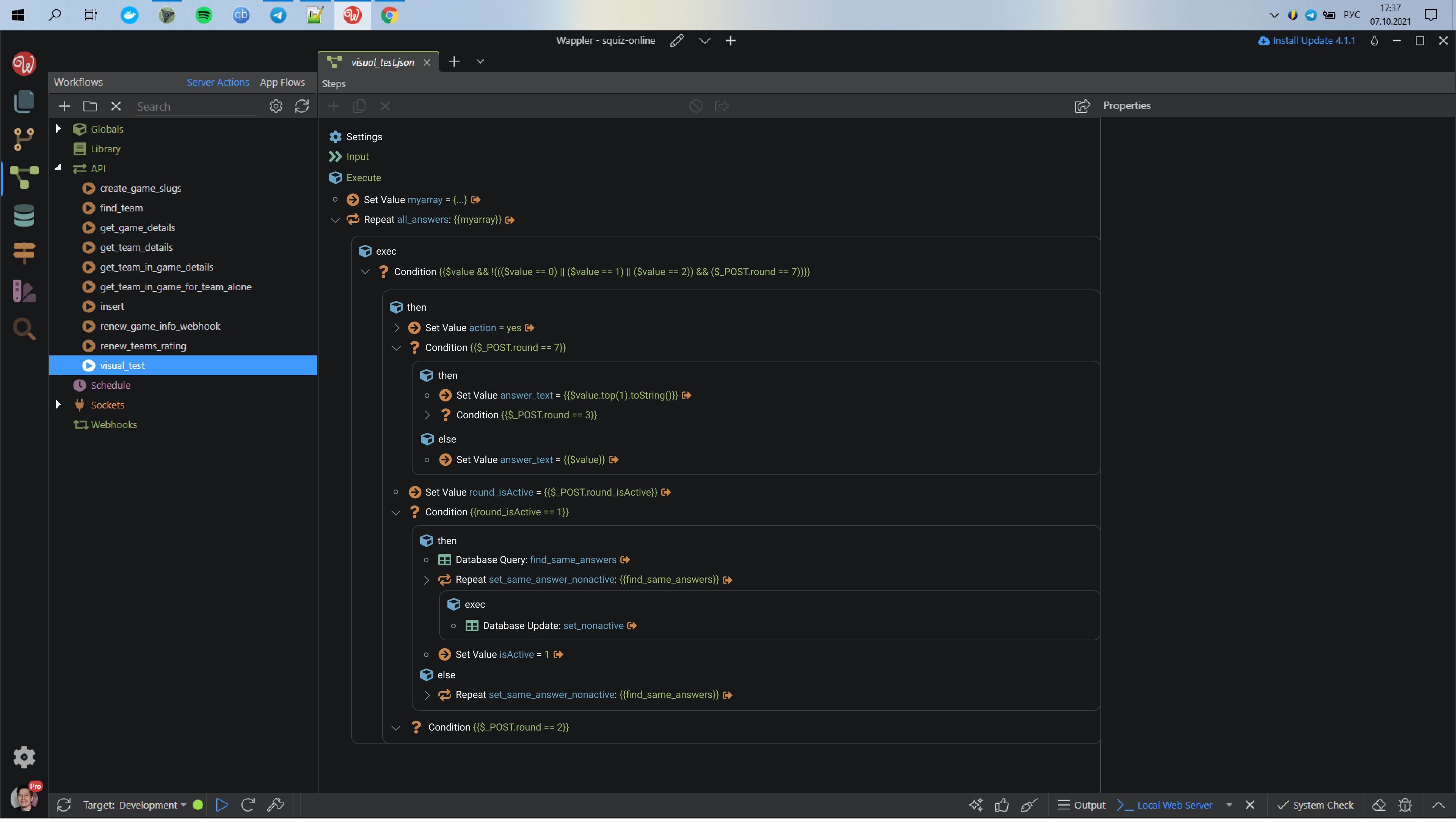
With arrows but also with numbers and circles.
For each block there is a vertical panel on the left, where all the arrows show. Users can click on arrows to extend/collapse inner nodes. This behavior remindes regular code editors.
When the user clicks on the number, it shows/hides a panel for comments for this particular node.
Circle around the number indicates that this node already has a comment.
-
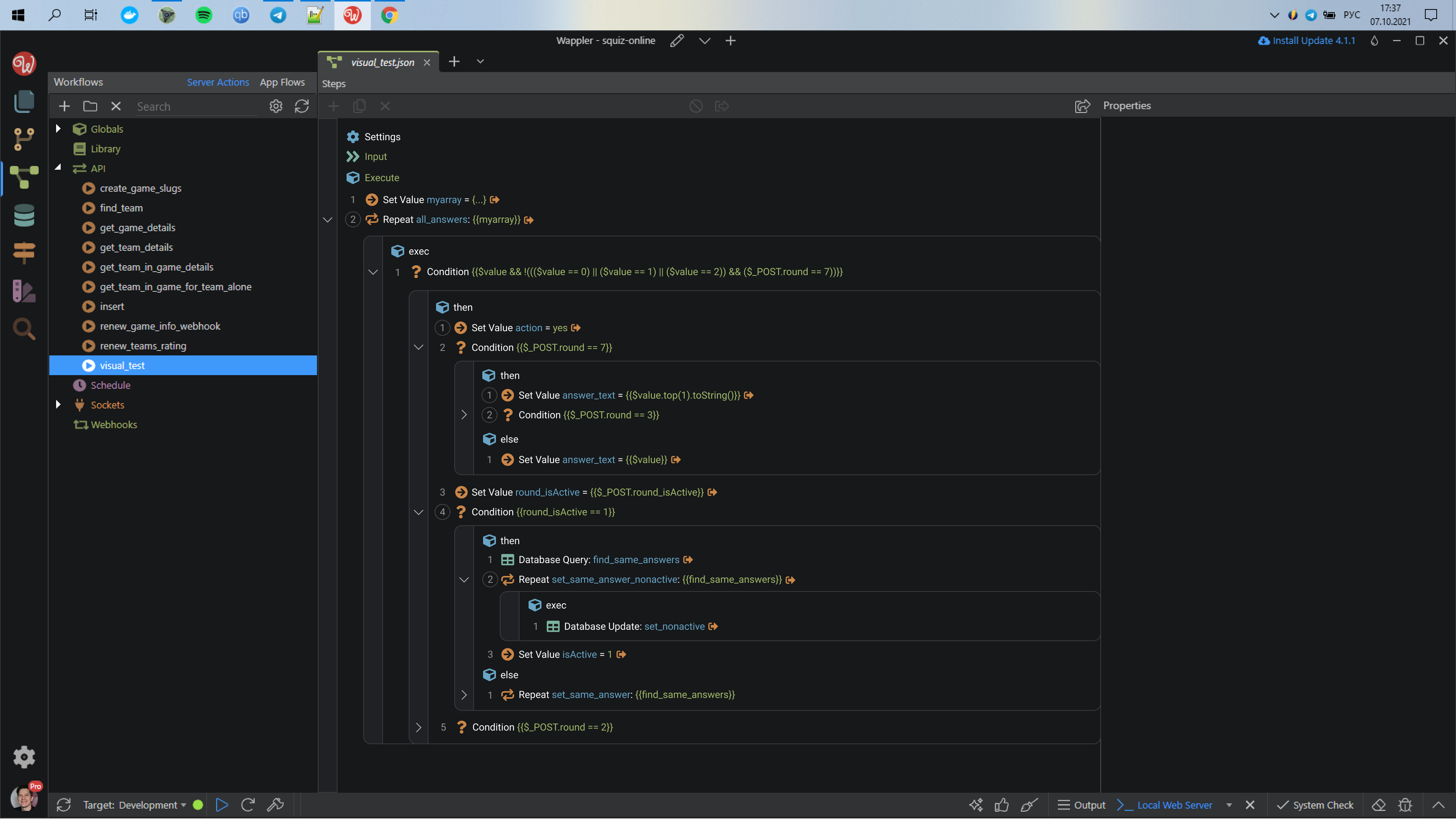
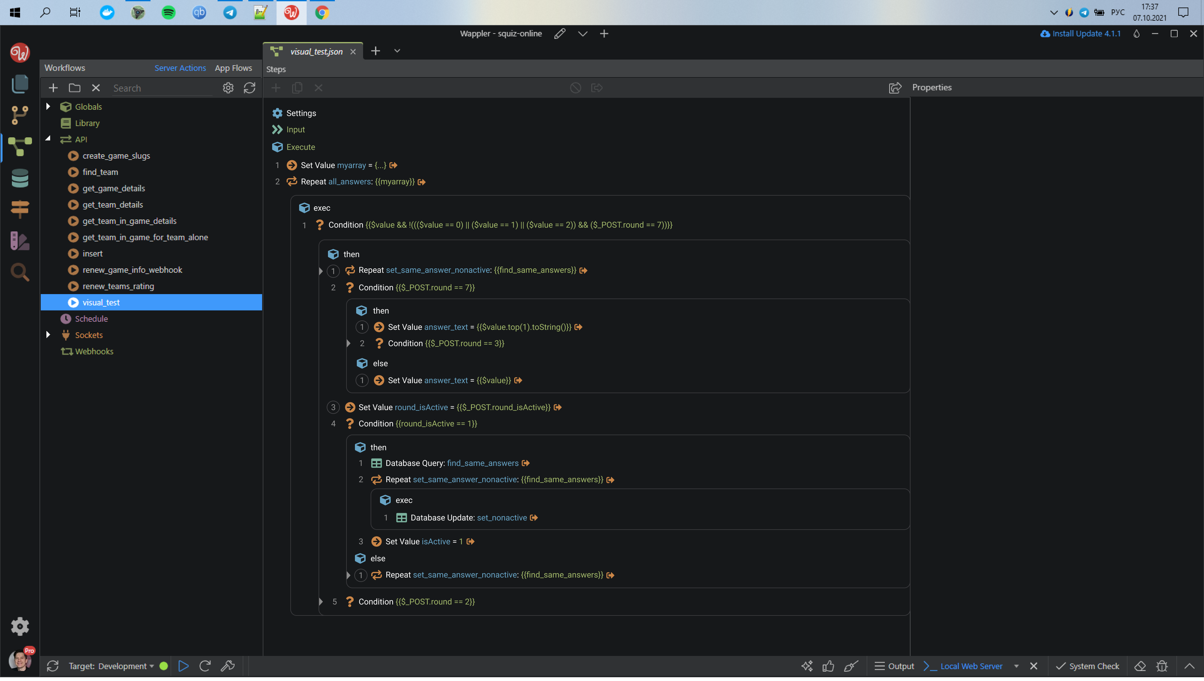
With numbers and circles, but without arrows for toggling.
In this version, when a user wants to hide/show inner nodes, he has to click on the node itself.
When the nodes have some inner nodes collapsed, we need to indicate that fact somehow.
For that we can change the background of the parent node (similar to regular code editors) or we can add a triangle connected to the border. These triangles are not clickable, they are just markers.
Similar to variant №2, when the user clicks on the number, a comment panel shows up. A circle around the number indicates that this node already has a comment.