I am struggling in reading and understanding it. Hard to see, what is going on.
In my version there is some changes:
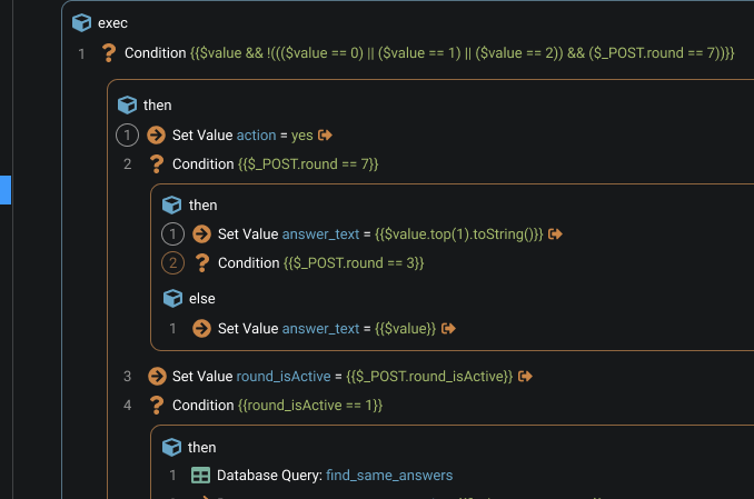
Every logical part of the workflow is visually separated from another by borders. So it looks like rectangles, or blocks. Now it easy to recognize them. Even more, there could be a color coding. For example, blue borders is “repeat” and orange is “conditional”.
To the left of every step now is a number, that shows a index of this step inside this logical part of workflow.
Deleted all white arrows. For me, they sometimes help, but most of the time just confuse.
Deleted all “Steps” lines. I understand, that there is maybe some use of it, that I don’t come to still. But at the moment it just only make harder to read workflow.
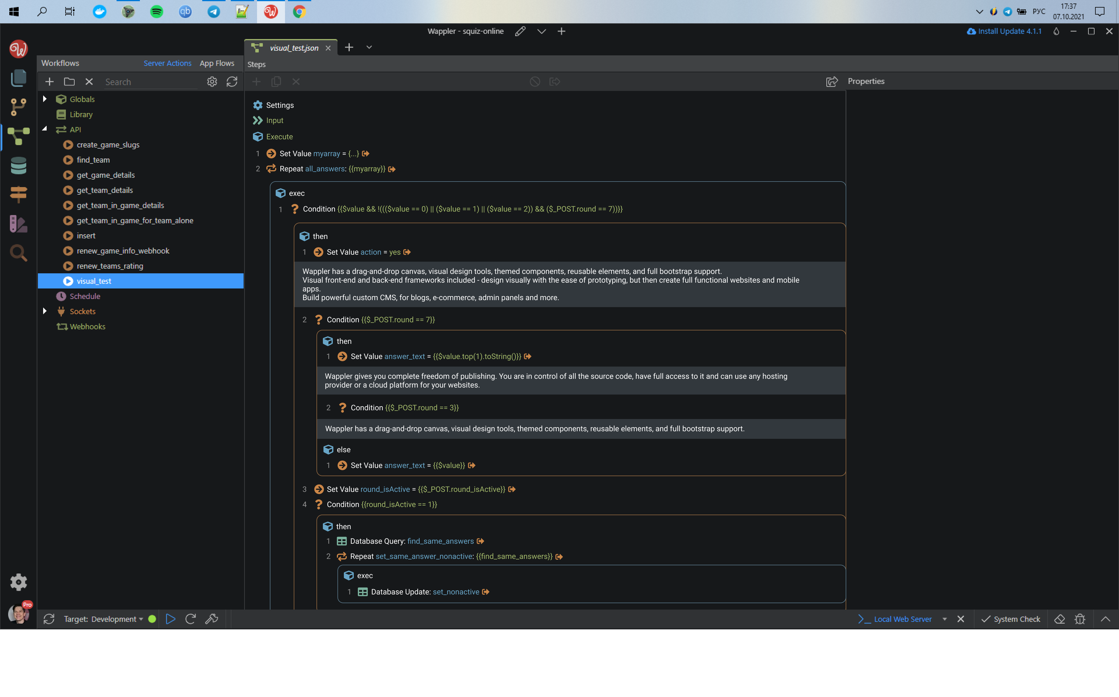
I added comments in the way of collapsable area with flexible height.
At the moment I don’t figure out good way to visually show if step have some inside steps or commentary inside. There is some ideas, that shown on the other design layouts in Figma, but I am not sure about them.
I understand that my concept not ideal, and especially because I’m relatively new to the Wappler. So feel free to ask questions, make suggestions and give criticism if needed. Let’s find comprehensive solution together.
I can’t say this is my ideal concept but it’s truly more readable. You brought to the table an interesting request.
It’s true that some of my workflows could do with some readability improvements. I tend to keep workflows simple to avoid what you are showing but a few of them I couldn’t break down.
Really like the readability with the borders.
I was just struggling with the same thing about 2 hours ago. Even though I have very few steps, but having multiple nested conditions made it really difficult to track which is nested where.
What interesting here is getting rid of the STEPS node in the tree. Which is pretty useless in my opinion.
With that, adding some padding and border does not increase the overall height of the SA and same number of steps are visible as before.
Although, the left icons still need to be there to expand and collapse nodes, rather than the serial number.
I did not like the comments design though. I would prefer the comment step itself as it is right now.
One thing you can be sure of is that you won't come up with a solution which everyone likes - but I think your suggestions look great. Unlike @sid, I like your idea for comments; as I mentioned in another feature request, I think comments are currently very awkward to use - to enter or to read.
I certainly agree that the borders help make things much clearer. However, some related problems - eg:
.. is perhaps as much a problem with Wappler's shortcomings as UI problems. In particular, the lack of an 'else if' condition potentially results in unnecessarily clumsy, difficult to read 'code'.
That is kinda true. But the UI of comments suggested above is not a good solution either. It needs to be something that works with the current UX.
There is some great discussion in the linked FR. Hope something happens on this front.
Although, the left icons still need to be there to expand and collapse nodes, rather than the serial number.
I agree that should be obvious indication if specific node can be expanded. For seeing inner nodes or for comment. And of course white arrows we use now is common and solid solution. But I think it is clumsy and heavy in part of visualization.
So my idea, is that we could use serial numbers itself instead of arrows. For example, circle around the number could be indication, that there is something inside. We can click on this number-button to see inner nodes or comment.
In this design layout color circles means inner nodes (orange for if/else, blue for repeat etc) and gray circles means comments. I wasn't sure about this layout so I didn't put it in first post.
If you still doesn't comfortable with this option, can you please describe in more details why?
Similar question about comments. Why exactly my version doesn't suits you?
If a redesign is being worked on, it would be great if a search facility could be incorporated - eg to search according to @Antony's suggestions made here:
...it would be a great time saver to be able to search for the names of:
Database Queries
Set Value
Set Session
And maybe some other things..
I think this is one of those features which somehow got lost, due to misunderstanding perhaps. This request was closed with:
Search input has been added to server connect panel in Wappler 4.0
.. but unless I misunderstood the request, this hasn't been implemented (or perhaps I've managed to overlook the feature).
I would still prefer the arrows. They might not be aesthetically pleasing.. But they will be easier on the eyes compared to numbers and circles.
And the border around nodes and numbers seem like too many borders now. Also, since the numers keep restarting from 1, its disorienting.
Its taking up too much space and are too in focus.
In a regular code file, comments can span many lines without any hinderance.
Wappler's list of steps need some other solution so that comments can disappear and still be usable when needed. Don't have anys ideas yet.
Got you. I will prepare alternative layout with arrows.
Just in case, maybe I wasn't clear about comments before. If so, my bad. I meant, that comments not supposed to be shown always. Every comment could be easily collapsed the same way that it was expanded -- by clicking on number.
So basically, it is the same comments as it now. But less clicks needed for creation + multiple lines available if needed + specific comments can be hidden/shown in 1 click.
And about comments colors -- it is open for discussion. For some reason I pick light grey color for comments background. But we can try another color, less bright.
I really like the border idea as this would make it so much easier to read.
The concept of code collapsing should remain, but if the white arrows are removed then instead for code collapsing do what the code editor does by having a left margin that on mouse hover displays the arrows that allow you to collapse the code, and collapsed code arrows always remain visible until toggled back.
I personally don’t see the need for index numbers as I think this will create more confusion and visually you can see where each logical flow is especially with the colored borders
Agree with multi line comments that are collapsible, but would add a request for a global comment expand toggle switch on top of the page that will toggle expansion / retraction of all comments at once this would reduce a lot of mouse clicks. This is very similar to what Ken asked for in another post to have a global output toggle switch at top of the page, which would also be a great addition.
Thank you for creating this feature request, excellent idea.

