Not at all sold on the number thing. ![]()
Having so different collapses for every comment will be a big hassle. I like the idea about just a single show/hide for comments as suggested by others.
That way, the comments can look however they want, since they will not be always visible.
Hey Nick, wanted to chime in here. Amazing effort.
When building a visual design tool with user experience in mind, it’s really important to take advantage of the space you have, the whole canvas, similar to how a painter will take advantage of all the space on their canvas to tell their story. The same should apply here. The more breathing room each element of the logic interface has, not only will it be easier to read each element, it’ll be easier to understand the bigger picture that each element combined creates. It’ll also be easier to understand contextual fit for each element, which, in some instances, can be just as important. With all that said, I think that taking the approaches that AppGyver takes with their visual tool is ideal in that regard. Merely the simple premise of their logic tool immediately takes the most advantage of the canvas while also maintaining efficiency and high readability, which is impressive to say the least. They also cleverly made their logic elements to look like literal puzzle pieces, thus allowing us to immediately recognize each element as what it actually is, one piece that when combined with the others creates a completed picture. So, while I think your redesign is wonderful, I’d seriously consider looking at AppGyver’s take and stealing theirs.
I wanna thank everybody for support, upvotes and detailed comments!
Seems like this topic is really needed and I have a feeling that our discussion will affect future design in Wappler.
.
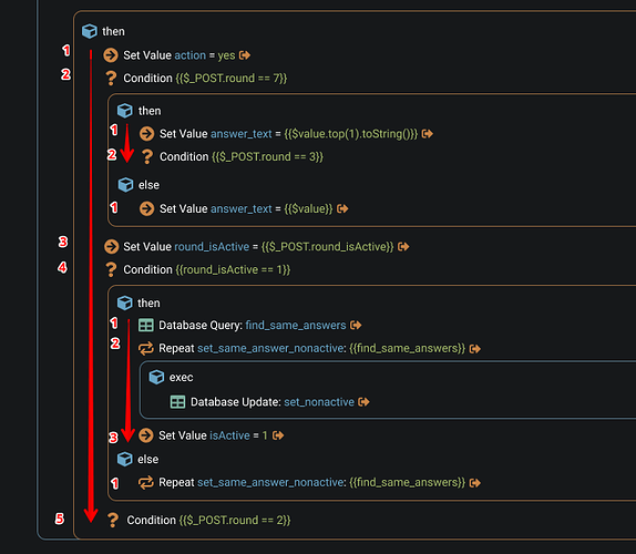
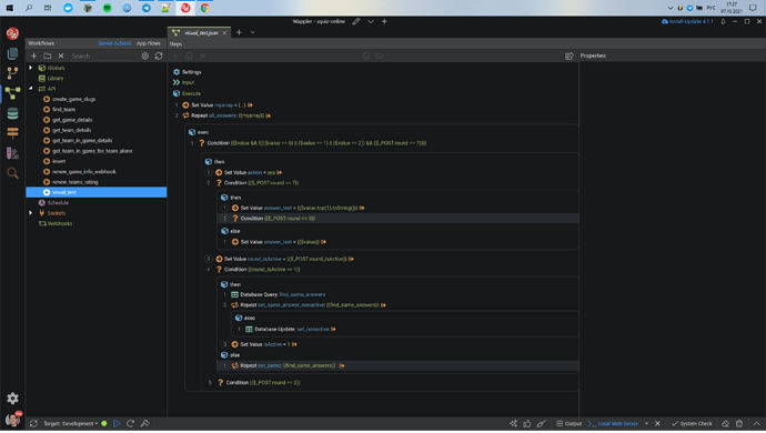
It feels I should clarify why I am not comfortable with arrows.
First of all, yes, I love the idea with numbers. And if we keep both arrows and numbers, that means we have one extra column, so overall design gets more details and becomes more clunky.
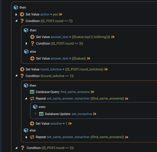
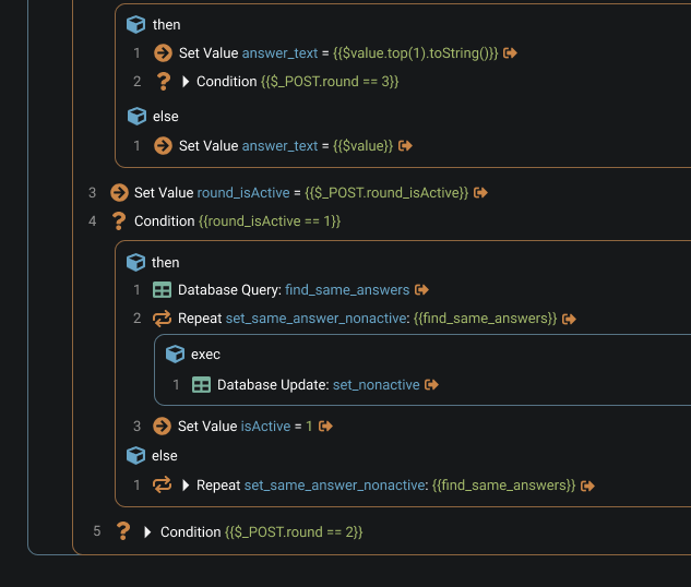
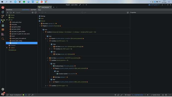
But there is another problem. Arrows don’t appear in every line, so sometimes it is empty space instead of it. Because of that there is no imagined vertical line that helps us to understand that all steps are on the same level.
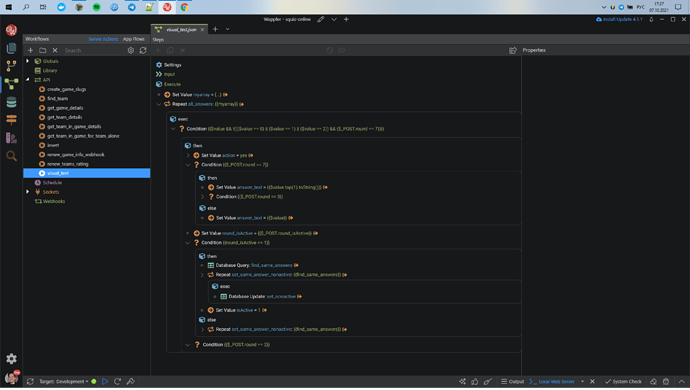
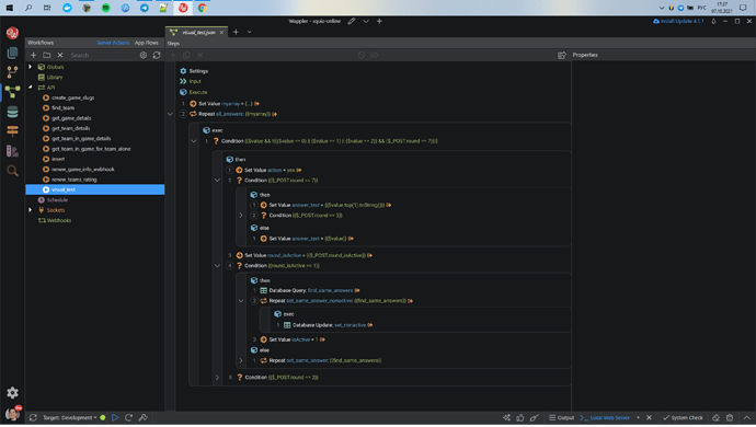
Here I see the sequence clear even without numbers.
But here it isn’t so easy. Arrows and empty spaces confuses me
I have some possible solutions for this problem. All acceptable, but I don’t like any of them too much.
-
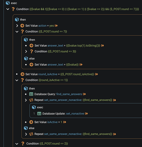
Fill empty spaces with some elements. For example, with dots. It’s ok, but not quite good
-
Incorporate arrow to border. Original, but seems too unfamiliar. (but gets along with numbers)
-
Incorporate arrow to text. Accurate, but also strange. (also gets along with numbers)
That’s why I prefer circles. 
But I also have some more ideas that don’t have anything to do with circles or arrows. Gonna show it later.
That definitely should be, I agree.
But sometimes I just wanna see comments for specific nodes. This option should be available too.
Good idea, thank you! I will try that
AppGyver is indeed an interesting tool with a nice UI.
But I am just trying to refresh the existing Wappler design without significant changes.
Of cause there are many different approaches for visual programming design. It would be interesting to examine them all in order to find or develop the best solution. But at the moment It is too complex and a big task for me to participate.
I'm not clear about what benefit the numbers add, at least as in your examples.
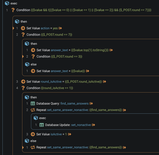
Generally, I'm certainly in favour of numbers - eg in text editors (including Wappler's code view). I think there would be something to be said for having line numbers, like in a text editor - eg a number for every line, in the left hand margin.
I don't know, I just feel like it would be easier to read/understand the sequence of the nodes/steps.
Btw, It must be noted that I'm not a developer actually. Before Wappler I have been working only with nocode tools (eg Integromat). I even have installed VSC first time 5 minutes ago. ![]()
So my perspective may be quite different. But it is a good thing, I think. Because Wappler is aimed not only at professional developers but also at citizen developers. We all, different users with different backgrounds should share our views with others and eventually come up with a comprehensive vision.
I think the sequence of the steps is perfectly clear, visually. Line numbers are useful for reference, for various purposes - but only if they’re unique. I think discreet, unique lines number, in the margin would be useful. I think the numbers in your examples add unnecessary clutter, without being obviously useful (at least not to me).
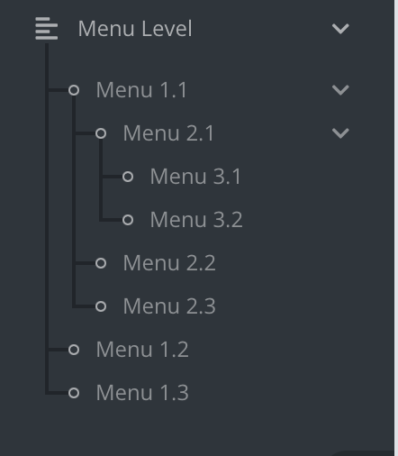
Could something like this possibly work instead of numbers on the side, you could end the line when nothing is able to collapse and have the circle when there is content to collapse, or have the circle empty when nothing to collapse and fill the circle when there is content.
Not sure how well this would work but just a idea
Another advantage of unique, sequential numbers is in relation to collapsed sections. The numbers offer extra information about what is hidden. Eg:

Having said that, there is an argument for saying there shouldn’t be numbers at all, given this is not a text editor (but I still think there would be an advantage in having them).
That could be useful. But having another collapse on each step is definitely not the solution.
Maybe a tooltip or something would make more sense.
Loving the debate!
At the moment, I put all my comments IN UPPER CASE so they stand out.
I have some huge and complex algorithms in my app. I’m actually getting on pretty well with the existing layout.
Whilst I know this thread is about graphical layout, what I keep wishing for is to be able to cut and paste regions of a workflow…
Just wanna sum up things a little bit.
Overall, we have those options.
-
With arrows and without numbers and without individual comment toggling.
Users can click on arrows to expand or collapse inner nodes. So, this version is closest to actual Wappler view and behavior. Though, I changed the arrow’s design a little. Also I on purpose placed dots on the empty spaces between arrows. Few posts earlier I explained why I think this is necessary.
To see the comments, users have to toggle the “Show/hide all commentary”.
-
With arrows but also with numbers and circles.
For each block there is a vertical panel on the left, where all the arrows show. Users can click on arrows to extend/collapse inner nodes. This behavior remindes regular code editors.
When the user clicks on the number, it shows/hides a panel for comments for this particular node.
Circle around the number indicates that this node already has a comment.
-
With numbers and circles, but without arrows for toggling.
In this version, when a user wants to hide/show inner nodes, he has to click on the node itself.
When the nodes have some inner nodes collapsed, we need to indicate that fact somehow.
For that we can change the background of the parent node (similar to regular code editors) or we can add a triangle connected to the border. These triangles are not clickable, they are just markers.
Similar to variant №2, when the user clicks on the number, a comment panel shows up. A circle around the number indicates that this node already has a comment.
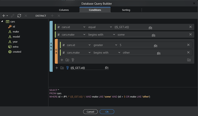
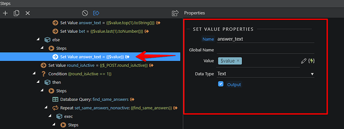
Actually like this very much, the blocks grouping at least. Reminds me what we have in the query builder as conditions
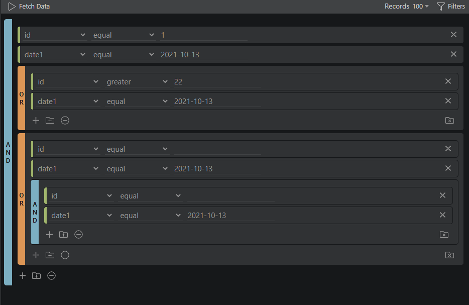
and also in the table editor as filters:
maybe we can use similar design to group the Server Connect actions with colorized collapsible bars and titles.
Maybe we should also integrate more description in the title - instead or next the current more code parameter oriented titles.
Thanks! I'm very happy to hear that.
Do you mean to bring all the fields from properties to node itself so we can edit it right in the tree?
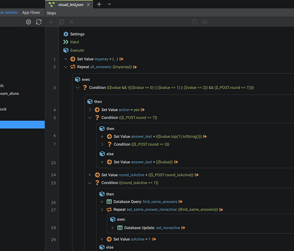
What about having a full line number similar to the (php)pages? It would help when working in a team to point on a specific position in the workflow.
I may feel silly asking this but what is the table editor? Is this a major feature of Wappler I've not yet used?
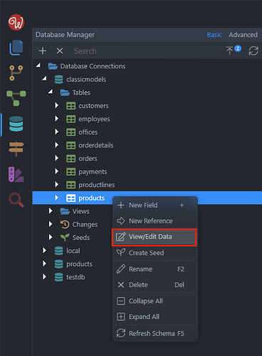
Yes it is a major feature ![]() This is the Database Manager, which allows you to view and edit table data:
This is the Database Manager, which allows you to view and edit table data:
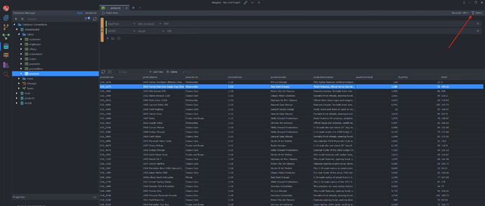
Where you can also filter your data to find specific results:
Aah, I’d not used the filters part, that’s what confused/excited me! Thanks @Teodor.
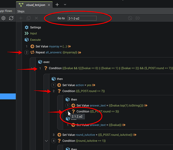
It could look like that, if we don't count "exec", "then", etc as lines.
In my opinion, it doesn't fit here.
But I have an alternative suggestion.
We could use a sequences of numbers inside the blocks for naming the "coordinates" of specific nodes.
Example:
User points a cursor above the node and a serial number like "2.1.2.a2" shows in the tooltip.
Also, there is a search input at the top of the section, if you need go to exact node fast. (this field accepts not only periods for separators).
What do you think?
