It is not about their design. It is about the fact that they kinda “cut” a hypothetical vertical line that allows me to easily read the sequence of the steps of each level. And, therefore, to see whole structure.
Here the tree with and without them. Which structure is easier to understand?
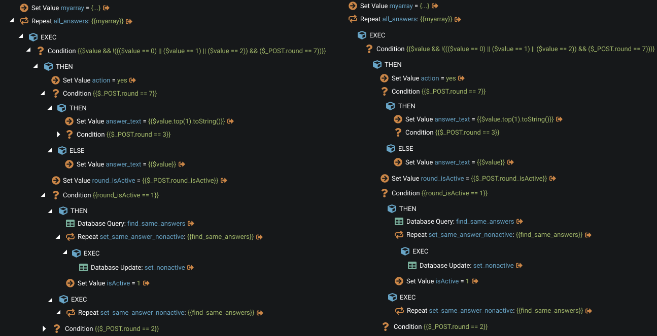
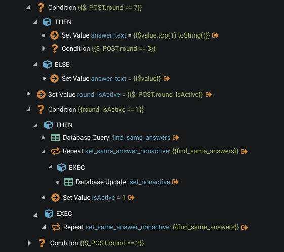
But I don’t suggest erasing the arrows. There must be a thorough solution. Maybe with arrows, or may not. In current not boxed layout there is not much options left.
For example, we could keep the arrows but fill the gaps between them. I know, it so-so. But at least levels are seen.
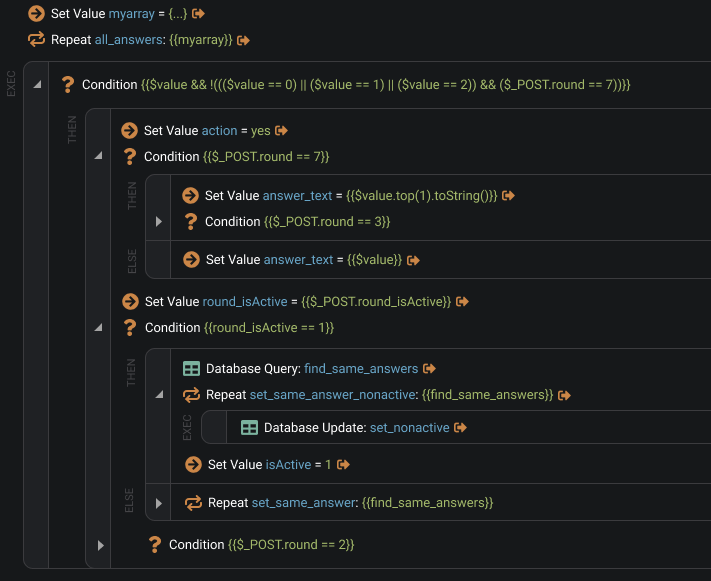
Really interesting options came up in the boxed design. I showed some of my ideas here and here.
Probably, my favourite is with numbers, where we reduce arrows and instead of it the circles indicating that this node can be expanded. And for expansion we could just click on the circle/number.

Considering options with arrows and without numbers there is good one, I think.
Anyway, the case is closed and we are moving forward.
But arrows need to be addressed. Because it affects not only SA but App Structure too. I’m going to come back to this matter later.