One of the things that makes a long wavy line of code difficult for me to read is the lack of space between blocks of information. Below is a basic model to show what I mean (click on the top nav links)
The ability to enable additional margin to the left and bottom of the information blocks could be accessed from either the top of the panel or in the user preferences for a more permanent set up.
I think the problem is not about thin indention, but about arrows. Because of them it is hard to read the levels.
I described it here. But it seems like my explanation wasn’t clear.
Here is a more simple example. This red line must be straight in order to see levels easily.
Finding a good solution for this is not simple.
I tested some options, you can see them in the post linked above.
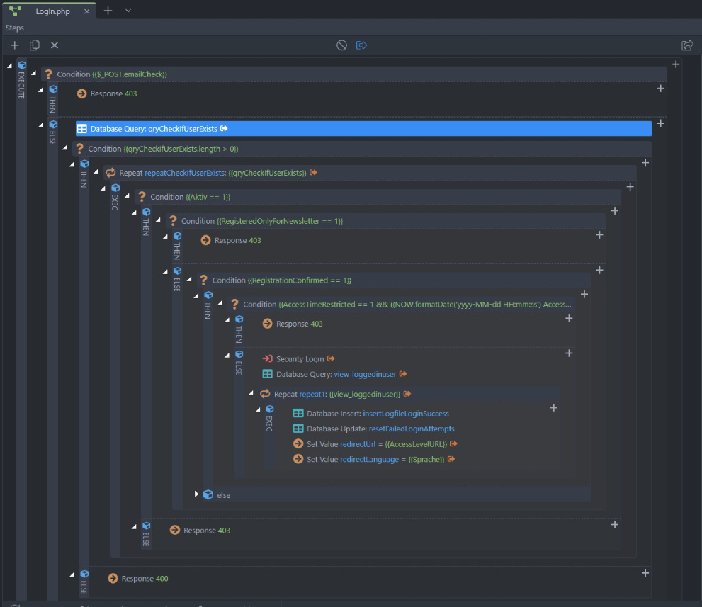
But this problem with arrows affects not only SA and PF.
Same with reading levels in page structure.
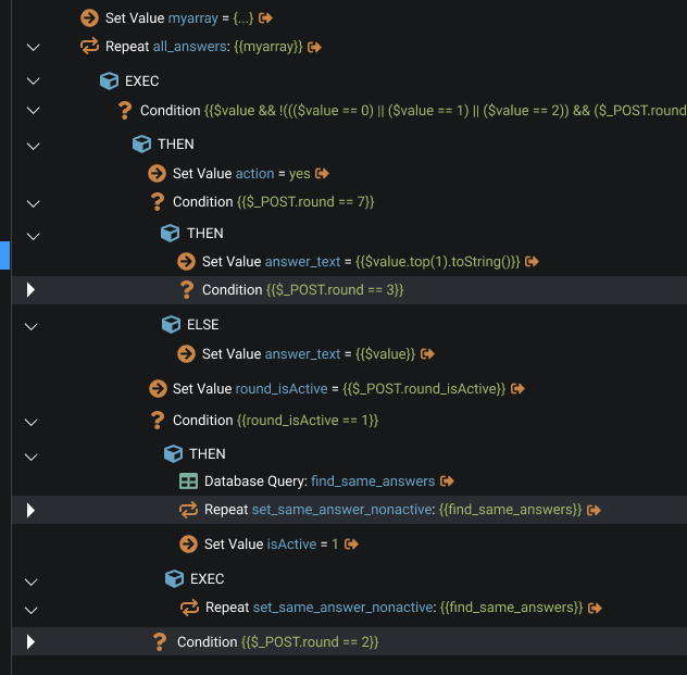
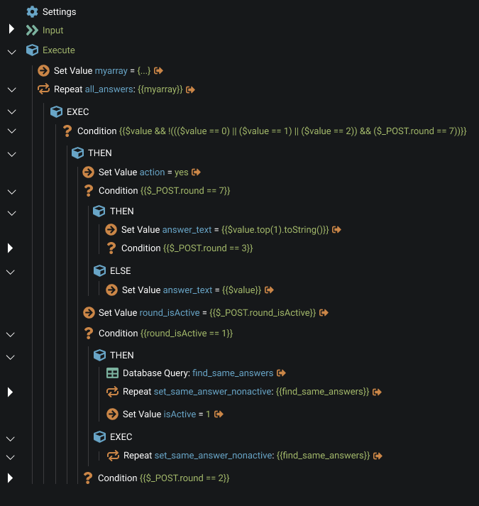
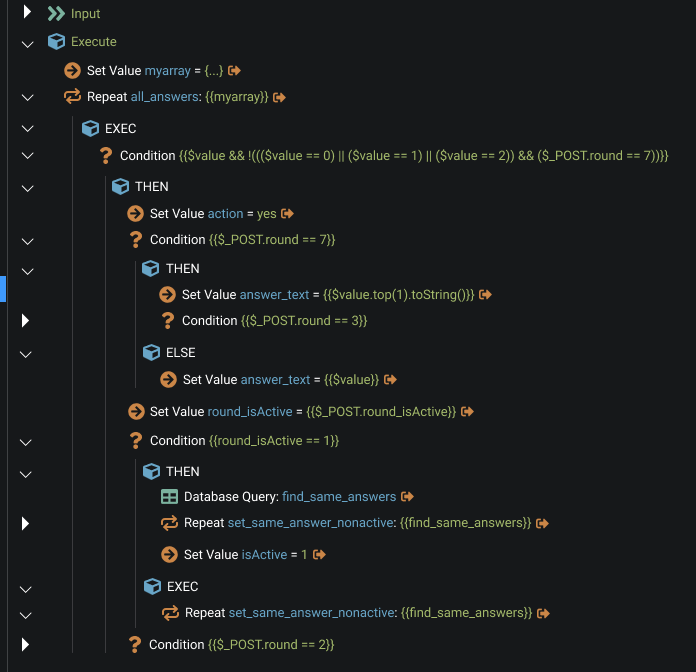
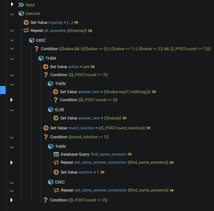
It is very hard to understand the structure in this case.
I didn’t see the page you linked to above so I’ll check it out later tonight. It looks great. I didn’t know there was another thread on the same subject so I missed that thread, completely. I was about to do a design that had circles like you have to replace the arrow function. Great minds…
On first glance, I still think margins would make the blocks more discrete – it gives the eyes space to breath – but I admit I’m a novice at how this side of Wappler works so it could be more complex than just nesting boxes within boxes. Anyway, I’ve only just started to check the other thread so I’ll comment over there.
.
.
.
.
PS: I had trouble linking the Figma prototype this morning and ended up posting the wrong link. Next thing I saw a cursor on my screen moving around by itself. It looked like a Ouija Board planchette moving on it’s own and freaked me out till I realized what was happening. It was probably you, Nick.
I don't know what you talking about... I'm afraid your Figma file is haunted. I've heard some scary stories about it. You better call some kind of webxorcist.
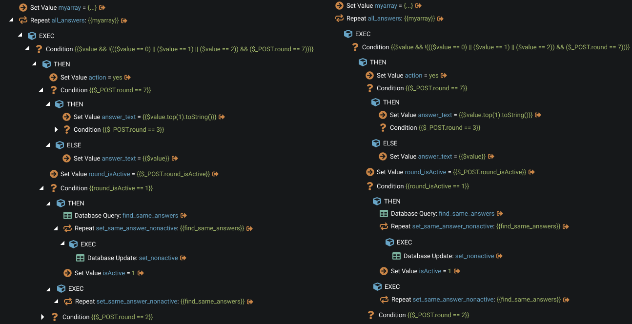
It is not about their design. It is about the fact that they kinda “cut” a hypothetical vertical line that allows me to easily read the sequence of the steps of each level. And, therefore, to see whole structure.
Here the tree with and without them. Which structure is easier to understand?
But I don’t suggest erasing the arrows. There must be a thorough solution. Maybe with arrows, or may not. In current not boxed layout there is not much options left.
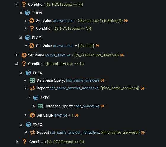
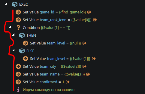
For example, we could keep the arrows but fill the gaps between them. I know, it so-so. But at least levels are seen.
Really interesting options came up in the boxed design. I showed some of my ideas here and here.
Probably, my favourite is with numbers, where we reduce arrows and instead of it the circles indicating that this node can be expanded. And for expansion we could just click on the circle/number.
I’m not sure about this.
Yes, it kinda solves the problem I am talking about.
But without highlights it is not convenient because I need to move my eyes all the way to the left to understand if it could be expanded.
And with highlights it creates much distraction.
Overall, in my opinion, VSC style doesn’t fit well with the current Wappler approach.
But I understand that many of us find it familiar and convenient.
It could be a nice minor iteration for the tree view seeing that the it is no longer going to receive major changes as per george’s feedback.
I have the suspicion that the new view that they will build from scratch will be based on flowchart elements so we will end up with two views(tree and flowchart). One to satisfy low-coders and the other one for no-coders.
So @george how about removing indentation from arrows and using the proposed icons?
On a sidenote I do enjoy how this one looks like, but I am pretty certain that in real case scenarios it will just knock out my brain.
But I do like it. Nice work!
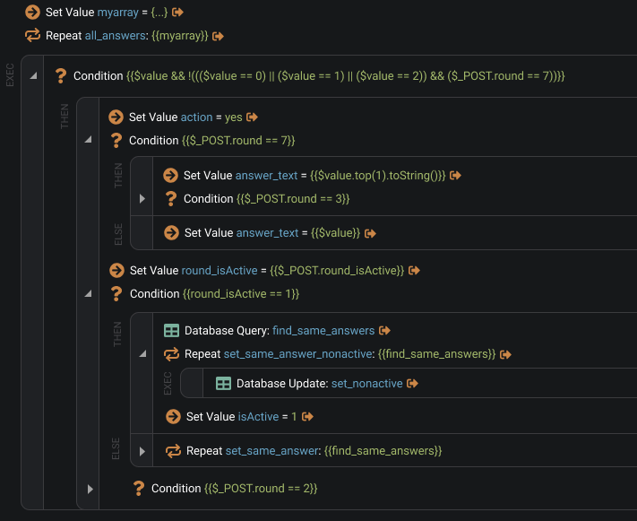
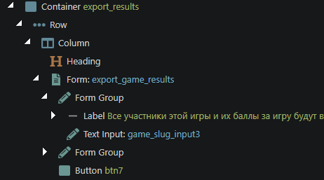
I really like this option. The concept completely repeats the code editor, which is a big plus, since the uniformity of information display improves the user experience. It is also very functional and at the same time clean. The best option for me.
Indeed. I think this is perfect for tree view and perfect for people used to code view.
While it may not be the visual solution no-coders are expecting it does also fix the original issue of having the arrows indented and it’s pretty clean when separating blocks.
@George any chance we get a smaller revision including this for the current tree view? Including the improvements you already made of course. Coders and low-coders will thank this I think.
No-coders will have to wait a bit until you guys come up with the new view. But for the rest of us it solves all the problems
So it’s a shared component? That’s a bummer. Maybe make the case study of changing it throughout the app if it makes sense and makes things clearer on all tree views?
I don’t know how it would look in other parts of the app. I just know that in Server Connect it makes things much more readable.
Regarding icons using a solid one when collapsed and a light one when expanded makes a lot of sense from a UI perspective. Solid meaning it contains information therefore it’s filled and light meaning it no longer contains/hides information thus being empty.

 I'm afraid your Figma file is haunted. I've heard some scary stories about it. You better call some kind of webxorcist.