I’m also a little disappointed the new design has been shelved. I think the idea went off at a bit of a tangent with the horizontal boxes; perhaps this has resulted in abandonding the ideas.
Having said that, I’m very grateful to @nickneustroev for all his work on this and his inspiring ideas. Also, I don’t think these efforts were wasted. While the main ideas have not been implemented, some critical ones have been and some really useful improvements have resulted - in particular the reduction in unnecessary clutter from the SC editor and the right-click options.
Perhaps more changes inspired by this thread will follow in due course.
Yep. I voted that for the same reason and not personal preference. I think the team could be shooting their toes here if they add the two options.
I do see a full redesign as to how we build server actions and the UI in the future with the flow libraries I mentioned before. Something for Wappler 6 or 7. That would make the whole thing more visual and would be very appealing to nocoders.
But if we are keeping the good ol’ way of presenting the flow as an indented tree(same as any code view) they should focus on giving the best experience in that area.
I actually see it more as a personal preference, just as you can choose your icon size or switch to list view in the assets and project manager, you can just as easy switch in server connect from tree to blocks view.
I’m good with it either way. I’d probably just use tree view anyways. Hopefully it can be set as a default. Just think you are getting into a documentation and support nightmare. There are other things in the Server Connect process that needs more attention than blocks. Getting rid of the modals comes to mind.
Appreciate whatever you guys choose to do. Thanks.
But you could make a decision to use just the tree view in all documentation and leave the blocks view for people who prefer that. I don’t think the docs need to cover both.
I definitely like the idea of both options especially as the blocks view has been created. Seems a shame to bin it.
I know, I know, everyone has already spoken out on this topic, and I have no intentions to start it again. The decision is now in the hands of the Team.
But I just want to point out that “blocks design” does not have to look much different from the existing way.
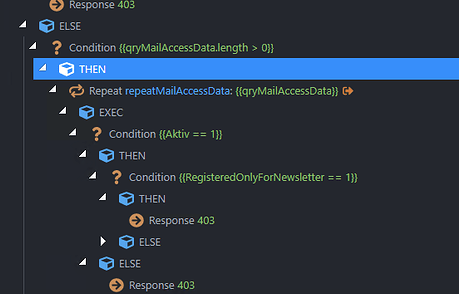
Take a look at this layout.
Yes, this is a boxed, but it is completely identical to the current tree, except for the subtle thin borders around logical blocks.
I don’t see how this approach will require additional support costs or documentation misunderstanding.
Actually, now I see that this is the only thing that I should have drawn in the first place.
All these many different ideas and improvements from me, from other wapplerers and later from Team… That was too much and too soon, and in result we stray away from what really matters.
Instead of boxes why not iterate on the concept of vertical lines they already introduced?
They could continue with this approach but extending it to all the tree and not just if/else. They would just need to make the line subtler and thinner as the current one would probably be too thick to have nested ones.
Also another nice touch would be to make the chevrons light instead of solid. Or make them solid only when they are collapsed and light when they are expanded.
All in all, it’s a well known and accepted design pattern in code editors and gives good clarity while avoiding bloating the UI.
Yeah I understand it can be hard to get used to it, but it is a common design pattern accepted by millions of coders.
I’m pretty sure eventually you would get used to it and your brain would be able to identify the blocks just by seing the vertical lines as we coders identify them in any code editor.
On the contrary, the boxes are not used anywhere I can think of. I’ve used dozens of code editors through my life and I’ve never seen that design pattern. And it probably has been suggested and studied before.
That's the point, coders, and I think that wappler is not only for coders, for who we are designers for example see the tree is really a mess, if i were a coder probably use VS or other code editor.
With all respect I thinks that here some wappler user are not considering or are missing in the most important part of this great software, the visual.
In my humble opinion I see this readable although you don't considering the original box design that were launched in previous versions.
When someone starts learning to code he is not a coder yet the design pattern is the same. It doesn’t evolve from a box to a vertical line with experience
It’s a line because it’s battle tested, easy on eyes, and on the brain.
Have to agree with @JonL when it comes to the code view. I was a Bubble “no coder” and now a “pretend coder” and this type of line separation for nesting is so much better than blocks!
I updated to new version, and I'm just a bit disappointed, because now I see that this was in vain.
Any way, just for couriosity porpuse, I'm asking in the most polite way, would be nice to know what was the inititative from developer team to initially launch this feature and then remove it completly. Because if the dev team considered it and at finally waste time trying to implementing this, sould be a reason for all this.
At same time thanks to Wappler Team for a great software.
New feature about Native Dialog and Popup Windows are just great.
We are still working on the new blocks design so it is not off the table.
It is just that current proposed blocks view is just not much different from the original tree view, specially now that we have enhanced the original view a lot.
So after a lot more experiments, we decided to go back to the drawing table and work an a new completely separate flows editor, so we can offer a brand new visual flow based editor.
But as this is a much larger project, it might take a while to complete so it moved a bit more on the long term. When progress is made, I will definitely keep you posted.
All your feedback and design suggestions have been very valuable to us! So keep them coming.