I guess if you drag the width of the column then you can make sure it doesn’t stack horizontally. But that would mean a needed feature where we can set the default column width so it’s always consistent?
The column width is stored and reused for all new tab editors or on Wappler reopen. So you can set it to your preference and it will be remembered.
4 Likes
Is it stored in the project files or in Wappler config itself? Would the setting carry across to another computer if keeping in sync via Github?
Yes, your post made that clear. I just expressed my opinion that I didn't like it. 
About the compact-ness, the spacing point I raise is about the horizontal spacing, not the vertical spacing.
Vertically, steps are definitely more compact than current, but to accommodate for the labels on the left, the width of the step itself has increased a lot.
If I increase the left panel to see more of a step which has longer text, other steps might get split into the side-by-side view, causing all sorts of confusions.
The large width UI will show steps side-by-side for some, and top-bottom for some as per the available width right?
In a general use-case its won't happend, but if there is some crazy nesting of 4-5 levels, it could.
Hence I suggest to get rid of it altogether.
As long as we can control whether or not the blocks align horizontally, regardless of the available space, that sounds fine (if I’ve understood correctly).
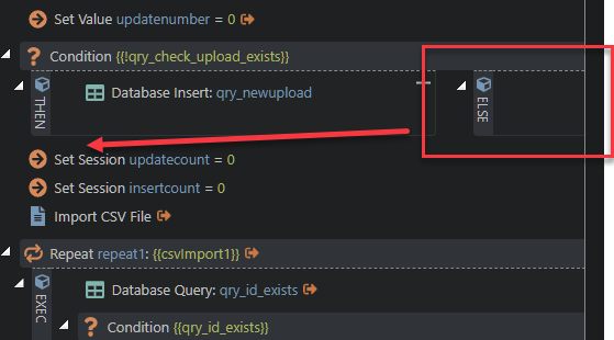
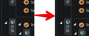
I expect it’s just an issue with the current implementation as far as it’s got, but in some cases, the wrapping isn’t working. Eg this ELSE clause should should presumably appear below its preceding THEN clause:
have spent some time with new UI - cannot share screenshots of the complex stuff we have without redacting so will avoid for now please.
don’t like:
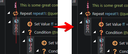
- the vertical text - it is causing discomfort to look at text in diff orientation.
- side by side layout of if…then…else, try…catch, etc. is not good at all - very much used to looking at steps one below the other. in our complex nested conditions, etc. if i collapse a step, the layout changes so much that it is very difficult to quickly gather what was the step that i just collapsed.
- the blocks are shaded out in diff colours - it is not a clear distinction - does not help with the intended use to make APIs more readable. this maybe due to the reason that i cannot distinguish between colours very well.
please note that i spend 100+ hours every month DEVELOPING WITH Wappler - my comments are from this perspective.
this change is massive and will certainly slow down the speed with which i can read the steps and add/update them.
please, please, please do not change it to this. if you must, give an option to keep the current view as an option.
we have API that have quite extensive nesting - we need to increase the width to be able to read the APIs better and not have to scroll horz too much - just vertically.
if it stacks horz on increasing width - it will be difficult and painful to adapt to this change.
This is the critical for me personally. I don't feel the tree needs any updating, but obviously others do, so being able to maintain the current tree experience is great.
2 Likes
The regular tree will stay as it is now.
2 Likes
George, thanks for sharing with us. I like the new design! Definitely more clear and accurate.
I was working with a new panel a bit. And I have to say, even in its current form, I like it much more than the old version.
Only struggle I have is “else” boxes, hiding somewhere in the right part of the screen.
Everybody already talked about it, so I will not be original.
I certainly won’t use horizontal block placement. At the same time, I work on a 1920px monitor and I like to set a large panel width. I would prefer if at any width the blocks and nodes do not go to the right, but remain under each other.
Of course, I’m not against the horizontal layout option, if it’s convenient for someone. But we definitely need a setting / button that turns it off for the user entirely.
I am still not sure about the additional arrows near the ‘exec’, ‘then’ etc labels. The collapse/expand function can be performed by clicking on the label itself. I understand that it is more obvious with those arrows, but visually they are distracting. Maybe if you don’t want to remove them, then at least make them gray?
Also I am worrying about how the announced ‘switch case’ would be implemented in this design? I mean, it would be strange to move ‘exec’, ‘then’ to the vertical labels and then later on change it back to the horizontal nodes. So maybe we should already consider it (and other future stuff) in the design layout.
1 Like
Also, wanna point out some tiny design issues, just in case.
-
Vertical alignment
-
Margins
-
Space beetween cube icon and label text
-
Way of connecting “then” and “else” blocks.
(I know it is on purpose. I just think It better another way. IMHO)
3 Likes
Thanks for all your feedback  We've simplified and improved the design in the latest update, make sure to check it
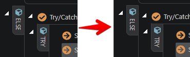
We got rid of the boxed design, based on users feedback.
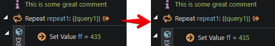
We got rid of all steps nodes in the tree. Also added a left border for the selected steps there for easier navigation.
Before:
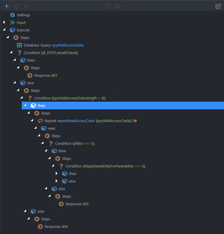
After:
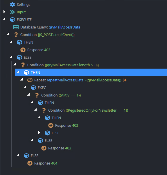
We styled and optimized the arrows and other icons in the tree.
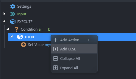
We added new options in the context menu (@sid) , such as: duplicate, delete, enable and disable steps and output, collapse and expand all child nodes:
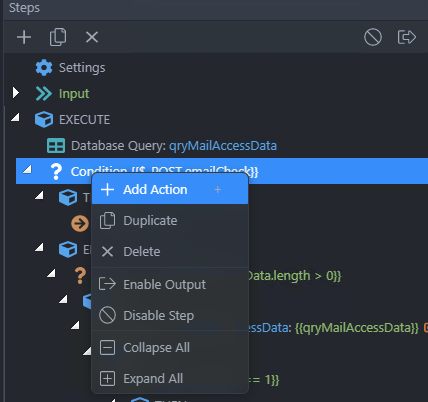
Also, an empty else is step is no longer added by default. Now you can add it using the context menu if/when needed:
6 Likes
I feel very sad that the new boxed design was revoked. 
It seems like the community agreed that it is the right direction. That just needed a little more tuning.
I worked with it for a while and began to love it even in the current form.
5 Likes
The boxed solution looked very nice in the examples you provided I must admit. But when we started to work with them in our real case scenarios it was too much. Instead of helping readability it was hindering it by bloating the UI. Our brains were processing too much info.
5 Likes
I agree, I was feeling too much comfortable with boxed design, and now with new update I just feel like if I were in an outdated version.
Please keep in mind that this Wappler project is actually VISUAL, LOW CODE, so the visual is the most important part of all this.
I really don't understand why you guys took a step back.
Maybe for complicated scenarios many users were confusing, but the readability with not big projects were just perfect!.
Please considering again the switch.
3 Likes
I agree with you. For non complex api it is nice design.
Switch would be appreciated.
I just wonder why the properties panel is still not 100% width:
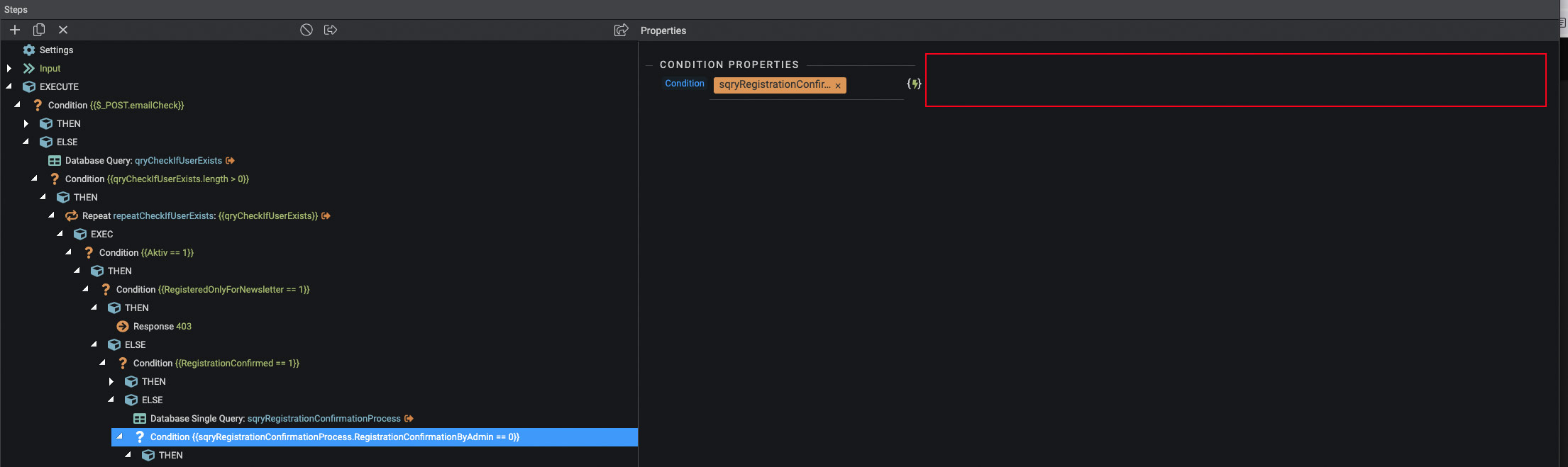
It would help a lot if the fields would be wider.
That context menu implementation is at par with what we’ve come to expect with Wappler’s powerful visual and open development workflow. Great work guys. 

1 Like
I agree, the context menu is super useful and leaving out an empty else is great. It would be even better, though, if an elseif could be added to the context menu to satisfy the switch type usage.
That's coming as well We just couldn't make it for this week's update.
3 Likes