Do note that the layout is fully responsive and it floats. So it gets wider only if you have space (wider monitoring you don’t, it just displays vertically.
And as indicated above we plant to make two views that you can toggle: tree view and flow view
Just like we have design view and code view, for the regular pages.
I realise it behaves responsively. I have a large monitor (43", 3840 x 2160), so with the current version I only get the horizontal version. Having both options would be ideal.
Perhaps the horizontal version may work well in some cases, as @psweb suggests, but it seems a strange and unfamiliar way of seeing code, or a representation of code.
Indeed having cases, will be challenging as you have multiple labels (case) and condition/value for each.
That is why I was thinking maybe to make the labels still horizontal as it was instead of vertical. But maybe your suggestions is also good. Just missing the Switch node connection a bit.
Only thing I would add is if I have complex block it would be great if you could some how just focus on that block to work on, it would make it a little less confusing in the block view for large SC.
It maybe as simple as a “collapse all” or “expand all”. Collapse all then I would just be able to just open the one block I need to work on without having to close them all manually.
However, now I say that, there needs to be some way of distinguishing the difference between blocks. What I mean is there seems to be something missing to be able to identify which block belongs to which process. I am not sure this is the right thing, but if a block had a title or some kind of identifier to indicate what is in the block of code.
I would like to see them all collapsed and see how you identify which bit does what other than lots of “execute” and “then” and “else” labels on the left. When you come back to code you often forget which bit did what and unless you add an info tag the block.
A ‘collapse all’ would be very welcome. And I like the idea of colour-coding. Either standard colours for the different block types (exec, then, else, etc.) or maybe even allow us to give each block a custom colour?
I agree @StevenM that there’s a need to 1. collapse everything and 2. collapse down so you can hone in on the one you want and 3. open everything.
That was the idea I was trying to get with the graphic I posted previously (again ignore the data/headings etc - I was just focusing on the collapse feature.)
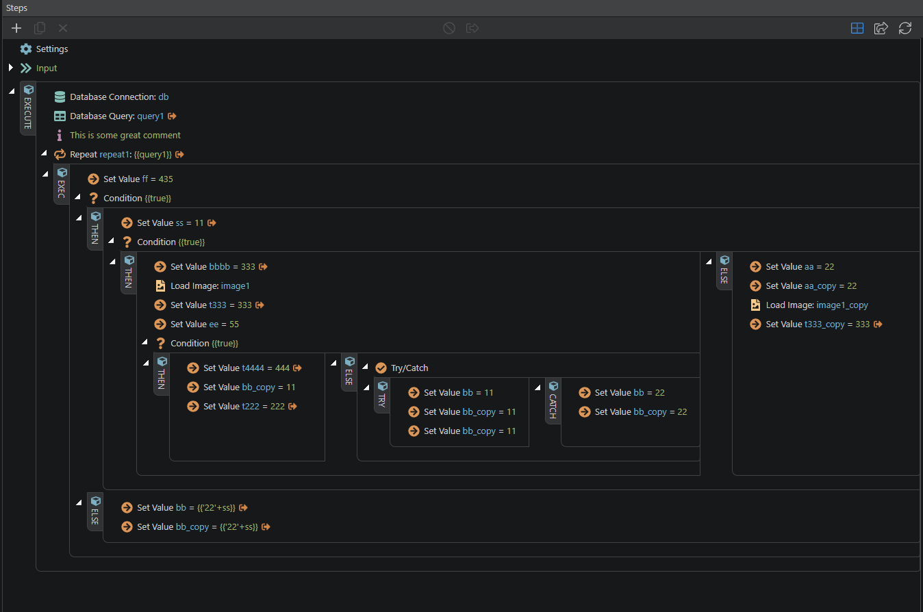
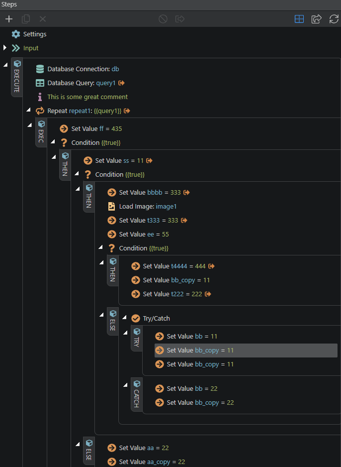
This is a much better design. My preference will be to use the blocks view - small size more than the wide view. Blocks - small view provides a very clear hierarchy and demarcation of nested blocks.
Much less psychedelic.
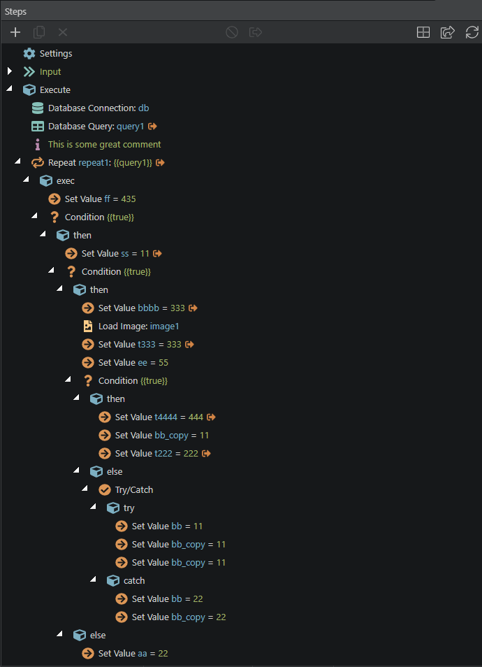
I am still not getting around the idea of then/else/exec etc on the left edge. Its a waste of space and makes the design way more indented. Look at how concise the regular view is (now that “steps” nodes are gone).
Although, I have to say blocks thing is a better UX.
One thing I can suggest is to get rid of the node arrow and move it to the right edge of the step itself. That way, the left spacing reduces, making it more concise again… and the exec/then/else tag are perfectly capable of segregating the nested steps. At the same time, the arrows are still there on the right.
If the collapse all thing is something that you guys would be interested in implementing, the arrow could be replaced with the plus/minus icons as well.
Lastly, the wide view is not something that makes sense. Too much content all over the place. I know people like Paul with huge monitors appreciate it, but I don’t think it would be productive at all. When trying to edit steps… another view opens on the right and you get lost as to which step you were working on.
Looks much better @George, thank you for hearing us!
I’ll use it without the blocks, as I only have a normal 1920 monitor and deeply nested conditions with long maths assignments within them… so not enough width is my issue.
Any chance of having the range of expand/collapse options that I proposed earlier? (expand all below, collapse all below, expand all at this level, collapse all at this level)
It would be epic if they were on quick keys too…
This would make debugging a large algorithm way faster!
Can we also have viewport horizontal stacking optional? My brain prefers consistency when dealing with things like this. I use a lot of visual memory when browsing code pages and server connect flows. So I navigate directly to certain parts of the flow/code based on visual memory.
When changing monitors/computers or in the future with split tabs and things start to get inconsistent, now it opens horizontally stacked and later vertically, I can see this being a nuisance and inducing errors.