As Teodor would say: Please post different topics in different posts.
But I agree with most points listed.. They would make the UX waaaaay better than any major redesign.
This is indeed a much cleaner layout, similar to what the original post was going for. A mashup of both could actually make for a great re-design.
We will go more for the simple method as mentioned by cy2 above, which is based on the current tree view with mostly removal of the unnecessary “steps” branch and improving the conditional labels. So the layout will look and feel as it was.
We will also be also adding additional actions and multiple conditionals as planed.
Perhaps a toggle option can be added in the current tree-view (right-click -> show/hide block code) to either highlight the block of code or show lines indicating start & end of the block code. If I want to check a complex block of code, then I can highlight it to check or work on it and remove the highlight after finished working on it.
There’s some excellent feedback here. I think my summary would be to revert back to the previous way but add borders so each nested section is clearly defined. I generally close everything manually to see the overall structure and then open branches as needed. When they all start open it’s hard to see what is inside what so borders would solve that. But I’d still keep it all in a standard tree with branches.
Personally, I would love a toggle switch so we can choose which design we want to use, for me on a 50 inch monitor it is spectacular, so much easier to read my complex server actions. I do realise I have an unusually large monitor setup because im old and instead of getting glasses i just keep getting bigger monitors.
First, I want to thank the Wappler team and community.
It seems to me that it was very important to get rid of unnecessary elements in Server Actions. This was done and this is awesome!
At the same time, in terms of design, there is something to discuss and to improve. I agree that the final visual is too boxed and slightly awkward.
But it’s easy to fix. Here’s what I would suggest changing.
I think the ‘then’ and ‘else’ blocks look better on top of each other than on the side. It is inconvenient to run your eyes from left to right and back. And the fact that to open and hide the ‘else’ block you need to click in different places of the screen, is confusing. Also, as already mentioned, it becomes too messy when there are many conditional blocks.
I think there is no need to highlight the parent node. An arrow is enough to see and understand that the node can be collapsed or expanded.
Vertical panel ‘exec, else, then’ could be less distracting. We could make the text and background of it darker and also remove icons.
Also, I think there is no need to collapse/expand ‘exec, else, then’ individually. It is better without additional arrows.
And I find it is easy to read text from the bottom up.
It seems to me that it is better to get rid of the accumulation of visual layers on the right and below of the tree. If possible, of course.
The result will look something like this. It seems to me that this is accurate and convenient.
But I still prefer the variant, where the vertical panel is used for arrows.
I consider it better, because the current alternation of arrows and empty spaces make it a little harder to read the sequence of the nodes. I explained it here.
Also, sometimes there are no arrows at all and there is empty space to the left of the nodes, not ok.
So, proposed layout will look like this.
I do like this one. I think it's clear and convenient. Slight rounded borders also help to focus on the flow. Too much square got me lost.
Regarding horizontal stacking I do think it could be useful with ultrawide monitors but it would need some time to getting used to.
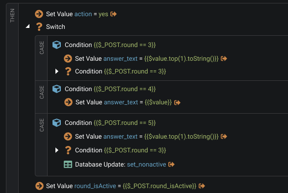
Also remember team that at some point you need to give use if-elseif-else and switch functionality. This is a real need. With horizontal stacking it would be unreadable.
More rounded was also the initial proposal we had, we just removed last minute as we don't have much rounding in the rest of Wappler. But in this case it is indeed more useful.
I hope this will be an optional layout if it remains. I can see some merit in it, but can't imagine preferring it to other options - eg @nickneustroev's latest suggestions which look really good.
I'm very excited about it as everyone. But also curious about how it will look like?
Switch is a one step, so it is one node. Therefore, all cases will be inside and the beginning of each case will have subtitle with condition on it? smth like this