Redesign concept for Properties Panel of page elements

I have some ideas how we can improve the current Properties panel for page elements.

1. If you prefer when the Properties panel takes only half of the monitor height, then you know the struggle of necessity to often scroll down to the bottom of the panel and to the top again.
To resolve this I propose to place tabs on the top of the panel. These tabs quickly scroll you to the corresponding part of the panel.

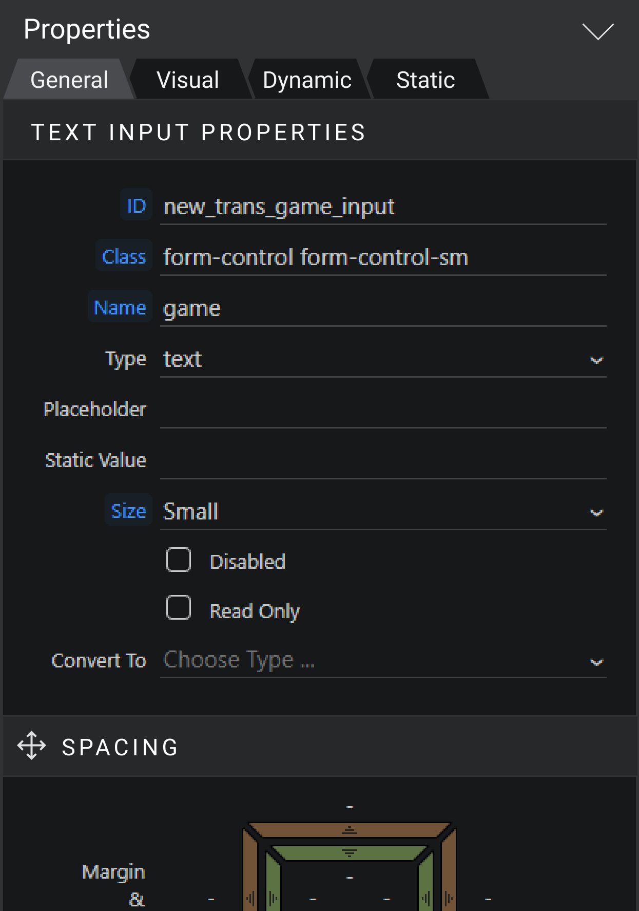
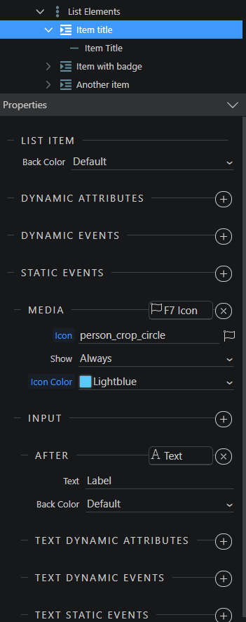
2. Current titles for Sections not doing a good job in visually separating the sections.
So as you see on all the screenshots, I’ve added background color for them.

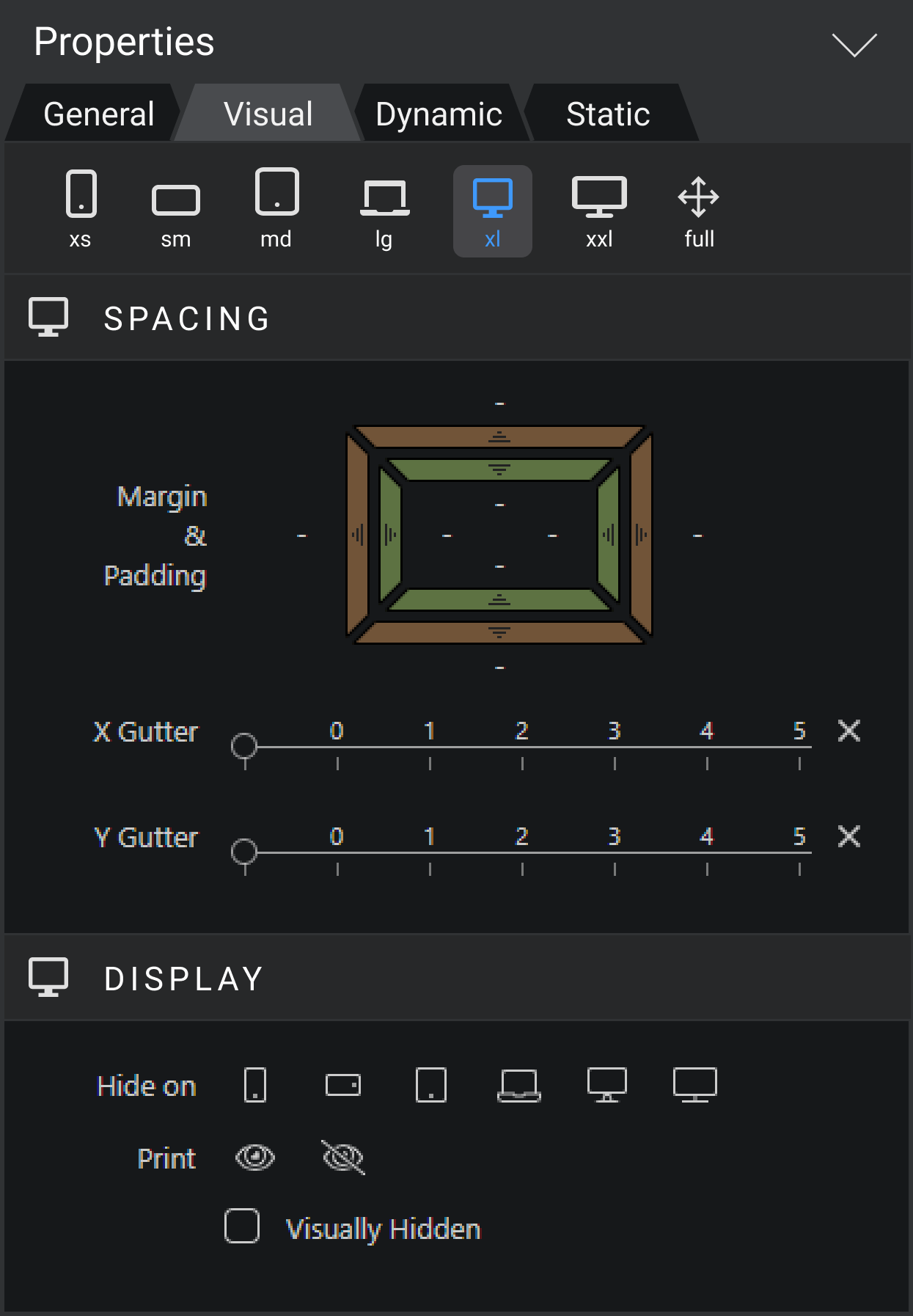
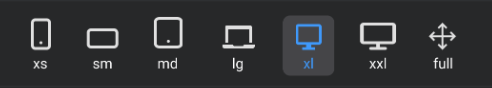
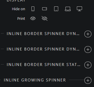
3. If the “Visual” tab is selected, you can see the buttons for quickly changing layout width. This panel with buttons stuck to the top. It is a good addition to the current buttons on the top center of the Wappler UI.

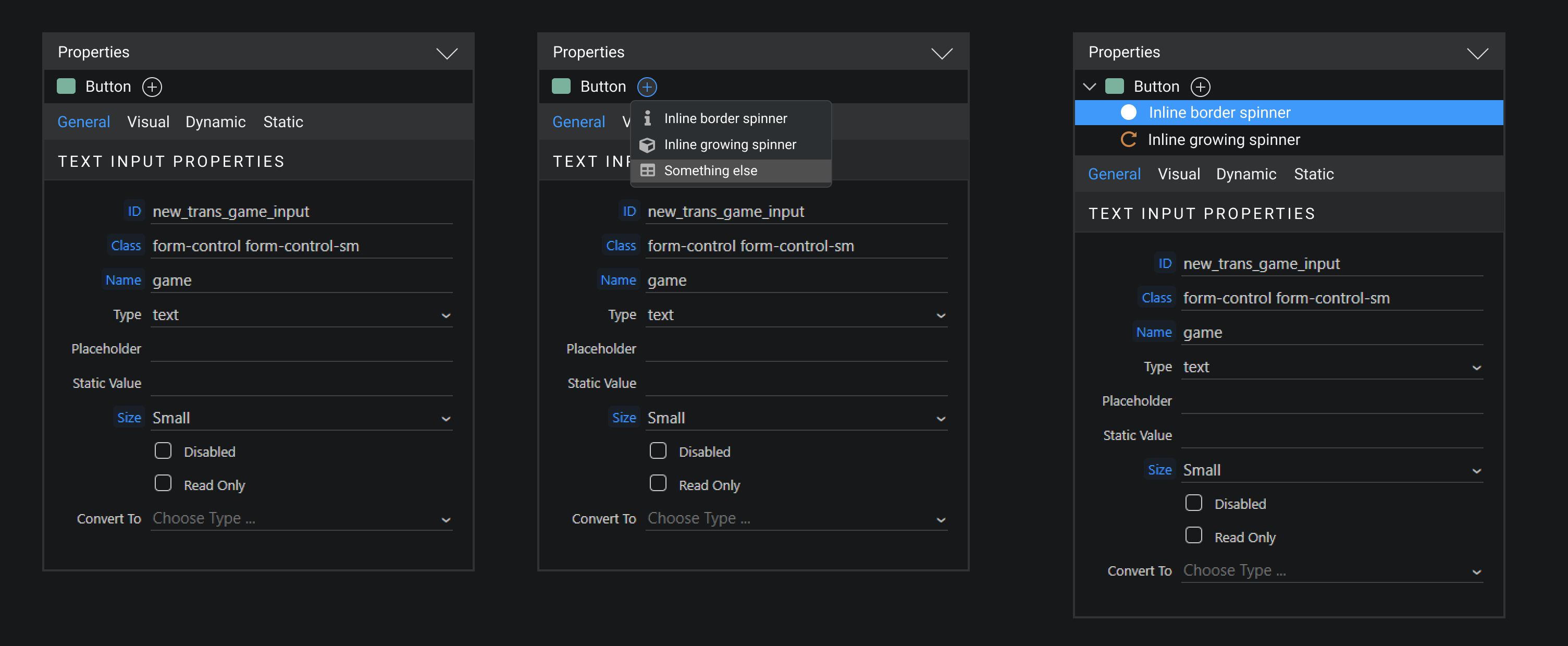
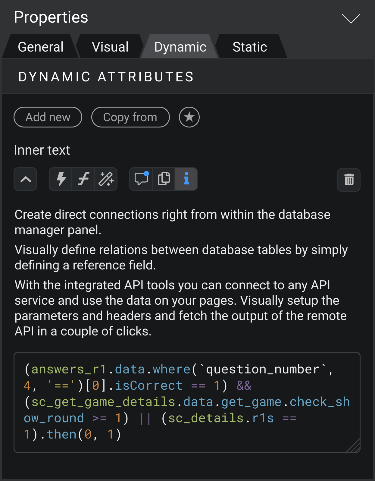
4. Button for adding new dynamic attributes or events is not very comfortable. It is tiny and placed at the edge of the screen – so it is hard to get to it.
So I propose to move it to the left and label it “Add new” to make it bigger.

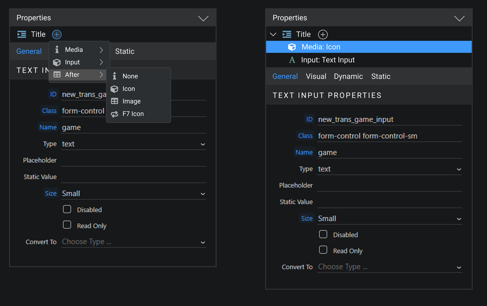
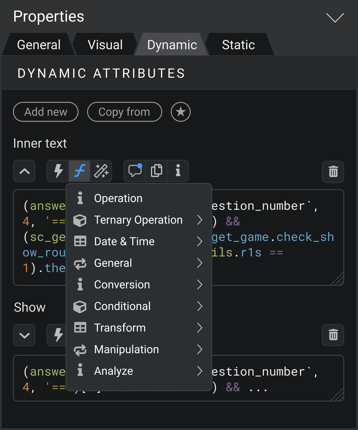
5. I think it is better to get rid of the big popup windows for choosing the options, where it is possible. For example, when adding new dynamic attribute. These pop ups change visual context, so you lose the focus. There are already good alternative for it - simple select blocks.

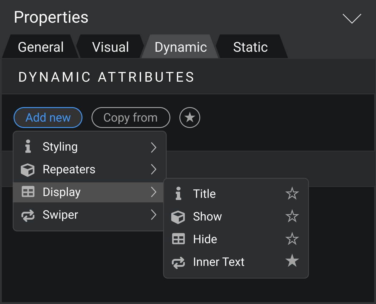
6. Sometimes you just want to copy all the attributes or events from another element. Now there is a button for it.

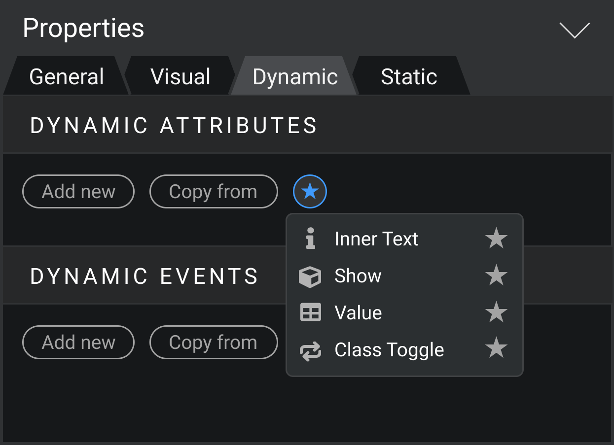
7. For an even quicker process of adding new attributes you have a Favorites button.

8. I keep promoting the idea that the ability to instant edit the code of expressions would incredibly speed up work in Wappler for most of the users. I see support for these idea in the community and still don’t see any defenders for “expression bubbles”.

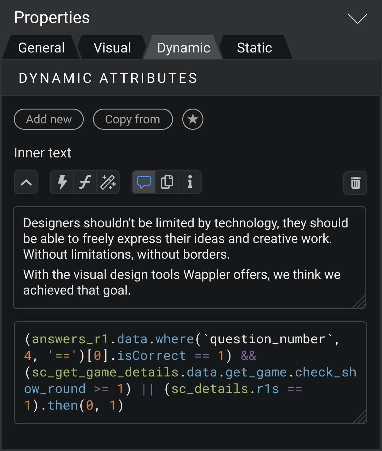
9. Overall, all changes require a button panel above the textarea.
First button is arrow. I assume, when you open panel, textarea would be 2 rows, but if you click the arrow button, textarea changes the height to show all the code.
Also, from the right side there is a trash button for deletion.
Let go through all other buttons in the panel.

10. “Lightning” button opens the binding panel. But there is a difference - this panel doesn’t have a code textarea itself. When you choose some item for binding, it appears right in the textarea in Properties panel.

11. “Formula” button allows you to see all formatters and add it in the textarea input.

12. “Magic wand” button is for the Data Formats window, for creating expressions visually.

13. “Commentary” button shows and hides another textarea input, where you can leave a comment about this dynamic attribute you compose. I think the ability to document all the parts of the project is crucial for comfortable work in Wappler.


I purposely have changed the icon from “i” to this, because actually now “i” is used in Wappler for both commentary and info/description. I think it must be separated.

14. “Copy” button just copies all code of expression to the clipboard. So you could paste it anywhere else.

15. “Info” button provide the description of this attribute. It would be especially useful for new users.

So what do you guys think about this concept?

PS: As always, there are raw files in Figma available, so you can copy it and bring your own vision.

A well thought concept. The idea around inline editing without the dreadful bubbles seems much more relevant here than it did on server actions. Comments is a nice touch as well - making Wappler a more visual tool.

One point I would like to add… if this tabbed UI does get an approval from Wappler team… remember the selected tab when switching between elements. Or at least give an option in settings to do so.

1 Like

Thanks!

Good point

Nice ideas Nick.

1 Like

I also like the concept a lot. Was actually already thinking of diving the property inspector with tabs to be more clear.

The problem only is that some components have nested inspectors for their sub elements and those again have the same groups like static and dynamic attributes and events that we would like to put it tabs.

Example is fontawesome icons when their appear in paragraph for example.

Also when designing tabs and toolbar icons try to keep our style of minimalistic tabs and toolbar icons highlighting and selections.

1 Like

This would be a good opportinity to get rid of this weird UX.
After adding the icon, it anyways appears as a separate item in the structure tree.
Best to move all such “hidden” items to the main component picker. Spinner should be shown as a separate component as well.
We use it extensively to show something is loading… not only inside a button.
Only problem I see is how to set position of the element - left or right of the text - visually.

This is another opportunity to re-think this. You guys are probably already working on a new UI for v5. The current state of selections - specially in pop-up confirmation dialogs - is really bad. There is no proper keyboard support and no proper highlighting even on mouse hover.
I see that icons used in example designs here are not as per the current design, but maybe there is a better solution if you merge the existing and suggested styles.

1 Like

Thanks, I appreciate it!

Hmm. But do we need to keep the Font Awesome Icon properties in paragraph properties?
I agree with the @sid here. Why don’t just leave it only in element properties itself?

Actually, it was intentional. :slight_smile: I’m changing the styles when I think it can be improved.
Though I dig minimalism too, it shouldn’t come in the way of usability and common practices.

For example, these elements in Wappler’s UI are clearly the tabs by the meaning, but they don’t look like it.
image
But for users it is important to easily recognise the UI element and its purpose.
So I think classic tabs would work much better here. Though indeed it does not look so clean and simple.
image

Maybe, as a compromise, it would be ok just to add another background for the active tab, as I did for layout buttons. But in my opinion, classic tabs are still better.
image

About general Wappler UI, I agree with @sid. There are some issues, that worth improving. One of the main things is hovering on the clickable element. I think changing the background for hover would make the UI experience much smoother.
And keyboard support would be helpful as well, I also agree here.

Please report this in a separate topic with more details - we are unware of any issues there.

I example of nested UI is for example when you choose a Button in boostrap. At the end of the UI you see all the extra elements you can add to a button:

image

and they can have again, more dynamic properties and events:
image

Those you don’t see in the App Connect tree they are “part” of the button.

If you do a mobile projects with Framework7 there even more elements are nested, because usually everything there is build around a “list item” but this item can have prefixes, suffixes, images etc

If you have ideas about such nested UI’s it will be great :slight_smile:

Those are indeed areas toggles, not really tabs - but you might see similarities as they reveal /switch content.

They seem all fine minimalistic as they are. If we put all tabs in there it will look awful.

1 Like

LOL. You really need to take out 2 months and build a real app in Wappler to see all the small quirks that reduce efficiency and will make you pull your hair.

I reported this quite some time ago. Found it: Keyboard Support For Various Popups

Haven’t built a mobile app still (3 years+ !), but that FW7 thing seems like a deal-breaker.
A consistent UI takes precedence.

Hope @nickneustroev can cook something up for this.

I’m sorry but seems you didn’t noticed that we have put a huge amount of work on integration of native dialogs and huge amount of improvements there in the past year.

We have also improved keyboard navigation in many areas but as you can see from your own feature request this is not a very popular requested feature.

Furthermore we go and improve features as they are requested and voted on, so if no requests are made in specific area, we have enough other stuff to cover.

And no we are not taking months break to find out that you are missing a keyboard navigation on one dialog.

So if you are unhappy with some UI or dialog please post about it specifically and don’t make generic comments like all dialogs suck, as those are not useful for us.

1 Like

I am on 4.7.3, and there are no improvements that I see. I think its still in experiment. Maybe in 4.8.x I will see them.

Yeah… only a couple of users here who use keyboards and shortcuts. Many other similar requests and posts with not much traction. Number of votes has not realtion to the feature being implemented. So not very concrened about the few votes.

Sounds like you really should. There are sooo many things. :sweat_smile:

I understand that its not useful, and I have no intention to get all UI isses fixed in a single post. The only reason why I mentioned that is becuase you mentioned about Wappler’s “minimalistic tabs and toolbar icons highlighting and selections.”, which is not a very good UX, and the dialogs could be part of any improvements for v5, if you guys are working on it.
As of 4.7.3, all dialogs suck.

Well if you stay on that version they will probably suck for ever :slight_smile:

Try running the latest version and deliver feedback about the new features and suggest improvements on existing - then we can work on those.

1 Like

Love it!! Congrats @nickneustroev!

1 Like

Oh, now I see. This is a tricky thing indeed. I will think about it.

3 Likes

Really loving this concept. Great work @nickneustroev.

1 Like

I assume it is better not to show inner elements properties inside properties of a parent element.
Alternative is to show a list of added inner elements at the top. Users can choose parent or one of the inners, in order to manage its properties.

@George What do you think?

3 Likes

Well that look great! Seems you solved the problem nicely!

Tabs look also in style :slight_smile:

Only the General / Visual / Dynamic / Static is a bit unclear.

What is the difference between General and Visual? Isn’t it a bit confusing where to find what?
As I understand from the initial post is the Visual is just with the device sizes above, but that is why we have the main device sizes - as you switch to that device and then design everything for it. No need to overwrite it locally, we have done this before and it was only confusing.

Furthermore Dynamic and Static:
We actually have 3 things: Dynamic Attributes, Dynamic Events and Static Events
Static attributes are usually what you see in the General

1 Like