@George Updated to 4.9.1 a few days ago. Sorry to say, but all dialogs still suck.
Ref:
The issue, as highlight in the original post, is that the buttons shown in dialogs are not usable via keyboard and have a bad mouse UX as well.
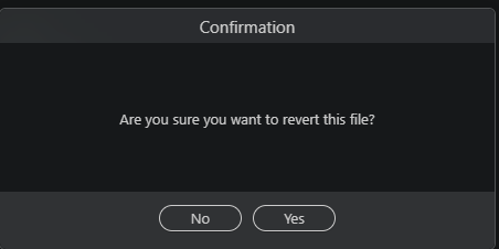
As an example, if I am to discard file changes via Git panel, I am shown below dialog:

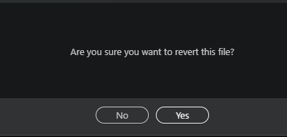
I have no idea which button is selected here so I can't just press arrow keys to highlight, and Enter to select from Keyboard.
As for mouse support, when I hover, the button is slightly brightened, but the mouse icon is not even a pointer.

Like you have informed.. if Wappler is using native dialogs as per the OS, these buttons should have the same native UX.