Hi Wappler,
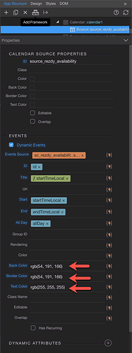
The Calendar works great, I added a dynamic data source and events do show.
The events show on 1 line though and cut the text I want to show. And there doesn’t seem to be an option to avoid that. Would there be a CSS trick/class I can add to allow the text to flow on more lines?
Hi Fred,
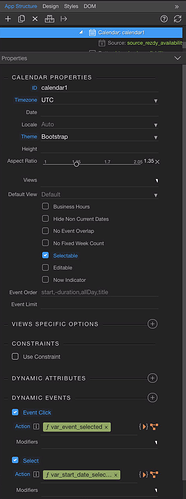
What is your Aspect Ratio set to in the Calendar options?
I use 2.05 but same results if 1.
Not sure if it will make a difference but we use:
aspect-ratio="1.5"
Also what theme have you set? Are you using Bootstrap, and have it set as the theme for the calendar?
Hi @Dave,
Wappler offers these ratios 1, 1.35, 1.7, 2.05. They don’t make much difference and I have not seen example in the Community posts that have multiple lines yet. Are you able to show multiple?
I have the Cal set as Bootstrap.

Just trying to find the calendar page in a Project bare with me Fred.
Hmmm am at a loss… Maybe @George or @Teodor could enlighten as if this is possible, and how to achieve a multiple line cell?
Sorry I couldn’t help, or if I wasted your time Fred.
I think it is an implementation of FullCalendar in which case the following CSS might be able to help:
.fc-event-main-frame {
    white-space: normal;
}
or maybe (depending on the version used)
.fc-day-grid-event > .fc-content {
    white-space: normal;
}
Excellent @bpj! Your CSS solved it!
The one that works is below.
.fc-day-grid-event > .fc-content {
    white-space: normal;
}
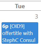
Now if I may, is there a way to center the Day number (2,3, 4 below) as it’s easy to mistake if Tuesday is the 2nd or the 3rd of the month…
And is there a way to have vertical grey borders as well?
Or what is the Wappler file commanding the Calendar CSS? Then I can do my own tests.
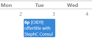
I think:
.fc-day-top > .fc-day-number{
float: none !important;
}
CORRECTION:
 .fc-day-top {
text-align:center;
}
.fc-day-top > .fc-day-number{
float: none !important;
}
It depends on your implementation of Full Calendar as it could be getting the core css files from the CDN, so it is just safer to use your own CSS file and override the parts you need.
Adding a rule of the below should override the date positions.
.fc .fc-row .fc-content-skeleton table, .fc .fc-row .fc-content-skeleton td, .fc .fc-row .fc-mirror-skeleton td {
    text-align: center;
}
Not sure what you mean by the vertical grey borders, do you mean just like

@psweb You’re correct, the vertical grey borders
Try this
thead, tbody, tfoot, tr, td, th {
    border: red 3px solid !important;
}
Thats for all tables in Bootstrap, if you only want to affect Full Calendar then just adjust to
.fc thead, .fc tbody, .fc tfoot, .fc tr, .fc td, .fc th {
    border: red 3px solid !important;
}
Thanks @psweb! Your solution worked but was a bit too drastic as it added a horizontal line in the middle of the blue (today) or white cell like these
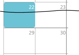
So I opted for
        .fc-day {
            // Add grey border around day cell
            border: 1px solid grey;
        }
Thank you so much @bpj, your correction worked perfectly! 
Quick two Cent interjection. Could do the border style DB side by storing your hex values there, then you can apply different characteristics based on the event type… Same for cell background color, text color, etc. Ie, have a table for Calendar variables and pull from there… Then you’re not stuck with a single static style for all event types…
EDIT:
Or in your events table have border_color, text_color, etc, and select list to define these styles when adding new events.
Agreed Dave, thats normally how I do it too, however in Wappler the event colours etc can all be controlled in the UI dynamically, but the base calendar skin seems to take most of its parameters from the core bootstrap theme you use.
It would be great if there were an easier way to control the base skin more easily to be honest.
In my 'edit' above the suggestion to have these variables and styles within the event table itself would make sense. We do this for scheduling for a Client, Arrival, Departure, Cleaning Status, etc. Very visual and easy to define for the user. Or maybe I'm not understanding what you mean by 'base skin'? Forgive me, long day Paul hahaha.
I was just meaning that in the Wappler UI, the base calendar component has no dynamic type style controls, for border colours of the calendar.
Then you add a data source to it, and the styling has quite a few controls and they all dynamic, which makes life easier.
Maybe I am incorrect though, I have not used the calendar in a few months now, so maybe I am nuts, that is always a very clear possibility.

