Applying dynamic styles to options in select list

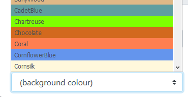
I have a form including several select fields where a colour can be chosen, eg:

image

I want these lists to be populated dynamically and have set up a table where the user can add colours and choose which colours should appear etc… The problem is, I don’t seem to be able to style the list so each <option> has a background colour.

The static version (which produces the select above) starts like this:

<option value="#F0F8FF" style="background-color: AliceBlue;">AliceBlue</option>
 <option value="#FAEBD7" style="background-color: AntiqueWhite;">AntiqueWhite</option>
<option value="#00FFFF" style="background-color: Aqua;">Aqua</option>

So far, the dynamic version is as below. It works, except for the styles:

<select id="select_back_colour"
  class="custom-select"
  dmx-on:updated="background_colour.setValue(select_back_colour.value)"
  name="format_bgcolour"
  dmx-bind:options="sc_colours_selectlist.data.qry_colours"
  optiontext="colour_name"
  optionvalue="colour_hex"
  dmx-style:background-color.important="colour_hex">    
</select>

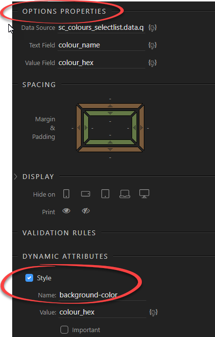
I applied the dynamic style using the UI, but no styles are generated. Have I done something wrong or is some special attribute needed to apply styles in this situation?

I would be grateful for any suggestions.

On your static select you applied the styles to the option tags, on your dynamic example you set it to the select tag. That’s why it’s not working.

Thanks Teodor, I thought I was probably doing something stupid - but I’m still not sure how to correct this.

This is where I’ve set the dynamic option properties and the dynamic styles:

Where should I apply the style so it applies to the options?

1 Like

Well the dynamic attributes and all the properties are applied to the whole select, there is no option to style the different options inside.
I’ll check if we can add dynamic style/class options for the <option> tags in the next updates.

Thanks - I would be very grateful if it could be added.

It’s not something I would very often need, but it’s frustrating to come across features which are simply not possible in Wappler. I had done quite a bit of work in relation to this, assuming - without checking - that the matter of actually applying the styles wouldn’t be an issue.

That’s not the most frequent request related to dropdowns, so we just haven’t thought it could be useful to style separate options of a dynamic dropdown. In most of the cases users want to style the whole dropdown the same way.

Anyway, it shouldn’t be a big issue to add this. @George will check this :slight_smile:

That would be great - thanks. I appreciate it’s a slightly obscure request, but I can think of other cases where it would be useful.

1 Like

Although I have managed to get this working - Dynamic Select Icons with Bootstrap-Select - it really would be sweet if this was integrated into Wappler.

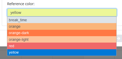
I just came across a need for this again. Hardly critical, but if it’s not a big issue, it would be good if it could be added at some point. Although it’s a feature request, it seems that it’s something that was perhaps overlooked.

My current project requires this.
This worked for me:

<div class="form-group">
	<label for="catcolorscheme">Reference color:</label>
	<select id="cselcolorscheme" class="custom-select custom-select-sm" name="cselcolorscheme" dmx-style:background="rptcolorschemeoptions[selectedIndex].background">
		<option dmx-repeat:rptcolorschemeoptions="scSettingsATReadColorSchemes.data.qColorScheme" dmx-bind:value="id" dmx-style:background.important="background" dmx-style:color.important="color">{{name}}</option>
	</select>
</div>

image

This is my table:
image

Hope this helps.

3 Likes

Thanks @zitroware. I was using a clever solution by @Heather_Mann, using Javascript, but this is a great ‘native’ Wappler solution (which I didn’t think was possible).

This looks like just what I need. How can I change the background color of static options?

Was looking for a solution like this and yours worked great! Exactly what I needed.