Was working on a new navigation and thought id share the design here so others can use it too.
Please note this was more focused on function over the styles you can edit the css below to change any colours needed etc
You will need Bootstrap 5 for this menu to work (not tried older versions could work there too)
And if you want to use icons font awesome I used version 5.14
Screen Recording 2022-10-17 at 23.23.25
The below code can be added where ever you need your menu for example inside a off canvas:
<ul class="list-unstyled ps-0">
                        <li class="mb-1">
                            <button class="btn btn-toggle align-items-center rounded w-100" data-bs-toggle="collapse" data-bs-target="#multiple_collapse" aria-expanded="true" dmx-class:active="content.var_nav_category.value=='multiple'">
                                <div class="w-100 d-flex" style="">
                                    <p class="align-self-center mb-0"><i class="fas fa-home fa-fw"></i></p>
                                    <p class="text-start w-100 mb-0 ms-2 me-3">Multiple</p>
                                    <p class="small align-self-center mb-0"><i class="fas fa-chevron-up fa-fw chevron-rotate"></i></p>
                                </div>
                            </button>
                            <div class="collapse show transition-collapse" id="multiple_collapse" style="">
                                <ul class="btn-toggle-nav list-unstyled fw-normal pb-1 small">
                                    <li><a href="/multiple_one" class="nav-link link-dark rounded" internal>Multiple 1</a></li>
                                    <li><a href="#" class="nav-link link-dark rounded" internal>Multiple 2</a></li>
                                    <li><a href="#" class="nav-link link-dark rounded" internal>Multiple 3</a></li>
                                    <li><a href="#" class="nav-link link-dark rounded" internal>Multiple 4</a></li>
                                </ul>
                            </div>
                        </li>
                        <li class="mb-1">
                            <button class="btn btn-toggle align-items-center rounded w-100 p-2" data-bs-toggle="collapse" data-bs-target="#nested_collapse" aria-expanded="true" is="dmx-button" value="" type="button" style="" dmx-class:active="content.var_nav_category.value=='nested'">
                                <div class="w-100 d-flex" style="">
                                    <p class="align-self-center mb-0"><i class="fas fa-align-left fa-fw"></i></p>
                                    <p class="text-start w-100 mb-0 ms-2 me-3">Nested Example</p>
                                    <p class="small align-self-center mb-0"><i class="fas fa-chevron-up fa-fw chevron-rotate"></i></p>
                                </div>
                            </button>
                            <div class="collapse show transition-collapse small" id="nested_collapse" style="">
                                <ul class="btn-toggle-nav list-unstyled fw-normal pb-1">
                                    <li>
                                        <a class="nav-link link-dark rounded" is="dmx-link" href="/nested_1" internal>Nested 1.1</a>
                                    </li>
                                    <li>
                                        <button class="btn btn-toggle-sub align-items-center rounded w-100" data-bs-toggle="collapse" data-bs-target="#nested_collapse_2" aria-expanded="true" is="dmx-button" value="" type="button" style="" dmx-class:active="content.var_nav_category.value=='edit_albums'">
                                            <div class="w-100 d-flex" style="">
                                                <p class="text-start w-100 mb-0 me-3">Nested 1.2</p>
                                                <p class="mb-0"><i class="fas fa-chevron-up fa-fw chevron-rotate"></i></p>
                                            </div>
                                        </button>
                                        <div class="collapse show transition-collapse-sub" id="nested_collapse_2" style="">
                                            <ul class="btn-toggle-nav list-unstyled fw-normal">
                                                <li>
                                                    <a class="nav-link link-dark rounded" is="dmx-link" href="/nested_2" internal>Nested 2.1</a>
                                                </li>
                                                <li>
                                                    <a class="nav-link link-dark rounded" is="dmx-link" href="#" internal>Nested 2.2</a>
                                                </li>
                                                <li>
                                                    <a class="nav-link link-dark rounded" is="dmx-link" href="#" internal>Nested 2.3</a>
                                                </li>
                                                <li>
                                                    <button class="btn btn-toggle-sub align-items-center rounded w-100" data-bs-toggle="collapse" data-bs-target="#nested_collapse_3" aria-expanded="true" is="dmx-button" value="" type="button" style="" dmx-class:active="content.var_nav_category.value=='edit_albums'">
                                                        <div class="w-100 d-flex" style="">
                                                            <p class="text-start w-100 mb-0 me-3">Nested 2.4</p>
                                                            <p class="mb-0"><i class="fas fa-chevron-up fa-fw chevron-rotate"></i></p>
                                                        </div>
                                                    </button>
                                                    <div class="collapse show transition-collapse-sub" id="nested_collapse_3" style="">
                                                        <ul class="btn-toggle-nav list-unstyled fw-normal">
                                                            <li>
                                                                <a class="nav-link link-dark rounded" is="dmx-link" href="/nested_3" internal>Nested 3.1</a>
                                                            </li>
                                                            <li>
                                                                <a class="nav-link link-dark rounded" is="dmx-link" href="#" internal>Nested 3.2</a>
                                                            </li>
                                                            <li>
                                                                <a class="nav-link link-dark rounded" is="dmx-link" href="#" internal>Nested 3.3</a>
                                                            </li>
                                                        </ul>
                                                    </div>
                                                </li>
                                            </ul>
                                        </div>
                                    </li>
                                    <li>
                                        <a class="nav-link link-dark rounded" is="dmx-link" href="#" internal>Nested 1.3</a>
                                    </li>
                                    <li>
                                        <a class="nav-link link-dark rounded" is="dmx-link" href="#" internal>Nested 1.4</a>
                                    </li>
                                </ul>
                            </div>
                        </li>
                        <li class="mb-1">
                            <a href="/single_icon" class="btn btn-toggle w-100" internal dmx-class:active="content.var_nav_category.value=='single_icon'">
                                <div class="w-100 d-flex" style="">
                                    <p class="align-self-center mb-0"><i class="fas fa-tachometer-alt fa-fw"></i></p>
                                    <p class="text-start w-100 mb-0 ms-2 me-3">Single With Icon</p>
                                </div>
                            </a>
                        </li>
                        <li class="mb-1">
                            <a href="/single" class="btn btn-toggle w-100" internal dmx-class:active="content.var_nav_category.value=='single'">Single No Icon</a>
                        </li>
                    </ul>
The below will want to go inside style.css:
.btn-toggle {
  display: -webkit-inline-box;
  display: -ms-inline-flexbox;
  display: inline-flex;
  -webkit-box-align: center;
      -ms-flex-align: center;
          align-items: center;
  padding: .5rem;
  font-weight: 600;
  color: var(--bs-body-color);
  background-color: transparent;
  border: 0;
}
.btn-toggle:hover,
.btn-toggle:focus {
  color: var(--bs-body-color);
  background-color: rgba(170, 170, 170, 0.47);
}

.btn-toggle.active {
    background-color: var(--bs-primary) !important;
}

.chevron-rotate {
    -webkit-transition: 1s;
    transition: 1s;
    color: var(--bs-body-color) !important;
}

.btn-toggle[aria-expanded="true"] .chevron-rotate {
  -webkit-transform: rotate(180deg);
          transform: rotate(180deg);
}

.btn-toggle-nav a {
  display: block;
  padding: .1875rem .5rem;
  margin-top: .125rem;
  text-decoration: none;
  color: var(--bs-body-color);
}
.btn-toggle-nav a:hover,
.btn-toggle-nav a:focus {
  color: var(--bs-info);
}

.btn-toggle-nav .active {
    color: var(--bs-info) !important;
}

.transition-collapse {
    -webkit-transition: 1s;
    transition: 1s;
    padding-left: 1.75rem;
}

.btn-toggle-sub {
  display: block;
  padding: .1875rem .5rem;
  margin-top: .125rem;
  color: var(--bs-body-color);
  border: 0;
  font-size: inherit;
}

.btn-toggle-sub[aria-expanded="true"] .chevron-rotate {
    -webkit-transform: rotate(180deg);
    transform: rotate(180deg);
}

.transition-collapse-sub {
    -webkit-transition: 1s;
    transition: 1s;
    padding-left: 1rem;
}

.btn-toggle-nav button {
  display: block;
  padding: .1875rem .5rem;
  margin-top: .125rem;
  color: var(--bs-body-color);
}
.btn-toggle-nav button:hover,
.btn-toggle-nav button:focus {
  color: var(--bs-info);
}
Few things to note the unstyled list class structure currently isn’t recognised by Wappler’s app connect (this is no issue but when creating new items you need to add them in code view)
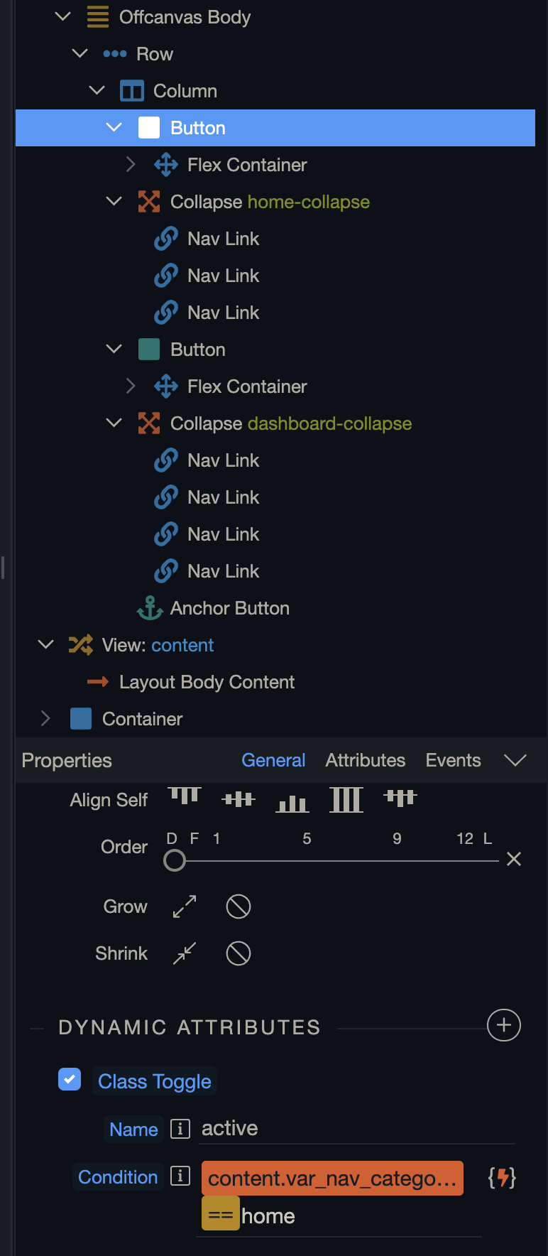
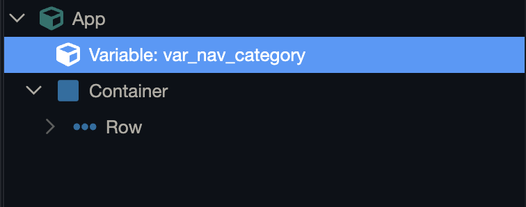
To make this work I decided to use a variable on each page to assign categories you will need to setup these yourself and edit the bind accordingly (the class toggle bind shown in the image above) for layout and content page setups the bind will be something like:
content.my_var_name.value =='my_category'
And for non layout setups your binds will likely be:
my_var_name.value =='my_category' (Not tested this)