There are many attributes for the properties that specify how to display and where to store the chosen value.
For each group of UI input options you can have multiple variables with the following structure:
{ name: 'compName', attribute: 'id', title: 'ID',
  type: 'text', required: true, defaultValue: ''},
General Properties
with general properties like:
| Key |
Type |
Description |
| name |
text, required |
an unique name for your input variable on the UI |
| attribute |
text, optional |
save the value in a html attribute with specified name |
| title |
text, required |
the prompt for the variable on the UI |
| type |
text, required |
the input variable display type, see display types
|
| required |
boolean, optional |
is the input required |
| defaultValue |
text/boolean, optional |
the default value for this input |
| help |
text, optional |
the help text describing this input |
For the text fields you can specify extra picker to be displayed next to the fields
Picker Properties
| Key |
Type |
Description |
| dataBindings |
boolean, optional |
display a data bindings picker next to the input for easy data, pickup. This also makes your control a visual expression tag editor |
| actionsPicker |
boolean, optional |
display a actions picker together with inline flow next to the input for easy data. If noFlowPicker is specified it won’t display the flow picker |
| routePicker |
boolean, optional |
display a route picker next to the input for easy data |
| iconsPicker |
boolean, optional |
display a icons picker next to the input for easy data |
Store and Retrieve Value
There are many options to select what to do with the chosen value or where to get it from.
Using HTML Attribute
| Key |
Type |
Description |
| attribute |
text, optional |
save and retrieve the value in a html attribute with specified name |
| hasAttribute |
text, optional |
save and retrieve the value as specified attribute name. Can also provide values for multiple values |
| attributeStartsWith |
text, optional |
match an attribute that starts with specified prefix, use isValue, isAttribute, isModifiers to match a specific part as value |
| isValue |
text, optional |
used in combination with attributeStartsWith to match the value of the attribute |
| isAttribute |
text, optional |
used in combination with attributeStartsWith to match the part after : from the attribute name as value |
| isModifiers |
text, optional |
used in combination with attributeStartsWith to match the part after . from the attribute name as value |
Using Class Name or Style
| Key |
Type |
Description |
| className |
text, optional |
save and retrieve the value in class attribute with specified name. If multiple values are specified in the values as single choice then all other will be removed and the selected added. |
| styleProperty |
text, optional |
save and retrieve the value in style attribute with specified name. |
Setting node Position within Parent
| Key |
Type |
Description |
| nodePosition |
text, optional |
specify first or last to move the node as first or as last child in its parent |
Changing Tag name
| Key |
Type |
Description |
| tagName |
text, optional |
set the tagName of the node. Usually specified as dropdown choice of available tags |
HTML Inner
| Key |
Type |
Description |
| inner |
text, optional |
save and retrieve the value as inner html of the component node |
| innerText |
text, optional |
save and retrieve the value as inner text of the component node |
| firstText |
text, optional |
save and retrieve the value as first text node of the component node |
| firstTextOrSpan |
text, optional |
save and retrieve the value as first text or span node of the component node |
| lastText |
text, optional |
save and retrieve the value as last text node of the component node |
Multi Value
| Key |
Type |
Description |
| separator |
text, optional |
when using multiple values, store them with this text as separator. Default comma. |
Store as JS Object
| Key |
Type |
Description |
| objectKey |
text, optional |
threat the attribute value as js object and save and retrieve the value as specified key name. |
Script and includes
| Key |
Type |
Description |
| scriptInclude |
text, optional |
specify that the value is a script include tag that should be linked. |
| includeParam |
text, optional |
specify that the value is an query param to add to the include when scriptInclude is used |
| script |
text, optional |
threat the value as js script object. Generated as inner node. used when the component node is script tag by itself to set its content |
| styleInclude |
text, optional |
specify that the value is a CSS include tag that should be linked. |
Working Node Selection
All the above actions are to be applied on the component node itself. However there are some situations that you want to apply the value to a child node or a different root node. Use the following fields to specify
| Key |
Type |
Description |
| selector |
text, optional |
specify that the actions are to be applied to a child than matches this CSS selector. |
| rootSelector |
text, optional |
specify that the actions are to be applied to a root element than matches this CSS selector. |
| prev |
text, optional |
specify that the actions are to be applied to prev sibling of the selected node. |
| next |
text, optional |
specify that the actions are to be applied to next sibling of the selected node. |
Display Types
General
| Type |
Description |
| text |
display text input |
| textarea |
display textarea |
| boolean |
display checkbox |
| number |
display number only input |
| numberorstring |
display number or string input |
| file |
choose a file |
| folder |
choose a folder |
| static |
not an input control but just a static text - use .help field to specify contents |
| droplist |
an advanced dropdown select control, see advanced types below* |
| enum |
an advanced multiselect control, see advanced types below* |
Special controls
| Type |
Description |
| range |
an advanced range control, see advanced types below* |
| color |
generic color picker |
| fontpicker |
font name picker |
CSS Related controls
| Type |
Description |
| css_checkbox |
css input checkbox |
| css_text |
css input text |
| css_url |
css url input text |
| css_color |
css color picker |
| css_select |
css select input control. use values for the multi values |
| css_easing |
css easing picker |
| css_toggle |
css toggle control |
| css_size |
css size control |
| css_size2 |
css size alternative control |
| css_time |
css time control |
| css_angle |
css angle control |
| css_gradient |
css gradient control |
| css_radius |
css radius control |
| css_layout |
css layout control |
| css_border |
css border control |
| css_border2 |
css border alternative control |
| css_spacing |
css spacing control |
| css_selector |
css selector control |
| css_background |
css background control |
Multi Values
You can use also advanced display controls like dropdowns and multiple selectors Usually you specify the values as nested array of objects with title and value.
example:
{
    name: 'elementRounding',
    title: 'Rounding',
    type: 'droplist',
    defaultValue: '',
    className: true,
    values: [
        {title: 'Default', value: ''},
        {title: 'All', value: 'rounded'},
        {title: 'Top', value: 'rounded-top'},
        {title: 'End', value: 'rounded-end'},
        {title: 'Bottom', value: 'rounded-bottom'},
        {title: 'Start', value: 'rounded-start'},
        {title: 'Circle', value: 'rounded-circle'},
        {title: 'None', value: 'rounded-0'}
    ]
}
You can however specify different sources for values. Like specify what css selector to execute in valuesSelector and which attribute from the resulted nodes to get in valuesSelectorAttribute
You can also specify valuePrefix a static string to add before the value
example:
{
	name: 'ToggleTargetCollapse',
	title: 'Collapse',
	type: 'droplist',
	defaultValue: '',
	attribute: 'data-bs-target',
	valuePrefix: '#',
	valuesSelector: '.collapse',
	valuesSelectorAttribute: 'id',
	values: [
		{ title: 'None', value: ''}
	]
}
Range fields
example:
{
  name: 'elementBorderWidth', className: true, title: 'Width', type: 'range',
 		defaultValue: '', initValue: '-1',
 		min: 0, max: 5,
 		showLabels: true, showTicks: false,
  values: {
      '0': { value: '', title: 'Default', label: 'D'},
      '1': { value: 'border-1', title: '1px', label: '1px' },
      '2': { value: 'border-2', title: '2px', label: '2px' },
      '3': { value: 'border-3', title: '3px', label: '3px' },
      '4': { value: 'border-4', title: '4px', label: '4px' },
      '5': { value: 'border-5', title: '5px', label: '5px' }
  }
}
Conditional Fields
Sometimes you need to show and hide some fields depending on chosen values of others.
So with the droplist field for example you can easily specify for each choice which fields to show or hide:
{ name: 'oauth_service', attribute: 'service', title: 'Service',
  type: 'droplist',
  values: [
    {title: 'Google', value: 'google', show:['oauth_key', 'oauth_url'], hide:[] },
    {title: 'Facebook', value: 'facebook', show:[], hide:['oauth_key', 'oauth_url'] },
    {title: 'Instagram', value: 'instagram', show:[], hide:['oauth_key', 'oauth_url'] },
    {title: 'Default', value: '', show:[], hide:['oauth_key', 'oauth_url']}
  ], defaultValue: '',
	help: 'Choose your OAuth2 Provider.'
},
{ name: 'oauth_key', attribute: 'key', title: 'Api Key',
  type: 'text', defaultValue: '', initDisplay: 'none'},
{ name: 'oauth_url', attribute: 'url', title: 'URL',
  type: 'text', defaultValue: '', initDisplay: 'none'},
Here only when Google is chosen, we display the additional two field otherwise they are just hidden - also initially with initDisplay option.
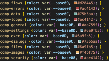
Color modifiers
| Key |
Description |
| comp-flows |
color for flows |
| comp-errors |
color for errors |
| comp-data |
color for data elements |
| comp-loops |
color for loop actions |
| comp-general |
general color |
| comp-settings |
color for settings |
| comp-exec |
color for executions |
| comp-dialogs |
color for dialogs |
| comp-files |
color for files and operations |
| comp-images |
color for images |
| comp-security |
color for security |