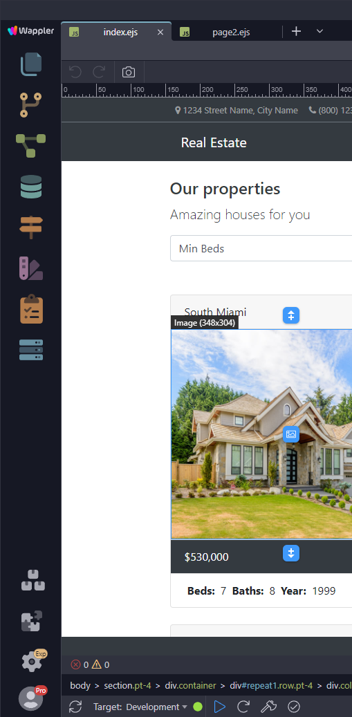
Wappler 5 added a new colorful icon above the folders icon. The problem with this is, it breaks muscle memory when clicking the folder button from people that regularly work with Visual Studio Code as well.
Please consider adding an option to put that icon in the lower end of the sidebar to enhance UX for those affected
We did enlarge the sidebar icons a bit and indeed also the top logo, so it takes a bit more space but it is clearer. Will see if we can optimize it more.
Having logo on bottom is not really good for branding.
Also the logo serves as menu when you click on it - but that seems like a hidden feature :), so we are thinking to change that to a more logical 3 vertical icons on the right side.
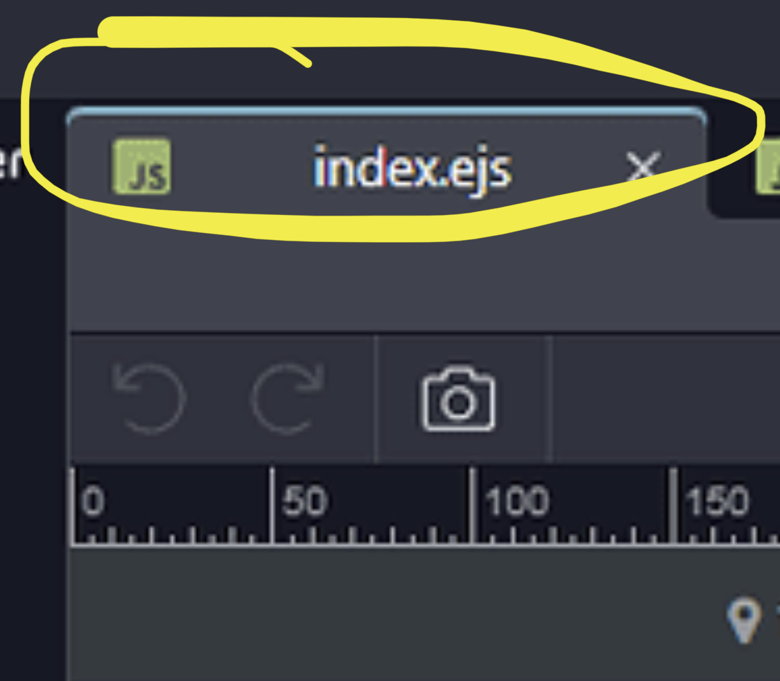
This logo icon is missing the shortcut key tooltip (F10). This would give a clue that it has some functionality. I only use it to access the Recent Files list, but this is very useful.
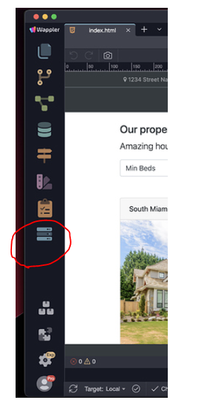
The Site Manager and Workflows icons - by far the most useful options - are also missing their tooltips (Alt+F and Alt+S).
I think the way these shortcuts are assigned is excellent. Almost all of the options can be reached from a single hand position. I would never use the mouse to access these features - except for the search feature (until the broken shortcut keys are fixed!) - so I don't really mind where the icons appear.
Although I like to look at the new colorful Wappler icon it has no place there. Not even for branding purposes as it breaks the UX of the sidebar(together with the new project setttings icon).
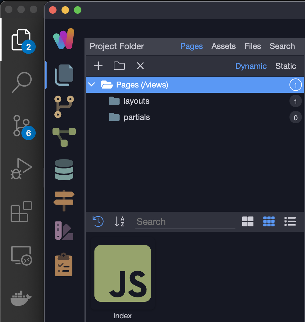
This icon opens a contextual menu that is redundant for MacOS. The suggested three dot solution for windows on the right side makes more sense.
All the above icons change the content of the left sidebar -> That’s ok and expected.
This one opens a modal. Messes up expected behaviour.
My suggestion:
Make this one the Wappler icon for branding purpose. I don’t have a special desire to view my community avatar picture in the app.
Put this one elsewhere as it’s a modal and doesn’t have effect on the left sidebar.
I respectfully disagree. The logo has been there for years and has never been a problem. I use it very frequently especially when in full screen mode. Not a deal breaker for me either way, but my preference is to leave it as is. I’m used to it being there now.
I do agree on the Clipboard Icon though. There is already four ways to get to project settings including the key command. I don’t think that needs to be there. But again, not a deal breaker.
We do plan to move the menu indeed under a 3 dots icon on the left side of the editor tabs.
@brad We have added project options (clipboard icon) and project manager icons to the left sidebar for easy access as we will be clearing the main window titlebar to contain just the Project name and no more icons arround it. As the title bar is also not visible in full screen.
@JonL - we do plan to move the project options to an editor tab or its own manager left sidebar panel, so it won’t be a popup any more.
For modals and windows I’m all for rounded as it’s a pattern today. But inside the windows everything is usually straight and flat.
I mean in the end it’s all about preference but I have a good hunch that having straight tabs with the colorful line on top is going to match perfectly the new branding. It will also make a very nice separation between the icon sidebar and the main window as now it looks like its embedded. Just a hunch.


 This icon opens a contextual menu that is redundant for MacOS. The suggested three dot solution for windows on the right side makes more sense.
 opens a modal. Messes up expected behaviour.
 the Wappler icon for branding purpose. I don’t have a special desire to view my community avatar picture in the app.