Intro
Framework7 comes with a set of ready to use UI components like dialogs, popup, action sheet, popover, list views, tabs, side panels, layout grid, form elements, cards and many more. You can use these components to build your mobile apps in Wappler.
We will take a look at some of the most popular components and explain you how to use them.
Action Sheet
Action Sheet is a slide-up pane for presenting the user with a set of alternatives for how to proceed with a given task. You can also use action sheets to prompt the user to confirm a potentially dangerous action.
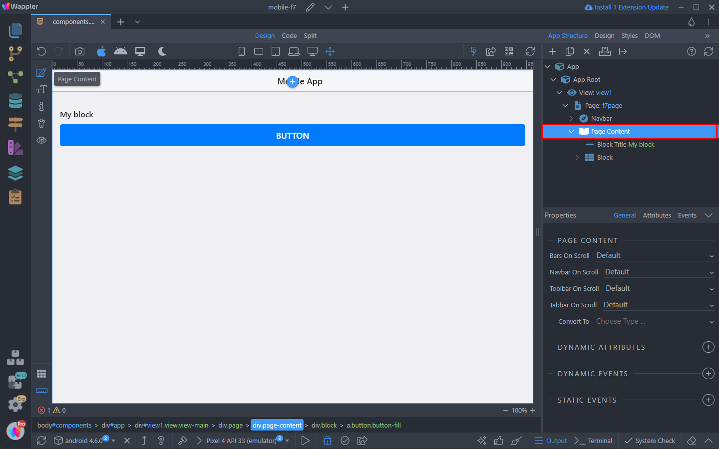
We have a simple app layout - a standard block with a button inside. We will use this button to open the Action Sheet:

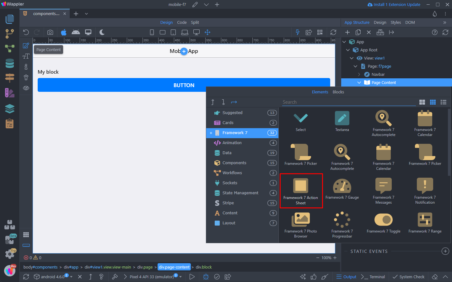
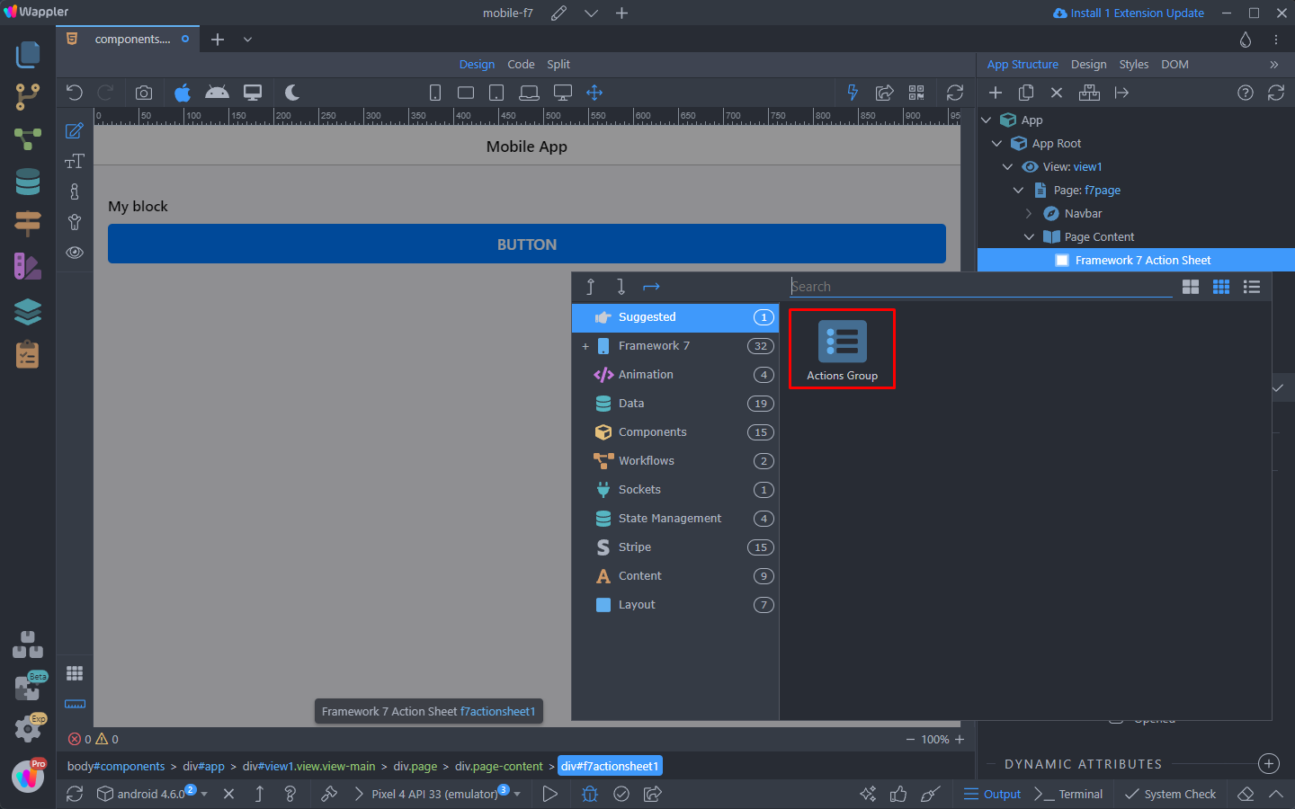
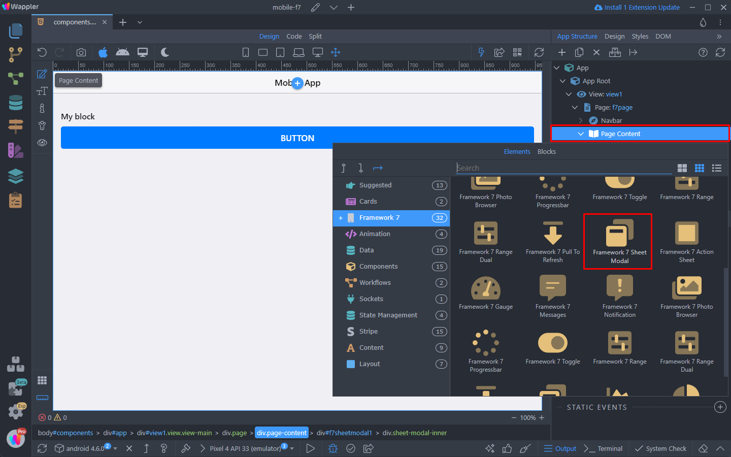
To use the Action Sheet component you need to add it on your page. Right click the Page Content:
Open the Framework7 category and select Action Sheet:
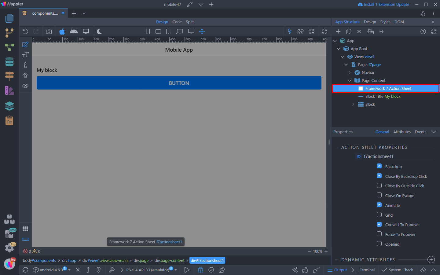
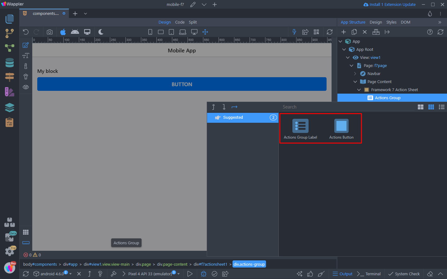
Once added on the page, we need to insert content inside. So right click the component:
And you will see the available options. It can contain one or more Action Group with buttons. Select Action Group:
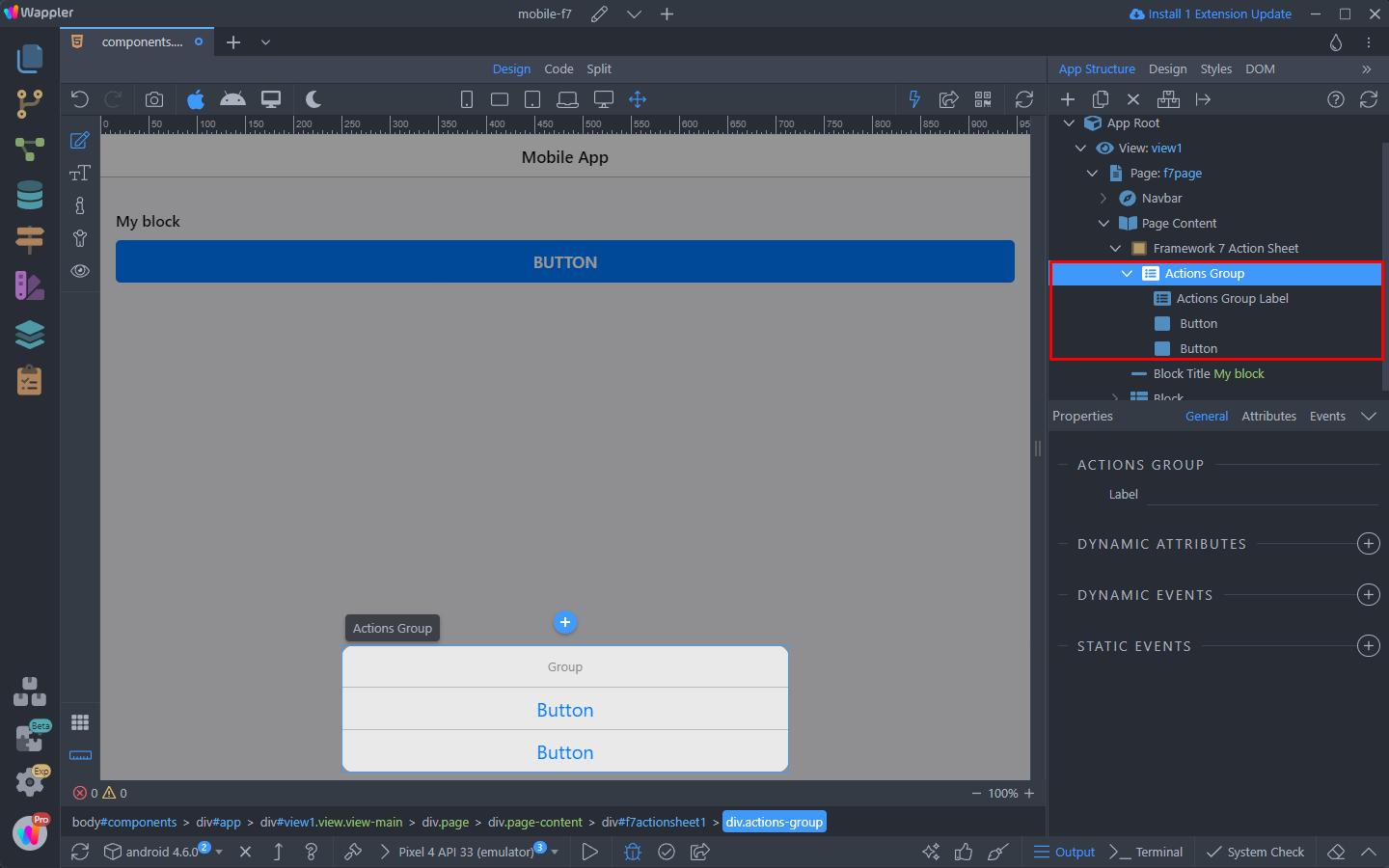
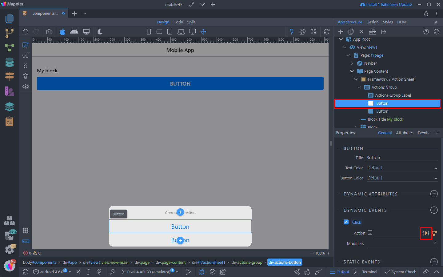
And when you right click the action group - you can see the available options, to be inserted inside it - Action Group Label and Action Button:
We insert an Action Group Label and 2 Action Buttons and this is the layout:
You can double click and edit the Action Group Title:
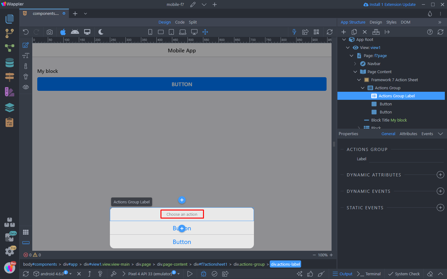
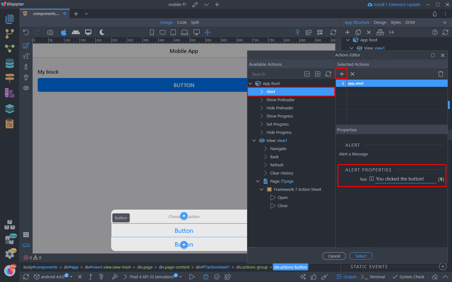
Each of the buttons have dynamic actions on click. Select the first button and click the dynamic action picker:
Here you can select any dynamic action to be executed on button click. For example we can show an alert:
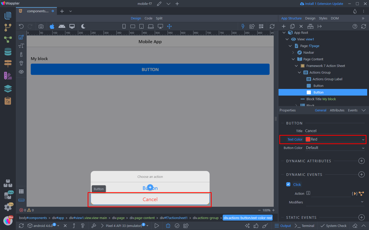
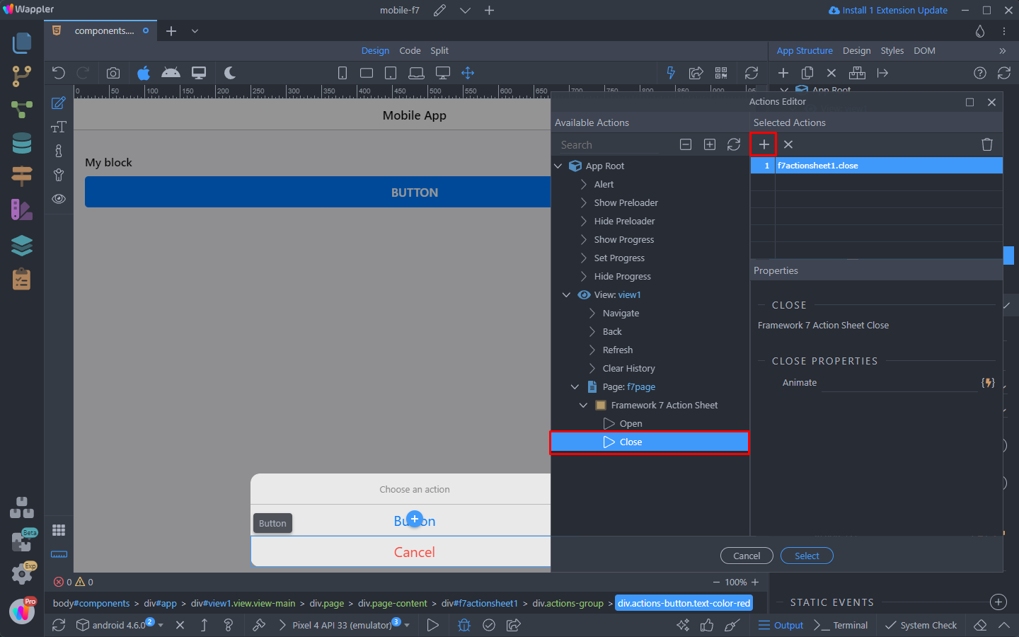
Let’s make the second button a cancel button, that closes the Action Sheet. Select the second button, change its text color to red and change its text to “Cancel”:
Then select the dynamic action picker for the click event:
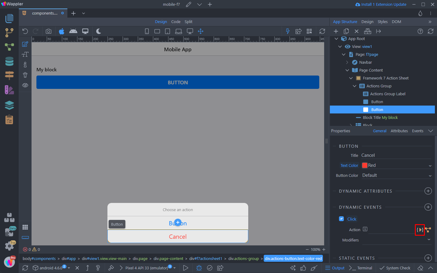
And select Action Sheet > Close:
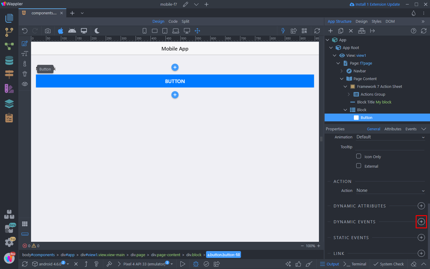
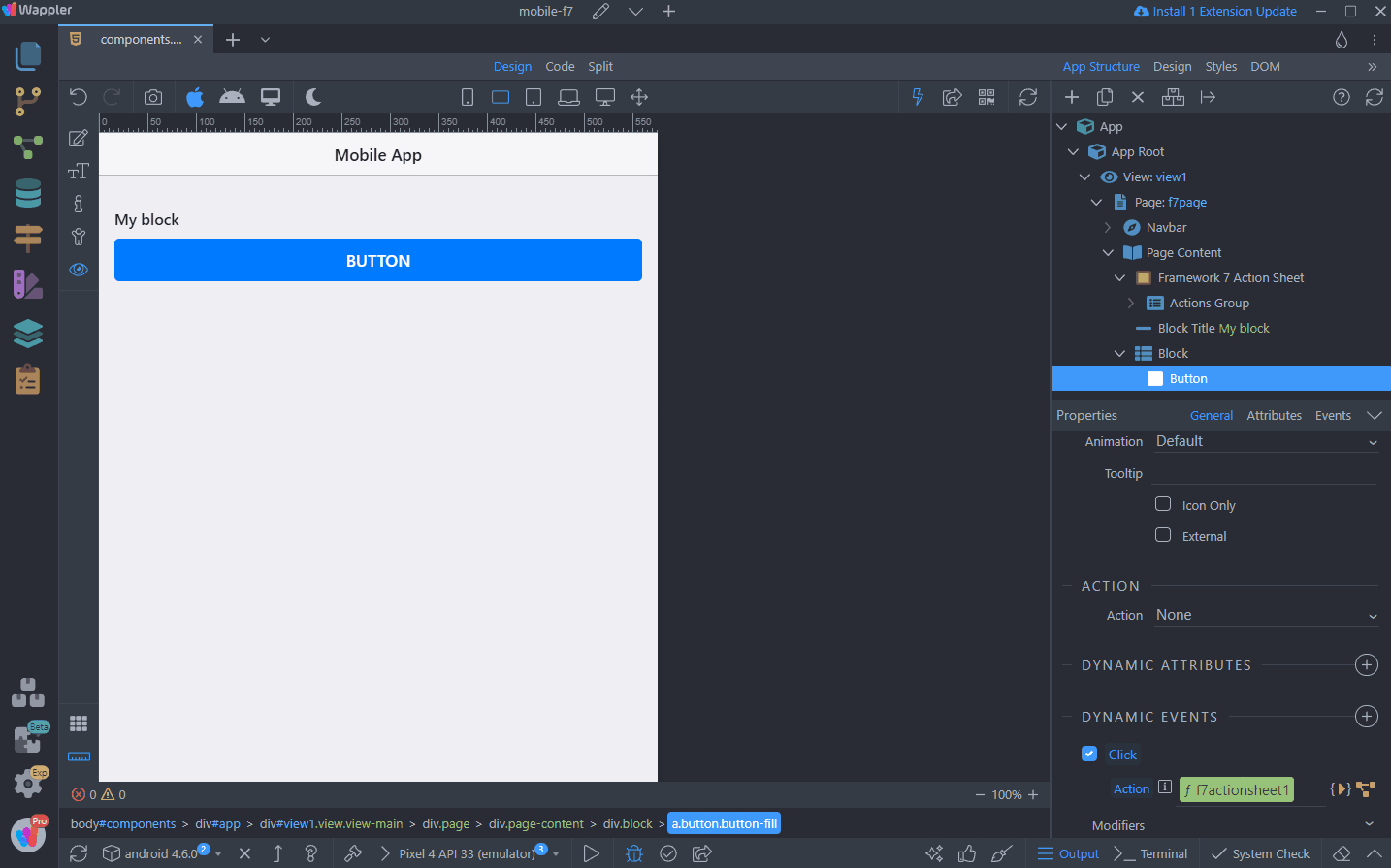
To open the Action Sheet you can use a button. Select the button on the page and add new dynamic event:
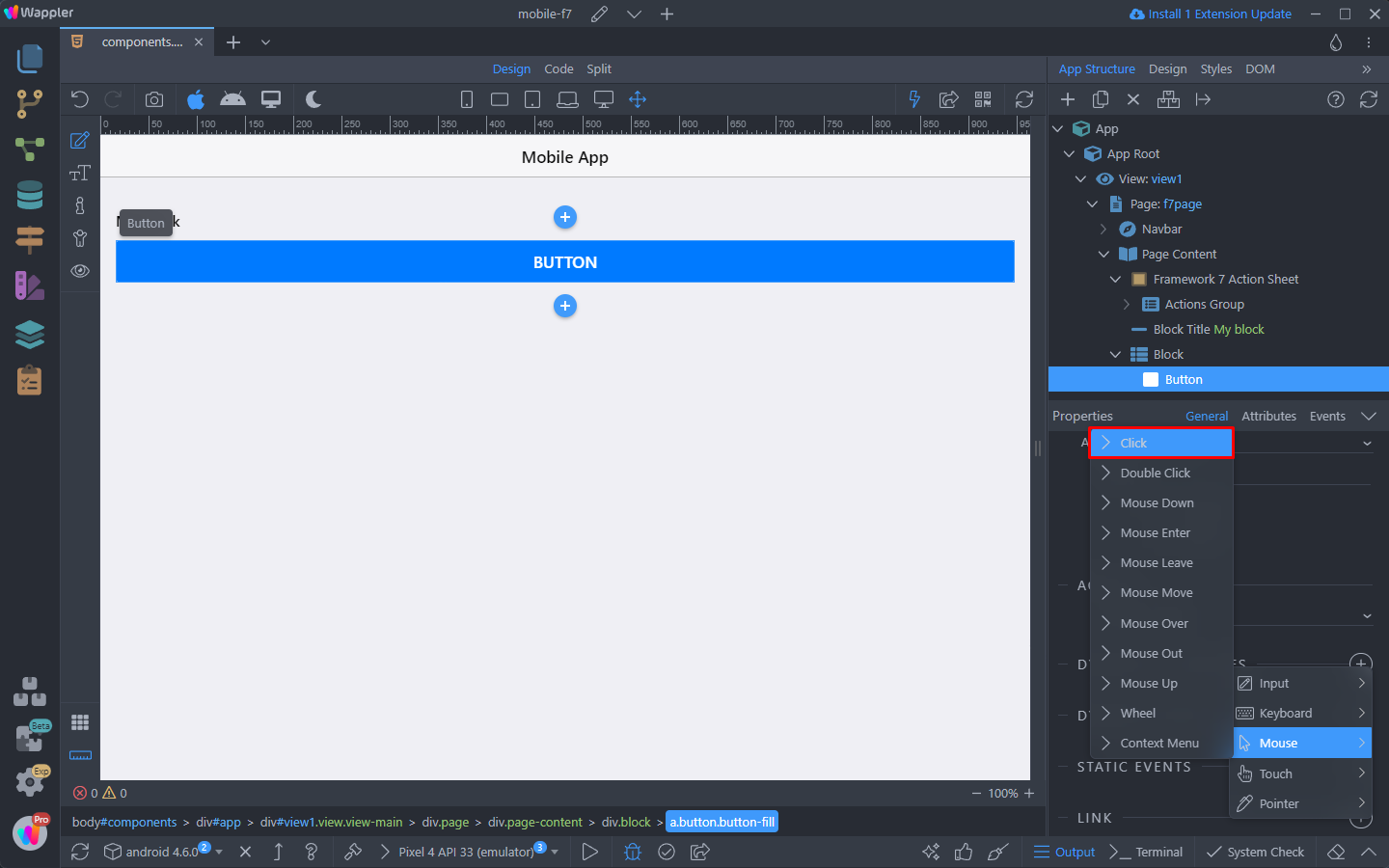
Select Mouse > Click:
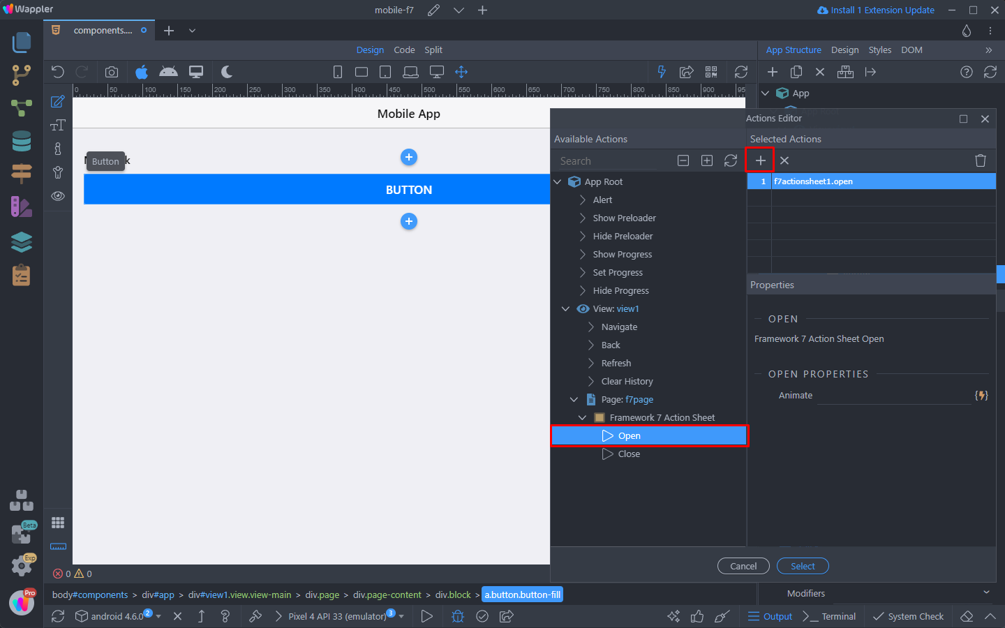
And open the dynamic action picker:

Select Action Sheet > Open:
And you are done.
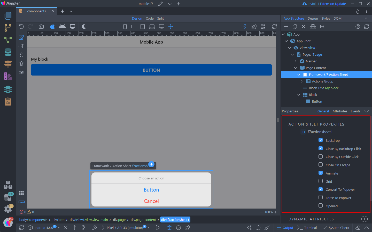
You can adjust the Action Sheet properties in the Properties inspector:
Let’s preview the results:
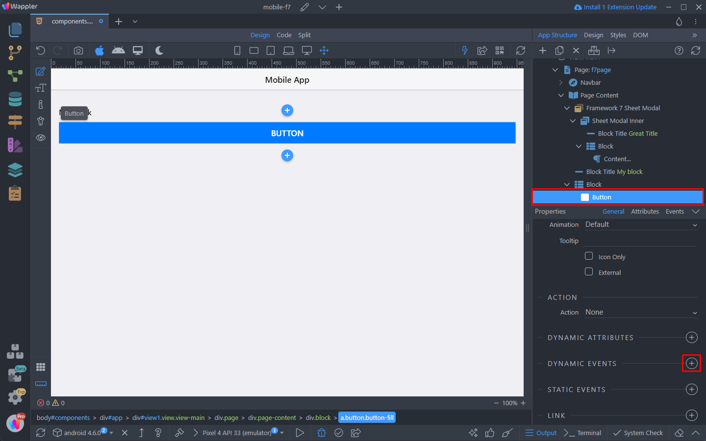
Sheet Modal
Sheet Modal is a special component, that allows you to create custom overlays with custom content.
We have a simple app layout - a standard block with a button inside. We will use this button to open the Action Sheet:
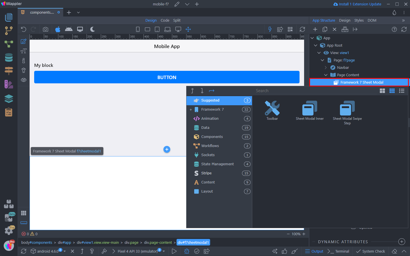
Right click the Page content, open Framewrok7 and select Sheet Modal:
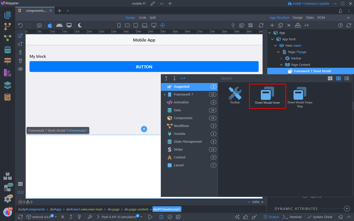
Right clicking the Sheet Modal you can see what’s available to be inserted inside i:
Select Sheet Modal Inner:
Show Whole Content
You can show the whole content, when the Sheet Modal is opened.
Inside the Sheet Modal Inner you can add the content you want to display:
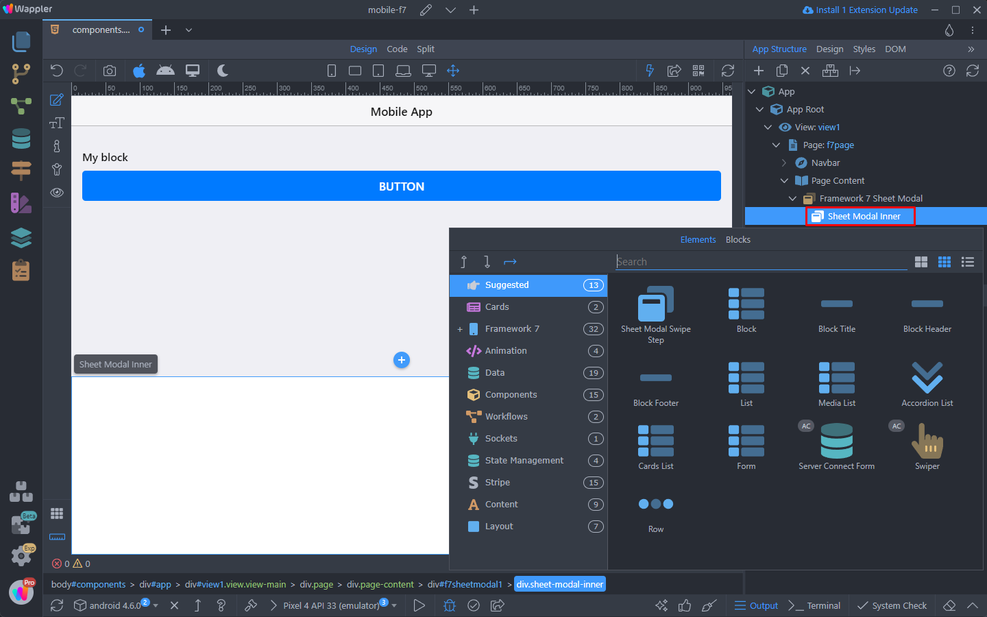
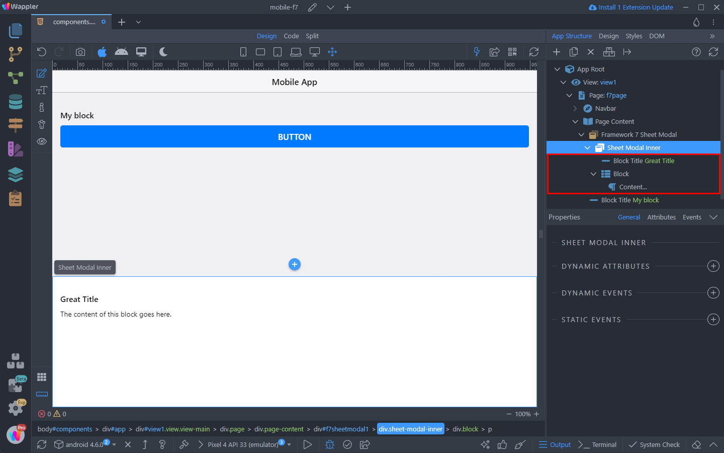
We added a Block with Content and a Block Title:
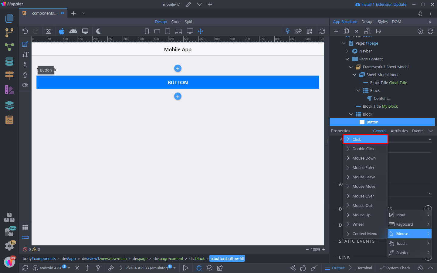
We’re done adding content to the modal. Now select the button on the page and add new dynamic event:
Select Mouse > Click:
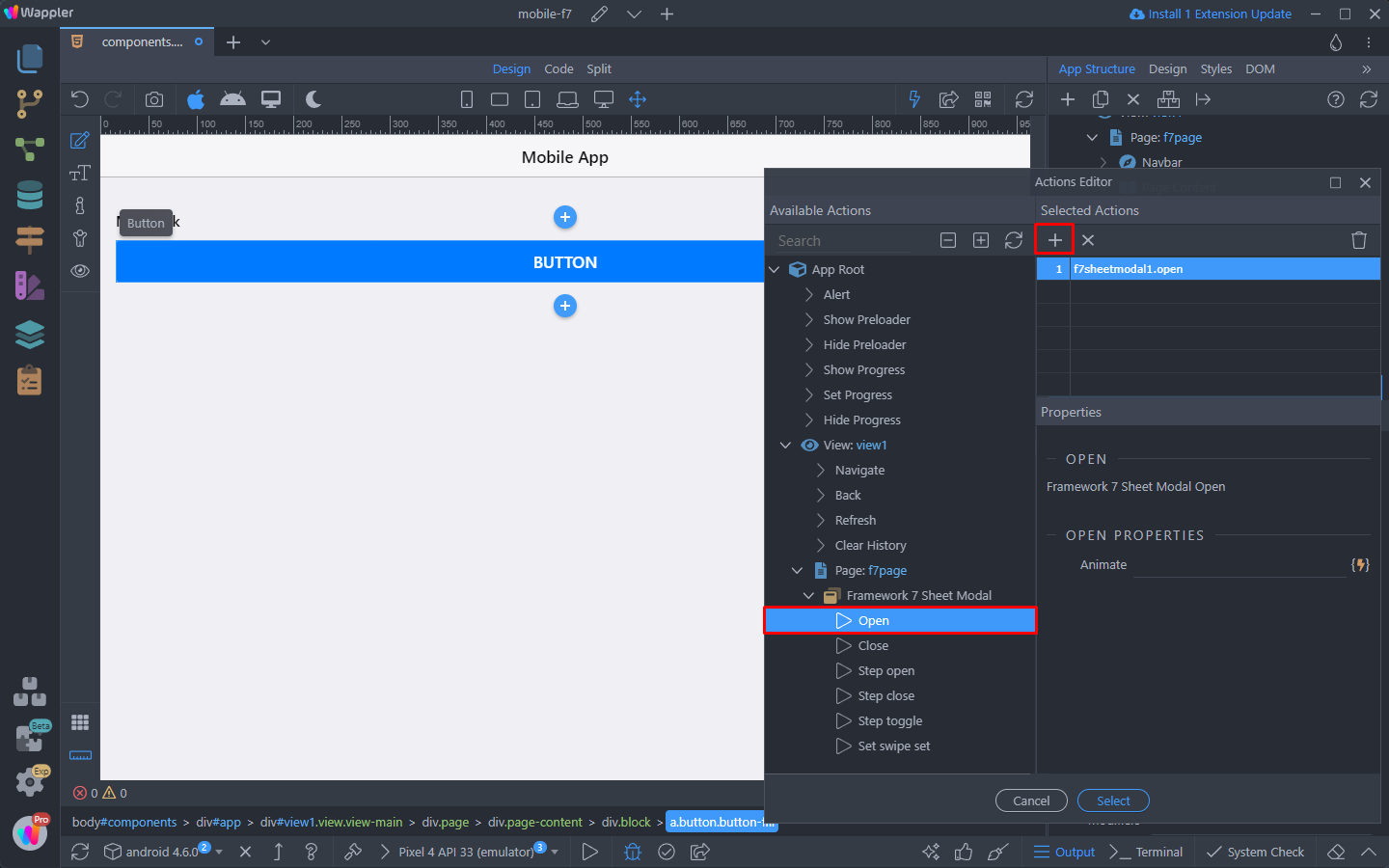
And click the dynamic action picker button:
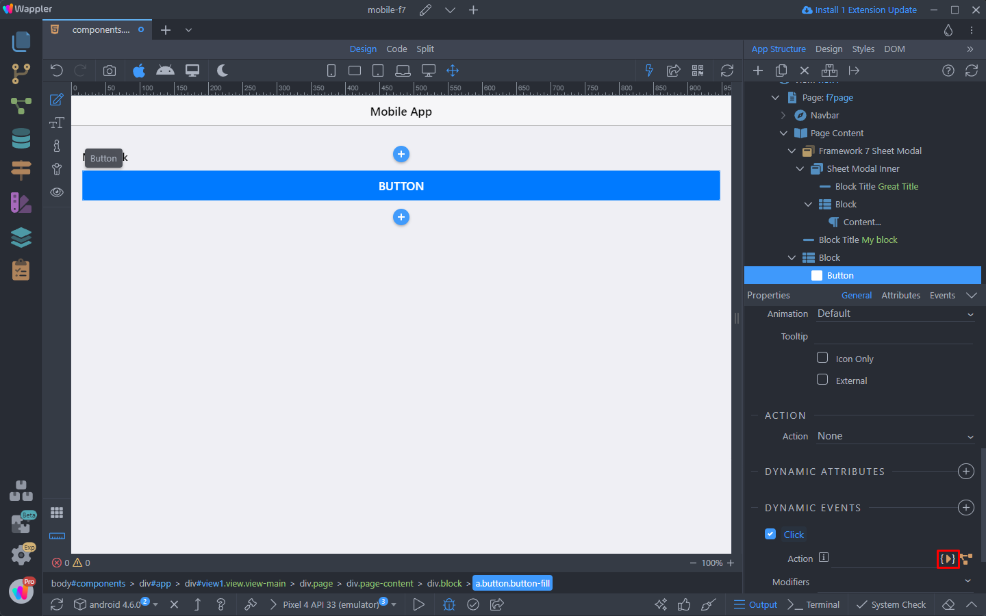
Select Open under the Sheet Modal and add it:
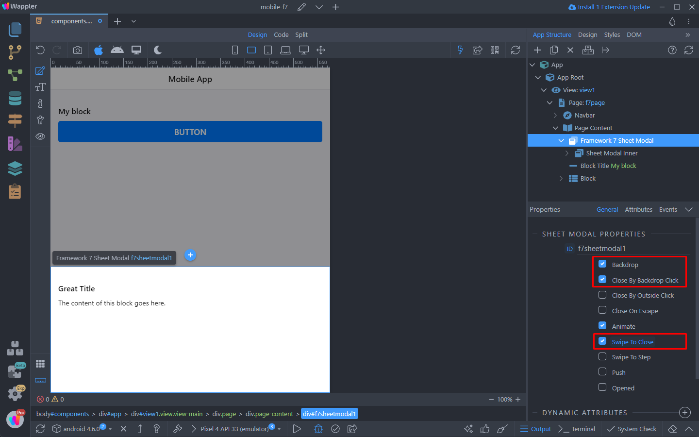
You can configure the Sheet Modal properties, we enable Backdrop, Close Modal on Backdrop click and also the Swipe to close option:
Here you can see the results:
Swipe To Show More
The other option is to show the content partially and with swipe it can be further expanded.
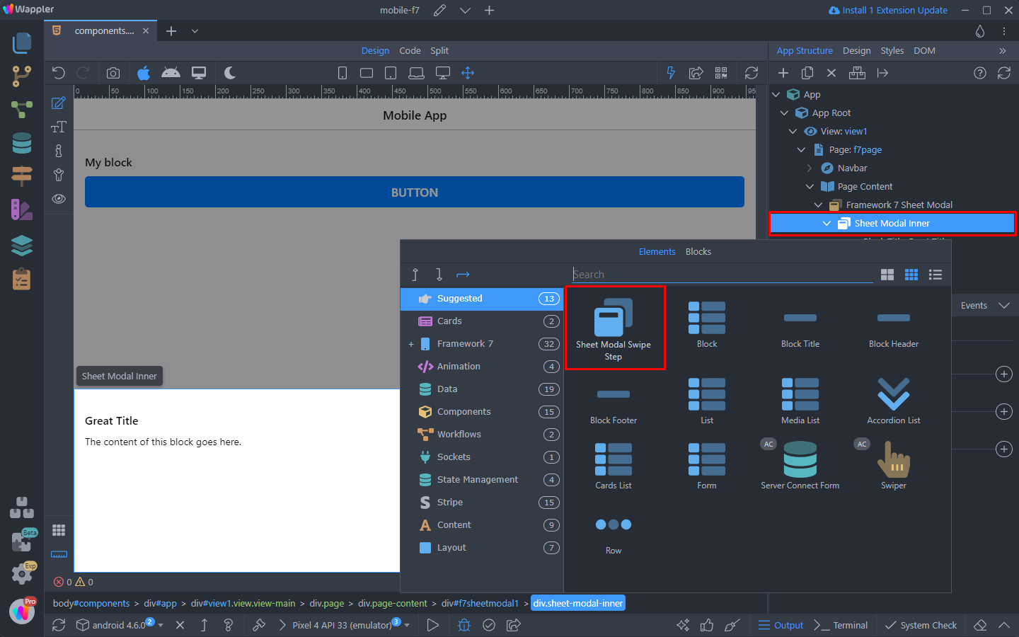
In order to do this, we need to add a special element called Swipe Step.
Right click the Sheet Modal Inner and select Sheet Modal Swipe Step:
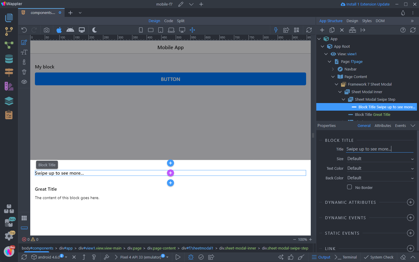
Inside the Swipe Step we add the content, that we want to be displayed when the Sheet Modal is opened:
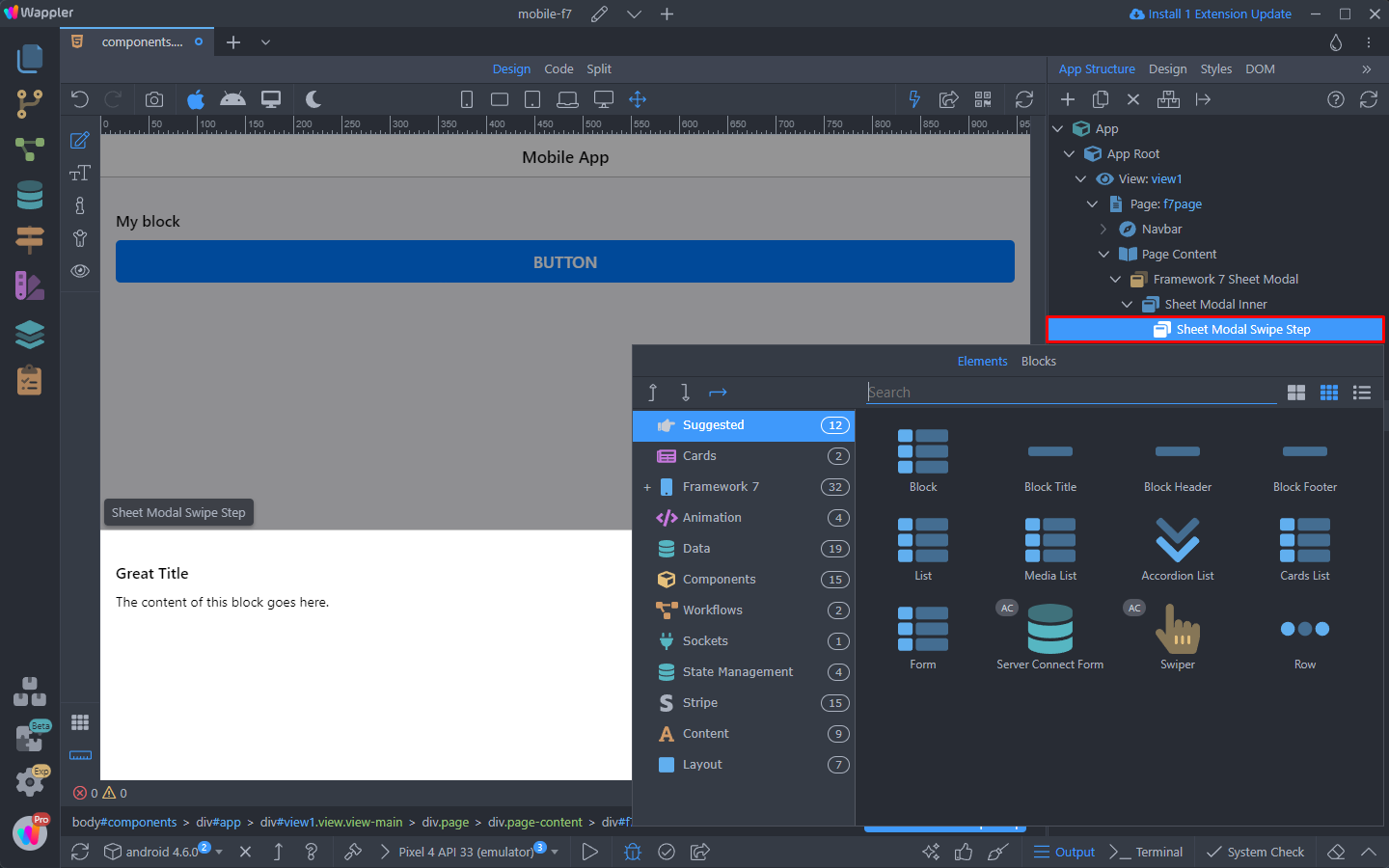
So we add a Block Title. We enter some text for it, in our case “Swipe up to see more…”, as with the Swipe Step, the rest of the content below will be hidden on modal open:
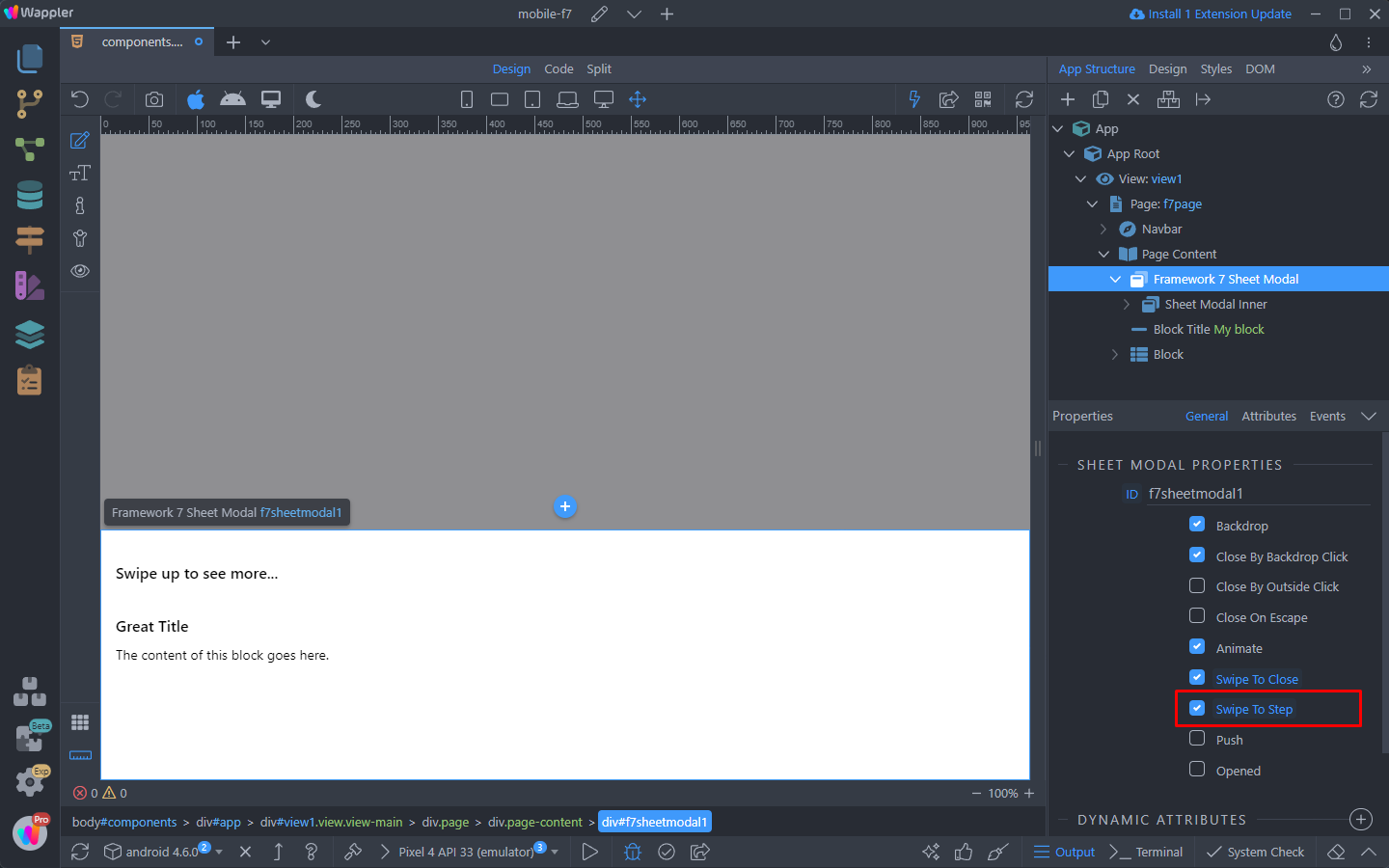
Make sure to enable the Swipe To Step option in the Sheet Modal options:
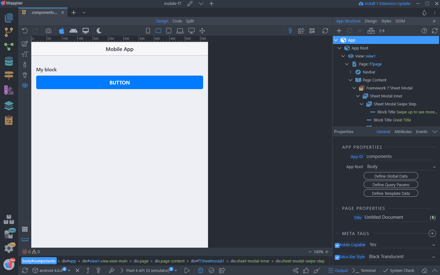
And you are done. Here are the results - the Sheet Modal only shows the Swipe Step content on load and you need to swipe up to see the rest:
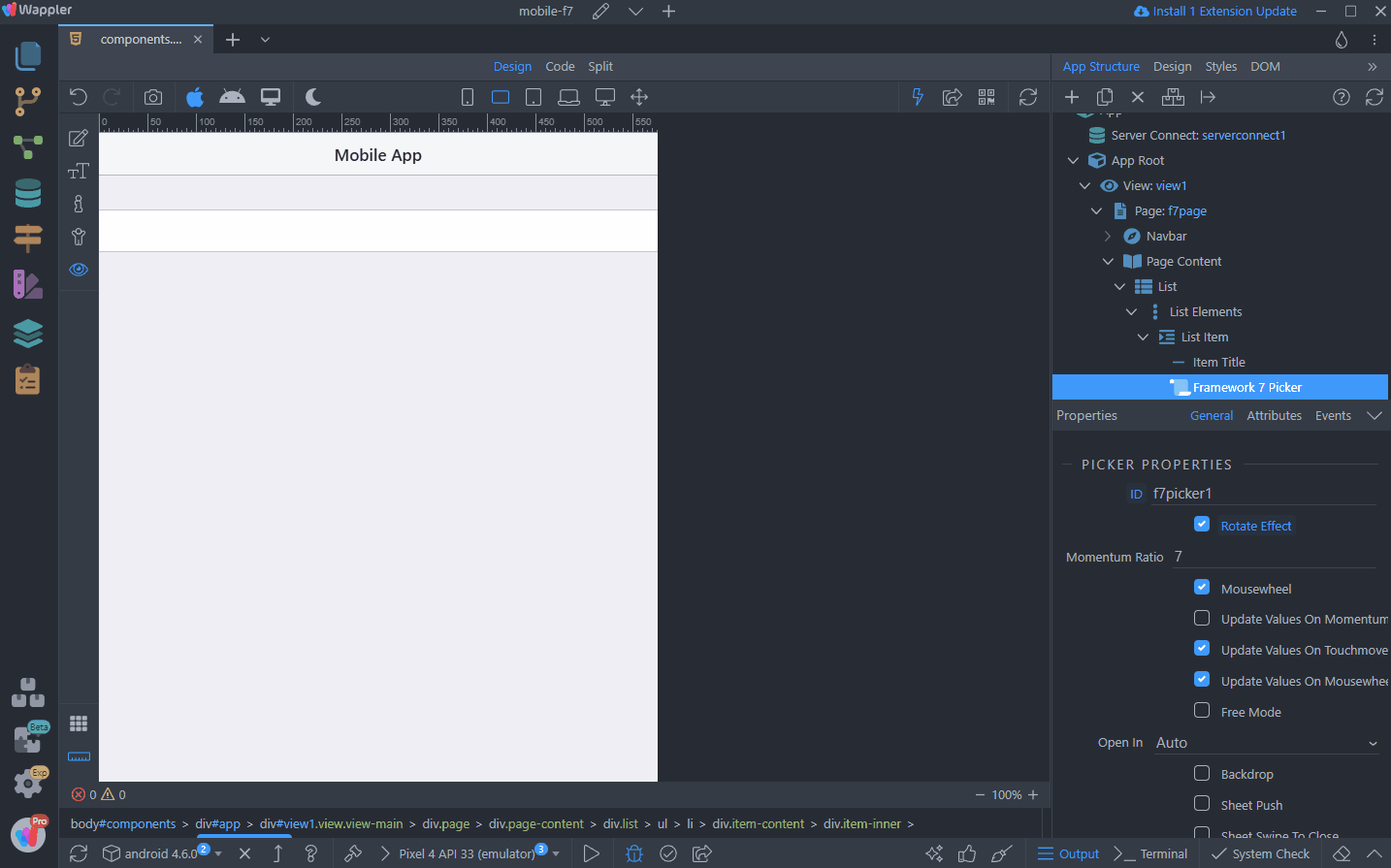
Calendar and Picker
There are other components such as the Calendar, Picker or Autocomplete that extend the inputs functionality.
Let’s start with the layout required for these components.
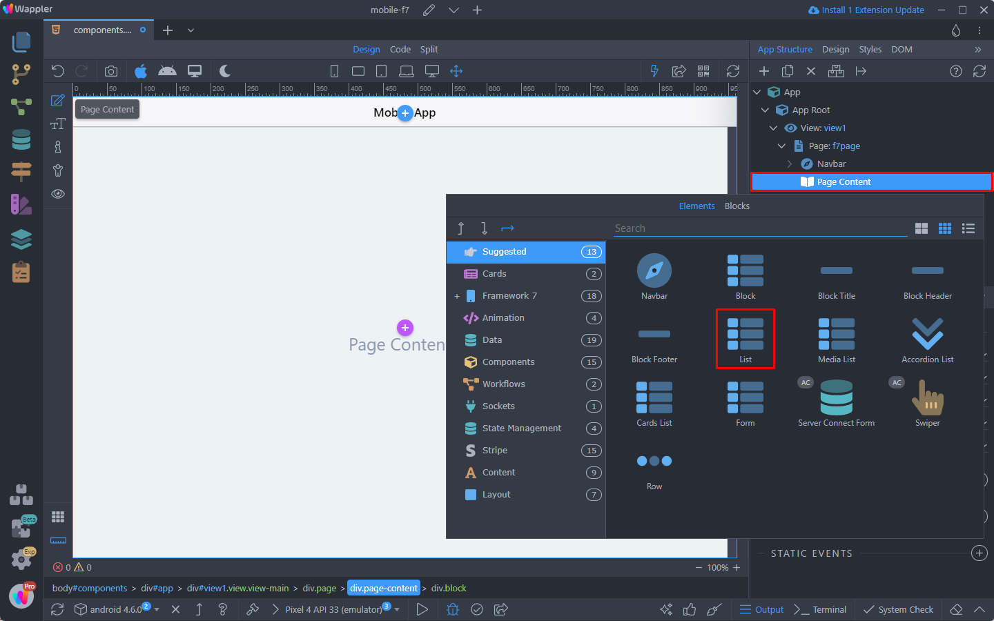
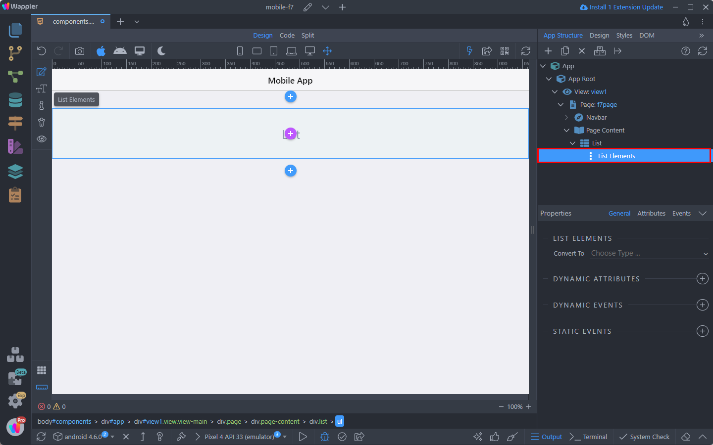
Right click the page content and add a List:
This will add a structure of List with List Elements inside:
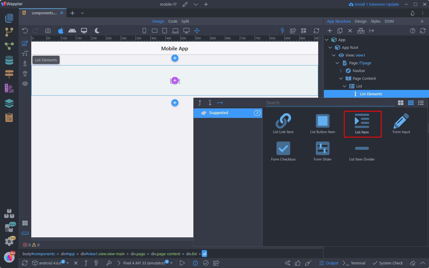
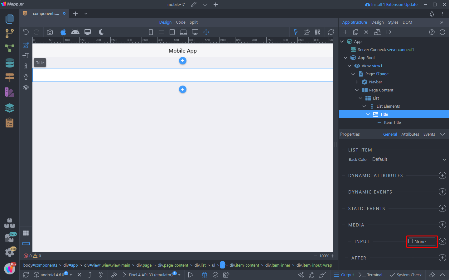
Right click List Elements and add a List Item:
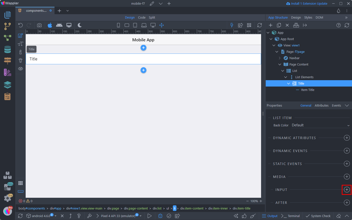
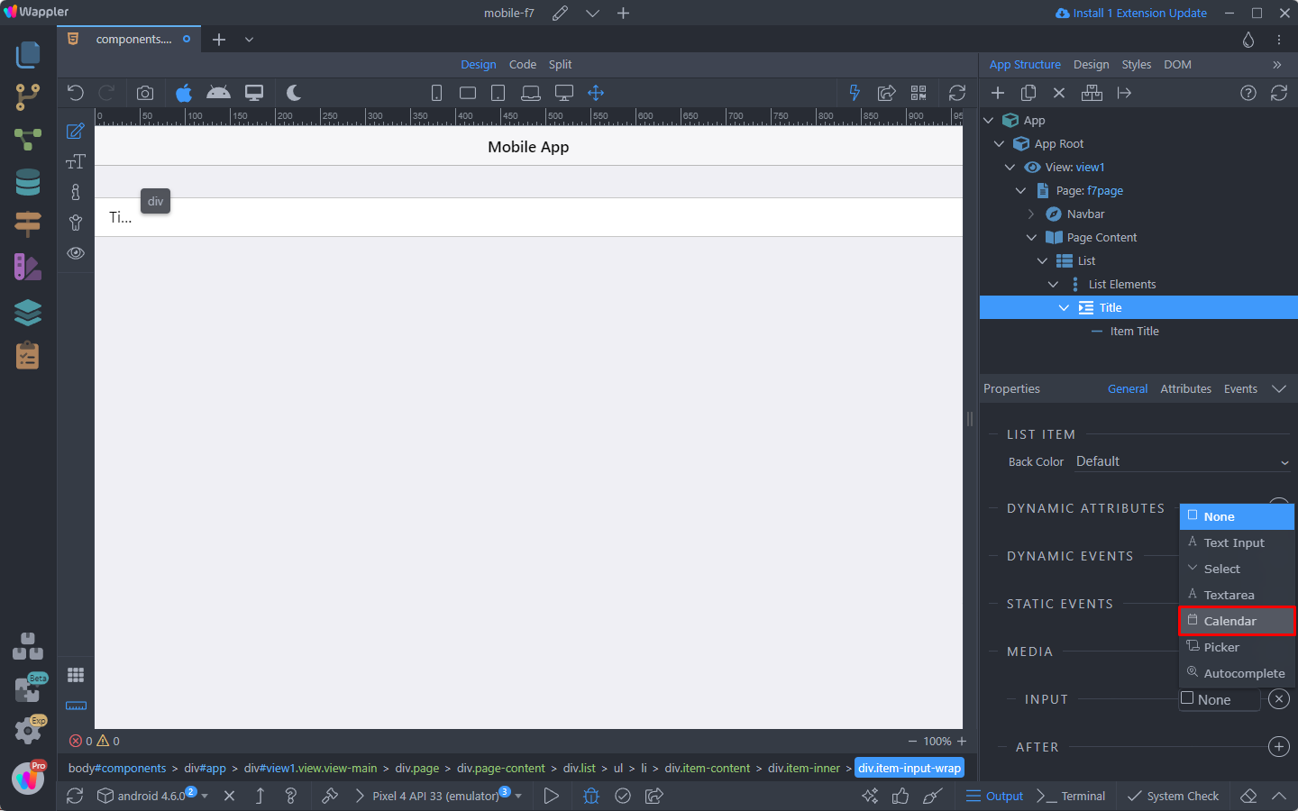
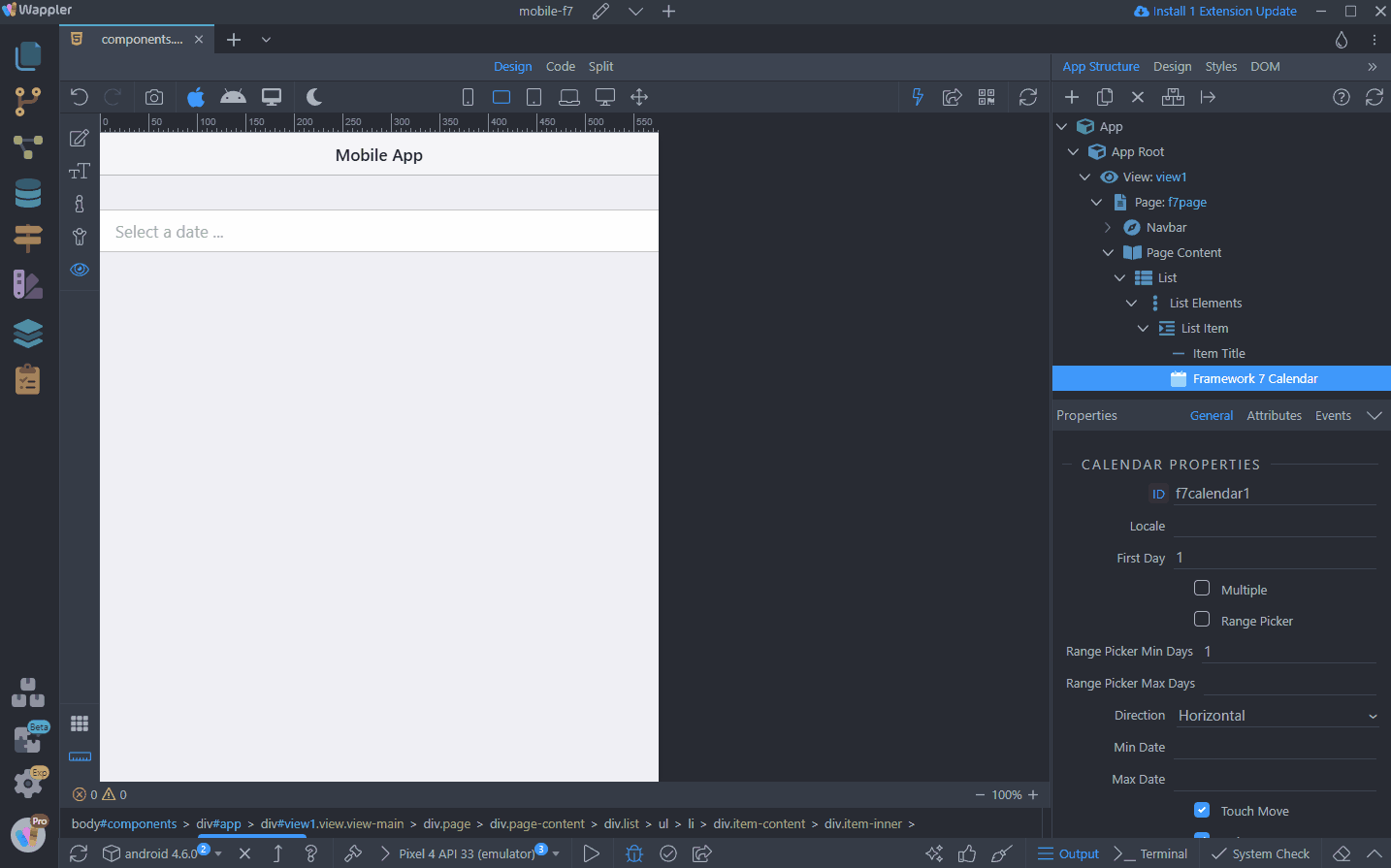
Scroll down the List Item properties and add an input:
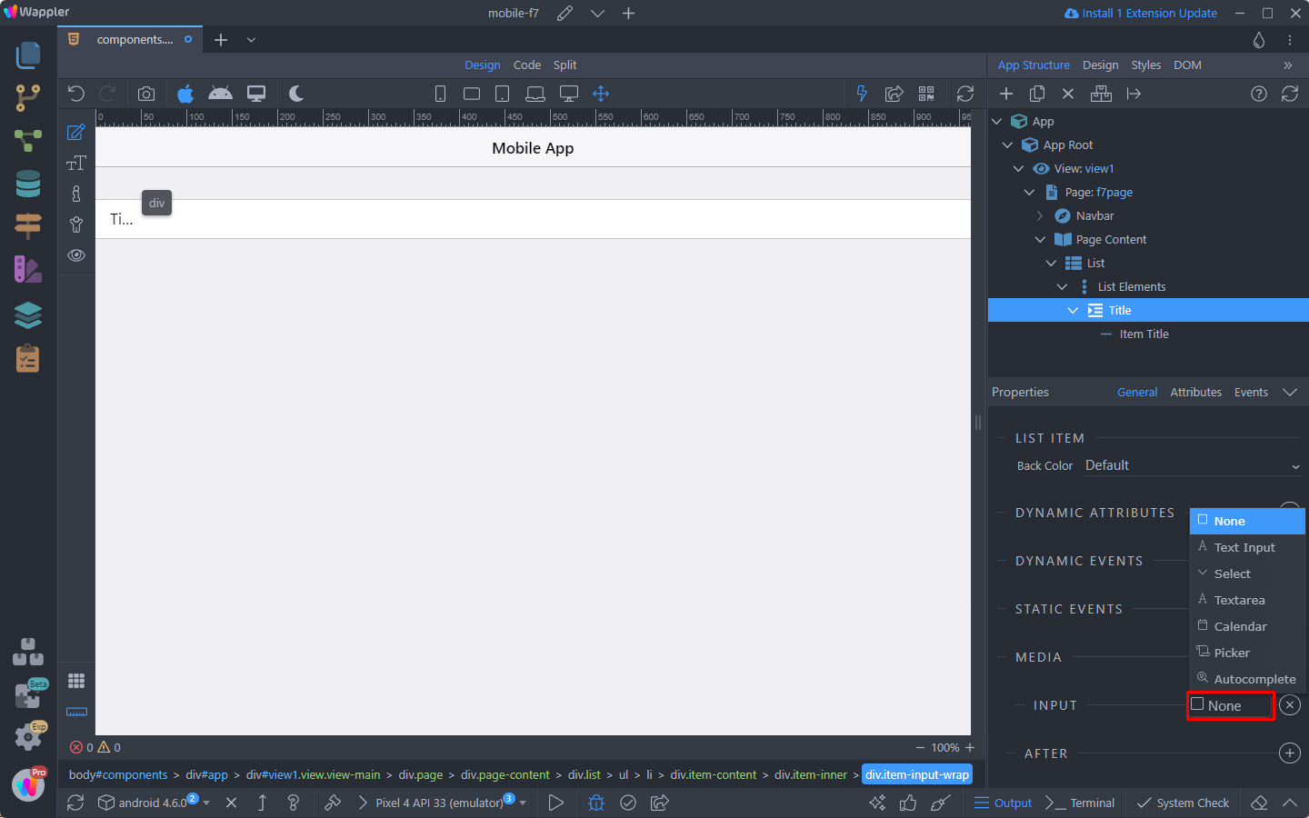
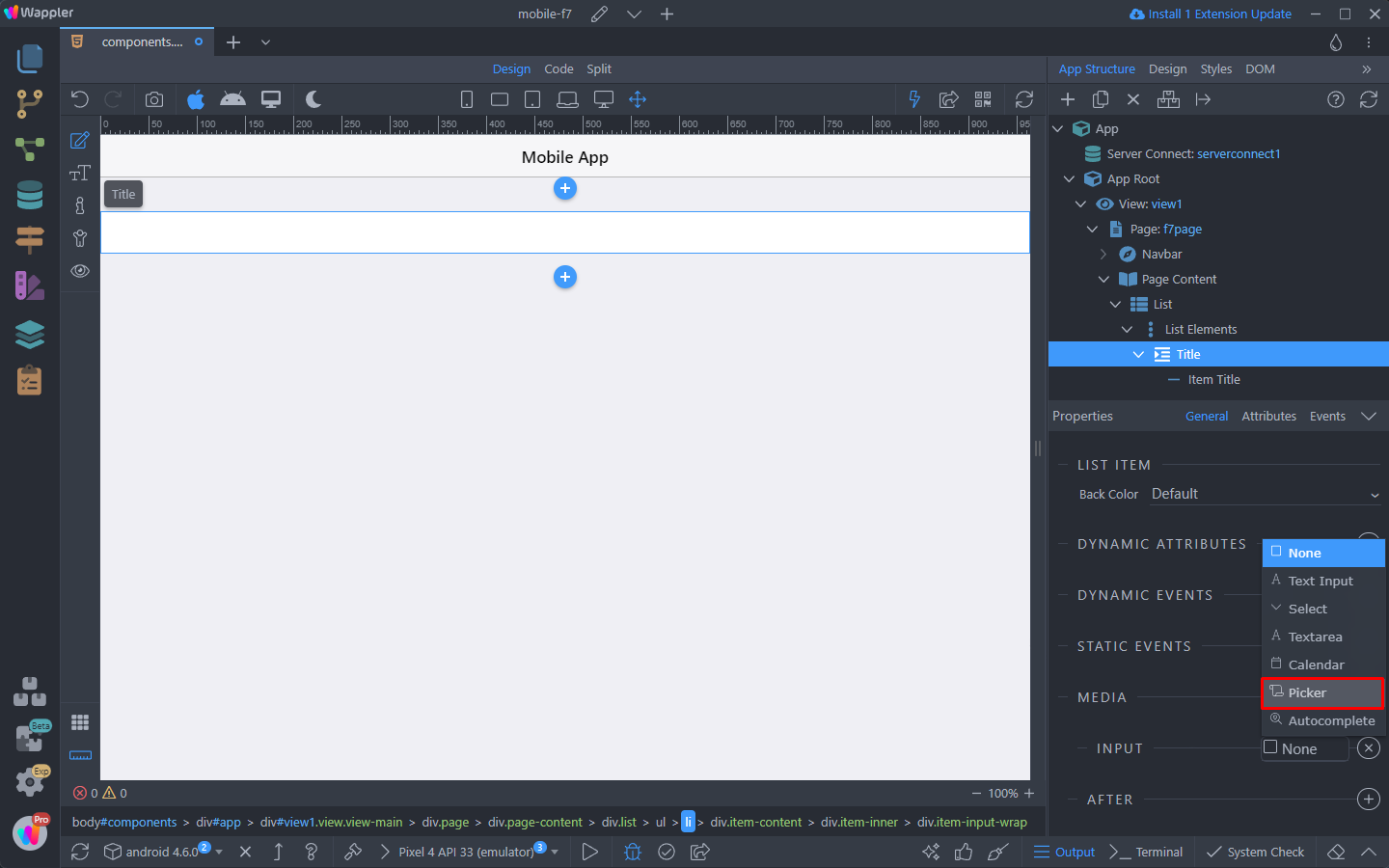
And that’s where you can convert the input to Select, Text Area, Calendar, Picker or Autocomplete:
Calendar
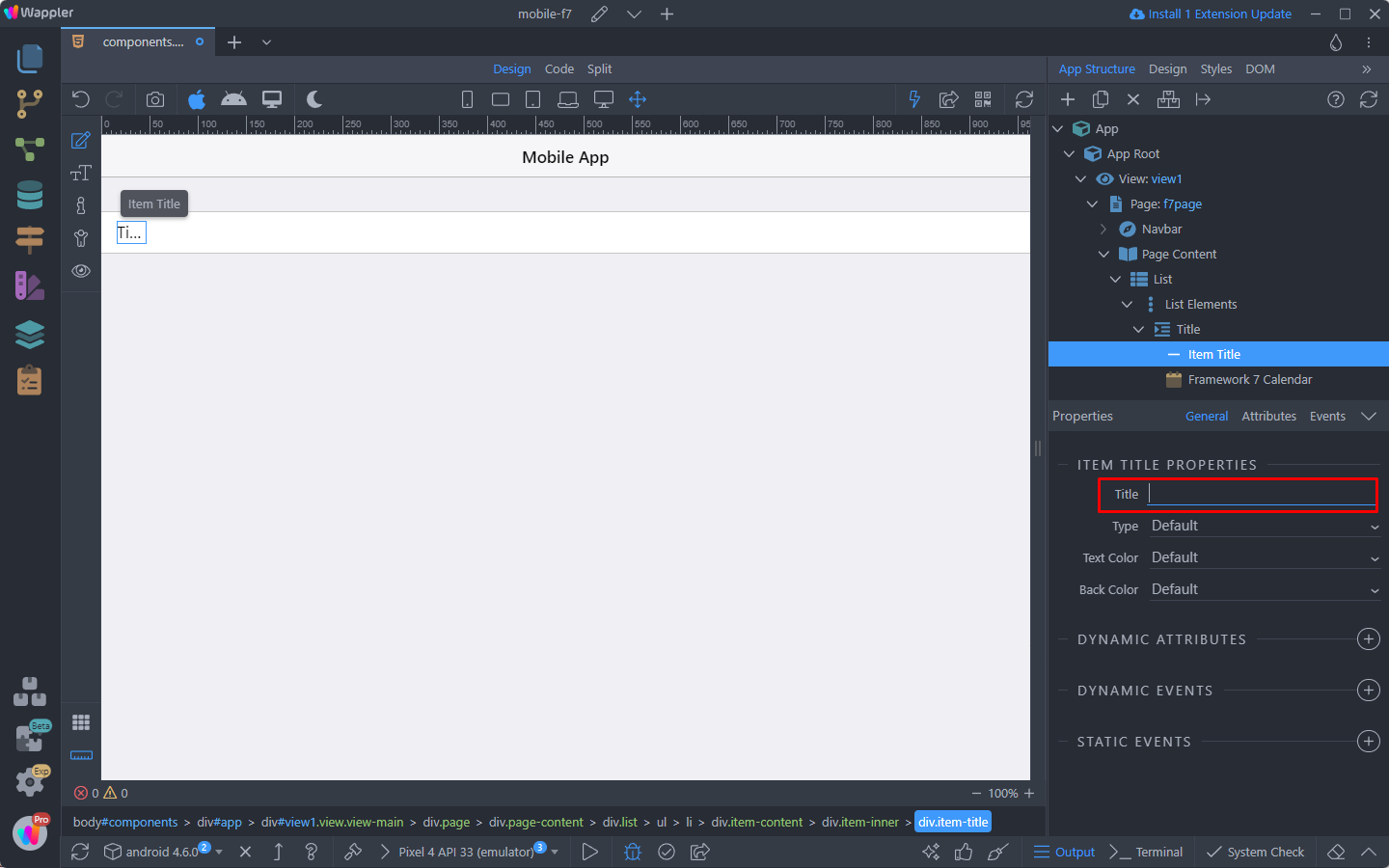
If you choose Calendar, the input will be converted to the Framewrok7 Calendar component:
You can leave the list element title empty, as we won’t needed it with the calendar:
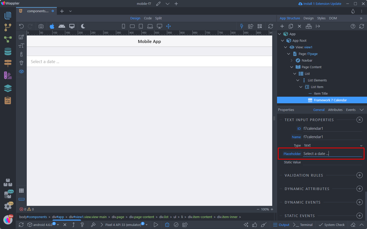
And scroll down the input properties you can add a placeholder text to be displayed to your users:
You can adjust the Calendar component properties in the Properties inspector:
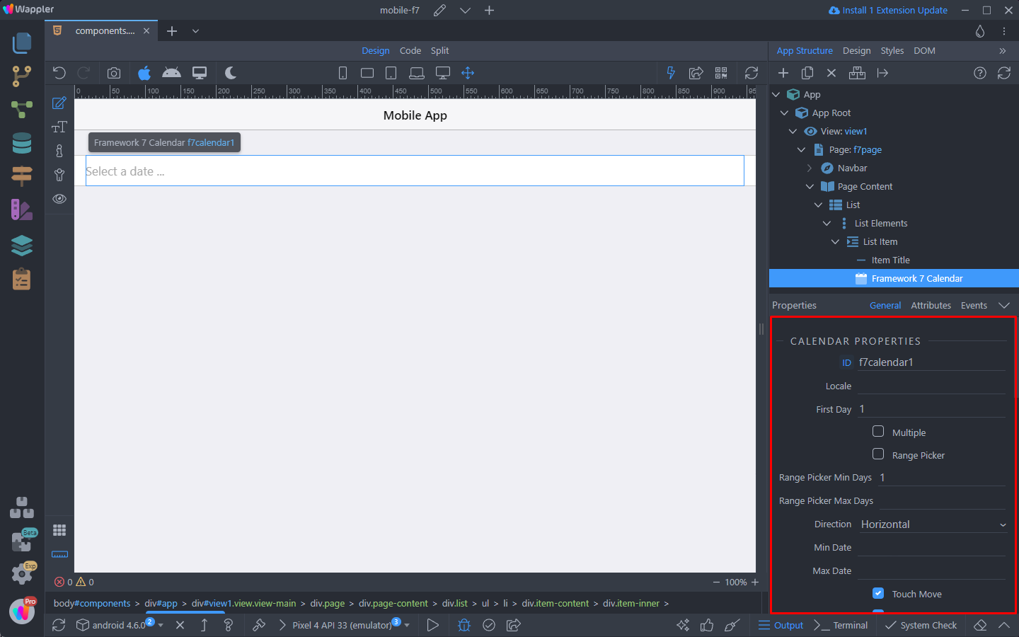
A list of all the properties and options of the component can be found in Framework7 docs.
You can see the results:
Picker
You can also convert your input to the Framework7 Picker Component:
Picker is a powerful component that allows you to create custom overlay pickers which looks like iOS native picker.
Open the dropdown next to your input:
Select the Picker component:
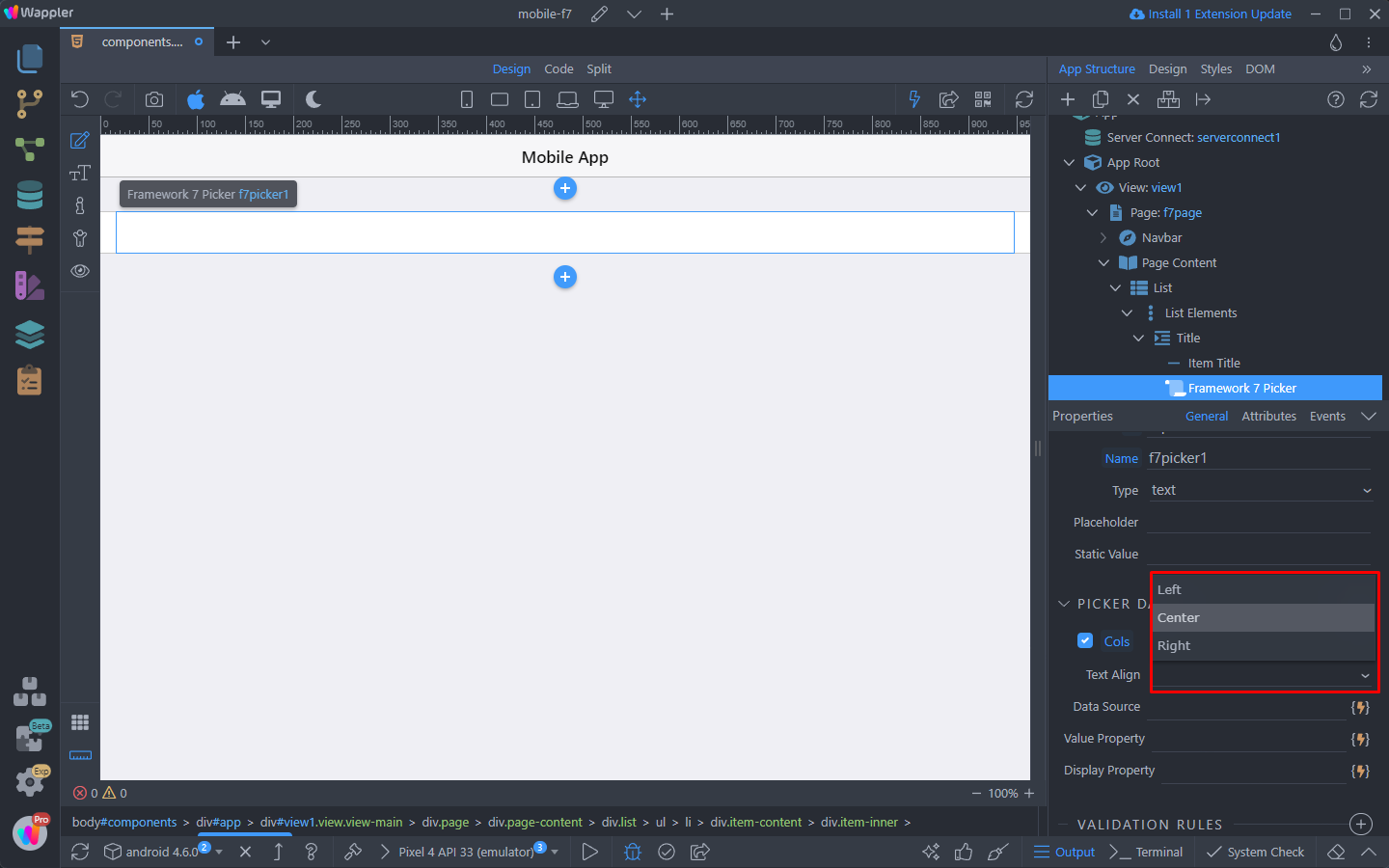
The picker component works with dynamic data, so scroll down the properties panel and click the add picker data button:
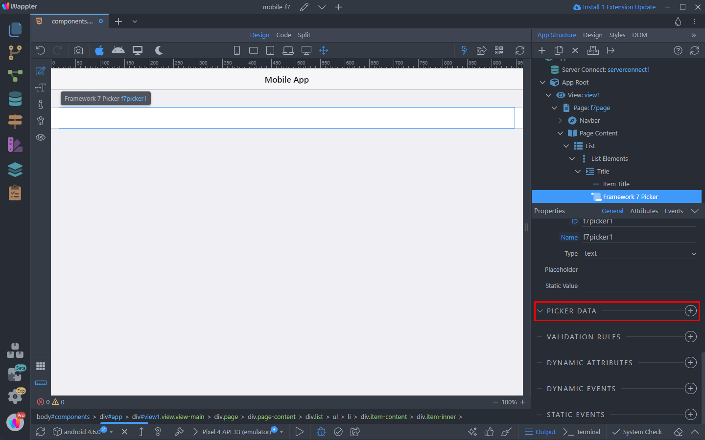
Select the text align:
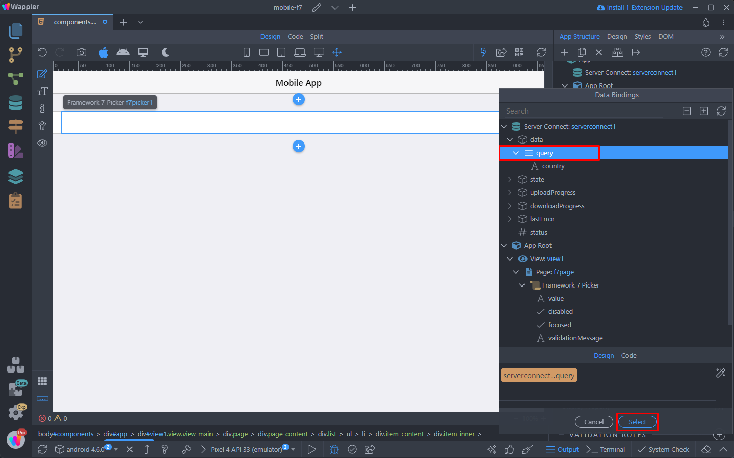
And then select a data source. This can be any dynamic data source in Wappler:
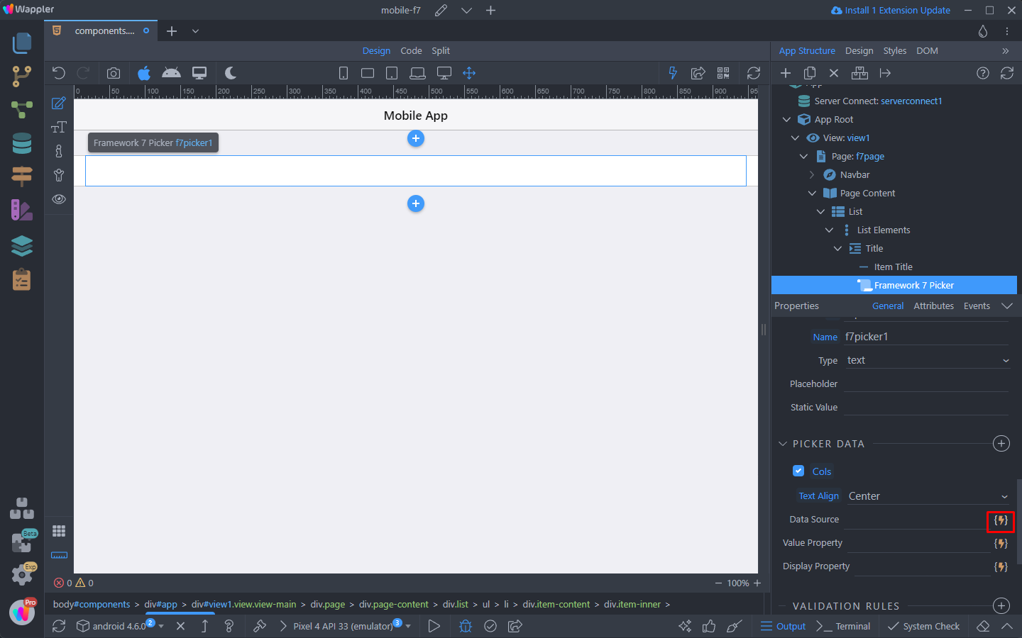
In our case this is a database query from a Server Action:
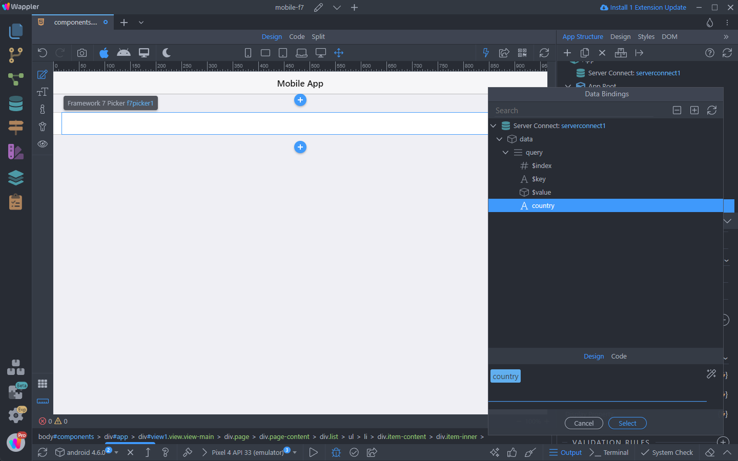
Select a dynamic value:
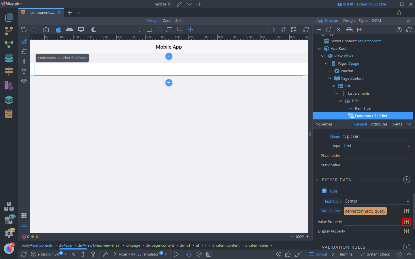
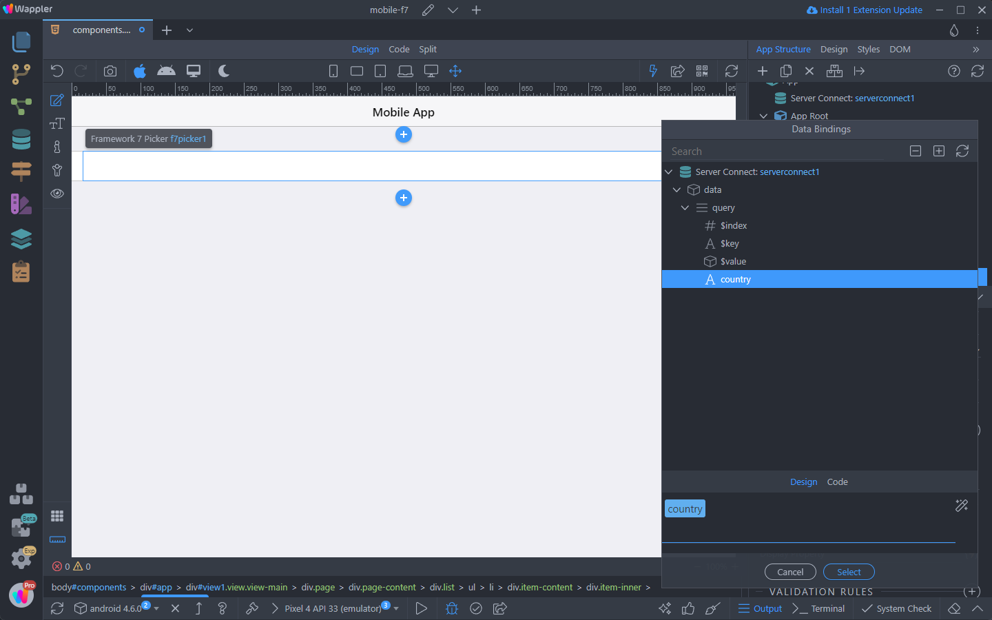
And then a dynamic text to be displayed in the Picker component:
And you are done:
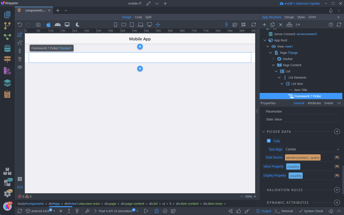
You can adjust the Picker component properties in the Properties inspector:
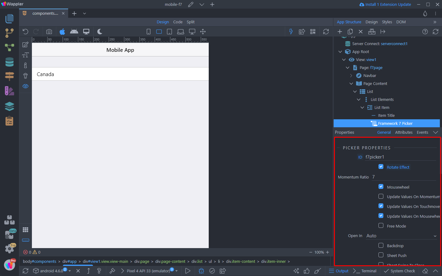
A list of all the properties and options of the component can be found in Framework7 docs.
Let’s preview the results: