@Hyperbytes
Sorry I haven’t explained myself properly.
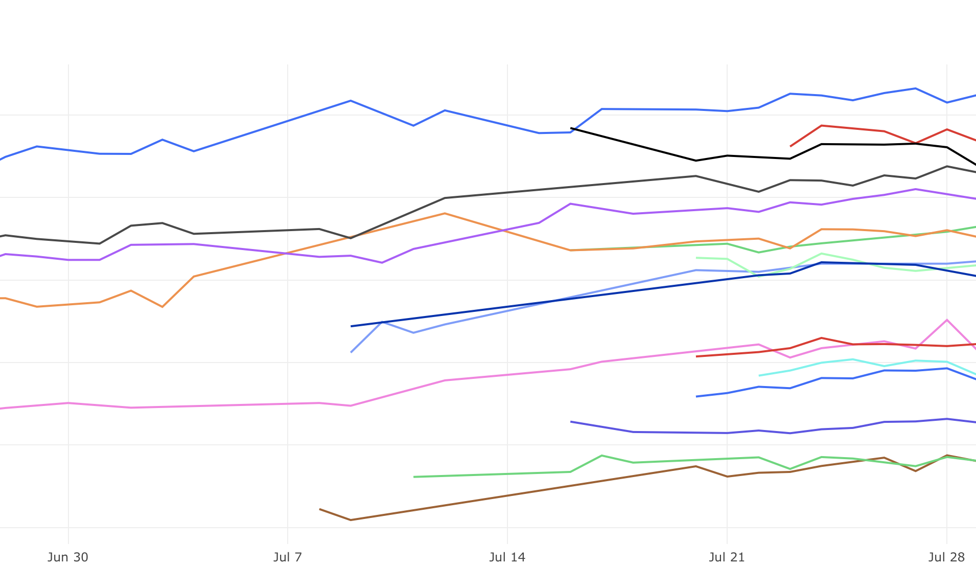
So in the above image you can see the x axis is a DATETIME axis and that it is uniformly distributed, so the vertical gridlines are equally spaced and represent the same interval of time each. This graph was not created in Wappler. This graph was created with data that does not necessarily have a datapoint for each day, but the graph joins the dots when the next data point is recorded.
The next graph was created in Wappler and you can see that Wappler only graphs the data points that exist, which means that the vertical gridlines although equally spaced visually do not represent equal quantities of time. For my particular application, the user is particularly interested in how the data varies over time, ie. the change in slope. But when I graph this in Wappler the visual change in slope doesn’t really tell the right story. As the slope from one point to the next could represent a week or a day. Does this clarify things anymore?
