Wappler Version : 3.9.7
Operating System : Win 10 Pro
Server Model: NodeJS
Database Type: MariaDB
Hosting Type: Cloud
Expected behavior
-
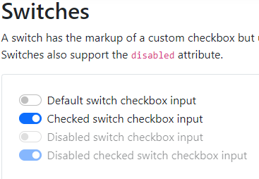
The design of the Bootstrap 5 Switch component should be showing correctly like that:
-
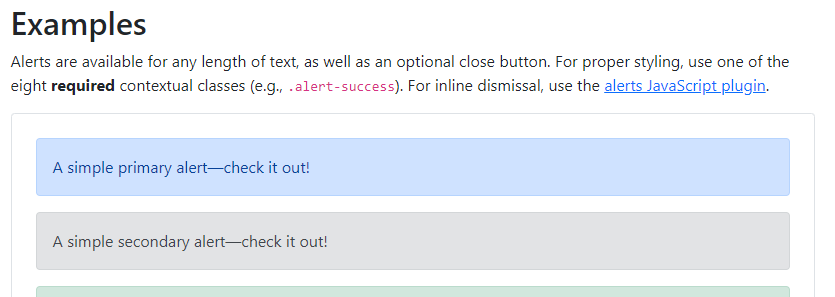
The design of the Bootstrap 5 Alert component should be showing correctly like that:
Actual behavior
-
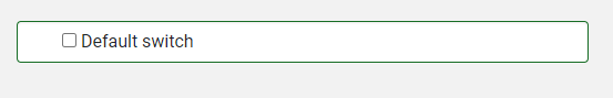
Here is how the Custom Switch is showing:
-
Here is how the alert is showing:
How to reproduce
- Try to create a Custom Switch in your form.
- Try to add an Alert in your page.
1. For the Custom Switch, I noticed that Wappler uses “form-control” instead of “form-check”:
Wappler:
<div class="form-control form-switch">
  <input class="form-control-input" type="checkbox" value="" id="checkbox1" name="checkbox1">
  <label class="form-control-label" for="checkbox1">Default switch</label>
</div>

Bootstrap docs:
<div class="form-check form-switch">
  <input class="form-check-input" type="checkbox" id="flexSwitchCheckDefault">
  <label class="form-check-label" for="flexSwitchCheckDefault">Default switch checkbox input</label>
</div>
- For the Alert, I noticed that Wappler is not adding the CSS class “alert-primary” or “alert-secondary” etc.
Actually it is only addingtype="secondary"but it’s not adding it for “primary” and it doesn’t seems to be working…
PS, I’ve fixed it on my project manually. 
Thanks!