BIt of a half backed idea which i can do in other ways but I though of this and it was a challenge i couldn’t work out.
The idea is to present data in the form of a bar chart but thought of the concept of using variable length columns with green/ red backgrounds.
I wondered if anyone had any ideas on this other than using conditionals / show/hide options. I have other options (and probably much easier ones but …) This seemed a challenge and a useful idea
I could like to set column sizes dependent on a value
For example, the variable can have a value from 1 - 5
If value == 1 i want <div col-1 … then <div col-4 …
if value == 2 i want <div col-2… then <div col-3 …
etc
Thinking something conceptually like <div class="col-{{var1.value}} …col-{{5-var1.value}} (which does not work of course)
Anyone any ideas how to do this without conditionals, did consider using CSS calc() function but couldn’t work out how to do it that way with a variable
I did contemplate that. The issue is if i was to go down this route i have about 30 to do, 2 columns per element to do and if i have to add 5 classes to each column that’s 3052 class definitions, was hoping for a quicker route
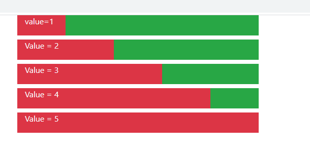
Yes, i have a number of database fields which return a value between 1 and 5
I want to represent them as a horizonal bar, red/green
so 3 will be 60% red, 40% green for example
Now i know the easiest way would probably be to use 5 images and use a tertiary operator to select the correct image. That would be a suitable solution and easy to do. (another question comes to mind, can i pass a parameter to a node partial?)
But it is Sunday and i had this daft idea about using columns of calculated size instead of a graphic so 3 would be “col-3 bg_red” then “col-2 bg-green” etc
It was the idea of using a calculated column size which intrigued me as a concept rather than it being an ideal solution
Kind of like responsive columns but by variable rather than screen size if you follow
Please don’t waste time on this crazy idea, the best solution is probably words of advice like “dont be stupid Brian” but i thought i would float the idea in case i was missing some clever wappler trick like adding $index to form elements etc
Have you tried using a dmx-bind:class?
dmx-bind:class=“col-lg-{{query_limit.value}} col-lg-{{query_limit.value}}”
im still learning Wappler but this did assign me a class and add my variable at the end (both the same here as the variable is the same and I was testing)
Ok so you want to represent values from 1 to 5 as two columns in a row? How are these related? What does 1 represent - how many red and how many green columns in the row? Then what about 2, 3, 4 and 5? Is there any logic representing this relation?
Not sure why the vid started late like that ill upload a new one if needed as you can’t see the search bar change when I pressed the button from 1 to 11
this was just a quick demo that I updated my search bars column from 1 to 11 with the variable query_limit
if you wanted all screen sizes and a default style you can use (all columns same size)
dmx-bind:class=“my-default-style col-sm-{{query_limit.value}} col-lg-{{query_limit.value}}” and add any other screen sizes you want
something like:
dmx-bind:class=“my-default-style col-sm-{{query_limit_sm.value}} col-lg-{{query_limit_lg.value}}”
will allow all columns to be set individually