I generally think a good logo is one which, when you see it appear somewhere you immediately link it to the company or product but that is mostly achieved by the marketing rather than the logo itself.
If I ever see the current swirrly W logo then I instantly connect it because I’ve seen it so many times. So the in-depth thinking of how and why a logo looks like it does isn’t so important in my view. But a well designed one, and the ones shown here are well designed with the grid demonstrating the spacing, etc. is what will make it work.
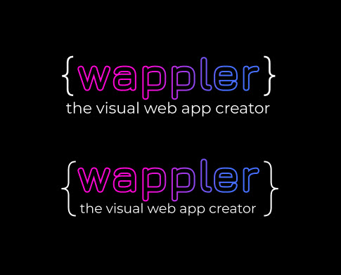
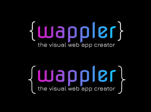
I have to say that the more I look at the new logo with the initial font, the more I like it. I like the initial font more than the other 2 proposed fonts. But this is of course only my humble opinion .
I’ve also been liking the initial font the more I look at it (this must be driving Jeroen crazy ) I think the other fonts are a bit bland and lack character, but my only suggestion with the initial font would be to consider making it a tad less fat/heavy to see if that works better.
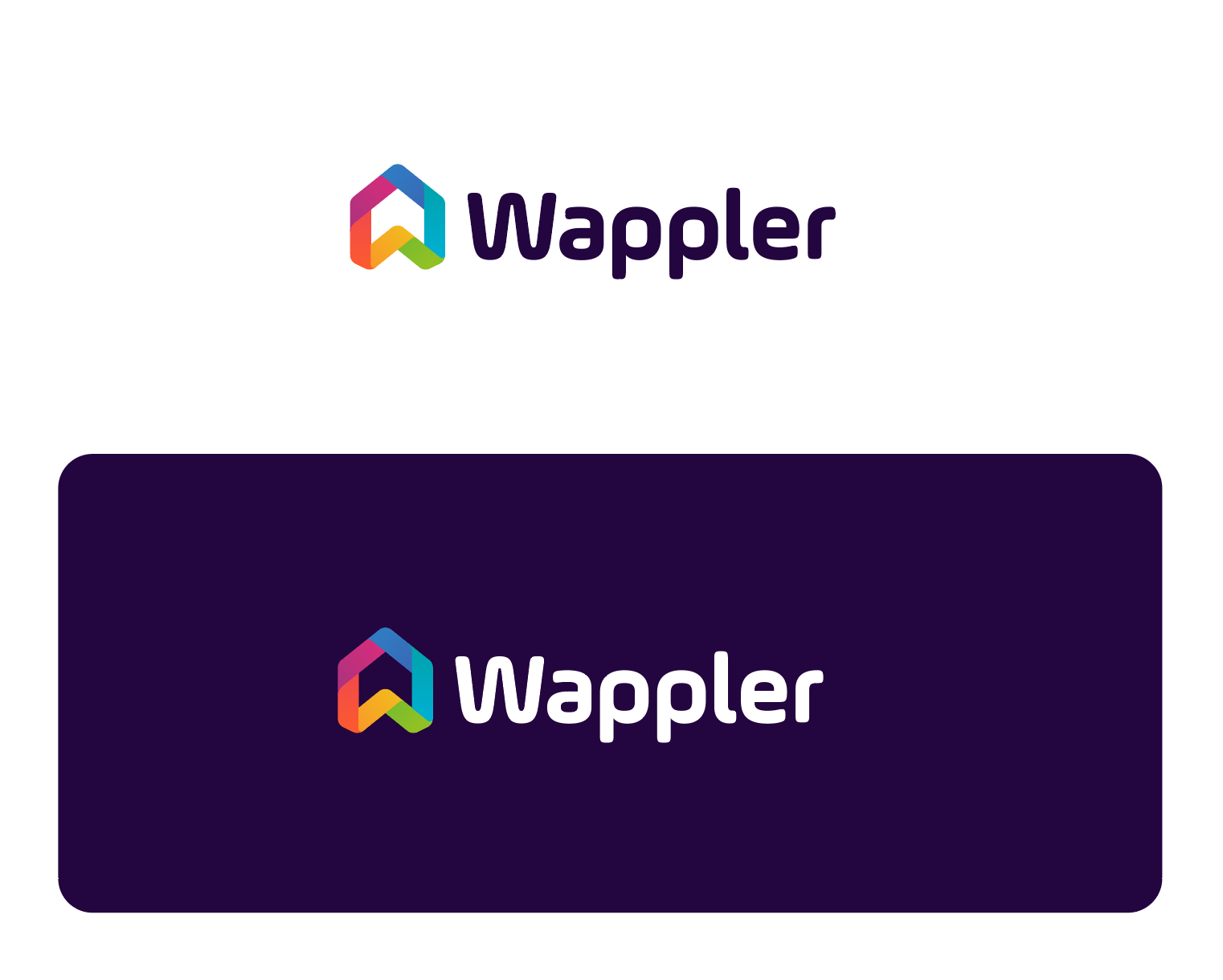
On another note, here’s a conceptual suggestion for Wappler 10.
lol… no offence taken at all… if u did read the post… i said i like the logo… but would have done it differently… the point i was making is… i dont know why the Team is even asking feedback… as they should just go with what they decide… asking a forum / community will just opens a can of worms… so go read my post again…
Sorry @Mozzi, I’ve just read my message back and I sometimes have no filter especially when I’m tired like I was when I sent that! People in my life often warn people to take no notice of me as I have autism and with that no filter!
Your logo this morning actually looks tidy, ironically. Both yours and the teams logo would work.
It's very common for a company to get feedback before releasing a new logo just to get a feel of what others think. This gives the owners a broad view about how the logo may be received by the public and going by the responses here, it's going to be very positive.
Idea for the concept is to put more attention to the great Wappler community that forms the “home” of Wappler, and also an arrow up create a bookmark of progress. Also the letter W is the foundation. Fresh colors are used, with a wink to code.
So what do you think is this a better concept than the previous one in the top of this topic?
 .
.
 ) I think the other fonts are a bit bland and lack character, but my only suggestion with the initial font would be to consider making it a tad less fat/heavy to see if that works better.