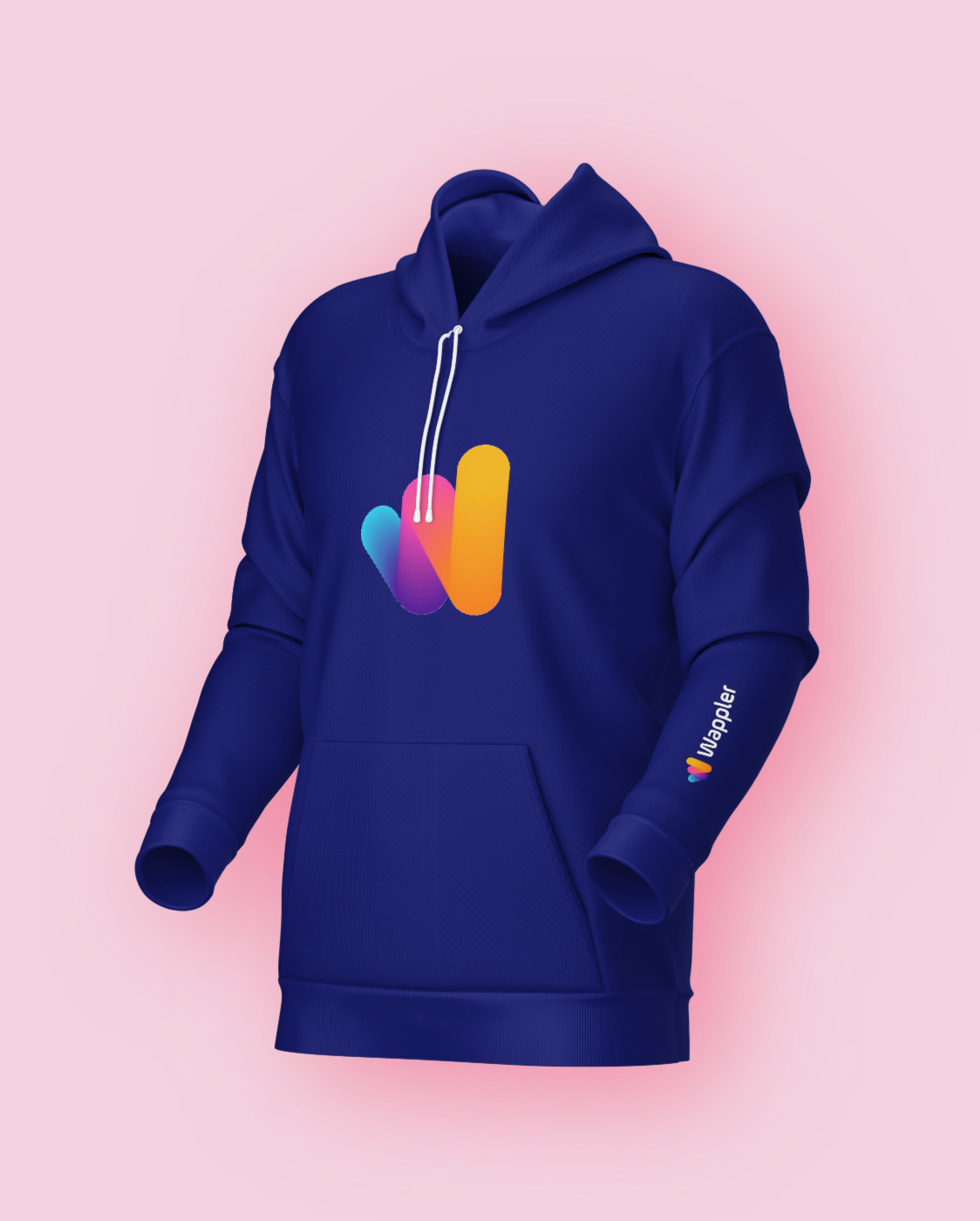
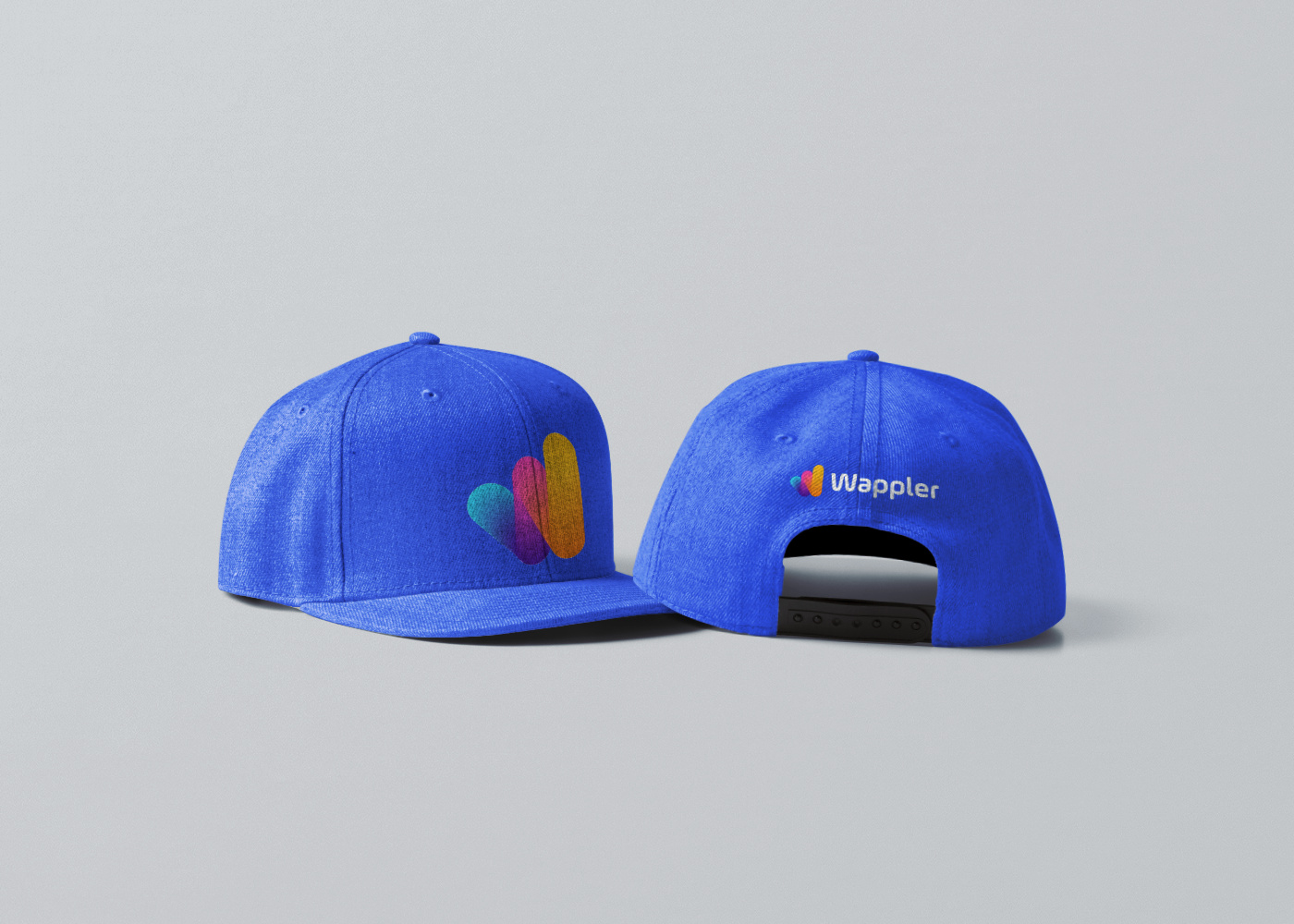
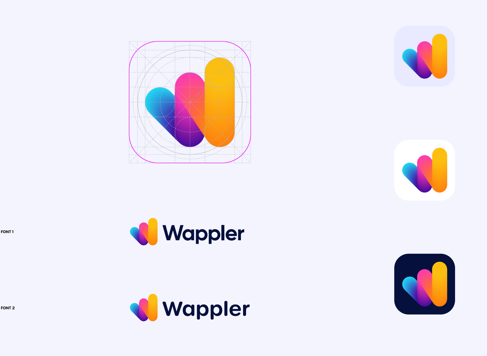
Don’t want to ruin a party here, but I don’t like it. 
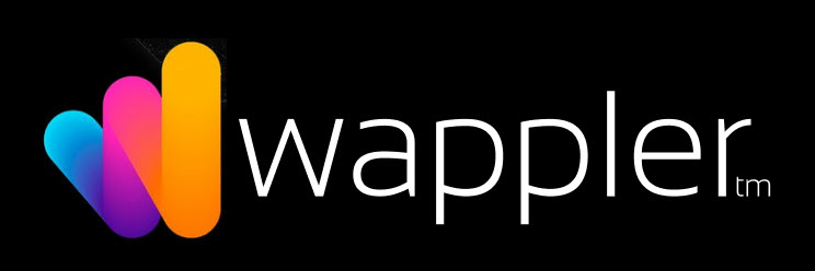
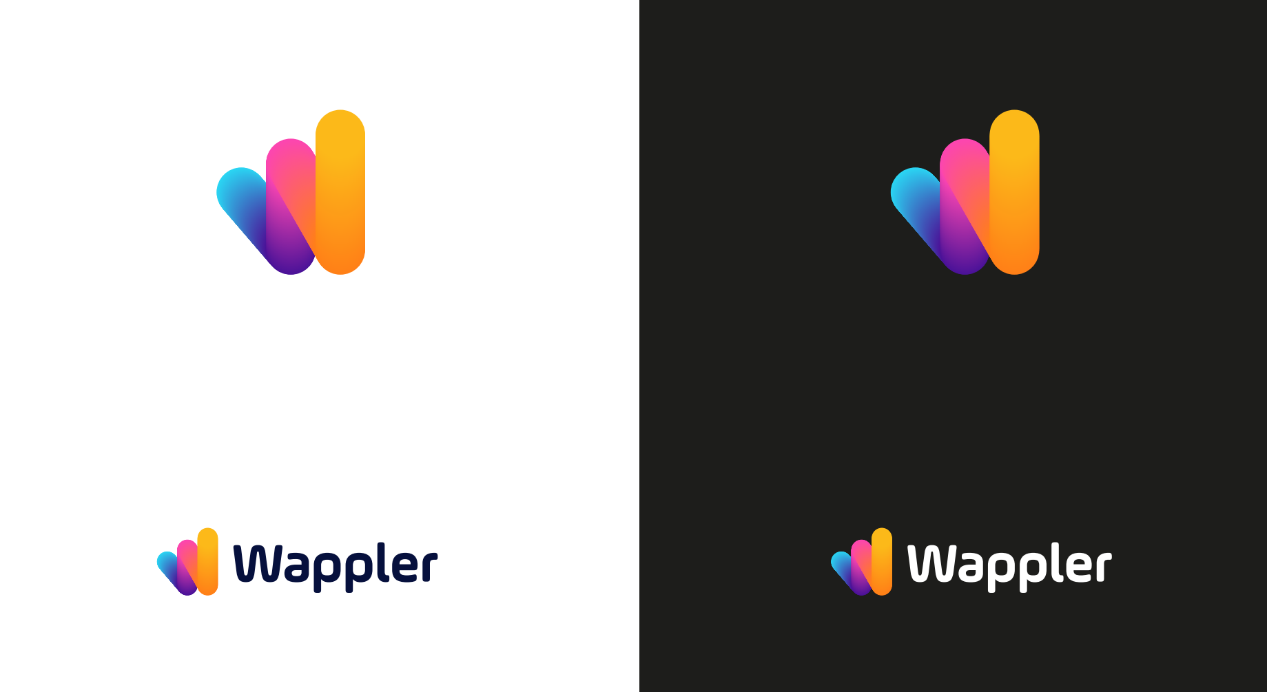
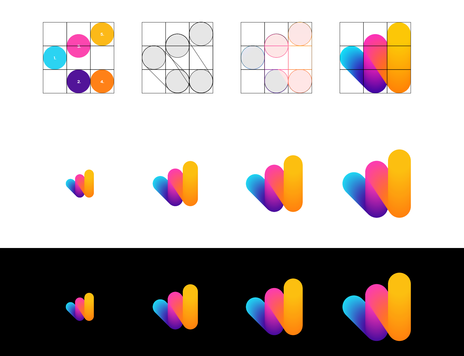
First, about the icon part.
1. Image meaning is not clear. It is kinda “W”, I get it, but only when I see it with “Wappler” text.
It is too weird “W” to be easily distinguished.
Without “Wappler” hint it is just two vertical lines and one third is looking from behind them. I don’t see “W”.
Of course it is not supposed to be only “W”, maybe it has another meaning. But in this way, this other association must be clear anyway. Currently, I don’t see it.
Only real working impression for me is that it is an icon for chart app.
2. One of the reasons why it is hard to see “W” is that there are three colors used here. Too much. That’s why I only see three thick lines of different colors.
3. Lines are too thick, so as the smaller the logo gets, then it is harder to distinguish the letter "W”.
4. Color mixing in the logo is strange. Yellow on pink looks like some artifact from layout left unpurposely. And the bottom part of the pink line looks muddy.
5. Logo feels unbalanced, disproportional. Obviously it has more weight on the right side. Feels like it is going to fall on the left side. This gives me a little anxious feeling.
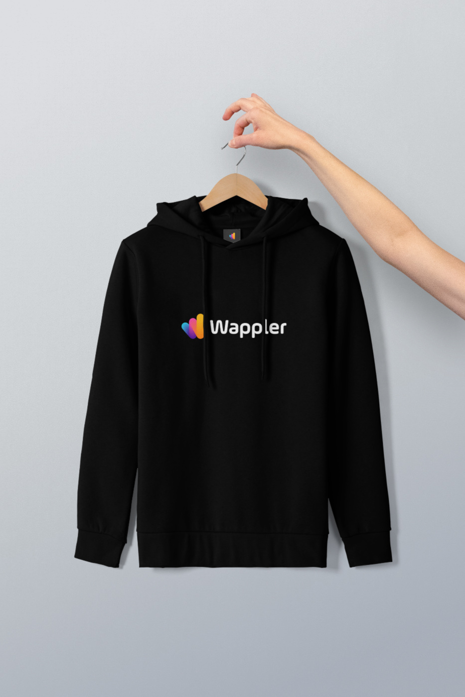
6. Those colors definitely look fresh and playful by themselves, can’t argue with that. I like those colors when I see them on websites. But they look good only on a dark background. Because they are bright.
I think on the white background they kinda lose their attractiveness.
7. And I just can’t see the character in this logo. It looks like some generic 2022 trendy logo that basically can be attached to any product.
On the contrary, the current Wappler logo is unique. It is weird, but in a good way. My first thought about it was “You must have a unique vision and you must be confident about it to make this unusual thing”. And this impresion is also true about the Wappler itself. So the logo reflects the product. This is the character I am talking about.
.
Overall, unfortunately, I think this new icon logo is unprofessional in general.
I don’t wanna be rude or hurt anybody. I just want the best for Wappler so I am being frank here.
So my vote for trying something completely different (supposedly with a different designer).
.
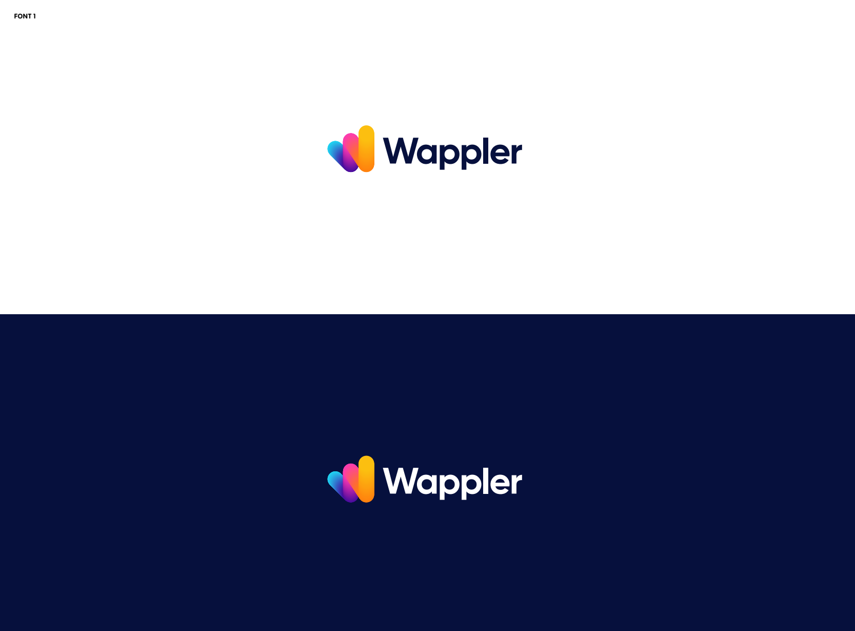
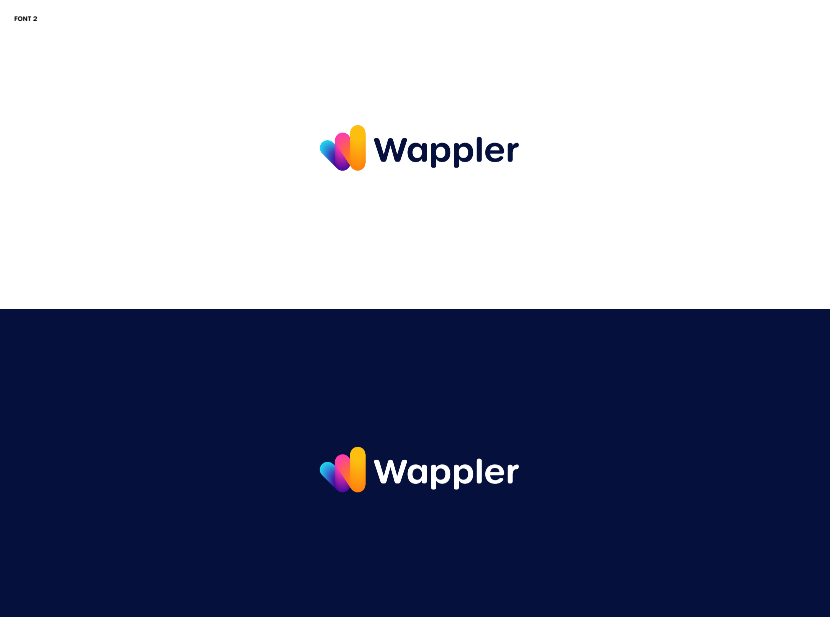
About font.
1. Definitely don’t like the wavy “W” in “Wappler” in the first version of the font. “W” in the second version is ok.
2. I think, more “serious” “not-rounded” version looks more suitable for Wappler. But short “legs” of “p”’s in the second version looks strange.