The future is looking good  @wappler_ambassadors
Instagram:
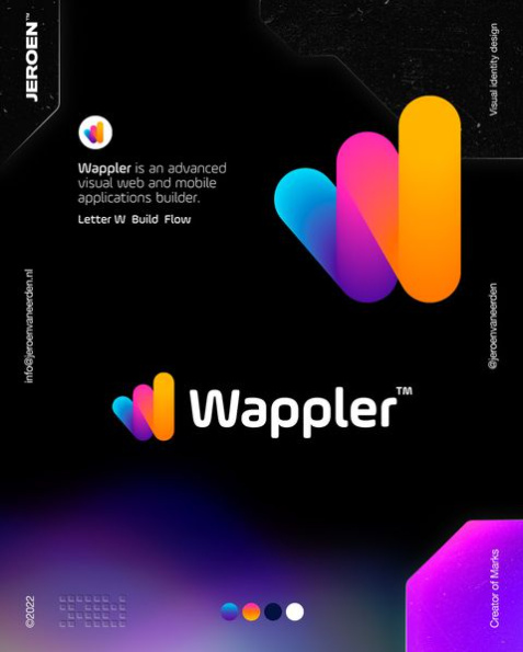
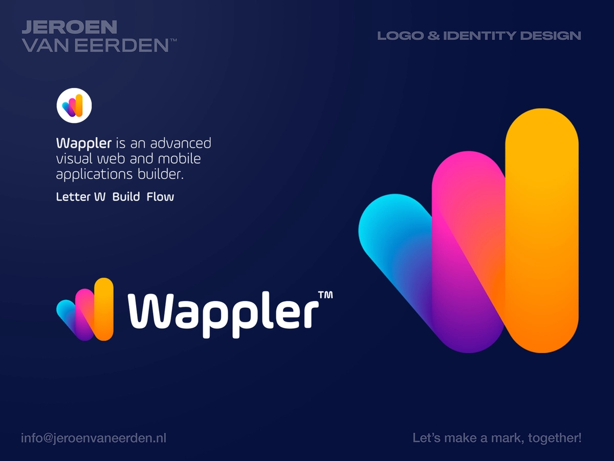
https://dribbble.com/shots/17779445-Wappler-Logo-Design
Feedback is welcome!
The future is looking good @wappler_ambassadors
Instagram:
https://dribbble.com/shots/17779445-Wappler-Logo-Design
Feedback is welcome!
Finally.
Like the logo. Like the colours. Not the type.
Same feedback as nshkrsh.
Looks pretty modern to me! I do like the font, actually. Nice to hear things are moving forward!
I love it!
The W logo reminds me of something else but I can’t remember what!
Love the new look. To this point, it has been a fun, great ride. Keep it up.
Do like the icon. I can deduct a lot of the reasoning behind it’s shape, slant and starting with a point and ending with a surface. Means a lot.
The type/font reminds me of NASA - Maybe just the W but the curves are close to the nasa logo if memory serves me right.
This is one thing, how it will translate to the look of the app excites me. We want something that looks more modern, playful and inviting although it is a serious tool. Changing fromm the dark and red to this is going to make a huge difference in user’s perception/approach to the app.
I guess we see what is in store for version 5
When/ where is that logo image available, have a lot of videos to remaster! Was hoping to start to release new series this weekend!
This will come with Wappler 5, later this year ![]()
Ok, will leave current material with old logo
Playful, futuristic and incremental are the words that come to mind.
The playful part is what has me a bit concerned. It could come as a bit deceiving for new users. When I see the logo with the colourful strokes the thing that comes to mind is a white canvas where I can design and place anything wherever I want. Drag&drop comes to mind, moving borders, increasing size with mouse movement. Something more flexible like photoshop, figma, etc
Wappler on the other side makes sure you respect rules/conventions(given by bootstrap mainly). And it’s a good thing.
All in all I like the change. Just concerned about a mismatch between branding and product.
Ten thumbs up from me. Modern and eye catching. Very nice.
Well the idea is to illustrate the freedom you get with Wappler, both creative and technical.
And our continuous goal is to make Wappler more and more visual and accessible for new users and design oriented people as well. So that fits the new logo statement as well.
I liked!! WAAAY better than the current “W” and logo…Looks more professional, modern…Congrats, guys!
It looks like a similar work was used in a different job. I might be a little more original. However it looks pretty good.
I like it!
So do I!
Hi!
It’s very nice!
Maybe the TM could be a little smaller but maybe there are some rules that define it.
Curious how it will be with an white (or clear background).
Fantastic job! Beautiful logo mark, great energy, character, and very persuasive on the boundless freedom Wappler offers. Superb job. Very exciting.