Wappler Community
Something great is taking shape on the horizon 🚀
Wappler General
sitestreet
March 31, 2022, 8:56am
28
Nice!
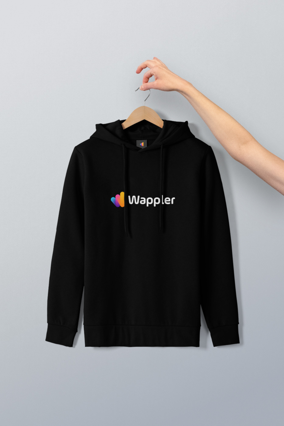
wappler-hoodie-1
933×1400 195 KB
wappler-hoodie-2
1124×1400 198 KB
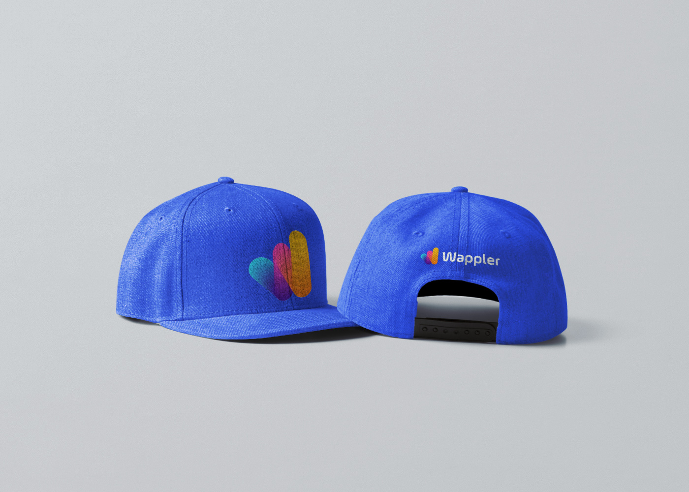
wappler-baseball-cap
1400×1000 358 KB
7 Likes
show post in topic