OMG…
Server Connect Flow Designer…
This sounds absolutely amazing and feels for me like the biggest upgrade to Wappler since I started the journey with you wonderful folks nearly 4 years ago…
Thank you guys ![]() … I can’t wait to play with it!
… I can’t wait to play with it!
OMG…
Server Connect Flow Designer…
This sounds absolutely amazing and feels for me like the biggest upgrade to Wappler since I started the journey with you wonderful folks nearly 4 years ago…
Thank you guys ![]() … I can’t wait to play with it!
… I can’t wait to play with it!
Yep can’t wait to get back from holiday to play with this!
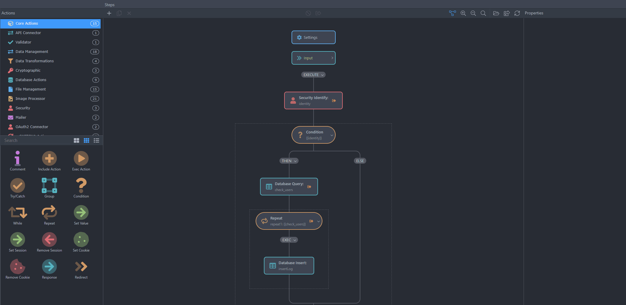
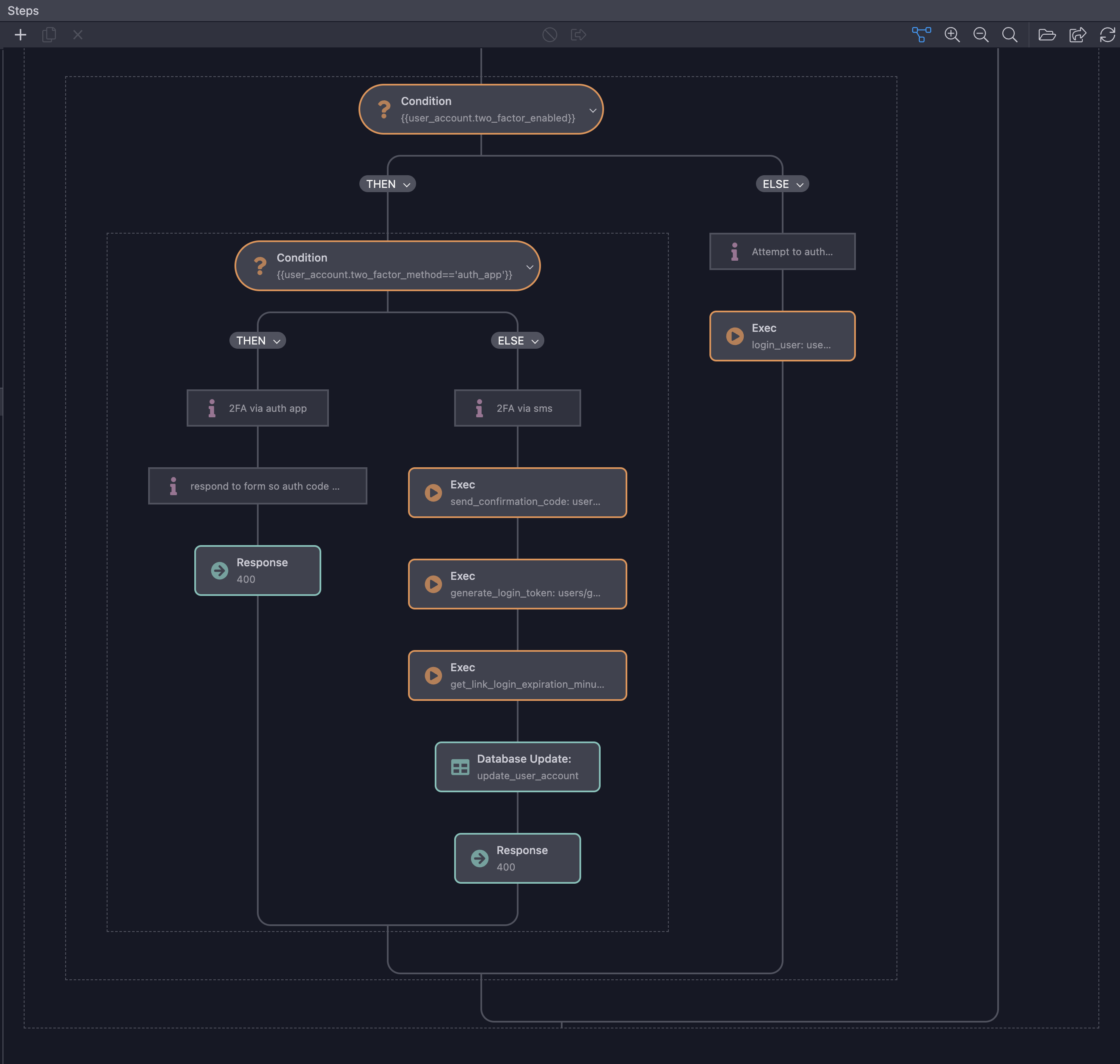
That’s a big change indeed, still work in progress and still not fully ready but we’d be happy to have feedback so we can polish it. More improvements are coming in the next betas:
Wow indeed! I’m on holiday, too, but looking forward to working with this next week. Superb work guys.

Is it too much to ask if it will support cut and paste of actions or groups of actions? ![]()
I think this is the first time I’m genuinely scared for the direction this is going, especially since it’s going to replace the old tree view. I’m not convinced of the practicality of this, and I’m really curious to know the long-term opinion of this feature.
I think dropping the old tree view is going to be a fatal mistake:
I doubt this will allow people to create more “complex” workflows. I think it’s just a way to bring it closer to Bubble to make it easier (“prettier”) for beginners, at the risk of killing productivity for intermediate to advanced users.
Purely from looking at the layout, I like the idea of the server action panel with a full “unhidden” view of available functions.
My ideal would be the centre part to have the 2 (or more) types of views - old tree and visual mode or whatever you call the new one and then the right side panel for the input/output.
Then having your +(add) before and after actions as with the front end/page designer.
It should be possible to multiple methods in the UI.
As an alternate mode, this would sometimes be useful, but completely abandoning the familiar string mode would be a huge mistake!
I haven’t been able to test our AppConnect Beta or even any of Beta 6 version. Its been months, but with the active business, I am unable to find time to test out things like this.
I am not sure how many existing active users actually test Beta things, but I am not one of them. And like Apple, I am a bit sceptical about this new design REPLACING the existing tree structure.
Had this been a toggle in a regular Wappler release, with a month or two for regular users to see if it makes sense - and then made permanent, it would make more sense.
Also, the UI is bloated. Compared to current tree structure which can show about 15-20 steps, this new UI is going to be a productivity killer, as Apple has noted.
Yep. I would definitely not want to see the end of the existing structure views. I initially liked the look of the new one from Teodor’s screenshot but I agree with the other views in this thread that this might not actually be the best way forward.
I can’t try it out yet but will likely have more thoughts one I’ve been able to.
This is actually a toggle at the moment, but their plan is to eventually remove it
For those of you wondering about the features and possibilities.
That would be:
My opinion: both views should co-exist
Please don’t turn the topic into a discussion about not integrated feature requests.
We’ve discussed hundreds of times why there are feature requests which have or have not been integrated.
We’d like to stay on the topic about the new Server Connect Flow Designer and hear people opinions.
I do apologize as I’ve missed the discussions about why this hasn’t been integrated.
We’ve already looked at this component and played with it but it was missing a lot of features which we need, so we built our own. But yes, the idea is quite similar ![]()
Thanks for your and others’ opinions on this, these are really important to us so keep these coming.
Hi @Apple ,
I have used a similar approach in FlutterFlow a lot and I am still using it. In addition, I argued that there should be a similar visual interface in an older post. Actually, this new visual interface will be good for intermediate and advanced users, contrary to what you think. Because it really reduces the chance of making mistakes in complex workflows. Yes, it is necessary to get used to this new interface, but I assure you that it provides a lot of comfort and a better perspective after you get used to it.
In addition, offering options in the form of old and new looks will make everyone even happier and remove their concerns.
I have to finish a piece of work today before I get to try it out… but I’ve just been working on some quite complex algorithms, so I can’t wait to play with those in the new interface.
For me, it will be all about how it can handle complexity and increase productivity…
… if I can really easily group things and expand/contract them, copy and paste between server actions, have an undo feature, move a group of server action steps to a library action, see as much detail on one screen as I could before, hover over items and see the details in a popup, not have to buy a new laptop and massive screen with a 4k rather than 2k display to sensibly use it…
… then I expect it to be a productivity boost and a benefit!
Good job that’s a small and easy-to-implement list, @Antony!
A couple first takes:
I share the concerns expressed, but having opened it up, so far so good. Obviously needs real world experience, but up front, it looks great.
Having both views would obviously be great, but having to maintain 2 views I would assume is more work for the team long-term, so hopefully one wins out to save dev time for other items.
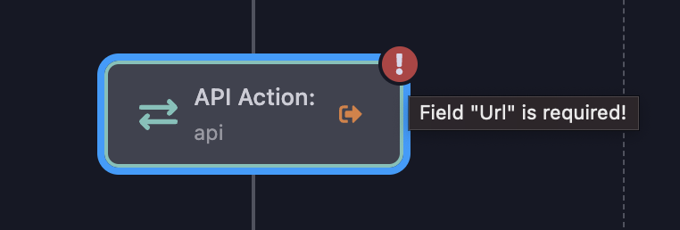
New validation pattern is a HUGE improvement. The current pattern is very disruptive, so big applause for this change.
The keystroke tabbing to actions is interesting; could the properties for the action be updated as I “tab” through actions?
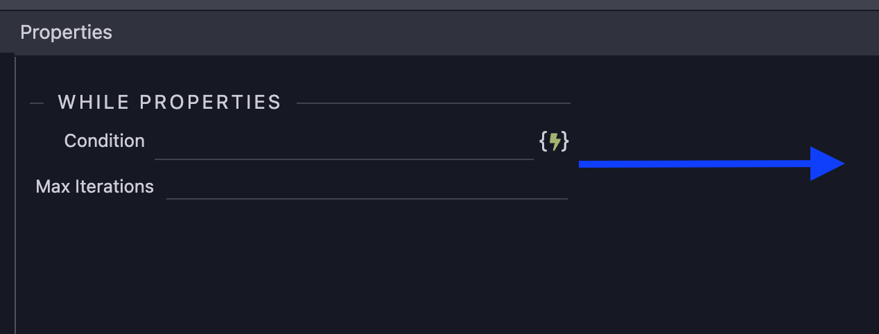
Property inputs that expand with the panel would be a welcome upgrade
The zoom increments seem to small. Also would be great to zoom via Command + mouse like Figma
Disabled actions could perhaps be stylized more–not enough difference from an active action right now
Perhaps since you are deep into this new view, you’d consider adding some of these requests:
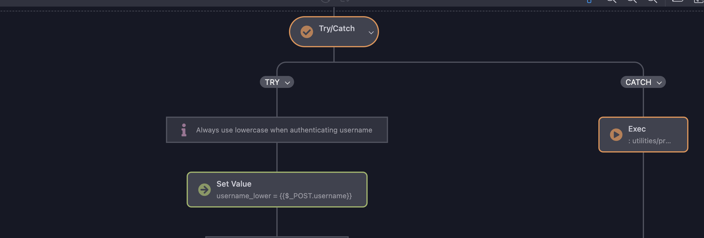
I’m wondering if actions that terminate execution (response, validator, etc.) should visually show a “hard end”. Right now they have a line connecting them back to other actions.
Similarly, the last action in my example here, is a catch that has nothing after it, so it too should not be connected back.
That’s probably enough for now!
Overall, I think I’m on-board.