Redesigning the Bootstrap 4 Properties panel, Part 1: Margin, Padding and Display

Hi All,

We are busy with redesigning the Bootstrap 4 properties to make it more easier, visual to use and also make more sense :slight_smile:

I would like to hear your opinion on our ideas and get your feedback. So I will be publishing a few posts about the new Properties UI.

To start let me show you want we have in mind for the general Bootstrap margin & padding options as well show and hiding on different devices.

Device choice

First to start let me point you that all media query / devices sensitive properties are controlled by the selection of devices in design view:

image

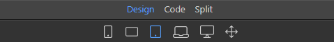
So if you select a device - then all settings are done for this specific device (and up if not overwritten) that is the whole idea Behind bootstrap’s mobile first design.

Simply stay on the default full view - to work with all devices, as actually full view is the same as the smallest mobile. Everything is visible there.

Margin & Padding

So the interfaces become pretty easy after you have selected a device to view on or have it on full view.

Take for example the new margin & padding control:

image

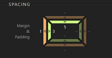
You can simply drag the outer bars to increase the margin or inner parts to increase the padding.
The colors become highlighted when a value is changed. The colors are also the same what you see highlighted in design view.

Furthermore the control follows the bootstrap rules it gives you the bootstrap settings from 1 to 5 for margin and padding.

And again to remind you the properties here effect the selected device only and up, if you have selected a device view in design view.

Display Properties

The display is another tricky part, because Bootstrap 4 makes it really difficult to select what is visible on which devices and what not. Sometimes you have to put up to 3 different classes to get the job done.

Then it all also depends on the element you are working on if it is a block element and flex element, or maybe inline …

We have however greatly simplified that for you and give you the power to just select what you want to hide!

The types of the elements are detected and the classes are added automatically!

image

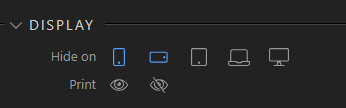
The same is for printing - you just select to print or not - or leave the defaults.

So that is all for now - let us know want you think of those improvements, so we know we are on the right track.

A heads up to our @wappler_ambassadors for their valuable opinion :slight_smile:

5 Likes

This all sounds good. Just a couple of thoughts.

Will there be options to enter the numbers manually as well as by dragging? I think this would be useful.

How will you add options like ml-auto and mr-auto? If there were an option to add two (or all) sides at once, perhaps by holding a key down, that would be good (but hardly critical).

Surely it’s not quite the same. Eg wouldn’t a card with these classes:
<div class="card d-none d-sm-flex">
not appear on the smallest device- but it would still show on the default full view (or is that changing)? I may have misunderstood your point.

I know it’s not quite the same subject, but a related area where things could be confusing is the overlap between the Bootstrap 4 properties and the options on the Design tab. Eg with code like this:
<div class="card pb-5" style="padding-bottom: 5px;">
… being created. Perhaps when these styles can be transferred to external files it will be better (I think this was mentioned as a future option).

2 Likes

well we have here only numbers 1-5 so not much to enter …

Forgot to mention that the “auto” options is the first drag - so you are dragging between auto, 0 … 5

Only the margin and padding are design view device dependent. In the display options - you see all the devices and you can toggle there on which to hide …

Actually a very good point. As we will have multiple ways of setting the same margin & padding, we have to improve the flow of it.

Now you can indeed, set the margin & padding:

  • in the Bootstrap 4 properties, according the Bootstrap way and classes
  • in the design panel - generating inline css
  • in the styles panel setting css classes

So a lots of ways that can clash to each other. In the design panel we already show the inherited properties, but a more natural flow is needed, because you are eventually editing the same thing.

It has to do I think with the level of control you want. With the Bootstrap properties - you follow their rules and are snapping to the bootstrap grid giving you more consistent look. But it is limited only to the Bootstrap choices.

Normally this is a good thing as you don’t want to count always all the pixels exactly but just follow the right proportion. But of course sometimes you need precise control and that is where you switch to the design panel with exact pixel control.

But as those margin & padding controls will probably look alike in both Bootstrap 4 properties panel and design panel, we need a more natural flow of going from one to another for the “advanced/fine tune” properties.

1 Like

No, but if you wanted to add the same padding on all sides, it’s quite a bit of slightly fiddly dragging. Typing a number in four boxes (or ideally just one box with some option selected) would be easier - as it is currently, making a selection from a list (admittedly, rather a long list). Having said that, I think the new control looks good and certainly more intuitive.

I agree that the Bootstrap options should be kept separate from the Design panel options. I appreciate it’s very difficult not to make it rather confusing.

1 Like

I take it this will only apply to local versions of Bootstrap?

Looks good to me. My one and only concern is there will be three places in which designs can be altered. This can become quite confusing I would think.

It doesn’t matter what version are you using - local or cdn. You style the elements on the page, by applying bootstrap classes - you are not changing the bootrap files using this panel.

As for the:

Bootstrap panel provides you with the options which the bootstrap framework offers - so you use them to style bootstrap components on the page - just like until now, but with better controls.

Design/CSS panels offer you to style any element on your page, using standard CSS properties.

So in bootstrap panel you can add margin 5 (which is a bootstrap class) and with design panel you can add specific margin values like: 23px.

3 Likes

These are a solid step forward. I think the padding and margin settings will be quicker than a select field. I also think beginners and people coming from other programs will find this instantly intuitive.

The settings holding per device and up is a huge leap. Love it. This is going to be a very large time saver, and give it real responsive design power.

The display properties are also very efficient and smart. Being able to show something on laptop, and hide it on mobile and tablet just by clicking a couple icons is fantastic. I think this is a great step forward.

4 Likes

@George, I have had to create parallax sites for some of my customers. Wappler is great to create these with the exception of adding the following to the <body>. There is no Wappler method to achieve this

data-spy="scroll" data-target=".navbar" data-offset="50"

I love the ideas @George, I have to admit though it even took me a while to understand that App Structure was only for Bootstrap Class Properties, and that was back when there was no Design Panel.

To avoid confusion for new users maybe where it says Properties under the App Structure panel you should rename it to Bootstrap 4 Properties which avoids all confusion.

The Design Panel could maybe be renamed to Design CSS or CSS Designer or Easy CSS or Simple CSS

The Styles panel we are all very aware of what it is, however a brand new web person might not, however I can not think of another name for it really, although when a user clicks it I am pretty sure they will either know what it is and use it or not know what it is and research it or not use it

DOM already sounds perfect to me, the Properties panel inside it could maybe be renamed to All Properties or Extended Properties

Not important to me because I already know what to expect but might be worth thinking about for the new user.

3 Likes

Well I think it is not about renaming the panels, but more about user flow.

A regular user should be able seamlessly to start from the Bootstrap properties panel, use the most common properties to do work as design requires, but the standards bootstrap properties does not fit, he should be able to go to the design panel, enter the base css properties there also visually, and if that does not satisfy go to the last CSS styles panel and enter the css styles.

So this summarizes also the priorities of flow. First the bootstrap properties pane, then the design panel and as last the css styles panel.

The same is also valid for HTML structure. First see if the global App Structure with its components is enough and if not then dive in to the detailed HTML/DOM structure.

We just have to make this flow even more easier so it is even easier than switching panels.

5 Likes

George:

I think you are on the right track with these modifications. I recently ran into some problems with using button groups and flex boxes. In short they did not reduce in width and were cut off as the device became smaller. Presumably this should not occur if we are building from the smallest to the largest display. I most likely entered an incorrect setting, but I had to use a different technique to get the desired display. I think the direction you propose will help out many people.

Thanks,

Bill

1 Like