Purple Theme for Wappler

Hey guys, now that Wappler 5 is official, a new logo, website has been released and the colors of the community have been changed, which by the way good job with the color and tone that you chose and how you did the gradient. I wonder if you could adapt these colors in a new theme for Wappler, I think it would be very nice.

What do you guys think?

I found the purple (as it was being changed) very hard to read, I had to turn my monitor brightness on full. But since being on it all day I have gotten used to it and I think it looks great. Love the new branding.

Not sure I would use a purple Wappler though? That would be too much purple for me personally. :wink:

1 Like

With all the monitors you use @brad, if you turned up the brightness I imagine you must be like this… :joy:

2 Likes

lol, maybe that’s why the cooling fan kicks into high gear on my MacBook Pro when on the Wappler website.

1 Like

Would’ve been terrible before my eye operations! Thanks to Wappler, I can now prove my point.

image

1 Like

The forum ‘Light’ theme needs to be updated with a different logo and new colours. Still red …

Good catch Ben, as always you are right!! But it still looks nice and modern :star_struck:

2 Likes

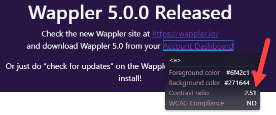
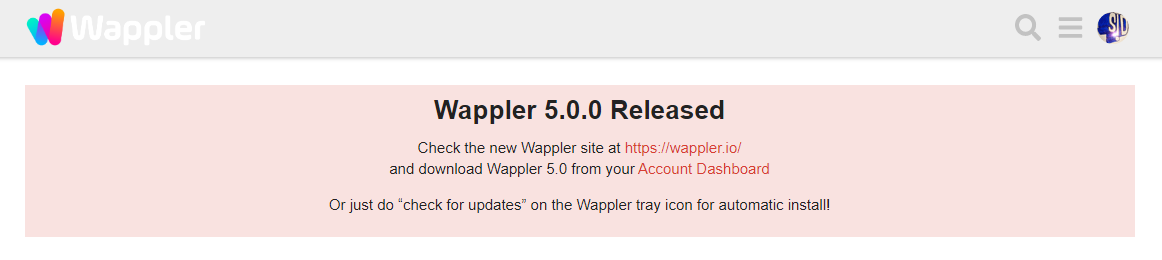
I think this is still the case with some of the darker purple texts and the boxes like the one to refresh the community posts I think a text colour been a colour like violet would be easier to read:

The boxes also blend into the background in some cases but this is just my opinion on this

2 Likes

Lol I never used light mode, I have to try it!

I think the orange of the logo could be better for the links.

2 Likes

I think any brighter colour works really orange would make more sense though as it keeps more inline with the logo

1 Like

The new purple is indeed an eye-soar in community dark mode.
And the Wappler text is gone when in light mode:

1 Like

The default theme in the app should match the new colour palette rather than a new one. The actual default can be renamed to something else for those who use it.

Retro?

1 Like

We can organise a vote. Let me gather my fellow colleagues from forocoches.

“Blas de Lezo” could be a cool name.

Btw tge forum theming here is now improved further, in case you didn’t noticed :slight_smile:

5 Likes

Yep, much better … now the light theme needs to be rebranded as well. :wink:

The only things id suggest is the last column is a little hard to read at times with the dark purple not a biggie.

And two the search area is all purple text not sure if this was intended

The background gradient is cool, but I did notice it was slightly harder to read due to the gradient approximating the color of the text (white)

Would you consider removing or tuning it down?