Pinegrow comes with CSS Grid

This is their announcement:

Today we released Pinegrow 4.9 with a full set of powerful visual tools for CSS Grid that can help you with:
• Editing the grid layout
• Managing named areas and named tracks
• Moving and resizing grid elements
• Dropping elements directly to the grid
• Makeing grid layouts responsive
• Creating fallbacks for older browsers

It will prove to be a game winner for Pinegrow especially now that Adobe have signalled the end of Muse.

I did suggest CSS Grid for Wappler in the very early stages There is still hope.

5 Likes

Sure we are adding new things on a weekly base, so why not.

To gather user feedback it will be really useful if you layout how would you like to see the integration in Wappler.
Special controls in design view? Extra options in the CSS Designer?

Haven’t checked out the one from Pinegrow - maybe I should :slight_smile:

Thanks for replying George.

I am probably the wrong person to ask when it comes to visual design, Code view is still my greatest friend when I use Wappler.

The reason why I bring CSS Grid to the forefront is because it is what we should be using right now. Flexbox has been a significant improvement over Floats and Clears, but it is only one dimensional. This means that we as developers are trading one fudge for another. What we want is a three dimensional tool. In this regard, HTML table layout was closer to the mark than Flexbox. (yes, it was the influence of DMXZone in the early years that weaned me off HTML table layout).

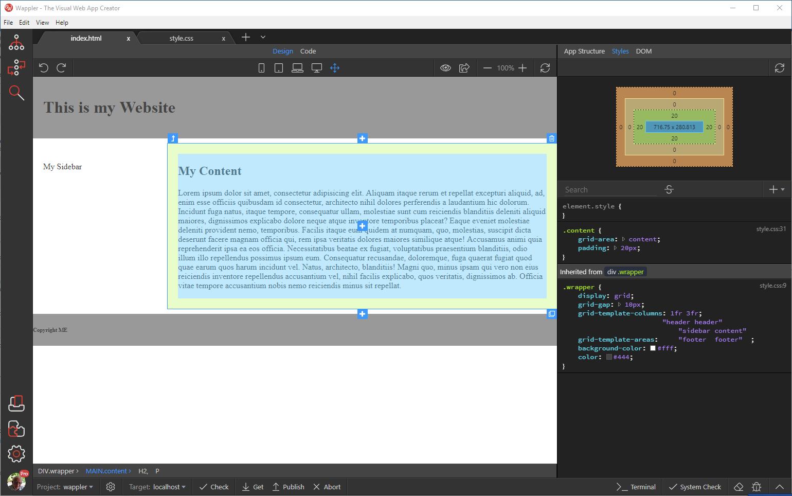
Have a look at the following image where I have constructed a very simple layout using Grid.

These are my observations:

  • Looking at the App Structure panel, all I see is ‘App’.
  • Looking at the Styles panel, I see a mishmash.
  • Looking at the DOM panel I see no Global Atributes that I can use for Grid.

Admittedly, I did use the Styles panel to style the document, but Wappler got confused when I entered the template areas.

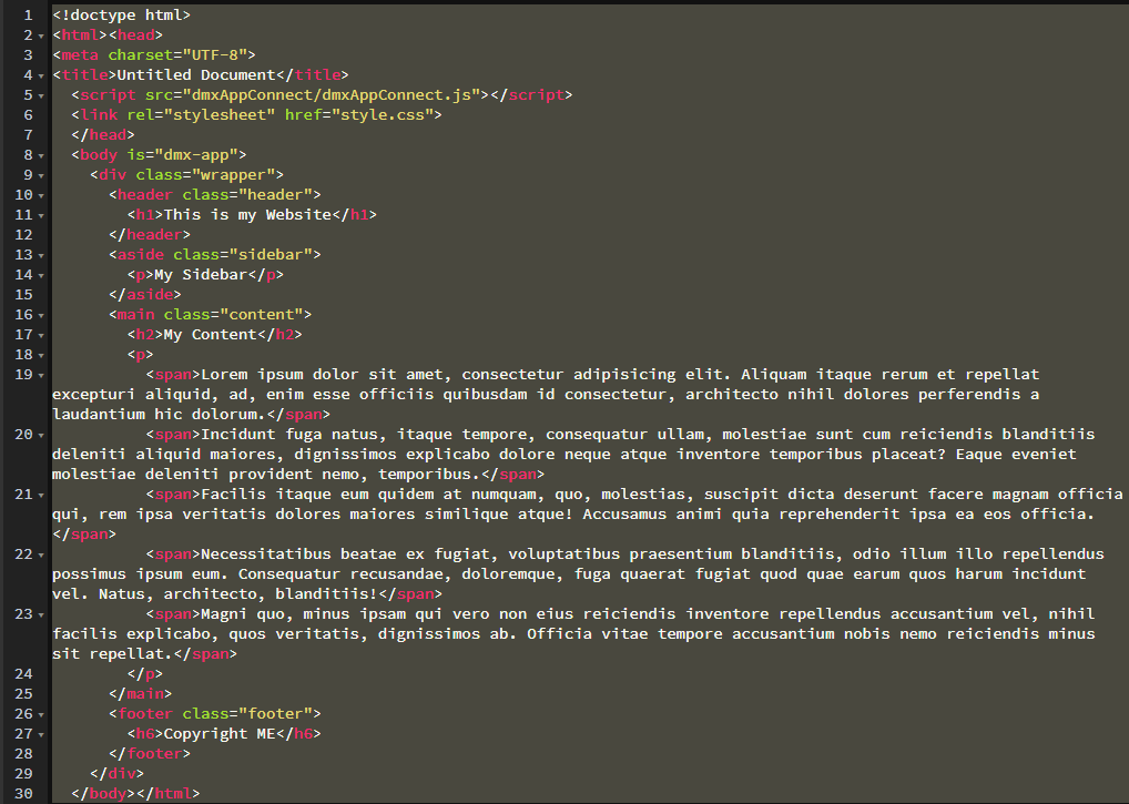
If you want to replicate the exercise, here is the code:

and the CSS:

.wrapper {
display: grid;
grid-gap: 10px;
grid-template-columns: 1fr 3fr;
grid-template-areas: “header header”
“sidebar content”
“footer footer”;
background-color: #fff;
color: #444;
}

.header {
grid-area: header;
background-color: #999;
padding: 20px;
}

.sidebar {
grid-area: sidebar;
padding: 20px;
}

.content {
grid-area: content;
padding: 20px;
}

.footer {
grid-area: footer;
background-color: #999;
}

As a final note, Flexbox has been integrated into Wappler, perhaps Grid could be incorporated in the same manner. This would be a great start. We could then use Grid for the overall layout and use Flexbox for single dimensional items such Menu-bars etc.

Yes, I know that Bootstrap can be used, but there are many developers that prefer to go without any ‘frameworks’ (I call them ‘libraries’) and I want Wappler to be the greatest.

4 Likes

I agree with you, Ben. CSS Grid and FlexBox are core to CSS whereas Bootstrap 3/4 and soon to be released 5 are libraries. Libraries will always give way to the core. The determination on whether to use Bootstrap vs CSS Grid is driven by the user’s browser. Users using older browsers (Older Audience) would want their developers using Bootstrap. Users who keep their browsers current make way to CSS Grid. My question to everyone is, will CSS Grid be added to Wappler? Or, is it already there? I’m a newbie ready to start developing again.

The libraries v Frameworks thing is very confusing. I believe that the difference is between who is control, so your code calls a library but a framework calls your code. I am still not the wiser for that though for example is Wappler a library as you call app connect components or a framework as app connect calls your code or even do you care as you just know it works!

I was going to write an essay when I came across: Framework vs Library

Frankly I don’t care as long as things work they can call them whatever you want but I am just a simple man with simple needs.

2 Likes

And how right you are. :sunglasses:

PS: I still think that Bootstrap is a library. :grinning:

I think it is something which keeps my boots on

I have used CSS Grid in a couple of my Wappler/Bootstrap projects, but it just makes things more difficult (read: takes more time). This defeats the whole purpose of using Wappler which is designed to save time (and money).

Having said that, I do feel that CSS Grid allows better flexibility and with a bit of luck, a future version of Bootstrap will be based on a combination of Flexbox and CSS Grid. The good part is that Bootstrap 5 will do away with jQuery.

5 Likes

This is how I’d like to see the CSS Grid implemented into Wappler. The image shows a section of a web page where I used grid layout. I chose this example because it’s slightly more complicated since the grid areas overlap. The light blue container represents an image while the darker grey-blue colour represents a box of text describing the image beneath.

If you right click inside one of the grid boxes you should get the option to create a grid-area name and/or select one of the names already created. If a Wappler didn’t want to name the areas, then it would revert to line numbers (eg grid-column: 2/4). Ideally, the designer shouldn’t have to concern him/herself with the code used, just the visual layout.

This is somewhat similar to PInegrow except in Pinegrow, you’re required to use a dialogue box whereas I’d prefer to create the grid directly on the webpage. Ideally, I’d like to manipulate the shape and size of grid areas by moving the lines and seeing the result instantaneously.

I just thought to check out Webflow and it looks very, very impressive. I’d check out what they do in their CSS Designer section, too. I’m sure they’ve got this down pat after about a year or so.

Webflow’s CSS Grid

1 Like

Wow I’m discovering new softwares here.

@transcoderm Webflow is one of the best out there but it locks you into using their hosting platform. It’s not a stand-alone app.